Typography System Research
View Figma ComponentKey Takeaways
- Typography hierarchy helps users understand content faster by making important information easier to spot and scan.
- Consistent line-height ratios (112%–162%) create a predictable reading rhythm and improve spacing between text elements, especially in dense interfaces.
- WCAG requires a minimum contrast ratio of 4.5:1 for normal text and 3:1 for large text so content remains readable across different viewing conditions and accessibility needs.
- Responsive typography with percentage-based line heights keeps spacing and readability consistent across screen sizes.
- Design systems should limit typeface usage to a maximum of two typefaces. Fewer typefaces create a cleaner interface, improve consistency and make the system easier to maintain.
Before We Start
Use a clear and consistent layer naming convention from the start when building a typography system. It makes text styles easier to organize, scale and maintain over time.
Many Figma plugins that generate typography styles rely on layer names to group styles correctly. Inconsistent naming quickly creates messy style libraries that become harder to update and manage.
Examples Typography Layer Naming:
Keep naming simple and predictable so the system stays easy to scale and maintain.
- Display [Category] / Display 1, Headline 1, Body 1... [Sub Category] / Bold, Medium [Weight]

Prioritize Readability
Keep text easy to read by using appropriate font sizes and sufficient contrast. Users should be able to scan content quickly without extra effort. Avoid shrinking text just to fit more information on the screen. Dense layouts with small text increase visual fatigue and slow down reading, especially in data-heavy interfaces.
Clear Hierarchy
This text uses appropriate sizing and contrast for easy reading.
Supporting text with good contrast and spacing.
Unclear Hierarchy
This text uses the same size as the headline, which removes any visual distinction.
Supporting text has low contrast, which reduces readability and makes the content harder to scan.
Typeface vs Font
Typeface refers to the overall design and aesthetic family of characters, while a font is a specific implementation of that design defined by its weight, style and size. Think of the typeface as the family and the fonts as the individual variations inside it.

Choosing the Right Type
Typography affects readability, scanning speed and the overall feel of a product. The typeface you choose should support the content and fit the product's tone without making the interface harder to read.
Serif Fonts

Serif fonts include small strokes at the ends of letters. They create a more classic and formal look and are commonly used in reading-heavy experiences.
Where to Use Serif Fonts:
- Print media (books, newspapers, magazines) - Serifs help guide the eye across longer passages of text.
- Branding for luxury, law, or academic products - Often associated with trust, tradition and authority.
- Long-form content (blogs, essays, reports) - Works well in structured layouts focused on reading.
Font Examples:
Times New Roman, Georgia, Unna, Baskerville
Sans Serif Fonts

Sans serif fonts remove decorative strokes and focus on simple letterforms. They are easier to read on screens and work well in modern interfaces.
Where to Use Sans Serif Fonts:
- Digital interfaces (websites, apps, dashboards) - Cleaner shapes improve readability across different screen sizes.
- Tech products and modern brands - Creates a more approachable and contemporary feel.
- Short-form content (headlines, buttons, captions) - Easy to scan quickly in fast interactions.
Font Examples:
Inter, Roboto, Open Sans, Segoe UI
Decorative (Display) Fonts

Decorative fonts use stylized letterforms meant to attract attention. They work best in small amounts where visual impact matters more than reading speed.
Where to Use Decorative Fonts:
- Logos and branding - Helps create a distinct visual identity.
- Posters, banners and social media graphics - Useful for grabbing attention in marketing content.
- Specialty headlines - Works for titles where personality or style is important.
Avoid in body text - Decorative fonts slow down reading and reduce clarity in longer content.
Avoid excessive use - Too many decorative styles create visual noise and make interfaces feel inconsistent.
Font Examples:
Lobster, Pacifico, Impact, Playfair Display
International & Multi-Language Support
When choosing a typeface for a product, language support matters as much as visual style. The font should support multiple languages, symbols and character sets so the interface remains reliable across different regions and users.
It should support writing systems such as Latin, Cyrillic, Arabic, or Asian character sets allows more users to read and interact with the product comfortably.
The typeface should maintain a consistent visual style across all supported languages. Differences in letter proportions, spacing, or alignment become noticeable in structured layouts such as tables, buttons, forms, or navigation.
Even small inconsistencies can make text appear slightly misaligned and affect the overall polish of the interface.
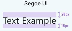
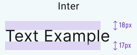
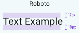
Strong language support reduces the need to replace fonts later when expanding into new markets. This avoids unnecessary design and development work across the product.
Always validate spacing, line height, wrapping and readability using non-English content. Some languages create longer words, denser text, or different vertical spacing requirements.
Many open-source typefaces include broad language support and are easier to scale across products and teams.
Examples:
- Roboto
- Noto Sans
- Inter
Keep Typeface Choices Minimal
Limit the system to a maximum of two typefaces to maintain consistency and reduce visual noise. Too many typefaces make interfaces feel fragmented and harder to maintain at scale.
Tracking & Kerning
Tracking (letter spacing) adjusts the spacing between all letters in a word or block of text. It helps improve readability, especially in small text, dense layouts, or uppercase labels.

Kerning adjusts spacing between specific letter pairs to fix uneven visual gaps and create a more balanced appearance.
Kerning works best in high-control scenarios such as logos, marketing visuals, or large hero headlines where typography is carefully refined and does not need to scale across multiple components or screen sizes.
In product design systems, kerning usually should not be a major focus. Most modern fonts already include well-tuned built-in kerning. Tracking and line height have a much larger impact on readability, scanning and layout consistency across the interface.

Font Size and Line Height
Line height controls the vertical spacing between lines of text. It affects readability, scanning speed and the overall rhythm of the interface.

Here are all the industry standards factors/multipliers:
Step 1: Finding the font sizes
Split the typography system into clear categories based on how text is used across the interface.
- Display → 48px–72px+
- Headlines → 20px–40px
- Body/Content → 13px–18px
- Labels/Captions → 10px–12px (occasionally 14px/16px)
Note!
14px and 16px labels are more common in websites or marketing pages. In dense dashboards or enterprise interfaces, they usually take too much space and reduce information density.
Step 2: How to build the scale
Each category should have a default size that becomes the most commonly used scale within that group. Once the base size is established, the remaining sizes become easier to define using consistent increments.
Use:
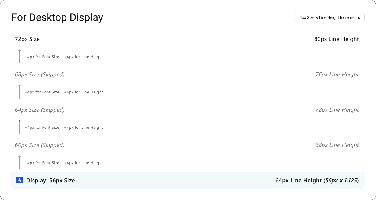
- +4px increments for Display and Headlines
- +2px increments for Body and Labels
This keeps the system predictable, easier to maintain and simpler for developers to implement consistently.
Step 3: Setting up the line Height
A practical way to define line height is by starting with a multiplier.
Typical range: 1.1 → 1.6
Example: 14px × 1.4* = 20px line height
This helps establish a readable starting point for each typography category.
*The multiplier is only used to find the base line height for the category's most common font size.
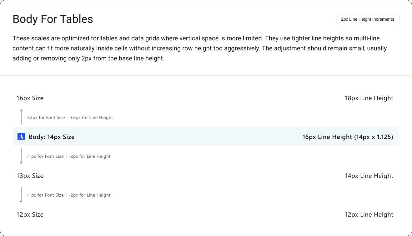
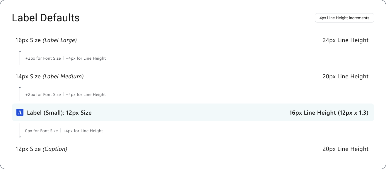
Once the base line height is defined, stop relying on multipliers and build the rest of the scale using fixed increments of 2px or 4px. This creates a cleaner and more predictable typography system.
Note!
Round line heights to values dividable by 2 to maintain alignment consistency across layouts and spacing systems.
Example:
If the result is: 57.5 → 56 (rounded to the nearest number that is a multiple of 2)
If the result is: 63 → 64 (rounded to the nearest number that is a multiple of 2)

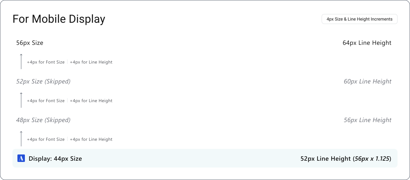
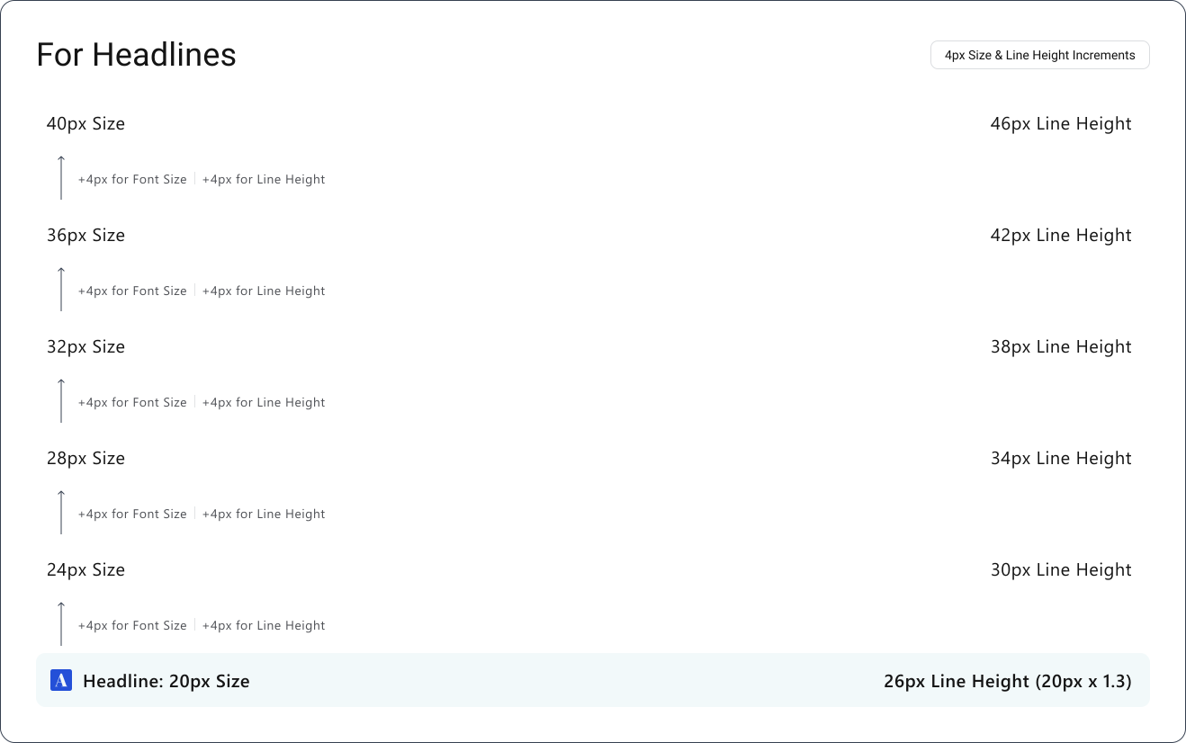
The Body Scales
Body scales are split into three categories because they serve different readability and layout needs across the interface.
- Body Defaults & Body Variants - These are the default fonts styles and their relaxed and compact versions.
- Body For Tables - These font styles are a optimized for data heavy tables and grids.
- Label Defaults - These are the default fonts styles linked with labels and captions.
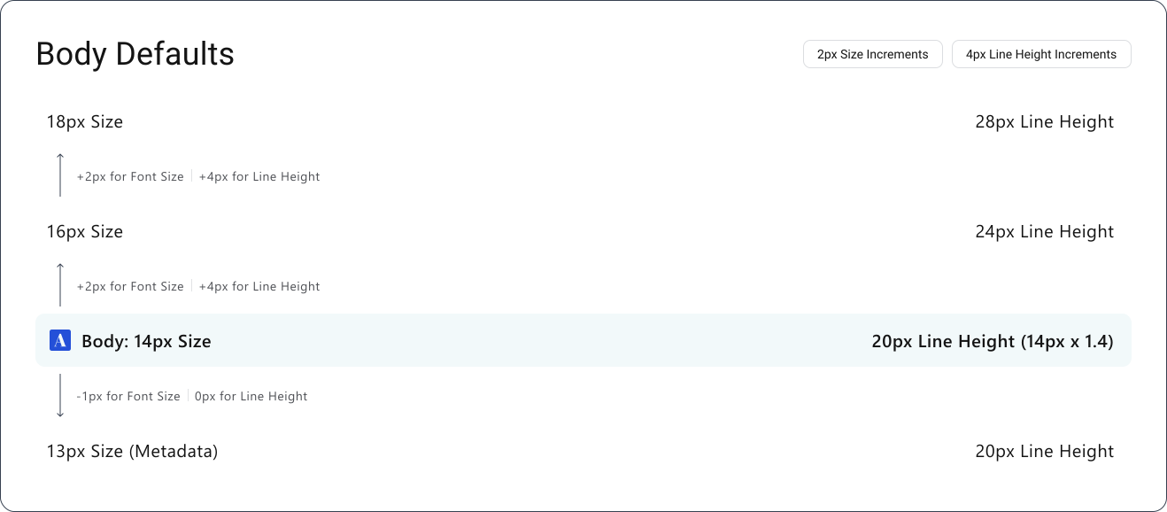
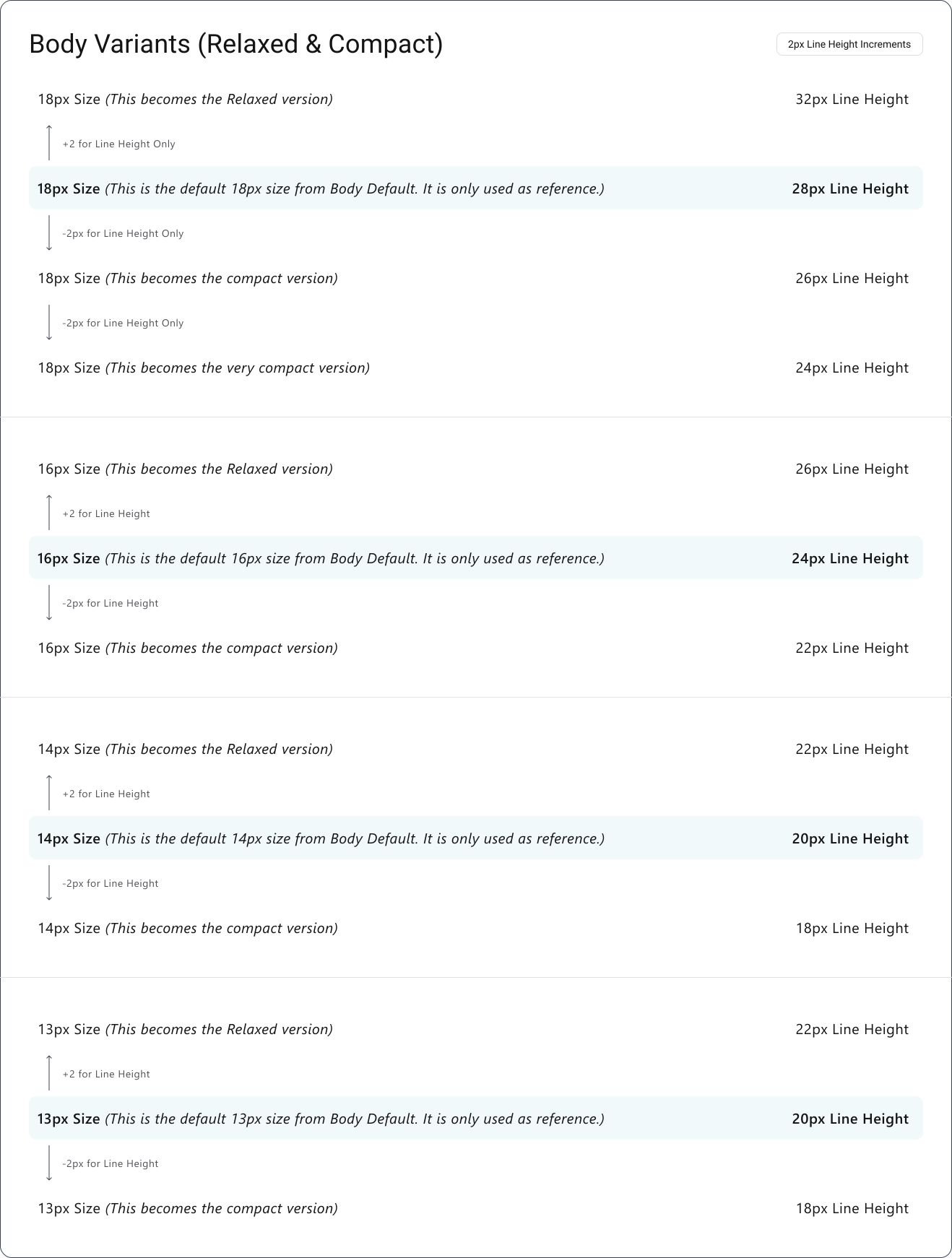
Step 4: Apply the same logic everywhere
Each typography category should follow the same structure:
- Choose the most commonly used font size
- Find a readable line height using a multiplier
- Lock that as the base style for the category
- Scale the remaining styles using fixed increments of +2px or +4px
Apply this process consistently across:
- Display
- Headlines
- Paragraph/Body
- Labels
Why this approach works?
- Keeps spacing consistent across the interface
- Avoids awkward values such as 21px or 27px
- Makes the system easier to scale and maintain
- Works well in dense, data-heavy products where alignment and readability matter more visibly
Important Notes!
Create a separate Figma frame to test typography decisions before applying them to the system.
Set up an 8px grid:
Layout Grid → Rows → Count: Auto → Type: Top → Height: 8px
Use this space to test different fonts, font sizes and line heights inside a consistent structure. Compare results using longer placeholder content such as:
“Lorem ipsum dolor sit amet, consectetur adipiscing elit, sed do eiusmod tempor incididunt ut labore et dolore magna aliqua...”
Longer text makes readability issues, spacing problems and inconsistent rhythm easier to spot across different text styles.
Remember
Do not force every text style to align perfectly to the 8px grid. Visual balance and readability matter more than mathematical precision.
Some font sizes will naturally sit slightly outside the grid. Forcing strict alignment can create awkward spacing and reduce readability. Small deviations are acceptable when the result feels more balanced visually.
Use the grid as a testing and alignment reference, not as a hard constraint.
It is especially useful for:
- validating base line heights for each typography category
- comparing font pairings
- testing how different font sizes behave once line height is applied
The goal is a typography system that feels consistent, readable and easy to maintain across the product.
Simple Rules To Follow
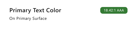
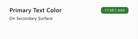
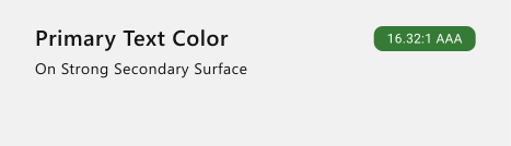
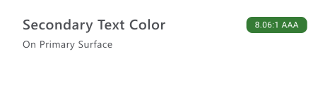
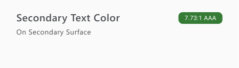
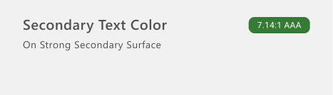
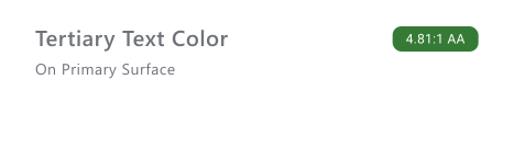
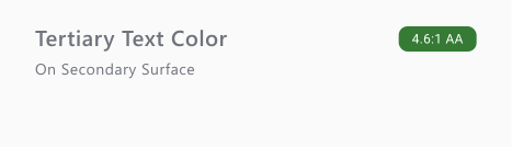
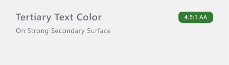
1. All Readable Text Must Meet at Least 4.5:1 Contrast (WCAG 2.1)
Any text that communicates information should maintain a minimum contrast ratio of 4.5:1 against its background. This includes primary, secondary and supporting text. Users should not need extra effort to read lower-priority content.
2. Large Text May Meet 3:1, but Readability Still Matters
Large text can meet a 3:1 contrast ratio under WCAG guidelines, but readability should still be evaluated visually. Passing contrast requirements does not automatically guarantee comfortable reading.
Common mistake!
- Lowering contrast for helper or secondary text.
- Assuming short text does not need proper contrast.
- Using bold text to compensate for low contrast.
- Treating meaningful icons as decorative.
1. Pixels (px)
Pixel-based line heights provide precise control and work well in static layouts or graphic design where responsiveness is less important.
2. Percentages (%)
RecommendedFor web and product design, unitless values (such as 1.5) or percentages (such as 150%) work better because they scale naturally with the font size. This keeps spacing more consistent across screen sizes and responsive layouts.
Alignment helps users scan content faster and understand relationships between elements more easily. Consistent alignment creates cleaner reading patterns and improves layout structure.
Use left, right, center, or justified alignment depending on the context, but avoid excessive justified text because uneven spacing between words can reduce readability.

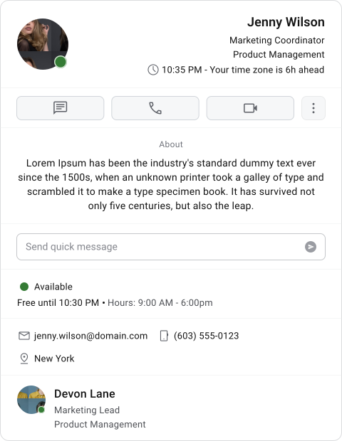

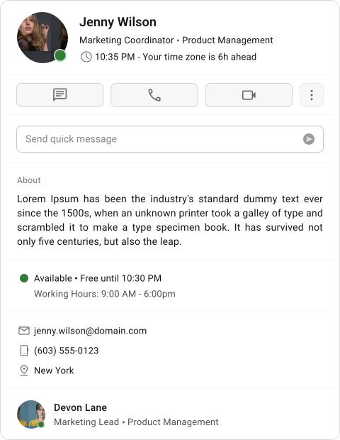
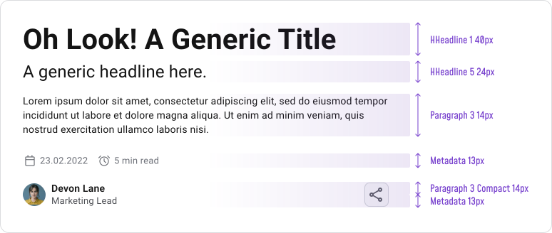
Consistent typography styles help users quickly understand what content is most important and how information is grouped. When font sizes, weights, or styles are inconsistent, scanning becomes slower and the interface feels less organized.
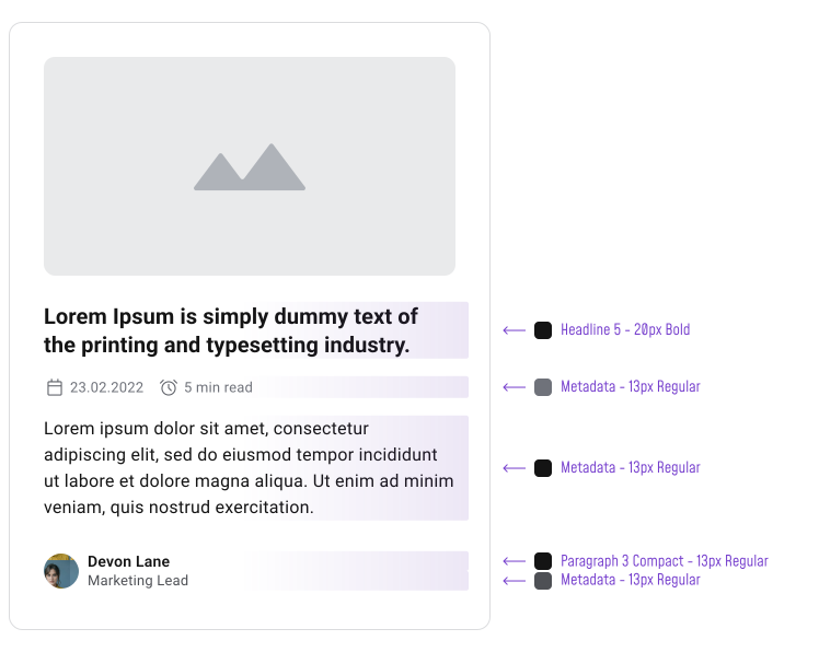
Text should remain easy to read against its background and surrounding elements. Overusing colors or relying on overly harsh contrast can create visual fatigue, especially in reading-heavy interfaces.
Maintain a minimum contrast ratio of 4.5:1 for readable text to support accessibility and improve clarity across different viewing conditions.
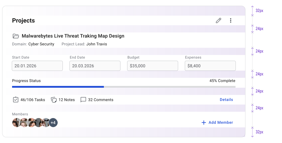
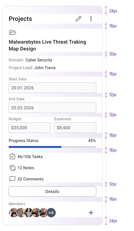
White space improves readability by giving text and UI elements enough room to breathe. Spacing between lines, paragraphs, sections and components helps users scan content faster and makes layouts feel more balanced and easier to navigate.
Make Typography Responsive
Typography should scale smoothly across different screen sizes and resolutions. Using responsive line-height values such as percentages or unitless ratios helps maintain readable spacing and more consistent proportions across devices.
Text Styles & Tokens
If the product uses different typefaces across categories such as Display, Headlines, or Body, create a separate font family token for each group. This makes it easier to update a typeface later without manually editing every text style.
Typography tokens in Figma behave differently from color tokens. They are closely tied to text styles and work together with them rather than independently.
BUT! A common issue appears when switching to a new font family that does not support the same font weights as the previous one. This can break typography mappings and make token management harder, especially when multiple text properties are tokenized.
Soooo ... Because of this, choosing the right typeface early is important. The font should support a wide range of weights and styles so the typography system remains flexible and easier to maintain as the product evolves.
A tutorial explaining how typography tokens work can be found here.
Final Thoughts
Typography decisions affect almost every part of the interface. A consistent system improves readability, creates clearer hierarchy and makes layouts easier to scan across different screen sizes and content types.
Focus on building predictable rules instead of endlessly tweaking individual text styles. Clear scales, consistent spacing, proper contrast and limited typeface usage will solve most readability and maintenance issues before they become problems.
Test typography in realistic layouts, not isolated examples. Long content, dense tables, responsive screens and multilingual text will expose issues much faster than perfect-looking showcase screens.
A good typography system should feel invisible to the user. Content becomes easier to read, information feels organized and the interface stays consistent as the product grows.
🔗 Sources
Language, Fonts and Typography
Source LinkTypography in UX/UI: A Complete Guide
Source LinkDesigning for Readability: A Guide to Web Typography
Source LinkBest Practices for Dashboard Design
Source LinkThe Role Of Typography In Web Design: Tips And Best Practices
Source Link10 Typography Rules for UI Design
Source LinkChoosing a suitable line height
Source LinkUnderstanding typography: Leading or line-height
Source LinkThe ideal line length & line height in web design
Source LinkFont-size, Line-height, Measure & Alignment
Source LinkLine height
Source LinkFonts for Multilingual Typesetting
Source LinkInclusive Fonts For The Connected World
Source LinkFont choices in International scenarios: multilingual vs unicode
Source LinkFonts that support a few specific languages
Source LinkThe Ultimate Guide To Choosing Fonts
Source Link