Tooltips Research
View Figma ComponentOverview
A tooltip shows a short text hint when a user hovers, focuses, or long-presses an element. It gives extra context right when they need it, without taking up permanent space in the UI.
Tooltips are supporting content only. If the information inside one is required to complete a task, it belongs somewhere visible in the interface instead.
In this design system, tooltips are text-only and non-interactive. If buttons, links, images, or multiple actions, are needed the use of Info Bubble (Popover) or Coach Marks (depending on the context) are the better option.
Tooltip
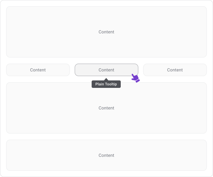
Tooltip
Not a Tooltip
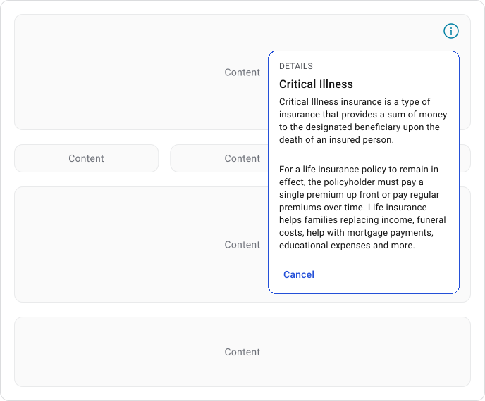
Not a Tooltip
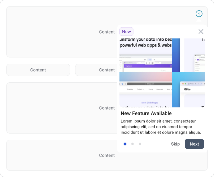
Tooltip Anatomy
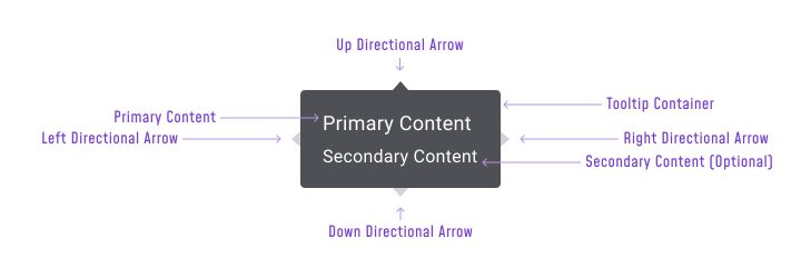
A tooltip has four parts:
- Container (Required) — The box that wraps the content. It should stay visually distinct from the background so the tooltip is easy to read at a glance.
- Primary Content (Required) — The main label or short explanation. This is the core message of the tooltip.
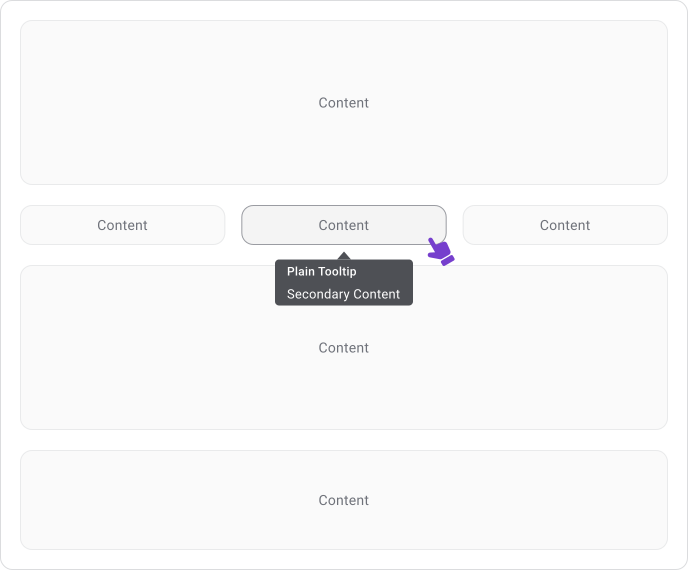
- Secondary Content (Optional) — A second line below the primary text. Useful when a tooltip needs to show an extra detail, like a value or a short description alongside the label.
- Directional Arrow (Optional/Contextual) — Points back to the trigger element. Helps when several interactive elements sit close together and the relationship between the tooltip and its trigger isn’t immediately clear.
Rich Tooltips vs Popovers
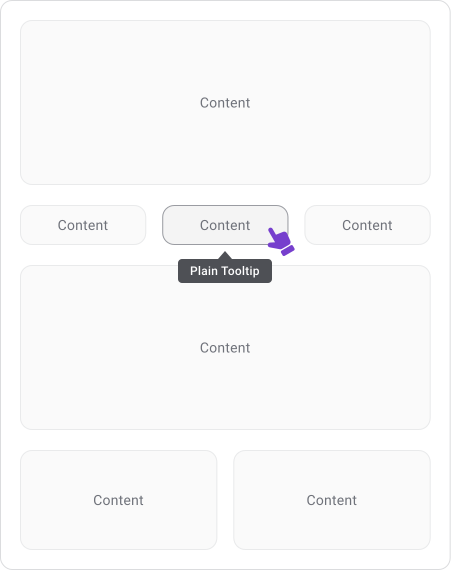
Plain Tooltip
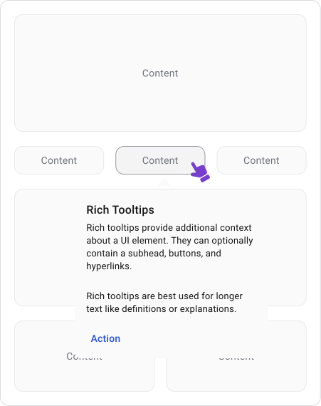
Rich Tooltip
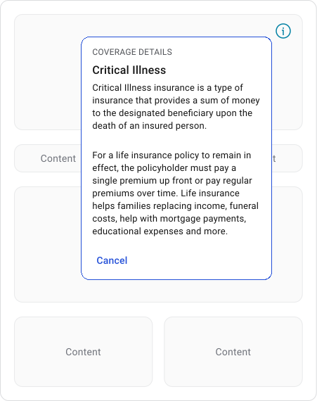
Info Bubble (Popover)
Some design systems have a “Rich Tooltip” variant that supports titles, links and buttons. Material Design 3 is a good example: they define a plain tooltip as a short label for icon-only buttons or fields and a rich tooltip as a longer explanation that can include a subhead, text buttons and hyperlinks.
Same component family, two very different behaviors. (Source)
Important Note
That gap is exactly where confusion starts. The more a tooltip can do, the more it behaves like a popover. Once users are expected to read longer text, click a link, or tap a button, the component has moved well past its original purpose.
This design system skips the distinction entirely. If a user needs to interact with the content, it’s an Info Bubble (Popover). If they don’t, it’s a Tooltip. That one question covers nearly every case.

Keeping tooltips text-only and non-interactive prevents them from gradually turning into miniature dialogs, which is how component libraries get messy over time.
When to Use Tooltips
Tooltips work best when a small bit of extra context is needed but showing it permanently would clutter the UI. They’re especially useful in dense interfaces where screen space is tight.
Good use for:
- Showing labels on icon-only buttons
- Showing the full version of truncated text
- Expanding abbreviations or acronyms
- Explaining technical terms or status labels
- Showing chart and graph values
- Showing keyboard shortcuts
- Settings that need a short explanation
When Not to Use Tooltips
Tooltips are often used to patch unclear design, which usually creates more problems than it solves. If the UI needs a tooltip to be usable, the UI needs fixing instead.
Avoid using tooltips for:
- Showing critical instructions. Critical information should always be visible by default, not hidden behind a hover. If users might miss it, best to put it inline.
- Showing error messages or validation requirements. Errors need to be seen immediately, not discovered on hover. Show them inline, below the field.
- Showing security warnings. Same reasoning as errors. Warnings that matter should never be hidden.
- Showing confirmation messages. If an action needs confirmation, use a dialog or inline message.
- Replacing primary onboarding flows. Tooltips disappear and don’t guide users through a sequence. Use a Coachmark (Teaching Bubble) or dedicated onboarding flow instead.
- Showing anything the user needs to remember while completing a task. If they need to refer back to it, it should stay visible on screen.
UX Principles
Good tooltips answer a question the user is already asking. When uncertainty appears, the tooltip gives a quick clarification without pulling them away from what they’re doing.
A tooltip should feel like a quick confirmation. The moment a user needs a detailed explanation, a comparison, or has to make a decision based on what’s inside it, the tooltip has exceeded its purpose and a different component should be used instead.
Behavior Patterns

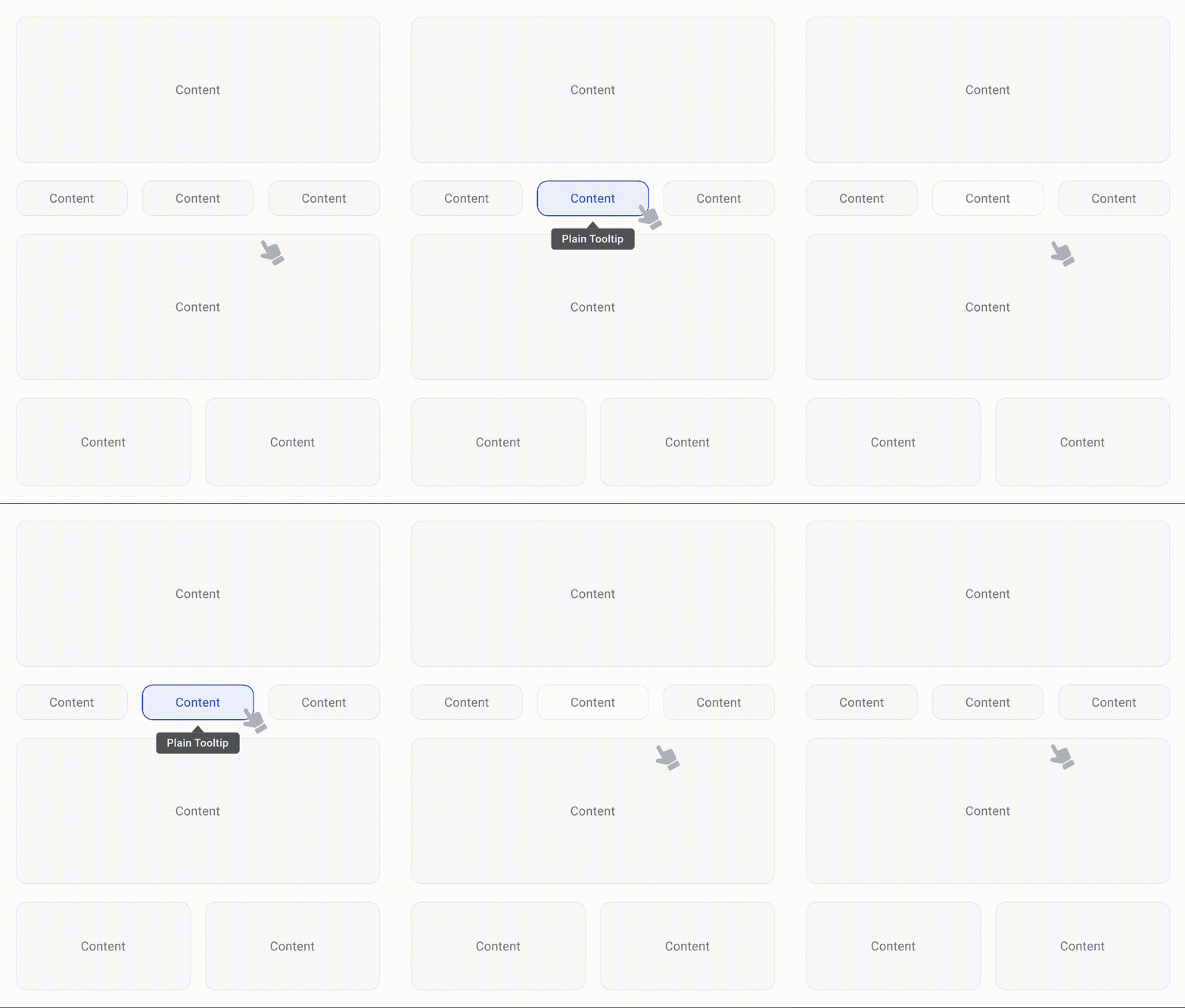

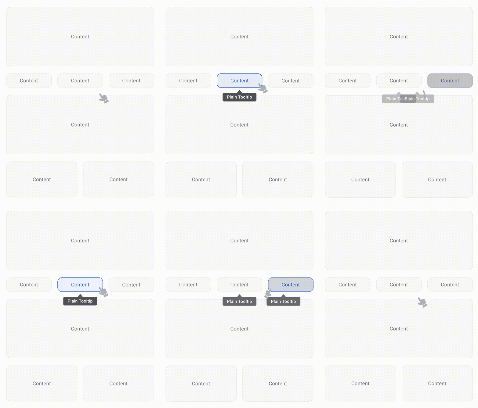
Tooltips appear on hover or keyboard focus on desktop and on long-press on mobile. They stay visible while the user is hovering or has focus on the trigger and disappear automatically when the interaction ends. Users should never have to manually close a tooltip.
Only one tooltip should be visible at a time. Multiple tooltips on screen at once make it harder to tell which element is being described.
Tooltip Placement
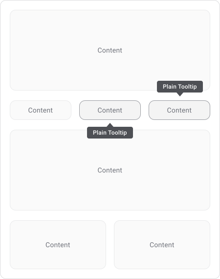
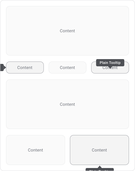
The preferred position is above the trigger. When space is tight, the tooltip can appear below, left, or right, but placement should adapt automatically to avoid clipping or going off screen.
A tooltip should never cover its own trigger, form fields, primary actions, or important content nearby. If a user has to move their cursor just to read what’s underneath, the placement is wrong.
Accessibility
Every tooltip that appears on hover should also appear on keyboard focus. Users navigating with Tab should get the same information as users with a pointer.
Tooltips should:
- Support keyboard focus
- Use aria-describedby to associate the tooltip with its trigger
- Use role="tooltip"
- Meet WCAG contrast requirements
- Be readable by screen readers
Accessibility should never depend on hover alone. Many users can’t hover.
Mobile Considerations
Mobile devices do not support traditional hover interactions.
Because of this, tooltips should appear through long press or another intentional touch interaction. The tooltip must remain readable without covering important content and should be easy to dismiss.
Content becomes even more important on small screens. Long messages quickly consume valuable space and can obscure surrounding controls. Mobile tooltips should be shorter and more focused than their desktop equivalents.
Best Practices
Keep tooltips lightweight. Use them to clarify a specific uncertainty, not explain how something works. The interface should function perfectly without them. If users are regularly relying on tooltips to understand the UI, the design needs revisiting.
Apply them consistently. If some icon buttons show tooltips and others don’t, users won’t know what to expect or where to look. Similar elements should behave the same way across the product.
Common Mistakes
- Most tooltip problems come from asking them to do too much. Critical information gets hidden inside them, text runs too long, or they get added to every element as a safety net for unclear icons and labels. This usually makes the interface harder to use, not easier.
- The other common mistake is letting tooltips creep into popover territory by adding links, actions, or complex content. Once a user needs to interact with what’s inside, it should be an Info Bubble instead.
Final Thoughts
Tooltips are small but have a real impact on clarity. A good one removes hesitation and answers a question before it becomes a friction point. A bad one adds noise, hides important information, or tries to fix problems that the interface itself should solve.
The best tooltips are the ones users barely notice. They show up when needed, give a quick answer and get out of the way.
🔗 Sources
Designing better tooltips for improved UX
Source LinkTooltip Guidelines
Source LinkWhat Is a Tooltip? Types, Best Practices & Design Tips (2026)
Source LinkTooltip UI design: Why most tooltips quietly hurt usability
Source LinkTooltip - uxtweak.com
Source LinkTooltip: A small design element with a big UX impact
Source LinkTooltip Guidelines: Best Practices and Common Mistakes [with Examples]
Source LinkTooltip UI: Components, Guidelines and Real-World Patterns That Work
Source LinkTooltip UI Design: Best Practices & Examples
Source LinkTooltips in UI Design
Source LinkDesigning Better Tooltips For Mobile User Interfaces
Source LinkTooltips UX: 9 Design Rules for a Better User Experience
Source LinkHow ToolTips Enhance Usability of Your Designs
Source LinkTooltip
Source LinkTooltip UI
Source LinkTooltips - m3.material
Source LinkThe magic of tooltips: Enhance your design with smart interaction
Source LinkMobile Tooltip Design
Source LinkTooltips
Source LinkTooltip Carbon Design
Source LinkWhat Are Tooltips and How To Use Them? Full Guide
Source LinkTooltip UI Design: Best Practices, Examples and Application in SaaS
Source Link