Tabs Research
View Figma ComponentKey Takeaways
- Tabs work best when organizing related content that users need to switch between frequently. Their main value comes from reducing cognitive load, improving scanning and maintaining context while navigating.
- Good tab design depends heavily on clarity.
- When tabs become overcrowded, hard to scan, or hide important information, the problem is usually not the component itself but the information architecture behind it.
Overview
Tabs split related content into separate views without moving users to a new page. They keep interfaces clean by showing one section at a time, which reduces scrolling and makes it easier to focus. They work best when users need to switch between sections often. Think dashboards, settings pages, or product detail pages.
One thing to watch for: users pay more attention to the default tab. Secondary tabs get less traffic, so if something is critical, don't hide it behind a tab users might never open.
Anatomy of Tabs
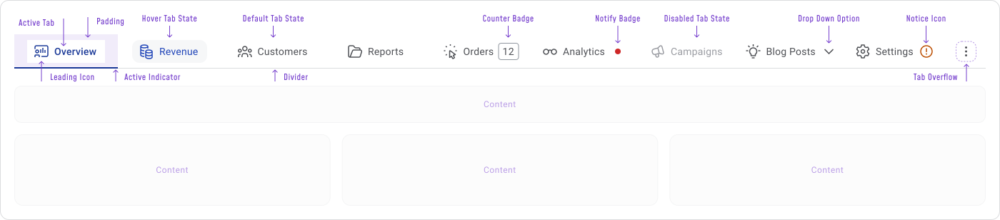
A tab component has three core parts:
- The tab list (the options),
- The content panel (what's shown when a tab is selected),
- The active indicator (the visual cue that shows which tab is open).
Some tabs also include icons, badges, overflow menus, or scroll controls. These are fine when they help the user, but add them with care as they increase visual complexity quickly.
A few practical notes:
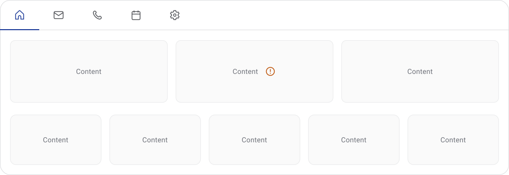
- Icons work better paired with labels, especially in dense or enterprise interfaces where users need to recognise options fast
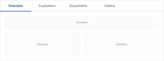
- Keep labels short. Long labels create horizontal pressure and get messy on smaller screens
Tabs Work Best When...
Tabs work well when content splits into clear categories and users need to move between them regularly, without leaving the current context.
They're a good fit when:
- Users need to switch quickly between related sections
- The content belongs to the same workflow or feature
- Sections don't need to be compared side by side
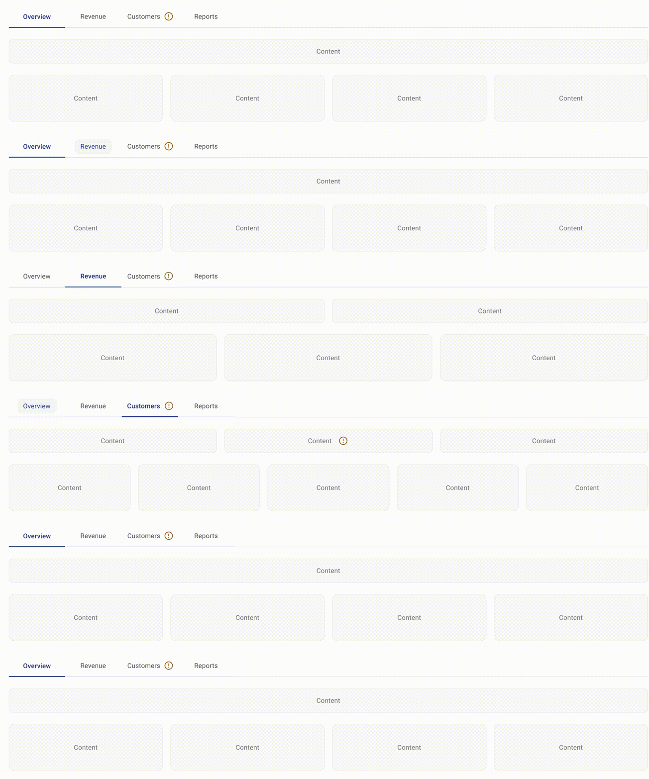
If users need to compare content across sections, tabs force them to switch back and forth and rely on memory. For things like analytics comparisons or large tables, a split layout or expandable sections usually works better.
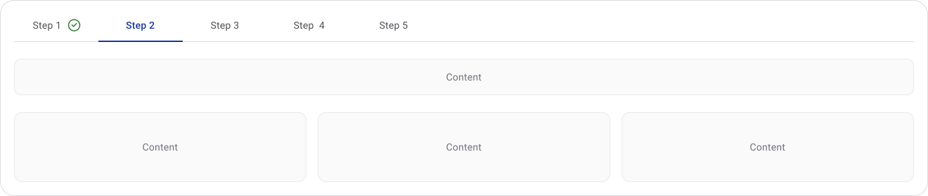
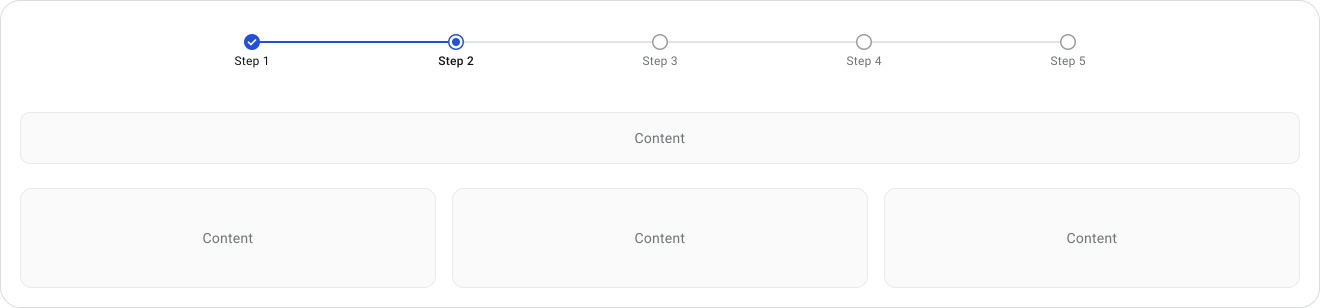
For sequential flows, like a multi-step form or onboarding, use a step indicator instead. Tabs don't communicate order or progress.


UX Principles
Tabs reduce cognitive load by splitting large interfaces into smaller chunks. Instead of scrolling through everything at once, users focus on one section at a time.
Good tabs also preserve context. The surrounding layout stays the same and only the content changes, so users don't feel like they've navigated away. This keeps the experience fast and familiar.
Consistency matters a lot here. Users build expectations quickly with repeated patterns, so every tab in the same component should behave the same way and use the same visual logic. A weak active state creates hesitation.
At any point, users should know:
- Which tab is active
- What other sections are available
- Where the content appears
Behavior Patterns
Tabs fall into two categories: in-page tabs and navigation tabs.
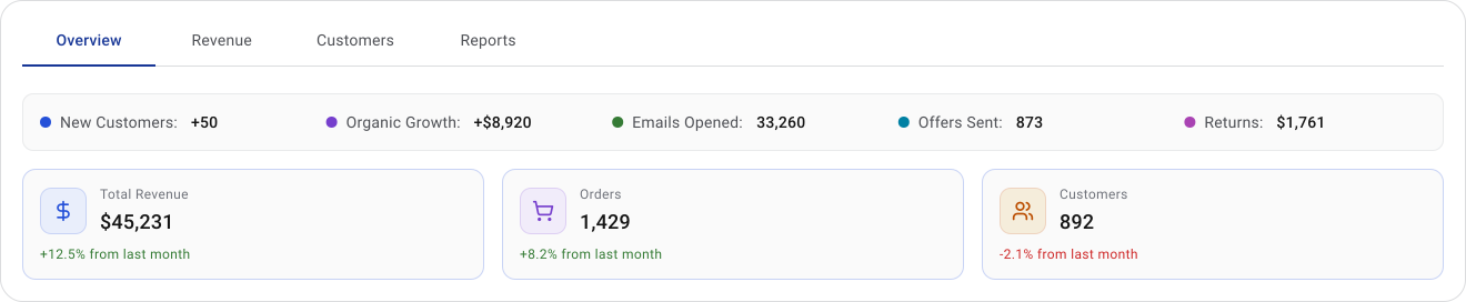
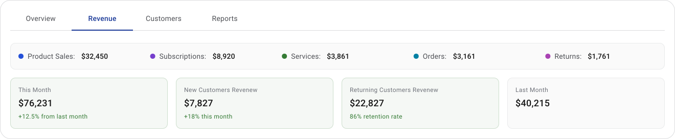
In-page tabs update the content panel without changing the page. The layout stays stable and the interaction feels immediate. This is the most common pattern in dashboards, settings and product detail pages.
Navigation tabs work more like routing. Selecting one loads a different page or product area. Mobile bottom navigation and SaaS platforms often use this pattern.
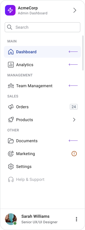
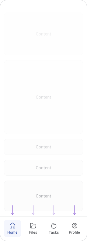
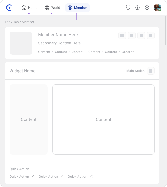
Don't mix the two in the same component. In-page tabs feel lightweight and instant, navigation tabs imply a structural move. Combining them creates inconsistent expectations.
Tab Overflow
Scrolling Tabs
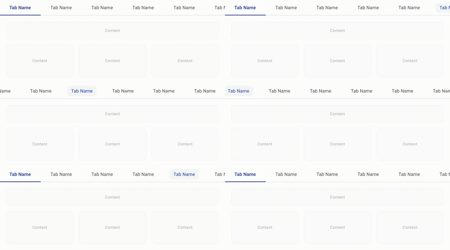
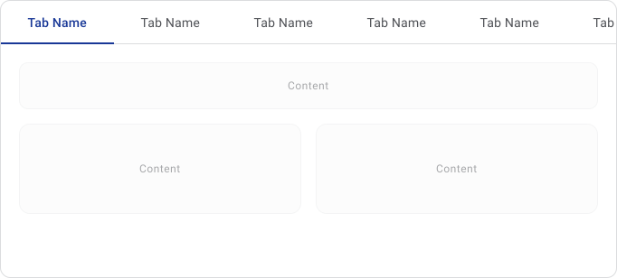
For scrollable tabs, the main risk is discoverability. If users can't tell more tabs exist, they won't look for them. A partially visible tab, gradient fade, or arrow indicator helps signal that there's more to explore.
Types of Tabs

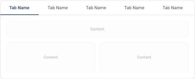
These tabs are the default choice. They're easy to scan and work well when the number of sections is small.
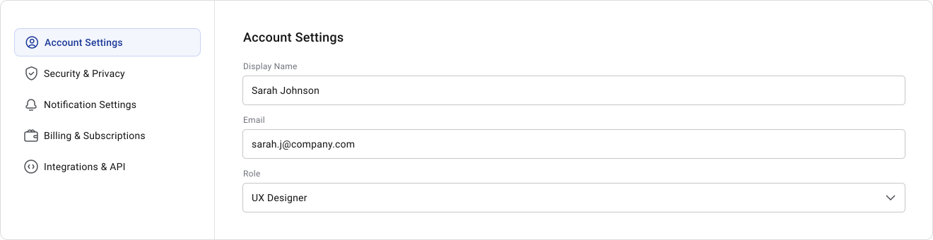
Vertical tabs are used in interfaces with longer labels or many sections. They free up horizontal space for content, which is why they're common in admin panels and documentation layouts.
They are a lighter variation for switching between closely related states, like filters or view toggles. They're not really tabs but serve a similar purpose at a smaller scale.
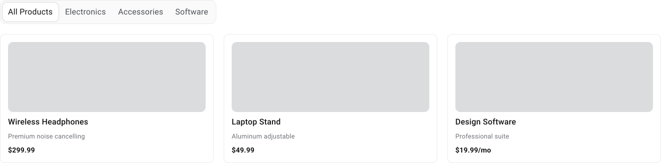
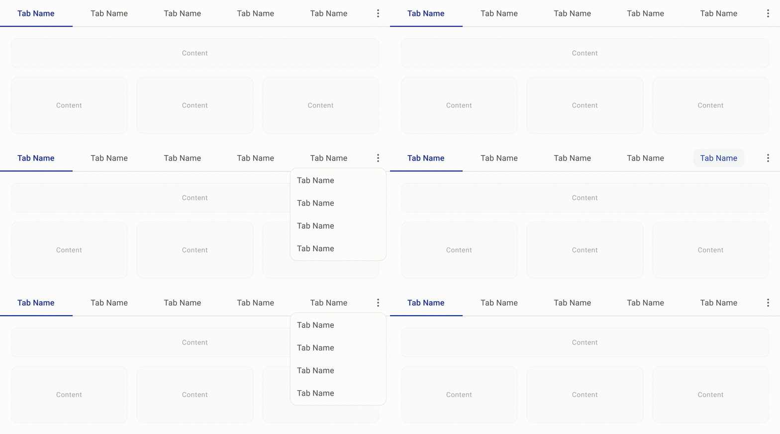
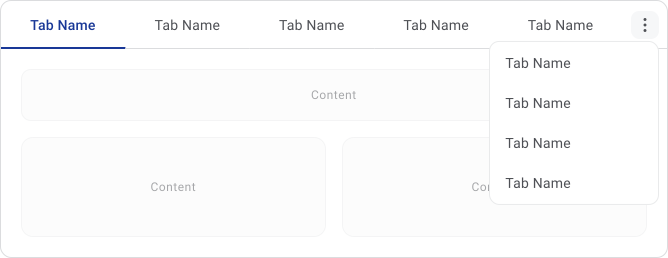
Scrollable tabs handle large tab sets without shrinking labels. Overflow tabs go further by collapsing extra options into a "More" menu when space runs out.
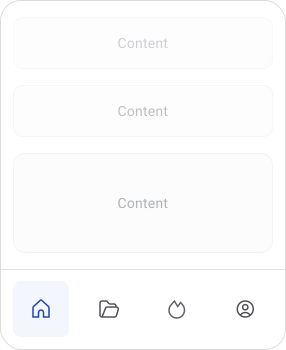
Icon-only tabs save space but rely on users recognising the icons. Pairing icons with labels is almost always the safer choice for usability and accessibility.
Accessibility
Tabs need to work across mouse, keyboard and touch. Active tabs should be clearly distinct from inactive ones through more than just color.
Keyboard navigation should feel predictable with visible focus states. Screen reader users need clear feedback about which tab is selected and which content panel is showing.
On mobile, keep touch targets comfortable. Compressed tabs are hard to tap accurately and frustrating to use. 40px+ Should be fine.
Hover, focus, active and disabled states should each look distinct. If color is the only visual difference, it won't work for everyone.


Mobile Considerations
Horizontal space runs out fast on mobile. Compressing labels to fit more tabs usually makes things harder to read and harder to discover.
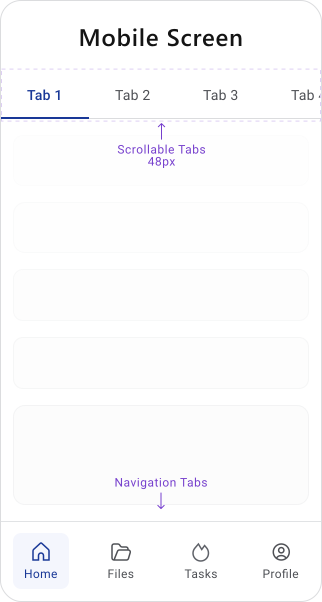
- Scrollable tab bars are often the safest solution. They keep labels readable while supporting more sections, but users need a clear signal that more tabs exist off-screen.
- Touch also changes the interaction. Active states, spacing and touch target size matter more on mobile because users rely on visual feedback and can't hover to explore.
- If the tab bar feels overcrowded, that's usually a sign to rethink the structure rather than squeeze more into the component.
Best Practices
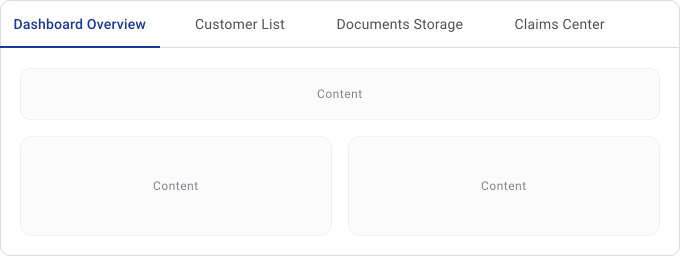
1. Keep labels short and descriptive. Users should know what's behind a tab before clicking it.
2. Put the most used sections first. The earlier tabs get the most attention.
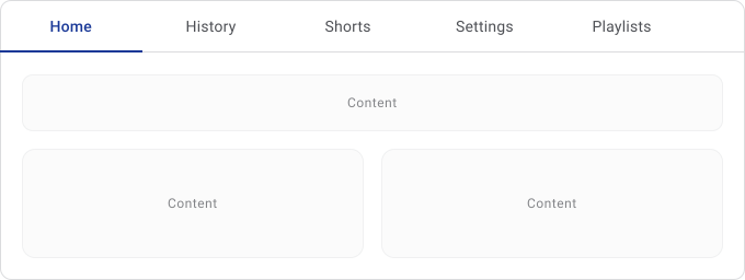
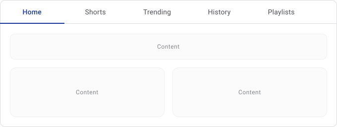
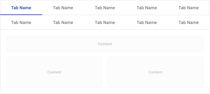
3. Stay in a single row. Multi-row tabs make active states harder to read and mess with spatial memory.
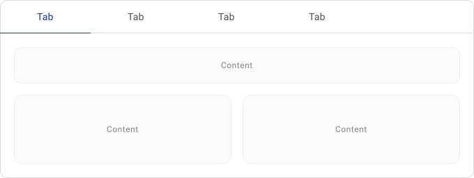
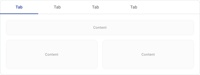
4. Use a strong active indicator. Users shouldn't have to think about which tab is selected.


5. Keep switching fast. Tab interaction should feel immediate, especially for in-page patterns.
6. Only group content that's genuinely related. If sections feel too different from each other, tabs probably aren't the right pattern.
Common Mistakes
Things to watch out for:
- Too many tabs. Discoverability drops as the list grows and the component becomes harder to scan.
- Weak active states. If the selected tab isn't obvious, users lose orientation fast.
- Vague labels like "Info," "Other," or "Details." Users have to guess what's inside instead of knowing at a glance.
- Using tabs for sequential flows. Use steppers instead.
- Hiding critical content in secondary tabs. Non-default tabs get less traffic, so important information shouldn't depend on users finding it.
Final Thoughts
Tabs are one of the most familiar navigation patterns in digital products, which is exactly why small usability issues become noticeable very quickly. When tabs are clear, predictable and easy to scan, users barely think about them.
The biggest challenge with tabs is usually not the component itself, but the information architecture behind it. Overcrowded tab bars, vague labels, hidden critical information and inconsistent behavior are often signs that the content structure needs simplification.
A good tab system keeps navigation lightweight, maintains orientation and reduces unnecessary cognitive effort.
🔗 Sources
Tabs, Used Right
Source LinkTabs UX: Best Practices, Mistakes to Avoid and Real-World Examples
Source LinkTabs UI design guide
Source LinkDesigning Perfect Tabs
Source LinkUX design for tab
Source LinkThe Ultimate Guide to Tabs Navigation Design Best Practices
Source LinkLittle details in UX design: Tabs vs. Accordions
Source LinkLittle details in UX design: Tabs vs. Accordions
Source LinkEssential tips and examples to get tabs right in web design
Source LinkUncover the Full Potential of Perfect Tabs Design!
Source LinkUI/UX Principle #21: When and When Not to Use Tabs
Source LinkTabs for Mobile UX Design
Source LinkUX Drill 10 — “Tabs and Tab bars”
Source LinkThe Ultimate Guide to Tab Design: Anatomy, Types and Tips
Source LinkTabs - Material
Source LinkThe Art of Tab Navigation in Web Design: Balancing Function with Flair
Source Link