Steppers Research
View Figma ComponentKey Takeaways
- Group steps around what users are trying to do, not how the system is built. Keep labels short. Don't wipe data when users go backward. Show errors as they happen. Use vertical layouts when the flow is complex, has sub-steps, or needs to work well on mobile.
- The best Steppers feel invisible. Users just move through the flow.
Overview
A Stepper breaks a big task into visible stages. Users know where they are, what they're doing right now and how much is left. That's the whole job. Without it, even a 4-step flow can feel disorganized or longer than it actually is. The component doesn't need to be complex to work well. It just needs to answer four questions clearly:
- Where am I?
- What is this step about?
- What comes next?
- How much is left?
If the Stepper is pulling more attention than the form or task it's wrapping, something went wrong.
Works well in: onboarding, checkout, verification flows, enterprise setup, KYC, insurance applications, anything form-heavy where users need to see progress to stay confident.

Stepper Anatomy
Core pieces every Stepper needs:
- A step indicator : A number, dot, or icon
- States: Complete, Current/Focused, Next Step, Disabled (if needed)
- Top Label (Optional)
- Main Label
- Secondary Info (Optional)
- Progress Connector (Line between steps)
- Navigation controls (Optional)
The current step needs to look clearly different from everything else. If completed, current and upcoming steps look too similar, users lose track quickly.
Labels should be short. Long labels cause problems in horizontal layouts where space is limited. Sub-labels can help when the step name alone isn't enough, but they should add context, not become a second title competing for attention.
Progress Connector carry meaning too. Solid connectors imply confirmed progress. Greyed out connectors works for upcoming steps. Inactive connectors should stay quiet visually and not compete with the active state.
Structuring the Flow
The biggest Stepper problem usually isn't the component itself, it's how the flow gets divided. A lot of bad implementations split steps based on how the backend is structured, not how users think about the task. That produces labels like "User Metadata", "API Configuration", "Database Settings" which mean nothing to the person filling in the form.
Good grouping follows what the user is trying to accomplish at each stage:
- Good: Account Setup → Personal Details → Payment → Review
- Bad: User Metadata → API Information → Database Settings
If the Stepper is pulling more attention than the form or task it's wrapping, something went wrong.
Too many steps makes the flow feel longer than it is. Too few and you end up with one overwhelming screen. Most flows sit comfortably around 3–6 steps. Users can hold that in their head without losing track
Enterprise systems sometimes go beyond that and that's fine, but once the Stepper gets long, users stop reading the full thing and just focus on where they are right now.
A Stepper is more useful when earlier answers affect what comes later. Shipping method changing payment options and amount. Eligibility answers filtering later questions. Product configuration changing what settings appear.

Linear vs Non-linear
Linear enforces order. Users finish the current step before moving forward. Works best when steps depend on each other, validation matters, or skipping something would break the logic. Checkout, identity verification, insurance applications, enrollment.

Important!
The problem with linear flows is frustration when users can't go back easily. A well optimized lineal steppers let's users go backward, keep everything they've already filled in and explain clearly why something is blocked instead of just stopping them cold.
Non-linear lets users move freely between steps. Works when sections are independent, the flow is exploratory, or users are experienced enough to fill things in any order. Because users can jump around, it becomes more important to show clearly what's done, what's still empty and where there are errors.

Sub-Steps and Nesting
Sub-steps let you organize a dense section without overloading the main Stepper. The main Stepper shows where users are in the overall flow. Sub-steps show where they are inside the current section.
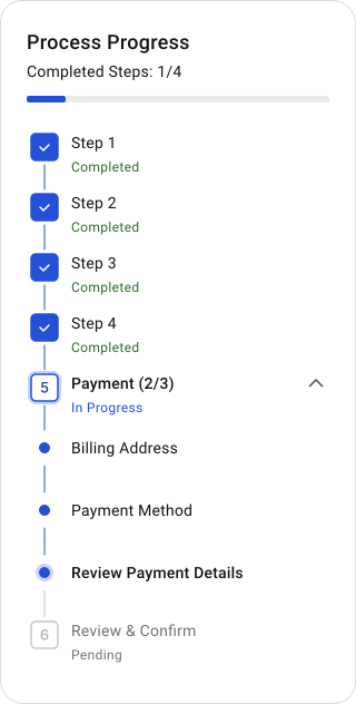
Example inside a Payment step:
- Billing Address
- Payment Method
- Review Payment Details
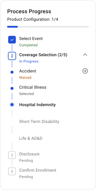
Example inside Enrollment Process. Selecting and configuring coverages:
- Accident
- Critical Illness
- Hospital Indemnity
- Short Term Disability
- Life & AD&D
Works well in enterprise onboarding, KYC, setup wizards and configuration-heavy flows. Vertical layouts handle sub-steps much better because there's more room for nesting, helper text, scrolling and context.
Horizontal layouts tend to fall apart when sub-steps appear. Teams end up adding extra rails, tabs, or separate progress indicators to compensate, which splits the user's sense of where they are across multiple parts of the interface.


Horizontal vs Vertical
Horizontal works when the flow is short, labels stay brief and there's enough space. Good for checkout, booking, reservations, lightweight onboarding. Users can see the full flow at once.
It falls apart once things get more complex. Long labels, sub-steps, uneven step structures and branching logic all cause problems. Spacing becomes inconsistent, readability drops and responsive scaling usually requires a separate implementation for mobile.






Vertical handles complexity better. It handle growth better than horizontal ones. That's one of the main reasons to choose vertical for anything enterprise or configuration-heavy.
Most complex workflows don't stay simple. Requirements keep coming: new products, conditional logic, sub-steps, approval states, branching flows, review sections. Horizontal layouts start breaking under that weight. Labels compress, spacing gets inconsistent and teams end up adding separate navigation systems just to compensate for the space they ran out of.
Vertical layouts expand downward, which means the structure stays intact as things get added. Sub-steps, expandable sections, conditional steps, helper text, progress states, dynamic step insertion. All of that fits without rebuilding the whole navigation pattern.
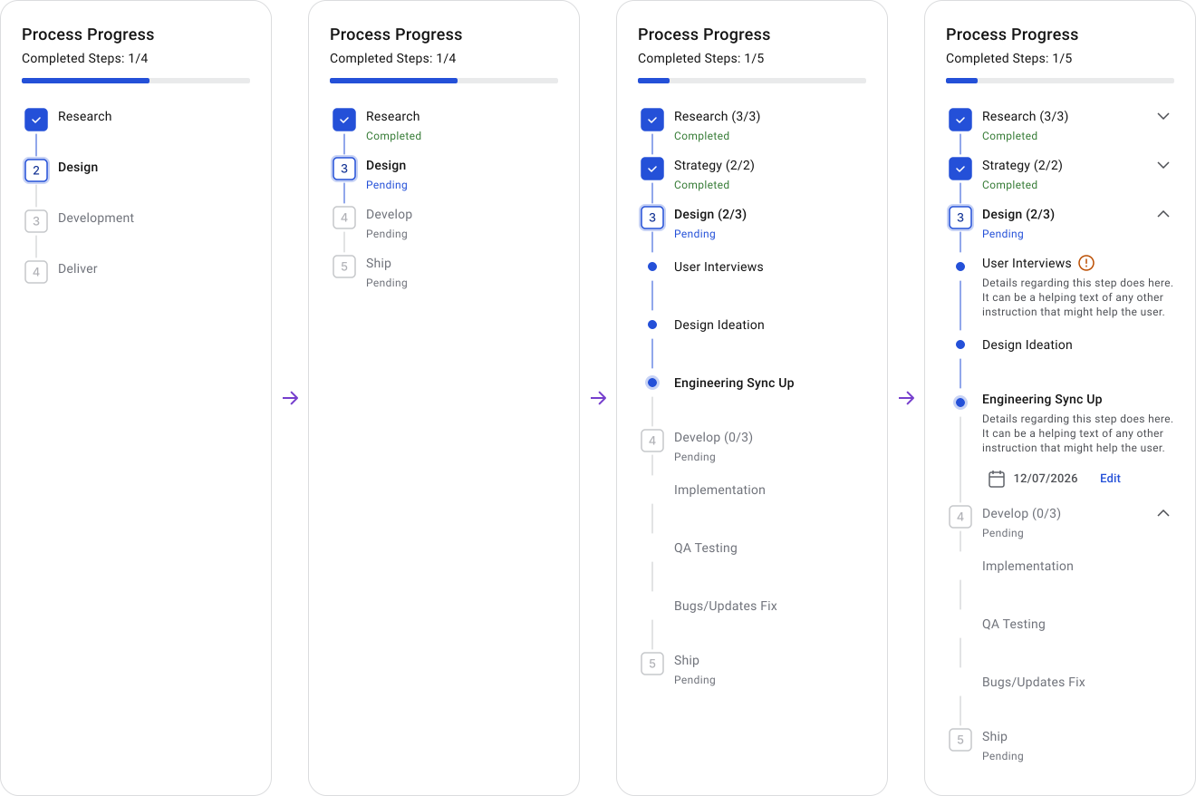
A vertical structure handles those changes by growing with the product instead of fighting against its own layout.
Scalability here isn't just about fitting more steps. It's about keeping the flow readable, scannable and consistent for users even as the product underneath it keeps changing.
Placement
Where the Stepper sits changes how users read the workflow.
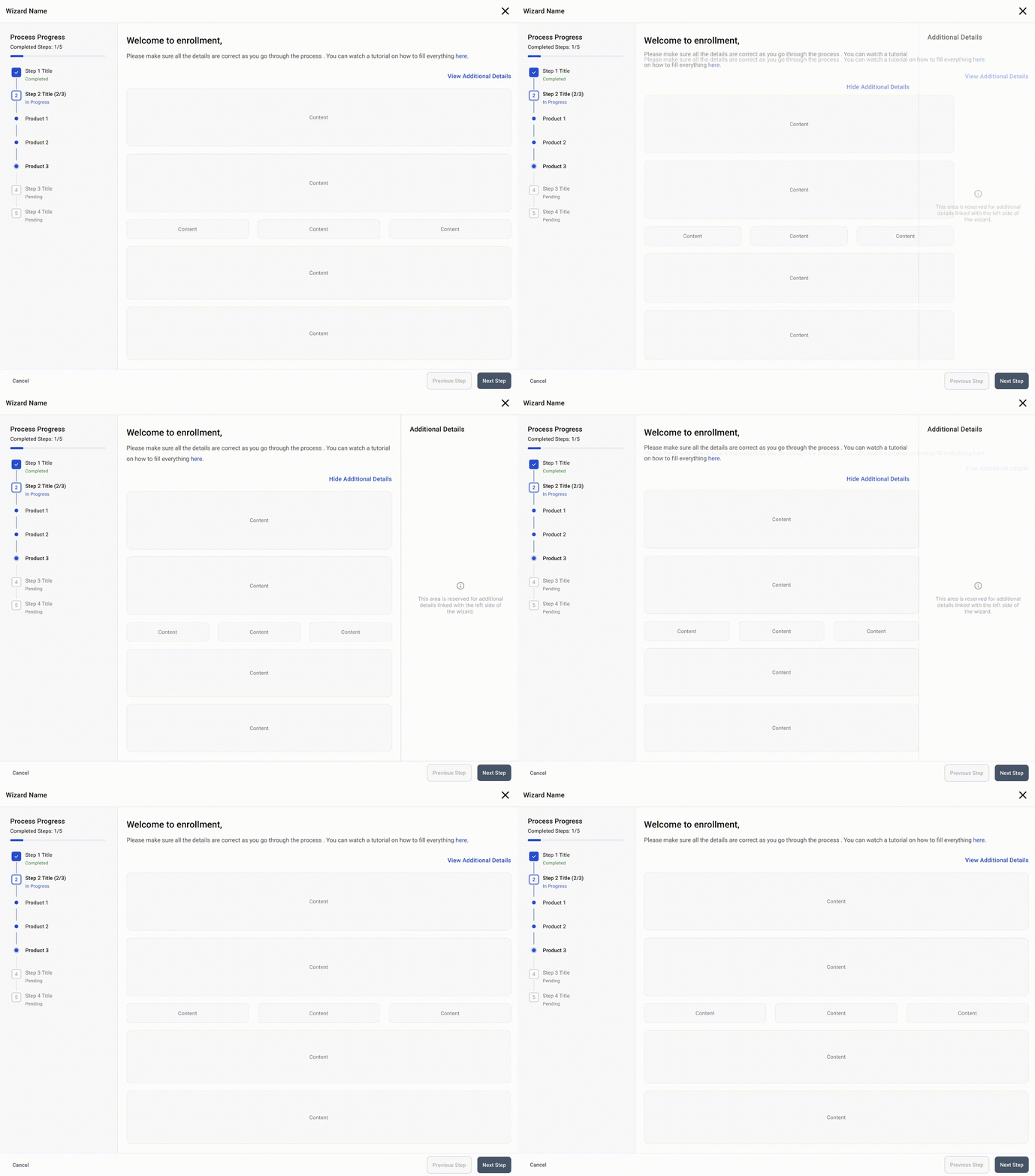
A right-side Stepper works better when the main focus is form completion or heavy data entry. The Stepper acts as passive progress feedback while the left side stays clean for interaction.
When to Use:
- The main focus is on filling input fields or make selections, making the progress indicator a secondary element.
- Additional information or sub-steps are present and could clutter the layout if placed elsewhere.
- The workflow involves frequent interaction, requiring the most space and attention to be given to the form fields or primary input areas (left side)
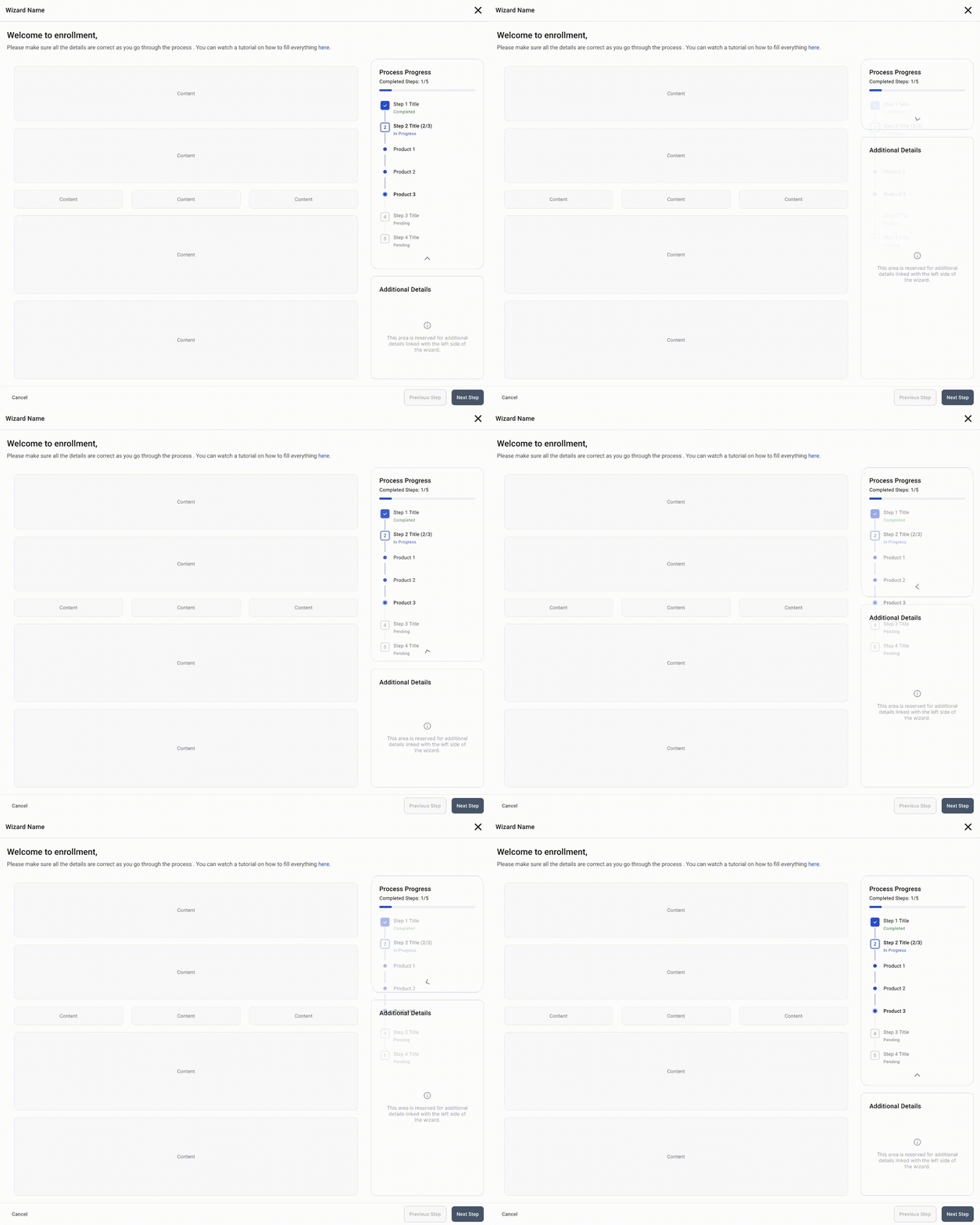
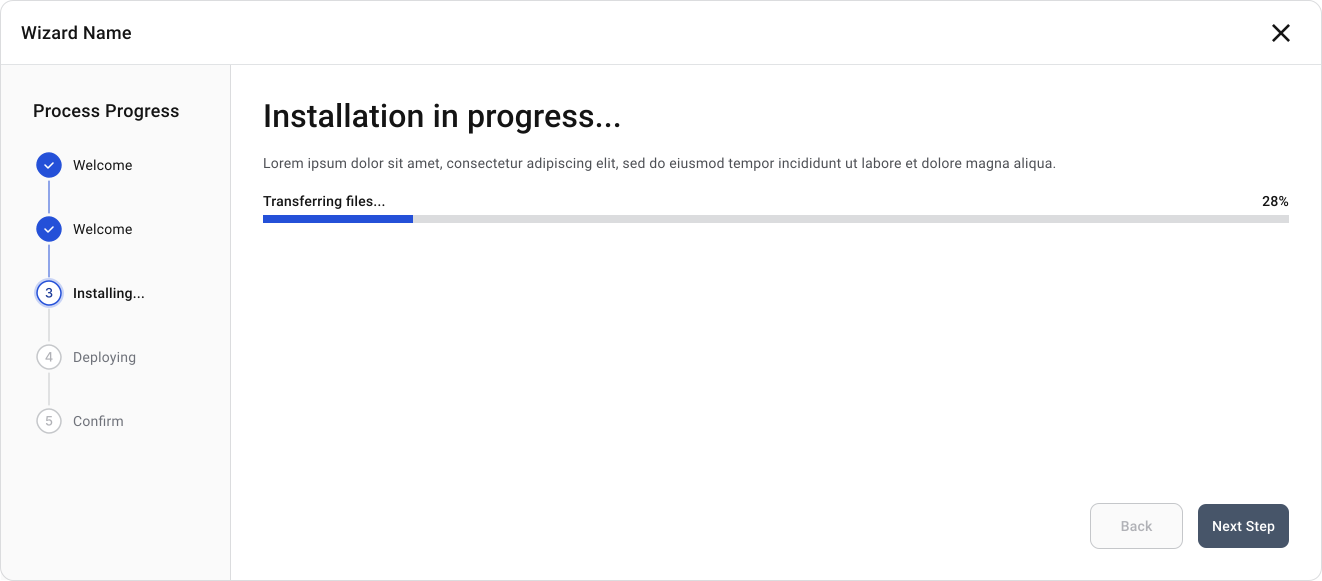
A left-side Stepper works well when moving through the flow is the main focus. It becomes the orientation anchor for the whole experience. Good for wizard-style flows, enrollment and guided setup.
When to Use:
- The main focus is to show users their progress and what's next.
- The process is automated or straightforward and users only need to follow along without much interaction.
- The process involves only a few steps with straightforward input options.
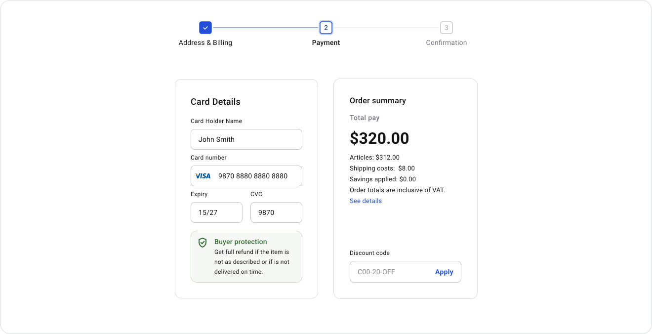
The horizontal stepper works best for simple processes with 3-6 steps, such as payment flows, booking reservations, airline tickets purchase, or very basic configuration wizards. It provides a clear and straightforward flow that fits well with modern design aesthetics.
However, it's not suitable for complex workflows as it doesn't handle sub-steps effectively, isn't scalable and becomes less user-friendly on mobile devices when there are more than 5 steps. In such cases, alternative solutions or additional development are needed.
When to Use:
- For simple, linear processes with a small number of steps (up to 3-6).
- When the focus is on maintaining a clear, minimalistic design without sub-steps.
Mobile Considerations
Mobile isn't a smaller version of the desktop layout. The interaction model changes once horizontal space disappears and everything is touch-based. Trying to preserve the desktop Stepper on mobile usually produces compressed labels, tiny tap targets and a component competing with the form it's supposed to support.
Horizontal Steppers break on mobile. Labels compress, tap targets get too small and the layout needs a separate implementation to work at all. Users on mobile don't need to see every step at once.
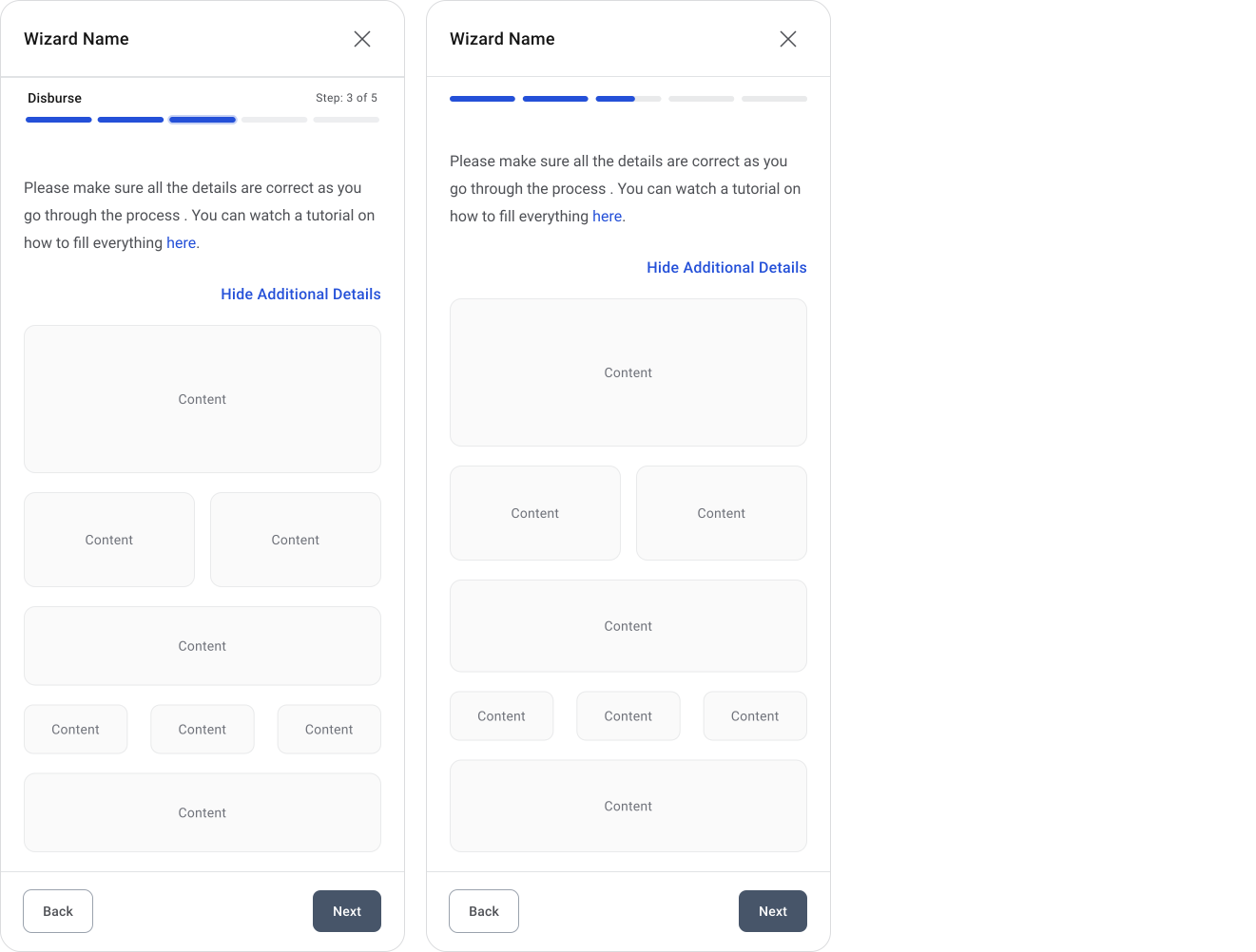
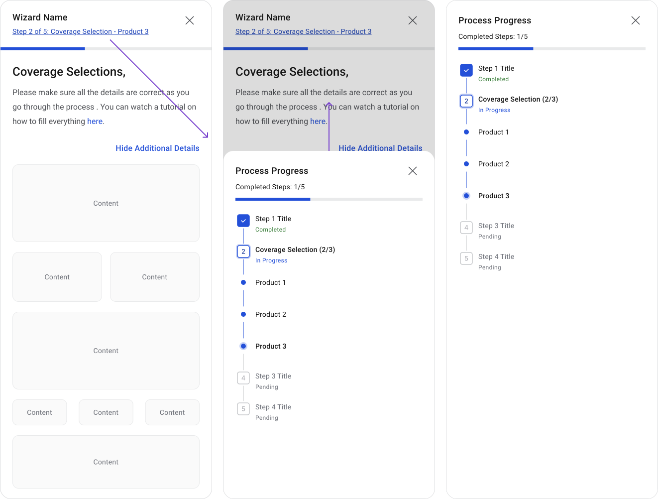
The best default is compact progress visibility with the option to expand the full workflow when needed by clicking on the stepper indicator. Show the current step, show overall progress and let users open the full list if they want it.
Vertical Steppers still need to adapt on mobile. Keeping the full vertical layout visible the same way it appears on desktop takes up too much space on a small screen.
The good part is that the full vertical Stepper can work as an overlay. The compact version stays visible by default and users tap it to open the full view showing all steps, progress and what's ahead. They get the detail when they want it without it taking over the screen the rest of the time.
Some mobile stepper indicator examples:
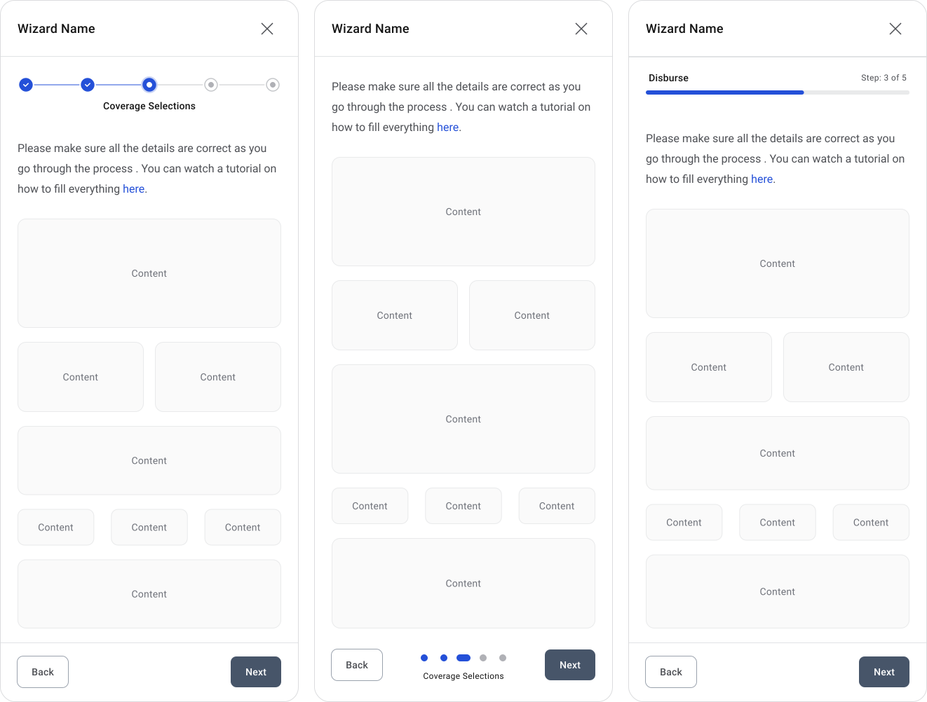
For longer or more complex flows, a fullscreen step view is usually the safest option. Users tap the progress area and get a full view of all steps, sub-steps, completion states and errors. It keeps the main form clean, avoids cramming labels into a tiny rail and works well for workflows with more than 5 steps or conditional sections.
Accessibility
Color alone shouldn't be the only thing separating step states. Use labels, icons, or shape differences alongside color.
Keyboard users need to move between steps, activate them and recover from errors without getting stuck. Screen readers should announce step name, position, status and whether it's complete.
Keep labels and instructions short and plain. Long or technical descriptions are harder for everyone, especially in flows that take sustained focus.
Common Mistakes
- Vague or system-language labels users don't recognize
- Too many steps with no way to handle the overflow
- Splitting progress across multiple parts of the interface
- Wiping entered data when users navigate backward
- Icon-only steps with no accessible label
- Hiding completed steps users might need to edit
- Steppers nested inside other Steppers
- Overloading horizontal layouts with long labels, sub-steps and extra metadata until the layout breaks
🔗 Sources
Components–Steppers
Source LinkStepper Component
Source Link32 Stepper UI Examples & UX Tips for Smoother Multi-Step Processes
Source LinkBeyond the Progress Bar: The Art of Stepper UI Design
Source LinkProgress Indicator UI
Source LinkBeyond the Progress Bar: The Art of Stepper UI Design
Source LinkUI components inspiration
Source LinkSteps UI design tutorial. Build better flows through visual guidance
Source LinkStepper ui
Source LinkStepper
Source LinkStepper - Design System Michelin
Source LinkLevel up — Design Better Steppers
Source LinkStepper
Source LinkStepper UX
Source Link8 Proven UX Practices for Designing Accessible Steppers
Source LinkStepper UI Guideline
Source LinkSteppers: which one to pick?
Source Link