Statuses & Badges Research
View Figma ComponentKey Takeaways
- Status indicators exist to remove uncertainty
- Different status types solve different problems
- Color alone is never enough
- Too many indicators reduce clarity instead of improving it
Differentiating Statuses, Badges and Chips/Tabs
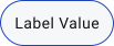
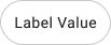
Statuses, badges and chips/tags share the same compact, rounded visual style, which makes them easy to confuse. The difference is functional. Ask yourself: what does it communicate and can the user interact with it?
Display data only. Users read them, nothing happens when clicked.
Statuses
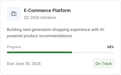
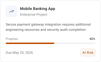
Communicate state or condition. They’re informational, telling the user what something currently is. Not clickable.












Badges
Highlight small pieces of metadata or counts. They sit next to something else and draw attention to it, but don’t invite interaction.


Work as lightweight interactive controls. Users can select, filter, input values, or trigger actions with them. They behave like compact buttons.
Chips/Tags
Dismissible
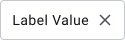
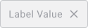
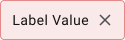
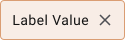
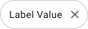
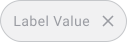
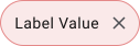
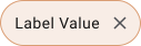
Chips/Tags
Filter/Selectable


Anatomy and Structure
Status indicators communicate the current condition of a system, object, process, or action. They help users quickly understand what is happening without needing to investigate further. In complex interfaces, especially dashboards, enterprise tools, forms, notifications, or workflows, status indicators reduce uncertainty and help users decide what to do next.

Types of Status Indicators
Icon indicators combine multiple communication methods into a single element. They usually include an icon, color, shape and text label. Because they combine several visual cues together, they are the clearest and most noticeable type of status indicator.
They work best when users must immediately understand meaning without ambiguity.
Common states include Default > Hover > Selected & Disabled. Each state should be visually distinct, not subtle to the point of ambiguity.












The combination of symbol and label improves scannability and accessibility, especially in enterprise products where users process large amounts of information quickly.
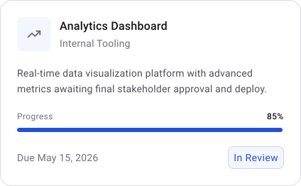
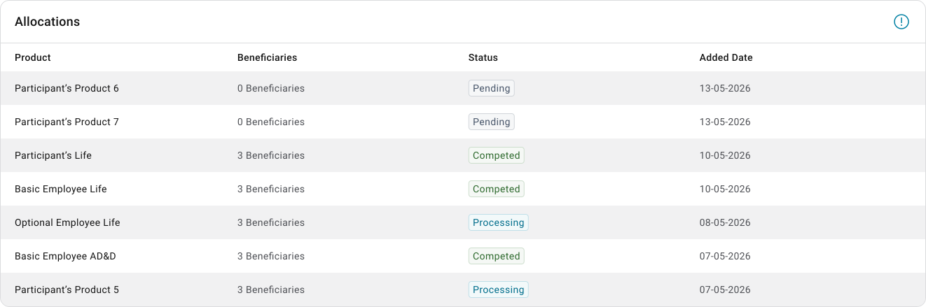


Badges indicate that something new, unread, or updated exists. They are not meant to explain detailed status information. Their purpose is mainly to attract attention and signal that users should check something.
Badges are intentionally compact and are usually attached to another component such as an icon, avatar, or navigation item.
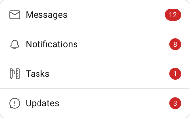
Badge With Number
A numbered badge communicates quantity. It is useful when the exact number matters because it helps users prioritize urgency or workload.
Badge With Dots
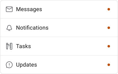
Status dots are minimal circular indicators usually used for binary states such as online/offline, active/inactive, or available/unavailable. They are static and non-interactive. Their strength comes from simplicity and small footprint.
Status dots work best when users already understand the context around them.

Practical examples:
- Green dot beside a user avatar for “Online”
- Gray dot for inactive users
- Red dot for disconnected devices
- Blue dot for recently active users
When to Use Status Indicators
Status indicators are useful whenever users need confirmation, reassurance, awareness, or prioritization. They reduce cognitive effort by making important information immediately visible.
Use them when:
- A process succeeds or fails
- Users must monitor changes
- Something requires attention
- A process is loading or processing
- New information exists
- A workflow has multiple stages
- Priority or severity matters
Avoid status indicators when:
- No user action is required
- The information is not meaningful
- Plain text communicates enough
- Too many statuses already exist on screen
- The meaning is unclear without explanation
A common mistake is adding colorful indicators simply because they “look informative.” If the indicator does not help decision-making, it usually should not exist.
Severity and Attention Levels
Not all statuses deserve the same visual weight. Strong visual attention should be reserved for situations that actually matter. Research repeatedly shows that overusing aggressive colors like red reduces their effectiveness over time.
Use when immediate action or awareness is required.
Common status associations include:
■ Red → Error, Danger, Critical


Use when users should notice something, but urgency is lower.
Common status associations include:
■ Orange → Serious Warning, Caution
■ Aqua → Ongoing, In Process, Monitoring, Loading
■ Purple → Undefined or experimental




Use when information is useful but not urgent.
Common status associations include:
■ Green → Success, stable
■ Blue → Informational or active
■ Gray → Disabled, inactive, draft



Labels and Microcopy
Clear labels often matter more than visuals. Short, direct language improves confidence and reduces interpretation effort.
Good status microcopy should:
- Explain the current state
- Be short and specific
- Avoid technical jargon
- Focus on clarity over cleverness
Good examples:
- Upload failed
- Last saved 2min ago
- Processing payment
- Draft available
- Changes published
Poor examples:
- Error
- Unknown issue
- Action incomplete
- Processing request object
- Invalid state detected
Accessibility
Accessibility is not optional for status communication because status indicators often carry important information. Users must be able to understand them regardless of visual ability, device conditions, or environment.
Relying only on color is one of the most common mistakes. A good status system combines multiple signals together such as:
- Color
- Shape
- Icon
- Text label
Contrast is also critical. Status indicators must remain distinguishable against their background, including in grayscale or low-visibility conditions.
Practical accessibility rules:
- Always pair color with another visual cue
- Use labels for important statuses
- Maintain minimum 3:1 contrast
- Avoid tiny unreadable indicators
- Keep icons recognizable at small sizes
🔗 Sources
Status indicators - Carbon Design System
Source LinkStatus Dot UI
Source LinkStatus indicator - Sky UX
Source LinkCase study: Designing for status changes
Source LinkVisibility of System Status (Usability Heuristic #1)
Source LinkVisibility of System Status
Source Link4 Ways To Communicate the Visibility of System Status in UI
Source LinkStatus System
Source LinkBadges vs. Pills vs. Chips vs. Tags
Source LinkBadges vs chips/tags — a friendly guide
Source LinkUX Drill 01 — Tags, Badges and Chips
Source Link