Spacing Research
View Figma ComponentKey Takeaways
- Spacing defines structure, hierarchy and relationships in the interface. It helps users scan content faster and understand how elements connect without relying on extra borders or visual noise.
- Use a consistent spacing system instead of adding values based on visual guesswork. Defining spacing through tokens or variables makes the system easier to scale, maintain and align with development.
- Layout tools like Auto Layout with gap help apply spacing consistently and reduce manual adjustments. Good spacing improves readability, lowers cognitive load and makes layouts feel easier to navigate.
What Is Spacing In Design
Spacing is the space between elements in a UI. It helps users understand what belongs together, what is separate and where to focus attention.
Elements placed close together feel connected, while larger gaps create separation.
Good spacing also improves readability, reduces clutter and makes interfaces easier to scan.
How to Start a Spacing System
A spacing system defines how space is applied across the interface. Most systems start with a base unit like 4px or 8px, then build a small reusable scale from it. Instead of using random values, reuse consistent spacing steps across layouts and components.
This makes interfaces easier to maintain and creates a more predictable structure.
Spacing should communicate relationships consistently across the interface. Smaller spacing works well for tightly related elements like labels and inputs. Medium spacing is commonly used inside components, while larger spacing separates sections and content groups.
Consistent patterns make layouts easier to scan and easier to build over time.
Padding is the space inside a component, between the content and the edges. It affects readability, touch comfort and how visually balanced a component feels.
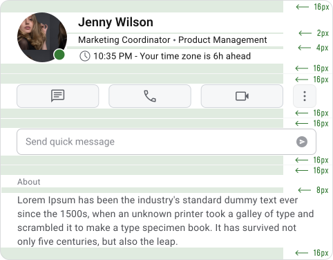

Spacing is the space outside components. It controls how elements relate to each other and helps organize the layout into clear groups and sections.



Dimension refers to the size of elements, such as width and height. It affects hierarchy, readability, touch targets and overall layout balance.
Important Note
Padding, spacing and dimension work together, but each solves a different layout problem.
- If something feels cramped, the issue is usually padding.
- If the layout feels messy or disconnected, the issue is usually spacing.
- If an element feels too large or too small, the issue is usually dimension.
Building the Spacing System
A spacing system usually starts with a base unit like 4px or 8px, then builds a reusable scale such as 4, 8, 16, 24 and 32. In this system, the base unit is 4px because it provides more flexibility while still keeping layouts predictable.
Each spacing value should have a clear purpose. Spacing decisions should come from structure and relationships, not from adjusting values until something “looks right.”
The T-shirt size system replaces raw spacing values with labels like XS, S, M, L and XL. Instead of saying “use 16px,” the system uses names like “spacing-M.” This makes spacing easier to reuse and discuss without focusing on exact numbers. It also helps the system scale more cleanly as layouts and components grow.
Here are all the industry standards Spacing Values:
Spacing should be defined through variables or tokens instead of hardcoded values. This makes the system easier to maintain because updates can scale across the entire product.
If a spacing value changes, every layout using that token updates automatically. Tokens also improve alignment between design and development. Designers and engineers can use the same naming structure and spacing values, which reduces inconsistencies during implementation.
Layout Control
Modern spacing systems rely on layout tools like Auto Layout in Figma or Flexbox and Grid in code. Instead of manually adding margins between elements, spacing should be controlled through gap values at the layout level.
This creates more predictable and maintainable layouts. When spacing is handled by the layout instead of individual components, components stay cleaner and easier to reuse. It also matches how developers structure interfaces, which reduces implementation inconsistencies.
Spacing rules remove guesswork. Without them, spacing decisions usually depend on what feels visually correct in the moment, which quickly creates inconsistencies across the product. With clear rules, spacing becomes more predictable because each value has a purpose.
They also create a shared language between designers and developers. Instead of vague feedback like “add more space,” teams can reference defined values such as spacing-M or spacing-L. This speeds up collaboration and reduces unnecessary revisions.
Spacing rules also help products scale. As new screens and features are added, consistent spacing keeps the experience visually connected and easier for users to navigate.
Auto Layout should be used whenever layouts need to adapt, align, or respond to changing content. In most modern UI work, it should be the default approach instead of manually positioning elements.
Use it for:
- Components like buttons, inputs and cards
- Repeating structures such as lists, menus and tables
- Sections that require consistent spacing
- Interfaces with dynamic content or changing text lengths
Since it mirrors how developers use Flexbox and Grid, handoff becomes much smoother.


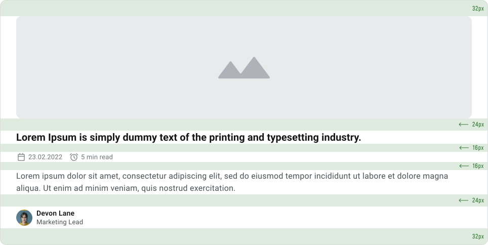
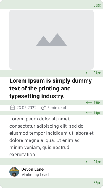
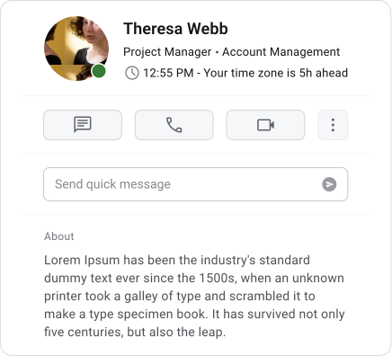
Spacing rules define which values should be used and what they mean in the interface. Auto Layout controls how those values are applied across layouts and components. Spacing rules create consistency in decision making. Auto Layout creates consistency in execution.
Even with Auto Layout, spacing rules still matter. Without shared spacing values and structure, layouts can still become inconsistent even if everything technically aligns.
Adaptive Layout
Spacing needs to adapt across screen sizes while keeping the same visual hierarchy and structure. Smaller screens usually require tighter spacing to fit content comfortably, while larger screens benefit from more space to improve readability and scanning.
A spacing system keeps layouts consistent across devices and reduces manual adjustments during design and development.
Density & User Needs
Spacing should support the way users interact with the product. Data-heavy interfaces often need tighter spacing to display more information efficiently, while marketing pages and content-focused layouts usually benefit from more generous spacing and breathing room.
The system should support different density levels without changing the underlying spacing logic. Users should still recognize the same structure and hierarchy regardless of how compact or spacious the interface feels.
Accessibility & Spacing
Spacing plays an important role in accessibility and usability. Interactive elements need enough space for comfortable interaction, especially on touch devices where targets are commonly expected to be around 44×44px.
Layouts also need to remain flexible when users increase text spacing or zoom levels. Focus states should have enough surrounding space to remain visible and easy to identify during keyboard navigation.
Important Note
Spacing systems usually break down when decisions rely on visual instinct instead of shared rules. Common problems include random spacing values, inconsistent use of margin and gap, ignoring implementation constraints and assigning spacing without a clear purpose.
Another common issue is treating spacing as visual decoration instead of layout structure. When spacing lacks consistency and intent, interfaces become harder to scan, harder to maintain and less predictable for users.
UX Laws
There are several UX principles that strongly influence how spacing should be used in an interface. Good spacing improves grouping, readability, interaction and how easily users process information.
Proximity is one of the most important principles behind spacing.
Elements placed close together are naturally perceived as related, while larger gaps create separation between groups. If spacing is inconsistent, users can misunderstand how content is connected even if the interface looks visually polished.
The more choices users see at once, the longer it takes to process and decide. Spacing helps reduce that feeling of complexity by organizing related actions into smaller groups.
Clear separation between sections makes interfaces easier to scan and prevents dense layouts from feeling overwhelming.
Users can only process a limited amount of information at one time. Spacing helps by breaking content into smaller, easier-to-understand groups.
Forms, lists, dashboards and navigation structures all become easier to scan when spacing creates clear visual separation between sections and content blocks.
The speed of interaction depends on the size and distance of interactive elements. Spacing directly affects this.
Buttons, inputs and clickable elements need enough padding for comfortable interaction and enough space between them to prevent accidental clicks or taps. Spacing decisions directly impact usability, especially on touch devices.
Users process simple and organized layouts faster than visually noisy ones. Consistent spacing creates structure, rhythm and predictability across the interface.
When spacing patterns remain consistent, layouts feel easier to understand and require less effort to navigate.
Elements inside the same visual area are usually perceived as related. Spacing works together with containers like cards, panels and sections to strengthen that grouping.
Even without visible borders, consistent spacing can help users understand where one group starts and another ends.
Users often perceive clean and organized interfaces as easier to use. Consistent spacing improves readability, visual balance and overall perceived quality.
Well-structured layouts also build trust because the interface feels more intentional and easier to navigate before users even interact with it.
Why Spacing Matters
A clear spacing system reduces unnecessary design decisions and creates more consistency across the product. Instead of adjusting spacing case by case, teams can rely on shared rules that make layouts faster to design, review and build.
It also improves collaboration with developers because spacing becomes predictable and easier to implement consistently. Most importantly, good spacing improves usability by making interfaces easier to scan, understand and navigate.
🔗 Sources
Space in Design Systems
Source LinkSpace, grids and layouts
Source LinkSpacing methods
Source LinkLayout basics
Source LinkSpacing
Source LinkEverything you need to know about spacing & layout grids
Source LinkCompose Material Design — Spacers, Margin, Padding
Source LinkFigma Design System: 05 Spacing (Video)
Source LinkTarget Size (Minimum) (Level AA)
Source Link