Snackbars Research
View Figma ComponentOverview
A snackbar shows up briefly after something happens, confirms the result and disappears. It doesn’t block anything or stay on screen long enough to get in the way.
It fits situations where the user already knows what they did and just needs to know it worked, failed, or kicked something off. Saving a draft, deleting a record, sending a message, copying a link, those are the right moments for a snackbar.
Snackbar Anatomy

The snackbar has a fixed content area on the left and optional action controls on the right.
- Primary Text (Required) — The main message, one short line
- Leading Icon (Optional) — Reinforces the message type (success, error, info)
- Profile Picture (Optional) — For notifications tied to a specific person
- Secondary or Tertiary Text (Optional/Contextual) — Extra context below the primary line
- Actions (Optional/Contextual) — Up to two buttons (primary and secondary) for quick follow-up
- Close Button (Optional/Contextual) — Lets the user dismiss manually
- Border (Optional) — Visual reinforcement, usually color-coded to message type
Keep the message short and the actions simple. If you need more than one decision point, a snackbar is the wrong place for it.
Good action labels: Undo, Retry, View, Open.
When to Use Snackbar
Use a snackbar when the user just did something and needs to know it worked, or when a background process finished. They can keep going, the message is just there to confirm.
Good fits:
- Item saved
- Message sent
- File uploaded
- Download ready
- Item deleted (with Undo)
- Failed operation (with Retry)
Skip it for anything that needs a real response. Security warnings, permission requests, legal confirmations, or errors the user has to act on all need something that stays on screen and blocks further action until they decide.
Snackbar vs Toast vs Banner
Two questions narrow it down fast:
- Does the user need to do something?
- How long should the message stay visible?

Use a snackbar when something just happened and the user might want to do one more thing. The message is tied to a recent action and usually offers Undo, Retry, or View.
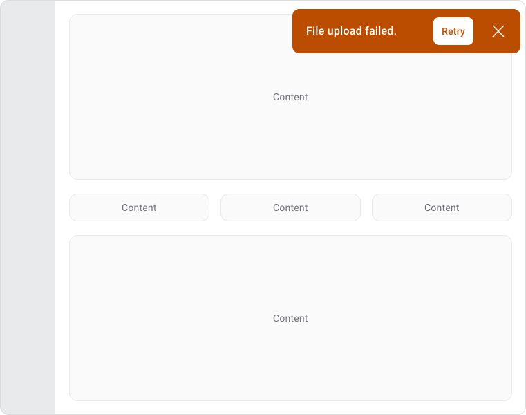
Use when:
- User deleted something and may want to undo it.
- An operation failed and they can retry.
- Content was created and they can open it.
- A process finished and they may want to view results.
Examples:
- File deleted. Undo.
- Message sent. View.
- Upload failed. Retry.
- Export ready. Open.
Avoid when:
- Information is critical.
- The user must acknowledge the message.
- You need more than one action.
- The message needs to stay visible.
Purely informational. Confirms something happened, disappears automatically, no action needed.
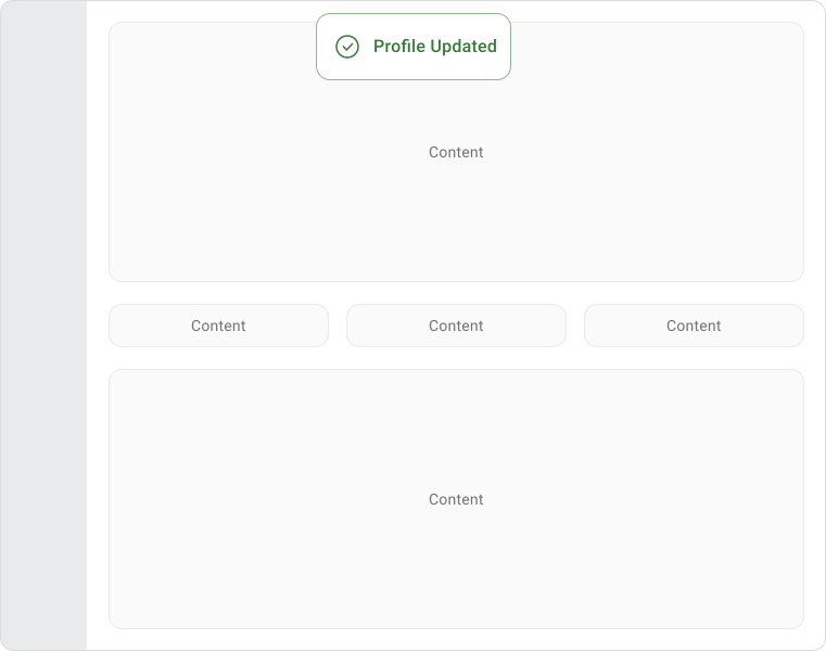
Use when:
- The user just needs confirmation.
- No recovery action is needed.
- The message is short and low priority.
Examples:
- Settings saved.
- Copied to clipboard.
- Profile updated.
- Draft saved.
Avoid when:
- The user may want to undo something.
- An action should be available.
- Missing the message would cause a problem.
Stays visible until dismissed or until the condition no longer exists. Relevant while the user keeps working.
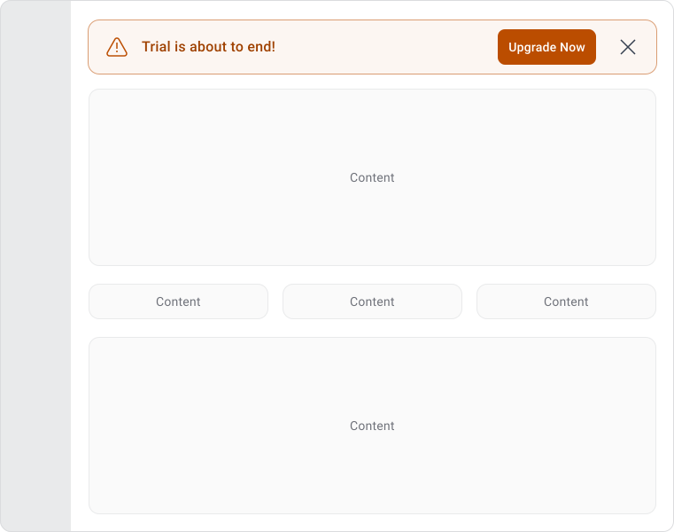
Use when:
- A system issue affects the product.
- A warning applies across screens.
- The user needs to review something before continuing.
- The message should stay visible.
Examples:
- Scheduled maintenance tonight from 10 PM to 12 AM.
- Your payment method requires attention.
- You currently have read-only access.
- Verify your email to access all features.
Avoid when:
- Feedback is tied to a single action.
- The message only matters for a few seconds.
- The information doesn't affect current usage.
Use a snackbar when something just happened and the user might want to do one more thing. Undo a delete, retry a failed upload, open a newly created file. One optional action, directly tied to what just happened.
UX Principles
A snackbar works because it shows up right when something happens, confirms it and leaves before it gets in the way.
Messages should be readable in a glance. If you’re writing more than a short line, the information probably belongs somewhere else. Multiple lines, detailed instructions, or anything that needs careful reading is a sign you’re using the wrong component. Consider a popover.
Snackbar Placement
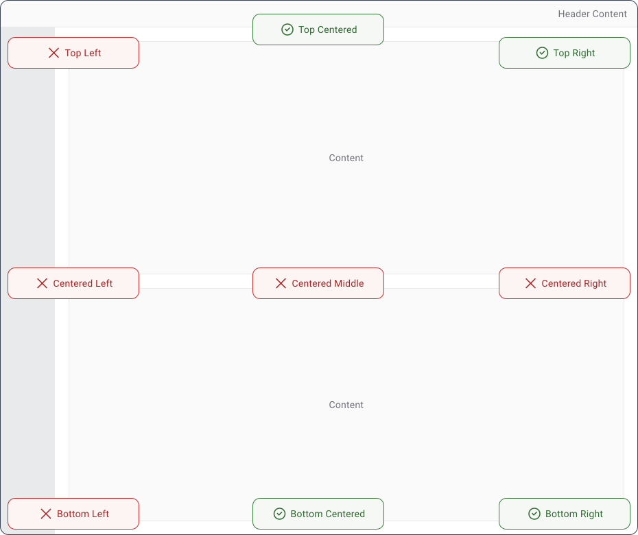
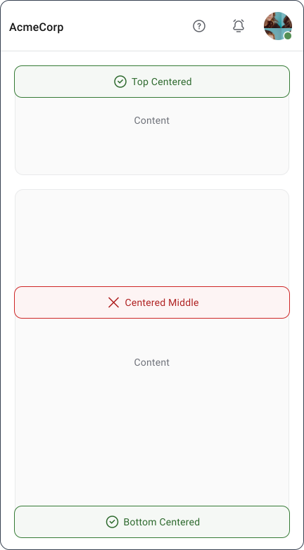
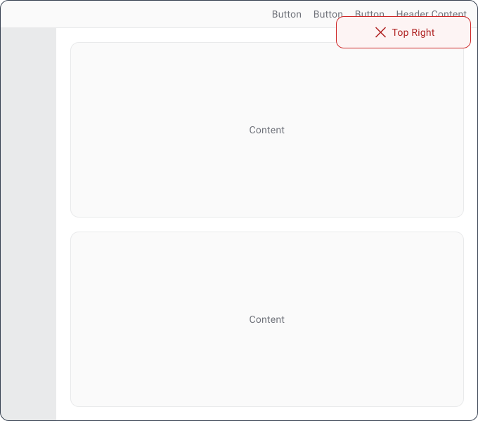
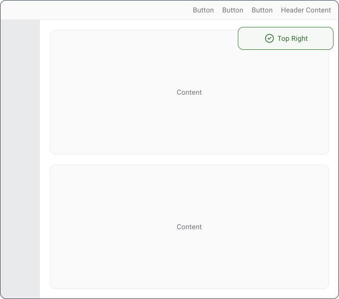
Snackbars typically sit at the bottom of the screen, though top placement works when it fits the layout better. Corners or center-edge positions (top right, bottom right) work well. Middle of the screen doesn’t, it cuts across content and gets in the way.
The rule is to pick one position and stick to it. Users will stop noticing feedback if it keeps appearing somewhere different.
Desktop
Mobile


Snackbar Behavior
Snackbars should appear automatically and disappear automatically. The user should not need to close them to continue working. Most design systems recommend keeping them visible for roughly 3 to 10 seconds depending on message length. Longer messages need more reading time.
Actions should be limited to a single clear option. Undo and Retry are common because they help users recover from mistakes without interrupting the flow.
Note!
Only one should be visible at a time. If multiple notifications fire at once, queue them sequentially or use a notification panel. Stacking messages covers the interface and turns feedback into noise.
Accessibility
Snackbar messages should be announced by screen readers automatically. Use role="status" for standard confirmations or role="alert" for errors and anything more urgent. The difference matters because alerts interrupt the user immediately, while status messages wait for a natural pause.
Display time should be long enough for slower readers. If the message has an action, the user needs enough time to reach it with a keyboard before it disappears. Don’t make dismissal the only way to move forward. Anything important should also be findable somewhere else in the interface.
Mobile Considerations
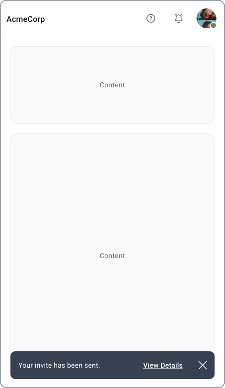
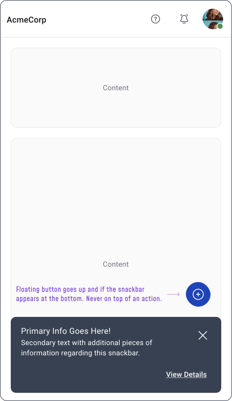
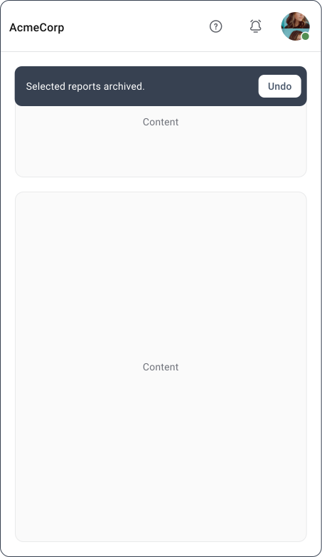
Snackbars work well on mobile because they confirm something happened without pulling the user out of what they’re doing. Keep the message to one or two lines max, screen space is tight and long messages are hard to read quickly.
Respect safe areas, home indicators and bottom navigation. A snackbar sitting on top of the navigation bar is more irritating than helpful.
Best Practices
Show the snackbar immediately after the action, keep the message focused on what just happened and let it disappear on its own. If the user might want to undo something, give them that option. If not, keep it purely informational and don’t add an action just to fill the space.
The simpler, the better.
Common Mistakes
1. The most common mistake is overloading the snackbar. Long messages, multiple actions, critical warnings, or too many notifications in a row all make it less noticeable and less trustworthy over time.
2. The other one is placement. If it covers navigation or controls the user needs, they have to dismiss it just to keep working.
Final Thoughts
A good snackbar goes unnoticed. It confirms what happened, removes any doubt and gets out of the way. The moment a message needs more explanation, requires a decision, or changes what the user can do next, it belongs in a banner, dialog, or dedicated screen instead.
Small, clear and temporary. That’s what makes it work.
🔗 Sources
Snackbar - designsystem.line.me
Source LinkSheet, dialog, or snackbar — what should a designer go for?
Source LinkSnackbar - infragistics.com
Source LinkSnackbar - Base Web
Source LinkSnackbar - mui.com
Source LinkSnackbar - designsystems.surf
Source LinkChoosing the right UI component for communication with your users
Source LinkSnackbar vs toast: decoding the subtle differences in design systems
Source LinkUX Drill 08 — Tooltips vs. Snackbars
Source LinkToasts or snack bars? — designing organic notifications
Source LinkSnackbars - m2.material.io
Source LinkWhat are snackbars in UI design?
Source LinkHow and When You Should Use Snackbars in UI Design
Source LinkSnackbars - uxcel.com
Source LinkUX Tip #3: Snackbars and Toasts
Source LinkToast vs Snackbar vs Banner: Which One Should You Use?
Source LinkMaterial Design in FileMaker: Snackbars and Banners
Source LinkSnackbars in UX – When and How Many?
Source Link