Scrollbars Research
View Figma ComponentKey Takeaways
- Scrollbars are communication tools first and interaction tools second.
- Users should immediately understand when content continues outside the visible area.
- Horizontal scrolling creates more usability and accessibility risks than vertical scrolling.
- Native scrollbar behavior is usually safer than heavily customized solutions.
Overview
A scrollbar does two things: it shows that more content exists outside the visible area and it shows where the user is within that content. When either signal is weak or missing, users miss overflow content, lose their place in long pages, or skip entire sections without realizing it.
Design Guidance
Keep scrollbars visible unless the content itself is used to suggest that there is more information on the page or in a section. When visible, it needs to be legible and easy to grab. The thumb needs enough contrast against the track to be seen at a glance.
The track needs to communicate that scrolling is possible before the user tries it. Floating overlays and auto-hide patterns should be used with care, since they remove the position signal entirely until the user interacts.
Scrollbar Anatomy

A scrollbar is usually made from two core parts:
- Track → represents the full scrollable length
- Thumb → shows where the user currently is within that content
- Scroll Arrows
- Auto-hide behavior (context dependent)
The thumb needs to be visually distinct from the track at all times. If a user can’t immediately tell what’s draggable, the whole thing feels unreliable.
Track (Background)
- Default StateTransparent
- Passive Scrolling State#Soft Button Surface
- Hover/Dragged State (Expanded)#Medium Button Surface


Thumb (or Handle)
- Default#Strong Button Surface

This color is used when the user isn’t interacting directly with the scrollbar and no scrolling is happening in other ways like dragging the content or using the mouse wheel. It serves as a subtle indicator that the element is scrollable, ensuring the UI doesn’t appear cluttered, as a darker shade would compete for the user’s attention.
- Hover/Dragged State (Expanded)##Button Surface Default

This color is used when the user scrolls using different methods other than dragging the thumb directly and when they hover over and interact with the scrollbar directly. It increases the visibility of the scrollbar, making it easier to see the length of the scrollable area and the user’s position within it, enhancing the overall user experience.
Icons
The icons (if available) will follow the Thumb color rules.
States and Size
The track maxes out at 12px wide. That’s narrower than most native browser defaults:
- Chrome/Safari on macOS sit at 15px,
- Windows browsers at 17px,
- Edge at 12px, but it fits the product direction of reducing visual clutter without hiding the scrollbar entirely. The 12px figure refers to the container width, not the thumb component.
Default State — 4px
This is the default compact size of the thumb that appears in scrollable areas or components when no scrolling action is taking place yet.

Passive Scrolling State — 4px
This is the default compact size of the thumb that appears in scrollable areas or components when no scrolling action is taking place yet.

Hover/Dragged State (Expanded) — 8px (10px Optional)
The thumb size increases from 4px to 8px when the user directly hovers over or interacts with the scrollbar. This enlargement makes it easier for the user to manually adjust the scroll position more efficiently.

Accessibility Recommendations at hover/focus.
- Minimum thumb width: 6px (absolute minimum for visibility and usability).
- Ideal thumb width for accessibility: 8px-12px based on user interactions.
Important Note
WCAG 2.2 target size (24px) doesn’t directly apply to scrollbars.
- Scrollbars have their own default sizes determined by the operating system and browser.
- Users typically interact with scrollbars via dragging, touch gestures, or mouse scroll wheels, rather than tapping a specific area.
- Customized scrollbars (e.g., with thin designs or hidden styles), must ensure that the scrollbar thumb (the draggable part) is easy to grab and meets usability needs.
- For a custom scrollbar thumb, it’s a good idea to design it to be at least 8-12px wide (or higher for touch devices), even though it doesn’t need to be 24px thick.
When to Use
Scrollbars apply whenever content can’t fit the available space, whether that’s a full page, a side panel, a list, or a data table. On desktop, where mouse interaction is primary, they’re especially important since users rely on them more directly than on touch devices.
Custom scrollbars need to carry full functionality. Styling the thumb and track is fine, but keyboard navigation and assistive technology support have to stay intact.
Important Note
Avoid horizontal scrolling for page-level content. Content must reflow to fit the viewport at any screen size. Users should never need to scroll sideways to read text or reach page sections.
Data tables are the one exception, but that exception applies to the table itself, not the page. The table should shrink in width and will get its own horizontal scrollbar contained within its boundaries. The page never scrolls horizontally. Everything else, including other widgets and containers, should resize and adapt to the available space rather than overflow. (WCAG 2.1 – Reflow)
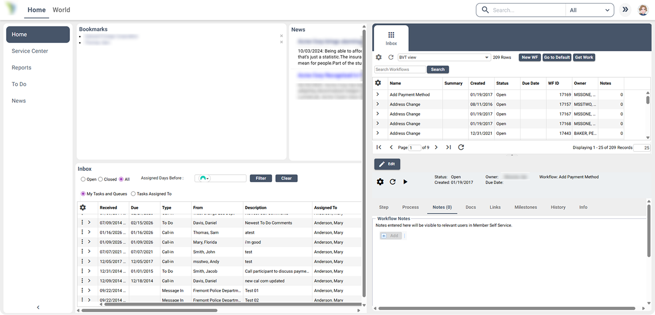
Behavior
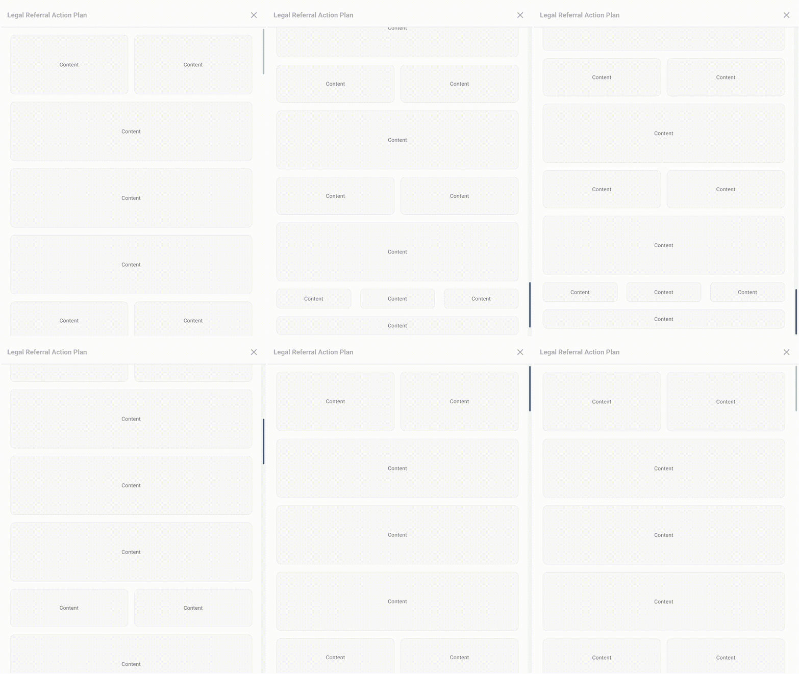
The page scrollbar starts in the passive state by default. It’s visible but compact. When the user hovers over or grabs it directly, it expands into the hover/dragged state.
Default → Passive → Hover/Dragged (If interacted directly)
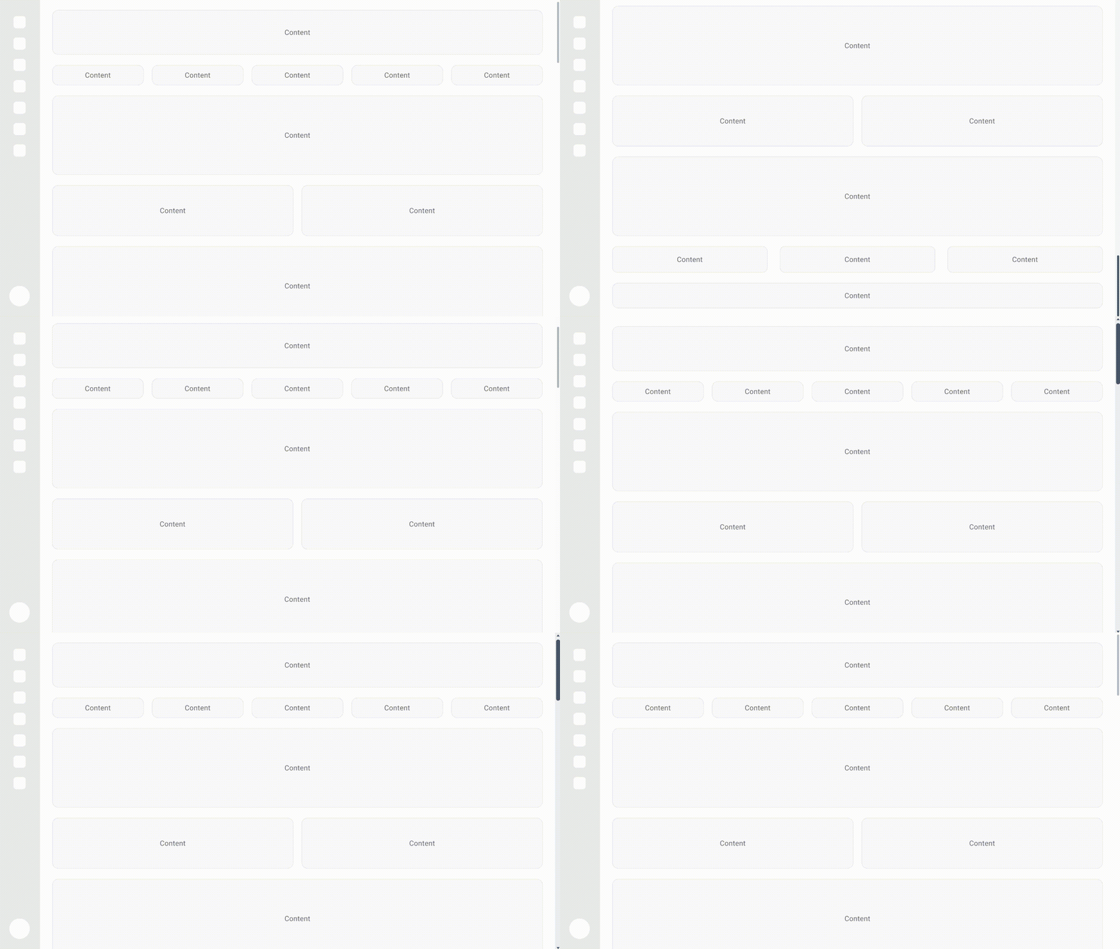
Internal scrollbars start hidden in the default state. They shift to passive when the user scrolls via mouse wheel, keyboard, or content drag, changing color but not size to avoid competing with surrounding UI. Hovering or grabbing the scrollbar directly triggers the expanded hover/dragged state.
Default → Passive → Hover/Dragged (If interacted directly)
Drop Downs and Text Areas:
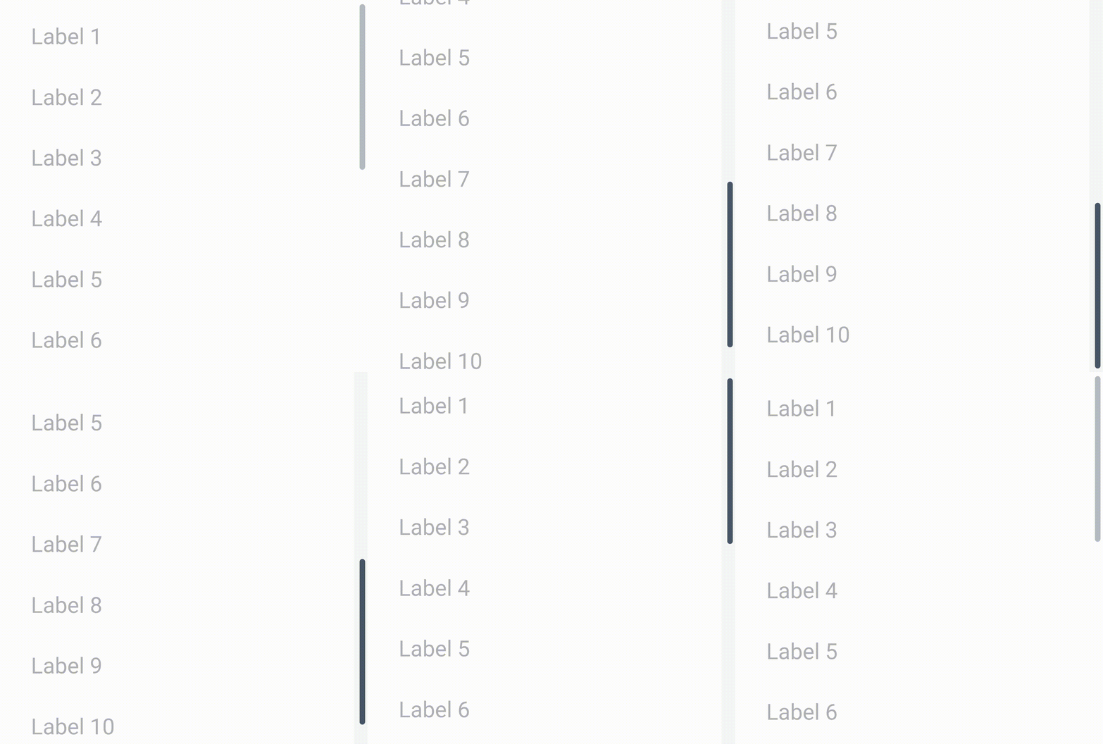
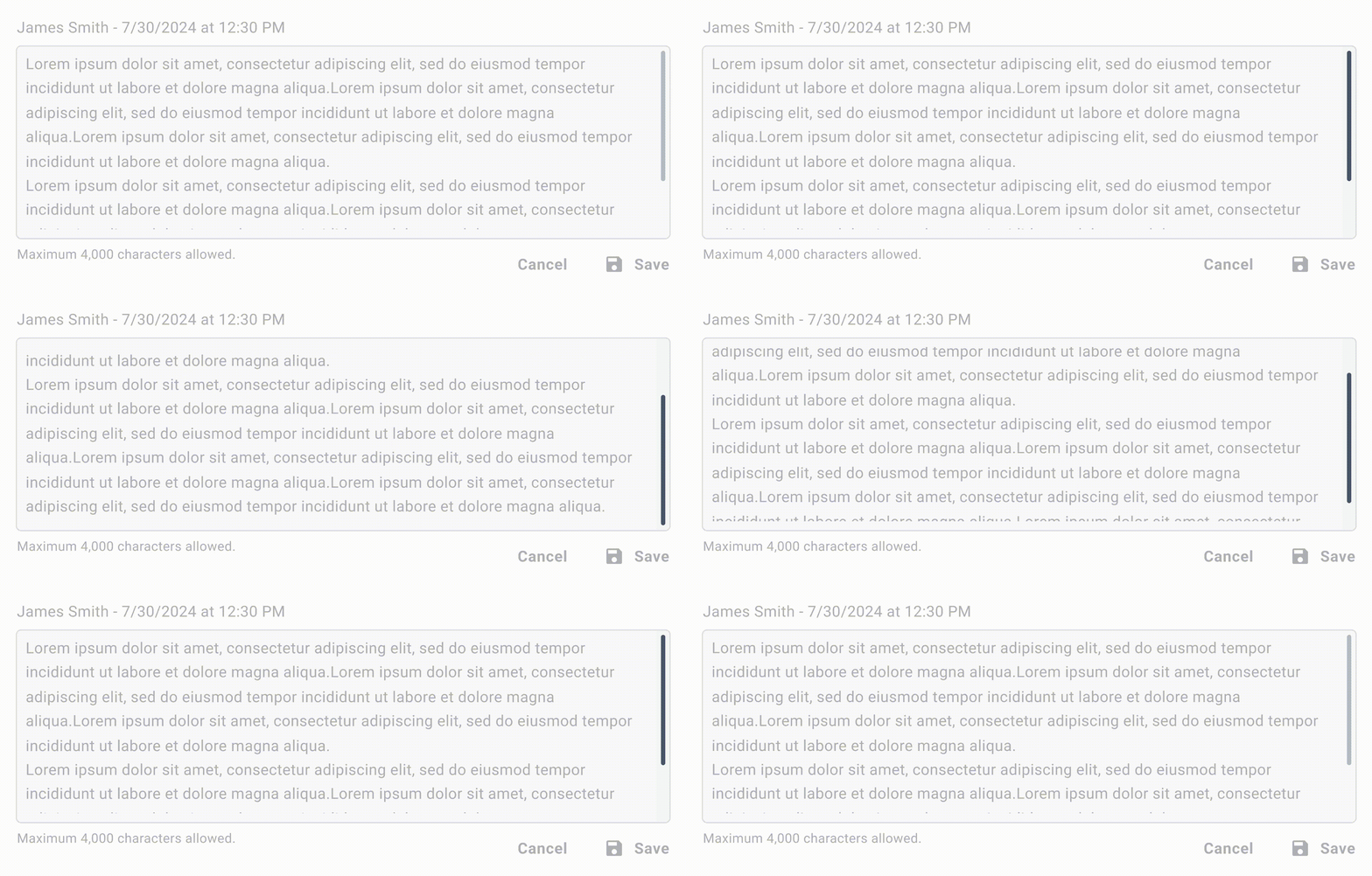
Widgets:
Tables/Grids:
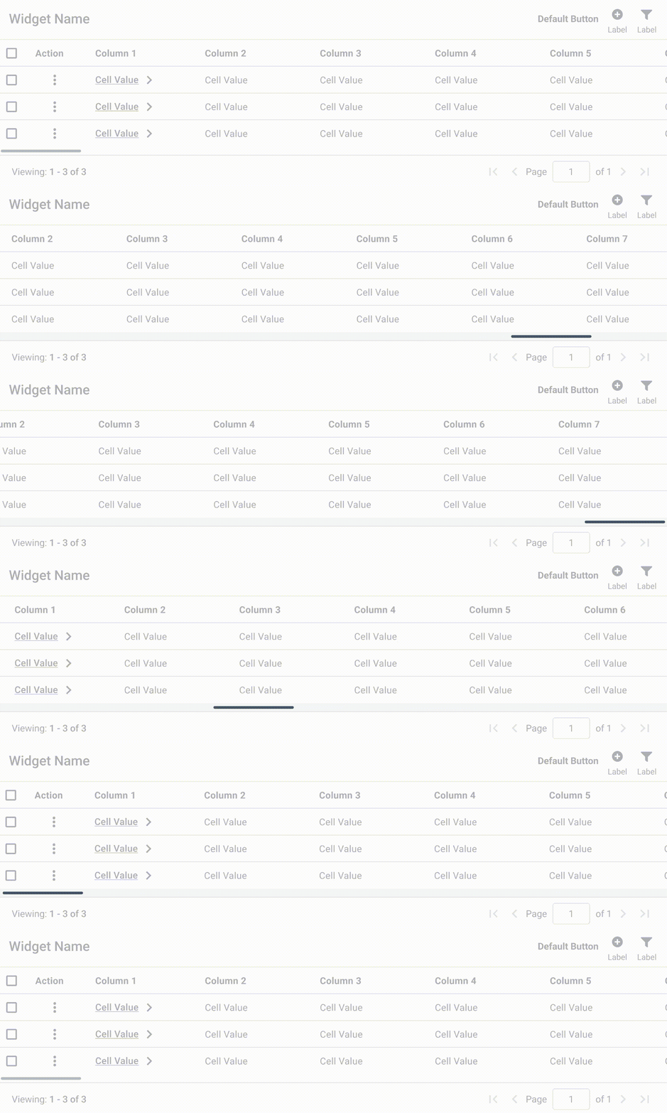
Preserve Native Expectations
Users already know how scrollbars work. Custom styling should never change that. A scrollbar needs to:
- Look draggable
- Stay visible enough to notice
- Respond to keyboard input, mouse wheels and touchpads
- Sit exactly where users expect it
Trying to make it minimal usually removes the exact cues users depend on to know scrollable content exists.
Nobody is using the product to interact with the scrollbar. It should stay out of the way and just work. Custom styling is only worth doing if it genuinely improves clarity or consistency within the product. If it’s purely aesthetic, it’s more likely to cause accessibility and visibility problems than solve anything.
Accessibility
Thumb and track need clear visual separation. Low contrast makes it hard to spot the draggable area quickly, particularly for low-vision users or anyone on a bright screen. Thin thumbs accentuate the problem. Small draggable targets are difficult to grab with:
- Touchpads
- Zoomed interfaces
- Users with motor impairments
- Unstable environments (moving vehicles, shaky hands)
WCAG and platform guidance consistently push toward larger targets, not smaller ones.
Keyboard access must stay fully functional:
- Arrow keys should scroll
- Focusable scroll regions may need tabindex
- Screen readers must follow a logical reading order
Voice control users have a harder time with horizontal scroll regions inside isolated containers. The commands required to scroll within a bounded area are less obvious and add extra steps. Avoid horizontal scrolling wherever possible and when it’s necessary, test it with voice control explicitly.
Mobile Considerations
On touch devices, users drag the content itself instead of the scrollbar. Because of this, the scrollbar behaves more like a temporary progress indicator than a primary interaction control.
Use Default OS Scrollbars on Mobile - Leverage the native scrolling behavior on mobile devices for a consistent and familiar user experience that saves space. Horizontal scrolling should be avoided unless absolutely necessary.
Common Mistakes
- Using Extremely Thin Scrollbars - Minimal styling often makes dragging difficult and reduces visibility.
- Low Contrast Thumbs - If the thumb blends into the track, users lose the draggable affordance immediately.
- Horizontal Navigation Regions - Critical navigation hidden behind sideways scrolling is easy to miss and harder to operate with assistive technologies.
- Styling Without Accessibility Validation - The moment native behavior is overridden, sizing, visibility and contrast become product responsibilities.
Final Thoughts
Scrollbar usability becomes noticeable mostly when it breaks. Users rarely think about scrollbars when they work correctly, but they immediately feel the friction when overflow becomes hidden, dragging becomes difficult, or orientation inside content disappears.
The safest approach is usually the simplest one: preserve native expectations, keep overflow obvious and avoid styling decisions that trade usability for aesthetics.
🔗 Sources
How to save you days of bug fixing with custom scroll CSS and JS
Source LinkBaseline Rules for Scrollbar Usability
Source Linkperfect-scrollbar
Source LinkCustom Scrollbars Examples
Source LinkCSS property: scrollbar-gutter
Source LinkScrollbars
Source LinkInclusive Design Principles
Source LinkShould mobile websites show a dedicated area for scroll bar like on desktop websites?
Source LinkCustom vs. browser-native scrollbars
Source LinkUse of Color (Level A)
Source LinkNon-text Contrast (Level AA)
Source LinkReflow (Level AA)
Source LinkTarget Size (Level AAA)
Source LinkConsistent Navigation (Level AA)
Source LinkConsider accessibility when using horizontally scrollable regions in webpages and apps
Source LinkCSS Scrollbars Styling Module Level 1
Source LinkScrollbar styling
Source Link