Profile Research
View Figma ComponentKey Takeaways
- Profile Pictures / Avatars help users quickly associate actions and content with specific people, which makes the interface easier to scan and understand.
- Photos work best, but your system needs solid fallbacks. Initials and placeholders keep layouts consistent when a photo is missing or fails to load.
- The same avatar component has to work across small lists, grouped views and large profile headers. Consistency across these contexts is what makes the system feel cohesive.
- Status indicators, selection states and notification badges let avatars carry more information without adding extra components to the UI.
Profile Pictures / Avatars
A Profile Picture / Avatar is a visual representation of a user, company, or entity. It usually appears as a photo, initials, or a simple icon. It helps users quickly recognize who they’re interacting with and creates a sense of presence across the interface.
This matters most in products where people interact, collaborate, or leave visible traces like comments or actions.
Use profile pictures / avatars when identity adds clarity or trust. If users aren’t a meaningful part of the experience, avatars can add unnecessary visual noise.
Examples:
- Messaging or collaboration tools where users need to identify participants quickly
- Task or project tools where avatars represent ownership or responsibility
- Social feeds or comments where identity builds trust and accountability
- Account menus or headers where the avatar acts as a personal anchor
- Avoid in purely data-driven dashboards with no user context
A profile picture / avatar is a container that represents identity. The system needs to stay visually consistent whether a photo is available or not, so fallback states are just as important as the default.
These are the standard variants to consider when building the component:
- Photo avatar - real image, strongest recognition and trust
- Initials avatar - generated from a name, a useful fallback that still feels personal
- Placeholder avatar - neutral icon or silhouette when no data exists
- Illustrated or custom avatar - used in products that allow personalization without real photos
- Shape variants - circular (most common), square, or brand-specific variations


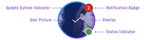
Profile pictures / avatars often carry extra meaning through states and overlays. These turn the avatar into a compact information container, showing status or feedback without taking up extra space. Indicators should be visible but never overpower the identity itself.
Examples
- Online status - Online, Busy, Away, Offline. Use this when availability matters for the relationship between users, like in messaging or collaboration tools.


- Notification badge - a counter for unread messages or updates


- Selection state - checkmark or overlay when a user is being chosen from a list


- Edit overlay - on hover, expose the option to change the profile picture when the context requires it


Avatars work better when paired with supporting text like a name, role, or status. Without it, users can struggle to identify people, especially when avatars are small or visually similar. Adding context improves scanning and reduces the chance of errors.
- Avatar + name in lists for quick identification
- Avatar + role or status in team dashboards
- Avatar with caption below in profile cards
- Avatar inside inputs for tagging or assigning users
- Avatar in headers as an entry point to account actions
Grouping and Scalability
When multiple users need to be shown, avatars are grouped to save space while still communicating presence. The goal is to show enough context without overwhelming the layout.
- Stacked avatars to represent a team or participants
- “+3” counter to indicate hidden members
- Tooltip on hover to reveal full names
- Expandable groups on click for full lists
- Consistent sizing and spacing to avoid clutter


Size
Avatars need to work across very different contexts, from dense tables to full profile pages. Clear size rules keep the component consistent and readable wherever it appears.
- 16-24px - tables or inline contexts where the avatar links information to a person
- 24-40px - headers and top navigation bars
- 40-56px - lists and content cards
- 56-112px+ - profile pages and settings areas
Final Thoughts
Avatars/Profile Pictures sit at the center of how users perceive identity in a product. When done well, they reduce cognitive load, improve recognition and make interactions feel more human.
The difference between a good and a poor avatar system comes down to consistency and behavior. Fallbacks, states and context are what determine whether avatars support the experience or quietly break it.
🔗 Sources