Placeholders Research
View Figma ComponentKey Takeaways
- Placeholders provide temporary hints, examples, or formatting guidance inside a field
- Labels identify the field and must always stay visible
- Placeholders support labels, they don’t replace them
- Keep placeholder text short and use real examples where possible
- Never put critical instructions inside a placeholder
- Placeholder text needs enough contrast to be readable
- Skeleton screens are a separate but related use of placeholders, useful for loading states
Overview
A placeholder is hint text inside an input field that disappears once the user starts typing. It shows an example value, expected format, or a short label-like hint to help users know what to enter.
Labels identify a field and stay visible. Placeholders are hints and go away. Once they disappear, there is no fallback for users who forget what the field was asking for, especially in longer forms. If a field needs a label to be understood, it needs a visible label, not a placeholder doing double duty.
Placeholders also appear in loading states and wireframes as temporary fill content, but those are different use cases with different intent. The interaction behavior and accessibility concerns are specific to input placeholders, so those are the focus of this documentation.
Placeholder Anatomy
A placeholder sits inside the input field itself, below the label and above any helper or validation text. It shows before the user types anything and disappears once they start.
Unless it’s an input field with Masking Text or Date Format.

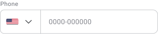
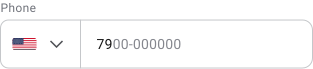
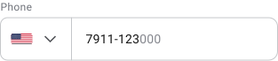
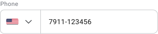
Masking helps users understand the expected structure of the input. Grouping characters into readable sections, such as phone numbers or identification codes, makes information easier to scan and validate while typing.
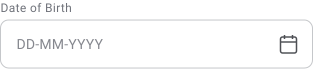
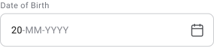
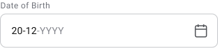
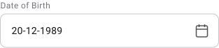
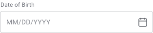
Date fields should always use a clear and consistent format. Calendar pickers help reduce formatting mistakes and improve accuracy, especially across regions with different date conventions.
Types of Placeholders
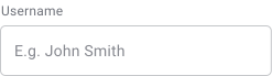
Text Input Field
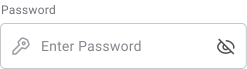
Password Input Field
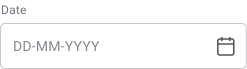
Date Input Field
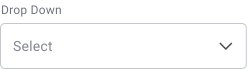
Selection Input Field
Phone Input Field
Input placeholders provide hints, examples, or formatting guidance inside form fields. Their purpose is to help users understand what information is expected and how it should be entered.
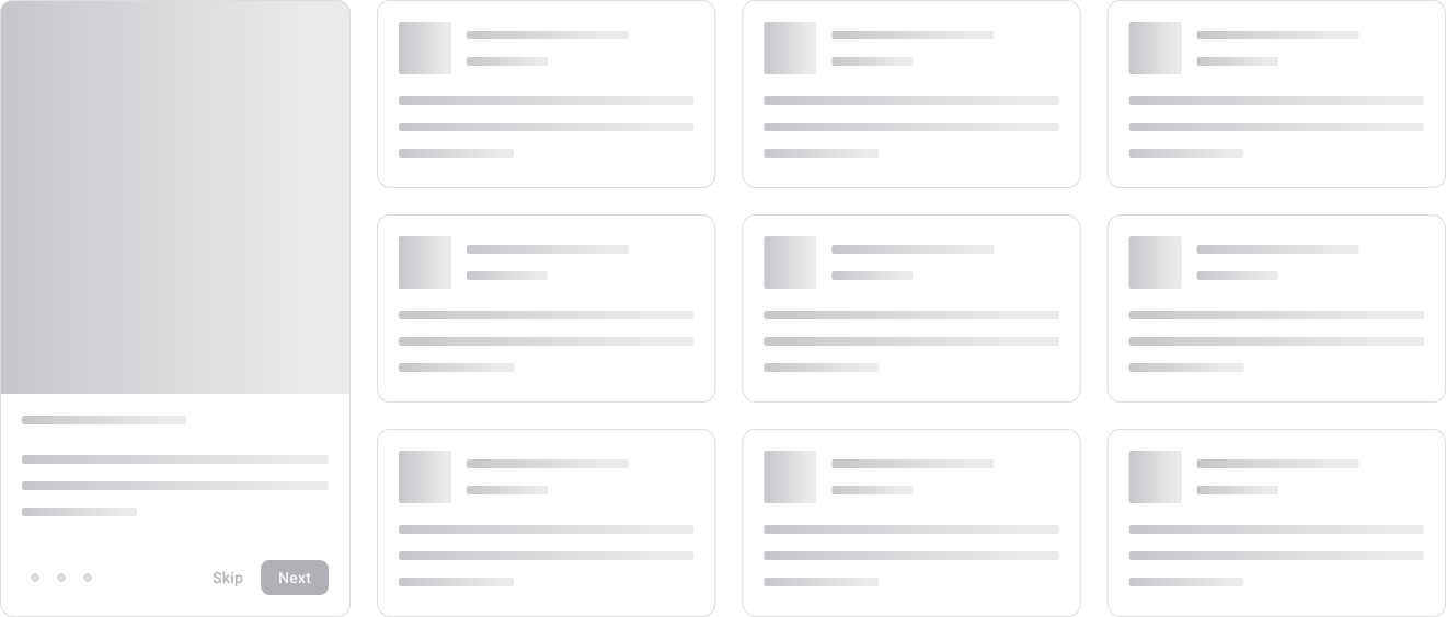
Skeleton screens show a rough version of the page layout while content loads, using grey blocks and lines where text, images, or cards will appear. The page doesn’t feel blank or broken and the layout doesn’t jump around once real content arrives.
The main advantage over a spinner is that users can see where things are going. A spinner tells you to wait. A skeleton tells you what’s coming.
Common places to use them:
- Article feeds
- Product listings
- Social timelines
- Dashboard cards
Content and Design Placeholders
Content placeholders are commonly used during wireframing, prototyping and design exploration.
Examples include:
- Lorem Ipsum text
- Gray image boxes
- Temporary profile images
- Placeholder cards
- Future content sections
Their purpose is to help designers focus on layout, hierarchy and interaction before final content is available.
Why Placeholders Matter
A placeholder gives users guidance exactly where they need it, inside the field they’re about to fill in. A good example value or format hint answers the question before the user has to ask it, which means fewer errors and less time spent figuring out what a field wants.
For loading states, skeletons make the wait feel shorter. Users can see the page taking shape, which reads as progress even when nothing has loaded yet.
An empty screen feels broken. A skeleton doesn’t.
When Not to Use Placeholders
Placeholders should not be used when the information is essential for completing a task. Once a user starts typing, the placeholder is gone. Anything they might need to reference mid-input belongs outside the field as a visible label or helper text.
Avoid using placeholders for:
- Field labels
- Validation messages
- Long instructions
- Critical guidance
- Multi-step directions
- Information users may need to reference later
Labels vs Placeholders
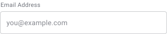
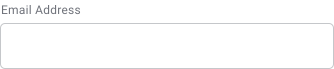
A label identifies the field. A placeholder adds supporting guidance. They’re not interchangeable.
Do
Don’t
Don’t
Don’t
Placeholder-only forms look clean but fall apart in use. The guidance disappears as soon as the user starts typing, which forces them to rely on memory and makes reviewing a half-filled form much harder. Labels stay visible. Placeholders don’t.


Placeholder Text Best Practices
Do
Do
Don’t
Don’t
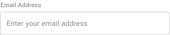
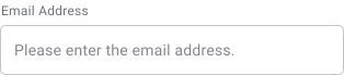
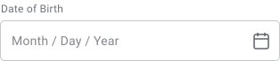
Placeholder text should be concise enough to scan at a glance. An example value or short format hint works well. A full sentence doesn’t. Long placeholders get ignored. If the field needs that much explanation, it belongs in helper text below the field.
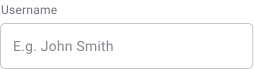
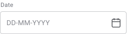
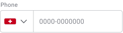
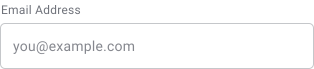
Examples are often more effective than instructions because they immediately demonstrate the expected format. They reduce input errors and improve form completion rates.
Placeholders should complement labels, not replace them. Users should always understand a field’s purpose even if the placeholder disappears.
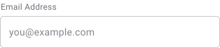
Do
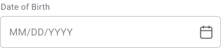
Do
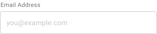
Don’t
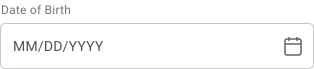
Don’t
Placeholder text must remain readable.
WCAG guidance generally recommends a minimum contrast ratio of:
- 4.5:1 for normal text
- 3:1 for larger text
Low-contrast placeholder text is one of the most common accessibility issues found in forms.
If instructions are necessary to successfully complete the field, they should remain visible.
Examples:
- Password requirements
- Tax identification rules
- Address formatting instructions
Users should not have to delete their input to recover important information.
Accessibility
Placeholder text must remain legible for users with low vision and in different lighting conditions. Poor contrast can make placeholder text difficult or impossible to read.
Not all screen readers consistently announce placeholder content. Users relying on assistive technology may miss placeholder guidance entirely if labels are absent.
When placeholders disappear, users must remember instructions while completing the field. This increases memory requirements and makes complex forms harder to complete.
Placeholder-only forms can require additional interactions when users need to recover instructions or examples. Persistent labels reduce unnecessary effort and improve usability.

Users should always understand what a field represents, even after entering data. Labels, helper text and visible instructions provide persistent context that placeholders cannot.
Placeholder Rules for Empty State
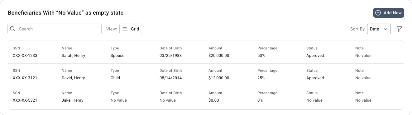
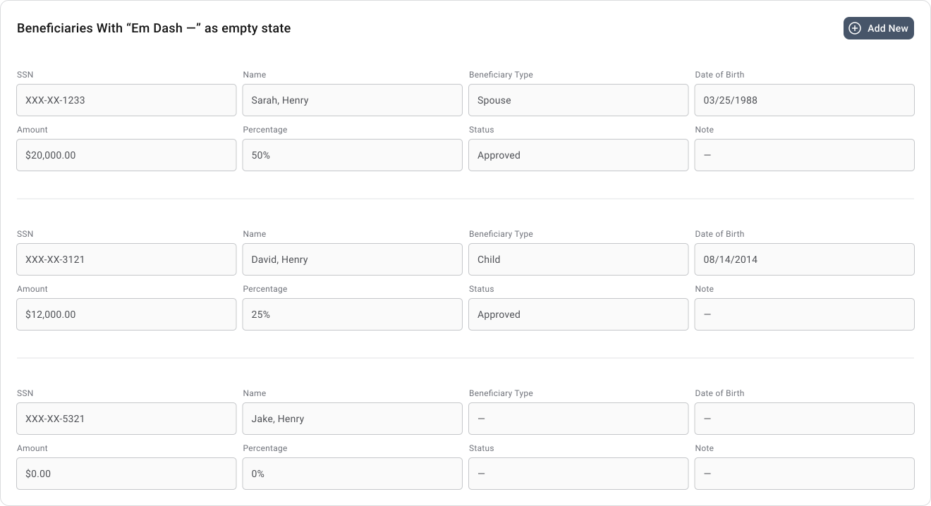
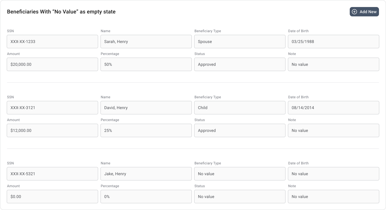
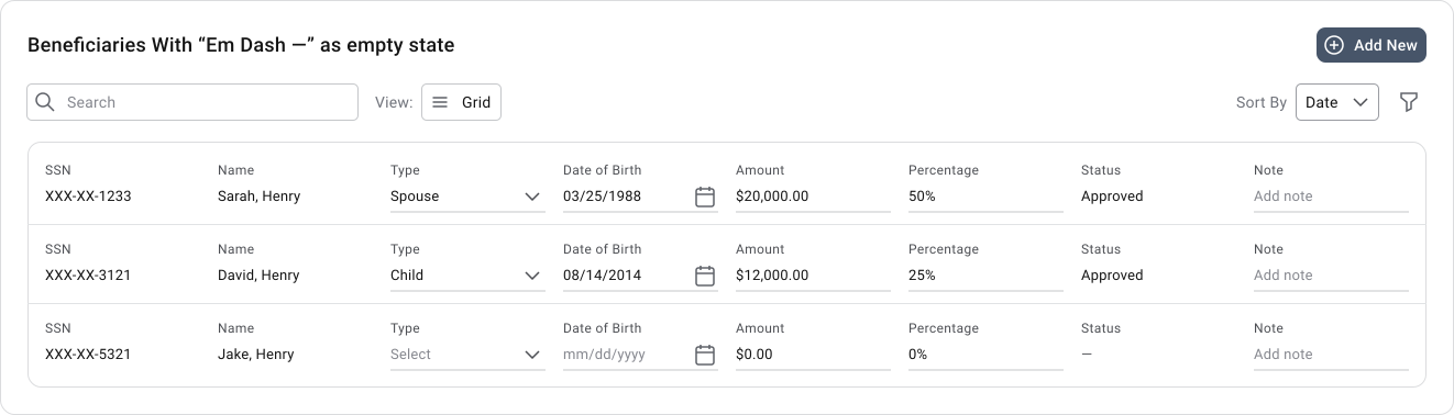
Empty values across all types: “—” (em dash)
Applies to:
- Free text → “—”
- Dates → “—”
- Dropdown values → “—”
- Amounts (if truly empty) → “—” if not then 0
- Description fields → “—”
Exception: “0” (Real numeric zero)
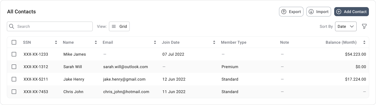
Important Note
Example for “Amounts (if truly empty)”
- 250.00 → Real value
- 0.00 → Real numeric zero (must always be shown as 0, never replaced)
- — → No value stored in the system
The dash does not mean zero. It means the system has no recorded amount.
Applies to:
- Free Text → “Empty”
- Dates → “Empty + picker”
- Dropdown values → “Empty + Icon”
- Amounts → “Empty”
- Description fields → “Empty”
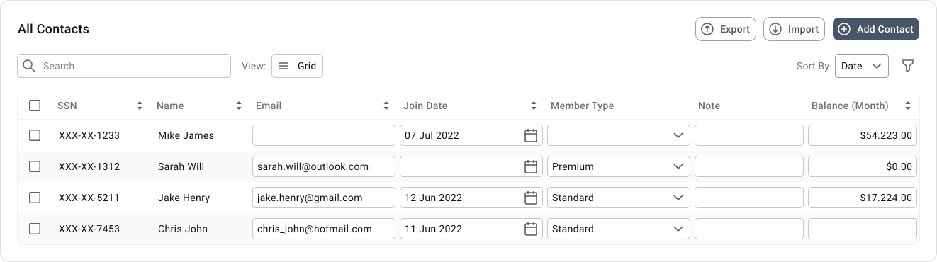
Important Note
Example for “Amounts (if truly empty)”
- 250.00 → Real value
- 0.00 → Real numeric zero (must always be shown as 0, never replaced)
- — → No value stored in the system
The dash does not mean zero. It means the system has no recorded amount.
Empty values across all types: “—” (em dash)
Applies to:
- Free text → “—”
- Dates → “—”
- Dropdown values → “—”
- Amounts (if truly empty) → “—” if not then 0
- Description fields → “—”
Exception: “0” (Real numeric zero)
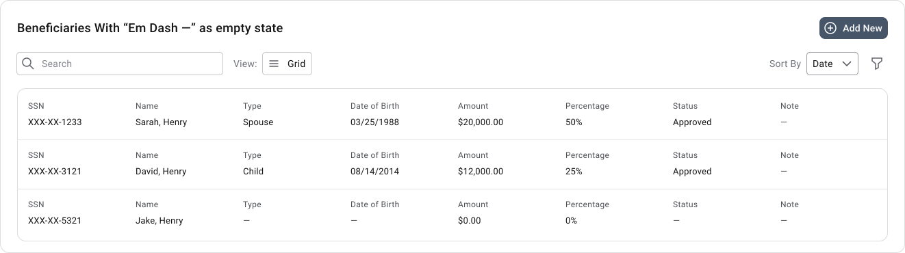
Important Note
Example for “Amounts (if truly empty)”
- 250.00 → Real value
- 0.00 → Real numeric zero (must always be shown as 0, never replaced)
- — → No value stored in the system
The dash does not mean zero. It means the system has no recorded amount.
Universal Rules:
- Always visible label above field.
- Placeholder optional and only supportive.
- Never rely on placeholder as label.
Universal Rules:
- Always visible label above field.
- Placeholder can be optional and only supportive. But it’s a good practice to use the placeholder to provide hints to user.
- Never rely on placeholder as label.
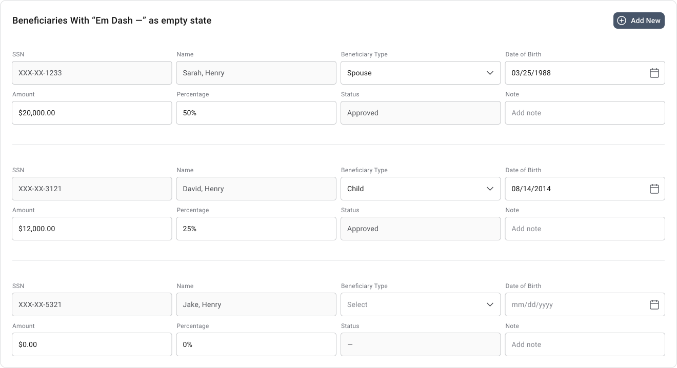
Important Note
Example for “Amounts (if truly empty)”
- $250.00 → Real value
- $0.00 → Real numeric zero (must always be shown as 0, never replaced)
- — → No value stored in the system
The dash does not mean zero. It means the system has no recorded amount.
Note! Why the em dash works better on both tables and forms/input sections
1. Faster scanning
Tables are primarily scanned, not read. When a user reviews 20, 50, or 100 rows, they are looking for patterns and exceptions. The em dash acts like a visual marker that immediately stands out from surrounding text and numbers.
2. Reduces visual noise
The repeated “No value” creates large text blocks that compete with actual data. The empty state should be visually present but not louder than the real data.
3. Language independent
The em dash works in:
- English
- French
- Spanish
- German
- Romanian
- Japanese
No translation needed. “No value” must be translated everywhere. This is especially important for enterprise products with localization requirements.
4. Avoids business meaning conflicts
Sometimes “No Value” is a legitimate business value. The em dash never has this problem because nobody selects an em dash as data.
Dropdown values:
- Approved
- Rejected
- Pending
- No Value
5. Matches enterprise software conventions
Most enterprise systems use one of: —, N/A, Not Available
Of those, the em dash is generally the cleanest because it:
- Consumes little space
- Works in dense layouts
- Remains visually distinct
- Does not imply a business meaning
What Not To Do
- Do not use different empty-state patterns across screens (dash in one place, N/A in another, blank somewhere else).
- Do not rely on placeholder text as the only label.
- Do not use format placeholders in read-only fields.
- Do not show fake example data that looks like real data.
- Do not leave empty read-only fields completely blank as they look broken.
Common Mistakes
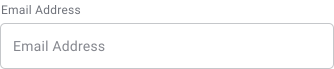
The most common mistake is using placeholders instead of labels. Once the user starts typing, the field loses all context. Related to this: if the label already says “Email address”, a placeholder that also says “Email address” adds nothing. Placeholders should add information, not repeat what’s already there.
Other mistakes worth avoiding:
- Long instructions in the placeholder — anything beyond a short hint or example belongs in helper text
- Low contrast text — placeholder text that’s too light becomes unreadable for many users
- Placeholder-only forms — labels should always be present; placeholders alone create real accessibility and usability problems
- Validation messages in placeholders — by the time an error occurs, the placeholder is gone; validation belongs outside the field as persistent feedback
Good Placeholder Examples
| Field | Label | Placeholder |
|---|---|---|
| Email Address | you@example.com | |
| Date | Date of Birth | MM/DD/YYYY |
| Phone | Phone Number | (555) 123-4567 |
| Search | Search | Search products, articles, or categories |
| Feedback | Feedback | Tell us about your experience |
Final Thoughts
Placeholders work best when they add just enough guidance to help users move forward without doing the job that labels, helper text and validation messages should be doing.
When the responsibilities are split correctly, placeholders reduce errors and keep the experience feeling clear without creating a crutch that breaks the moment it disappears.
🔗 Sources
What Is Placeholder in UX Design?
Source LinkPlaceholder
Source LinkPlaceholders Code Academy
Source LinkIntent text: Creating more effective placeholder copy
Source LinkIs placeholder UI a good design practice?
Source LinkWhat Is a Placeholder in UX?
Source LinkMastering Placeholder Text in UX
Source LinkPlaceholders in Form Fields Are Harmful
Source LinkPlaceholder Userfy
Source LinkUI Placeholder
Source LinkPlaceholder - semantic-ui.com
Source LinkWhat Is the Best Practice of Placeholder?
Source LinkAlternatives to Placeholder Text
Source LinkPlaceholder Text in UX
Source LinkStop Misusing Placeholder Text on Textfields
Source LinkWhat Is Placeholder Text in UX?
Source LinkA Guide to using Placeholder texts.
Source LinkFree Form Placeholder Text Generator & 50+ Examples (with Best Practices & UX Tips)
Source LinkTextarea Placeholder: Usage, Examples and Best Practices
Source LinkFields
Source LinkThe problem with placeholders and what to do instead
Source Link