Pagination Research
View Figma ComponentKey Takeaways
- Pagination works best when users need to compare items, track their position, or navigate predictably through large datasets.
- Infinite scroll suits continuous browsing and discovery, but users lose orientation and can't easily return to a specific point.
- "Load More" gives users a bit of both: content loads progressively without completely removing the sense of stopping points.
- In dashboards and data-heavy grids, pagination usually wins on performance since it limits how much gets rendered and loaded at once.
Overview
Pagination breaks large content sets into smaller chunks so users can move through them without being overwhelmed. It gives users a sense of position, like knowing they're on page 3 of 12, which helps when they need to find, compare, or return to something specific.
It works well in dashboards, data grids, search results, archives and product listings.
Anatomy of a Simple Modern Pagination
A pagination component should stay lightweight. Give users enough to navigate confidently without cluttering the bottom of the screen.
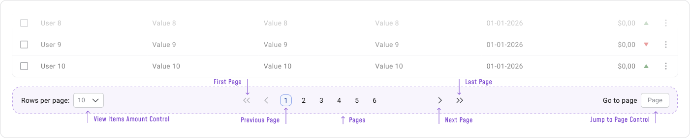
Basic anatomy:
For data grids:
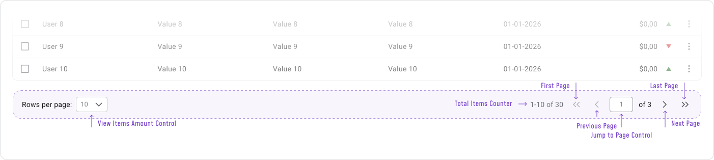
Core elements:
- Previous / Next controls for step-by-step movement
- Current page indicator so users know where they are
- Page numbers for direct access
- Ellipses to trim down long page ranges
- Result count or range when the dataset size matters
Best Practices
Place pagination close to the content it controls, usually below a table, list, or grid. For very long pages, adding controls at both the top and bottom saves users from unnecessary scrolling.
The current page needs a clear active state so users stay oriented as they move through pages. Use ellipses for long ranges instead of showing every number.
Example:
- Show a result range like "1–10 of 1,248" in data grids so users understand how large the dataset is.
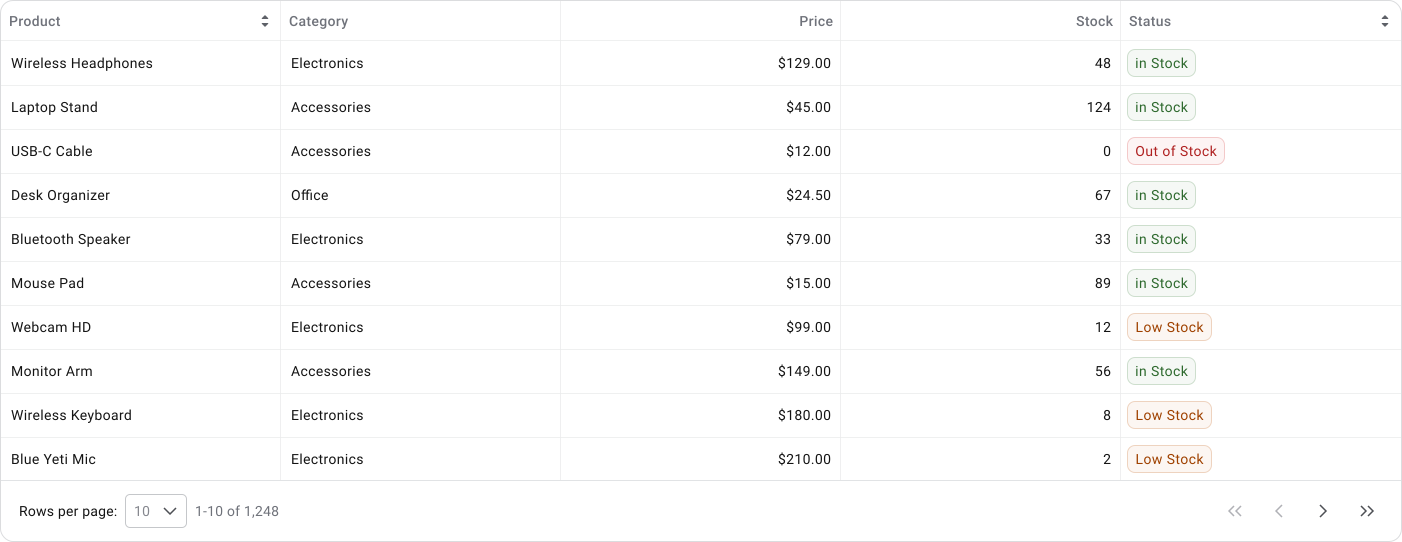
Example:
- In search results, keep page numbers simple and make the active page visually obvious.
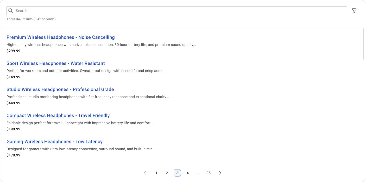
- Make click targets generous. Page numbers are small by default, so add enough padding around them to make tapping and clicking comfortable.
- Let users jump directly to the first and last pages, especially in long datasets.
- Always show the user's current position clearly.
Infinite Scrolling
Infinite scrolling loads more content automatically as the user scrolls down. It works well when users are exploring and don't need to track their position or return to something specific.
It works well for social feeds, visual discovery, galleries and entertainment-style browsing. Weaker in dashboards, data tables and any workflow where users need to find, compare, or revisit specific items.

- Smooth, continuous browsing with no interruptions
- Less clicking, especially on mobile
- Supports discovery and keeps users engaged in feed-based content
- Hard to return to a specific item once you've scrolled past it
- No clear position markers, so users lose orientation quickly
- The footer becomes difficult or impossible to reach
- Page performance can degrade as more content loads
- Poor fit for comparison, auditing, or any structured workflow
Load More
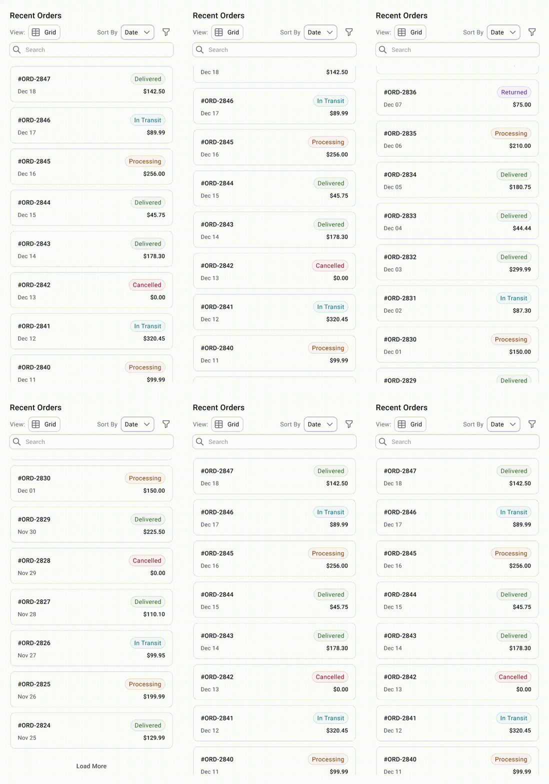
Tapping "Load More" reveals the next batch of content without leaving the page. It sits between infinite scroll and pagination: more controlled than automatic loading, less structured than numbered pages.
Works well for product grids, card layouts, content libraries and modular dashboards where full pagination would feel too heavy. It gives users a natural stopping point, which makes the experience feel less passive than infinite scroll.
- Keeps users in the same context without a full page reload
- Reduces initial load time
- Puts the user in control of when more content appears
- Works well for cards and visual grids
- Keeps the interface lighter than full pagination
- Weak for precise navigation
- Hard to bookmark or return to a specific position
- Repetitive clicking gets tiring if there's a lot of content
- Less useful for large structured datasets
- Not a good fit when users need direct access to specific page ranges
Performance Improvement
In dashboards and large data grids, pagination is usually the safest choice for performance. Complex grids carry a lot of weight: multiple columns, filters, sorting, row actions, popups and side panels. Loading all of that upfront gets expensive fast.
Pagination limits how many rows render at once, which also limits how much related data the system needs to prepare for row-level actions.
Infinite scroll and Load More keep adding to the page over time, which increases memory usage and can slow things down noticeably in complex interfaces.
- Paginate the main grid
- Load only visible row data
- Lazy-load popup details on demand
- Cache opened popup data when useful
- Avoid keeping hundreds of hidden row details in memory
Pagination controls how much users need to process at once, which matters most in dense interfaces like tables, dashboards, search results and product catalogs.
In tables, fewer rows generally improve readability because users are scanning across columns and comparing values.
Rows-per-page controls are worth including when users have different density needs, but keep the options simple. 10, 25 and 50 are easier to choose between than incremental steps like 10, 20, 30 and 40.
Mobile Considerations
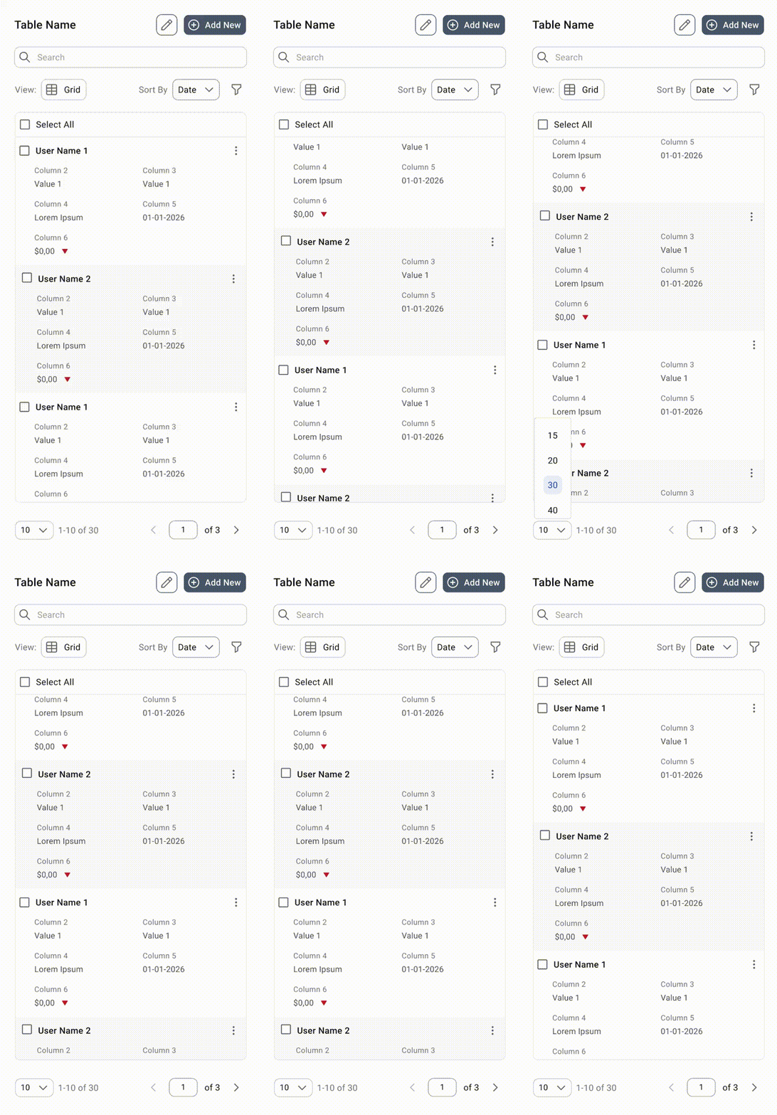
Pagination is more difficult to manage on mobile. Less horizontal space means long rows of page numbers quickly become cramped and difficult to tap.
On mobile, reduce the number of visible page links and lean on Previous / Next as the primary controls. If users don't need to jump to a specific page, a compact version works better than showing full numbered pagination.
Accessibility WCAG
Pagination needs to work with keyboard, mouse, touch and screen readers. Visual clarity matters, but so does semantic markup. Don't rely on color alone to communicate selected, disabled, or interactive states.
Important accessibility points:
- Use clear "Previous" and "Next" labels, or icons with proper accessible text
- Make focus states visible and obvious
- Keep touch targets at 32px or larger
- Make disabled states clear through more than just reduced opacity or color change
Common Mistakes
The most common mistake is showing too many page numbers. It makes the component look busy without actually helping navigation.
Other things to watch out for:
- Weak or unclear active states that leave users unsure which page they're on
- Click targets that are too small to tap comfortably
- Poor contrast on page numbers or controls
- Disabled states that aren't visually or semantically communicated
- Pagination that wraps onto multiple lines on smaller screens
- Using infinite scroll in dashboards where users need sorting, filtering, comparison, exporting, or stable row positions
How to Choose Between Pagination and Infinite Scroll
Users have a clear goal: finding something specific, comparing items, reviewing records, managing data, or exporting. It also helps performance by limiting how much data loads upfront.
Users are casually browsing and their exact position doesn't matter. Good for discovery, visual feeds and content where engagement matters more than precision.
You want a middle ground. Browsing stays lightweight but users still control when more content appears. Works particularly well on mobile.
Best Practices to Implement Pagination
Start with the user task. If users need precision, orientation and control, pagination is usually the better pattern. If they need flow and discovery, look at Load More or Infinite Scroll.
Keep the component simple. Show the current page, nearby pages, clear Previous / Next controls and use ellipses when the page range becomes large. For data-heavy dashboards, include result range and rows-per-page controls because users need to understand both position and scale.
Pagination should support the workflow around it. If users filter, sort, open row details, or perform actions, the component should preserve context instead of resetting them unnecessarily.
Final Thoughts
Pagination works best in products that need structure. It keeps users oriented, reduces performance load and makes large datasets easier to work with.
For design systems, the focus is on defining a predictable component that works well across tables, dashboards, search results and other structured content. No need to document every possible variation, just the one that covers most cases reliably.
🔗 Sources
Pagination - UX Patterns
Source LinkUsers' Pagination Preferences and "View All"
Source LinkPagination - ixdf.org
Source LinkPagination - U.S. Web Design System (USWDS)
Source LinkPagination UI in 2026: When to Use It, How to Design It and How to Implement It
Source LinkPagination UI design best practices
Source LinkEffective pagination for your website: design tips and examples
Source LinkPagination Examples that Work – We Analyzed the Most Effective Strategies
Source LinkConflicting UI elements: Page control
Source LinkBest Practices for Designing Pagination
Source Link10 Pagination Examples: Pagination Done Right
Source Link