Modal Dialogs
View in FigmaKey Takeaways
- Dialogs are built around interruption. That's what makes them effective for confirmations, warnings and critical decisions and what makes them damaging when overused. Every modal dialog asks the user to stop, deal with something and find their way back. That cost adds up quickly if dialogs appear too often or for the wrong reasons.
- Use modal dialogs when the user must respond before continuing. Use non-modal when they need the page behind them to stay accessible.
- Dialogs work best for short, focused tasks. As complexity grows, consider a full-screen dialog, a side panel, or a dedicated page.
- Action labels should describe what happens, not just confirm that something will happen.
- If a dialog keeps growing, stacking, or requiring outside context to complete, it's usually a signal to rethink the pattern entirely.
Overview
A dialog appears on top of the current page to show information, ask for input, or walk users through a short decision. It keeps the page behind it visible, so users don't lose their place.
Dialogs interrupt. That's the point and also the risk. When one appears, the user has to stop what they were doing, read it, act on it and then get back to where they were. That's fine when the interruption is worth it. It's annoying when it isn't.
Use a dialog when an action would cost the user something real, like accidentally deleting data or skipping a required step. If the same thing can happen inline or on a separate page without losing context, that's usually the better call.
Modal Dialog Anatomy
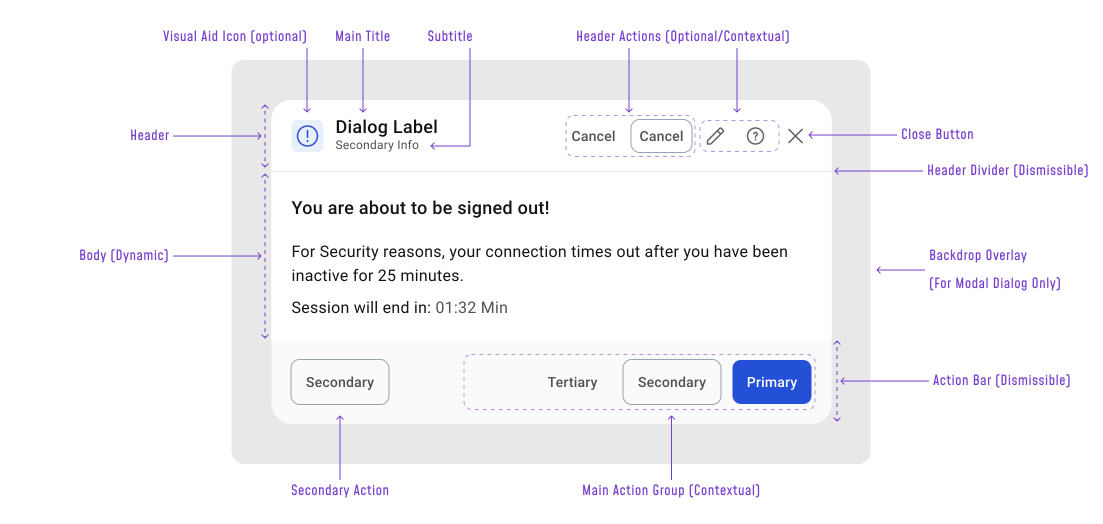
A dialog is built from four parts: a header, a body, an action bar and a backdrop for modal variants.
Header sets context before the user reads anything else.
- Title (required) — describes the task or decision, not the dialog type
- Subtitle — adds supporting detail when the title alone isn't enough
- Visual Aid Icon (optional) — reinforces the dialog type at a glance (warnings, errors, info)
- Header Actions + Close Button — optional, only on dismissible dialogs
- Header Divider — appears when the body scrolls or needs clear separation
Body contains only what the user needs to act. But, if they have to read through long explanations or look something up before responding, a dedicated page handles it better.
Action Bar split into two zones:
- Right: primary action + secondary options (the main decision flow)
- Left: reserved for actions that need separation from the main flow, usually something destructive like “Delete”
Keeping this left/right split consistent means users always know where to look without having to scan the whole dialog.
Backdrop dims the page behind modal dialogs to signal the rest of the interface is temporarily inactive.
When to Use Modal Dialogs
Modal Dialogs work best for short, focused tasks where sending the user to a new page would feel like overkill. Adding a row to a table, updating a single setting, or reviewing a few details are all cases where a dialog saves unnecessary navigation without losing context.
Common use cases:
- Confirming destructive actions
- Collecting a small amount of input
- Showing additional details about selected content
- Acknowledging critical information or warnings
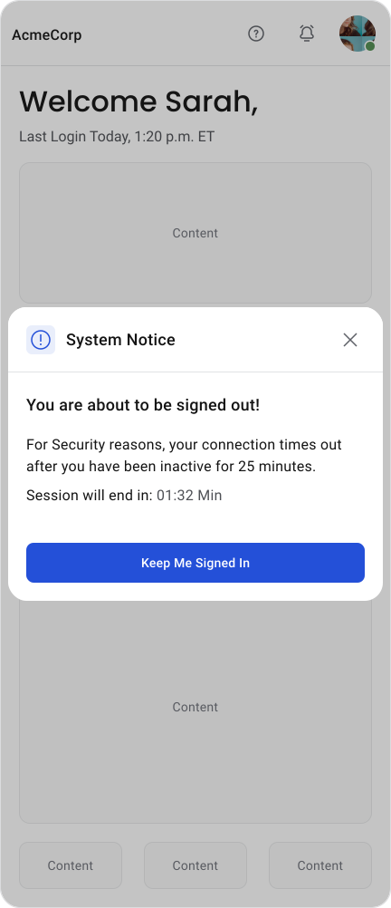
- Handling session expiration
- Walking users through a short multi-step flow
Important Note
Non-modal dialogs don't block the user, so the rules around interruption and necessity don't apply the same way.
Also if the task needs more than a few fields, requires research, or involves comparing information across the product, a dedicated page is the better call.
When Not to Use Modal Dialogs
The most common mistake is reaching for a modal dialog when something simpler would work. If the task involves a long form, complex decisions, or content that requires the user to go look something up first, a dialog will feel cramped and get in the way.
Avoid dialogs for:
- Large forms or multi-step flows that need more room
- Optional or informational content that doesn't need acknowledgment (simple instructional pop-over)
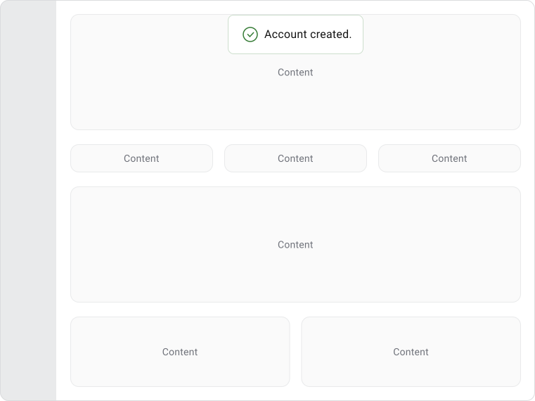
- Success messages, status updates, or lightweight feedback — use toasts, banners, or inline notifications instead
- Marketing messages or unrelated requests
Dialogs should almost never appear without a user triggering them. Unexpected interruptions frustrate users and, over time, train them to dismiss dialogs without reading them.
Modal vs Non-Modal
Dialogs can be either modal or non-modal. Understanding the difference is one of the most important design decisions because it determines how much control users retain while the dialog is open.
Modal dialogs block everything behind them. The page goes inactive (use of overlay), focus stays inside the dialog and the user has to deal with it before moving on.
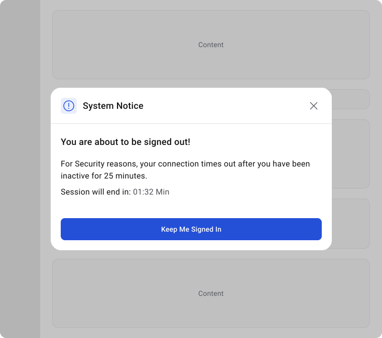
Alert Dialog
Used for warnings, errors and important information that requires acknowledgement.
Examples:
- Connection lost
- Session expired
- Storage full
- Security warning
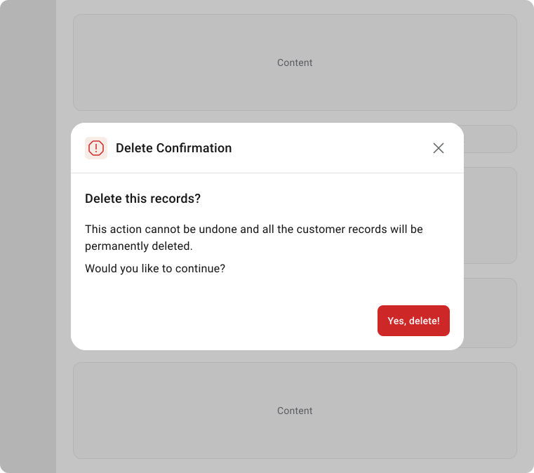
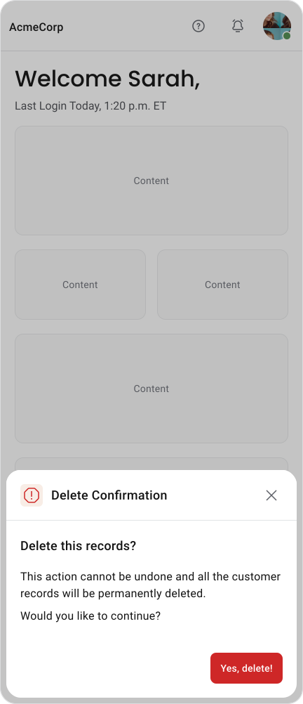
Confirmation Dialog
Used before irreversible or high-risk actions.
Examples:
- Delete record
- Remove user
- Discard changes
- Cancel subscription
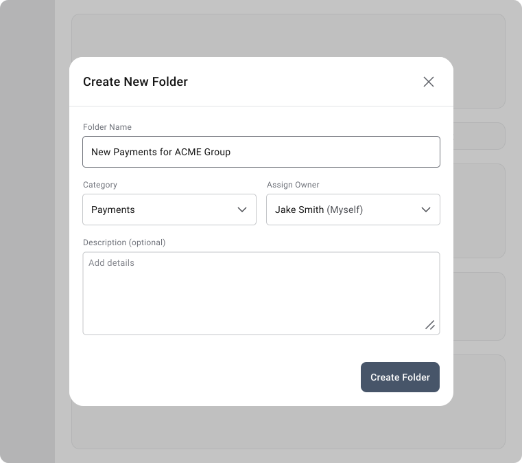
Prompt / Input Dialog
Used to collect information required before continuing.
Examples:
- Rename file
- Add customer
- Enter discount code
- Create folder
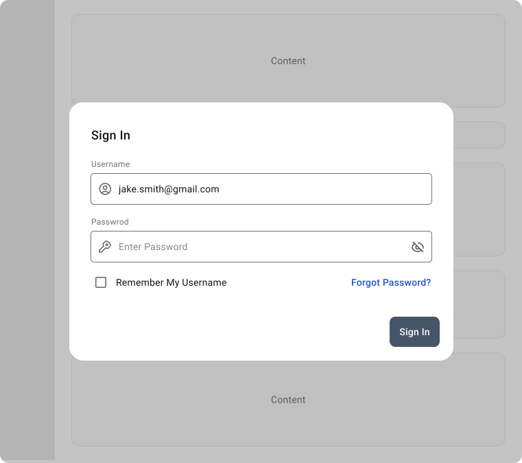
Login / Authentication Dialog
Used when authentication is required before continuing.
Examples:
- Login required
- Re-enter password
- Two-factor authentication
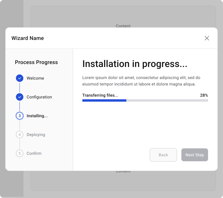
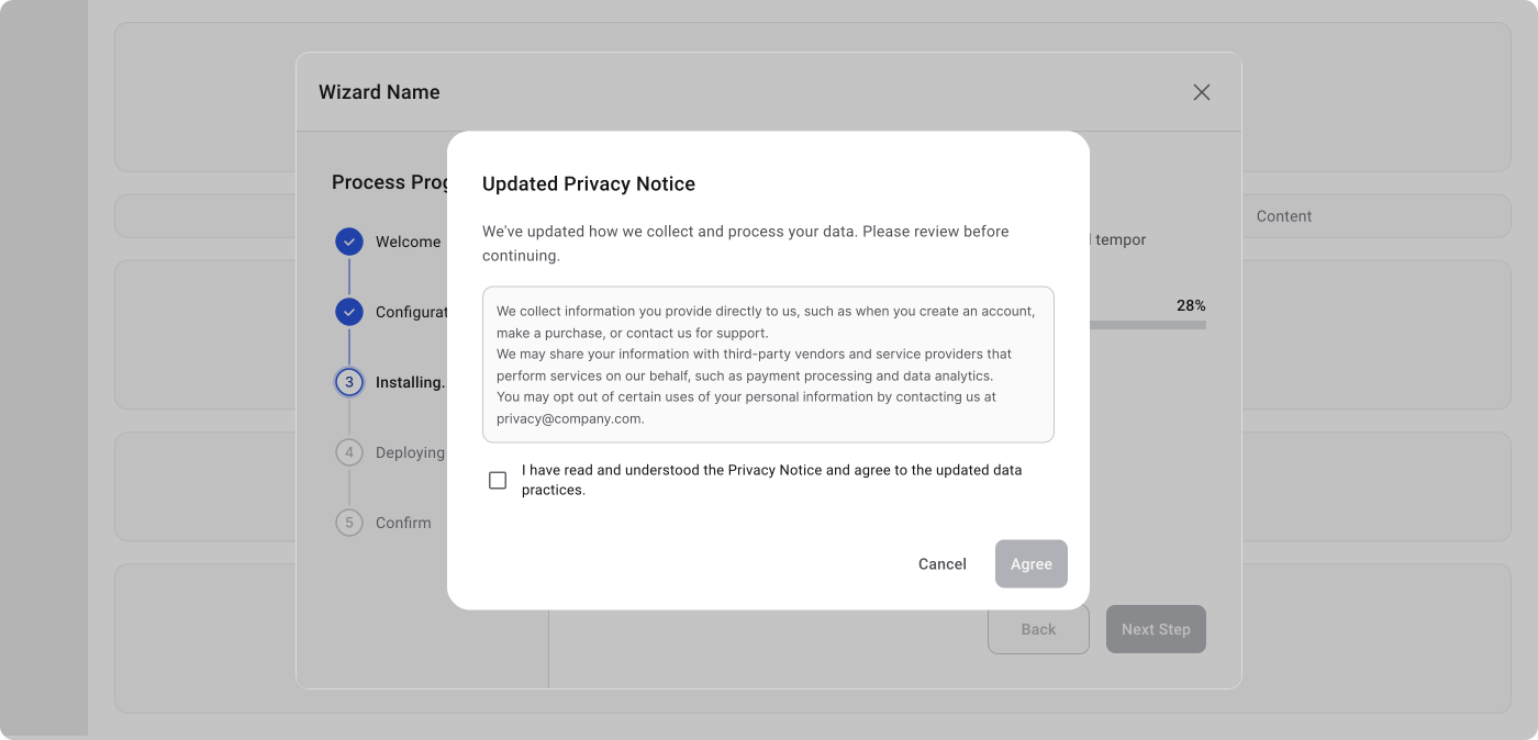
Multi-Step / Wizard Dialog
Used to split a complex process into smaller steps.
Examples:
- Software installation
- Account setup
- Product configuration
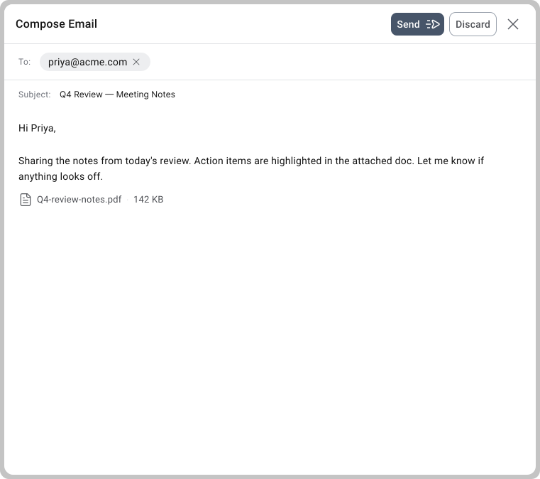
Full-Screen Dialog
Used when the task is too large for a standard dialog but should still feel temporary.
Examples:
- Create calendar event
- Compose email
- Edit profile
- Mobile form workflows
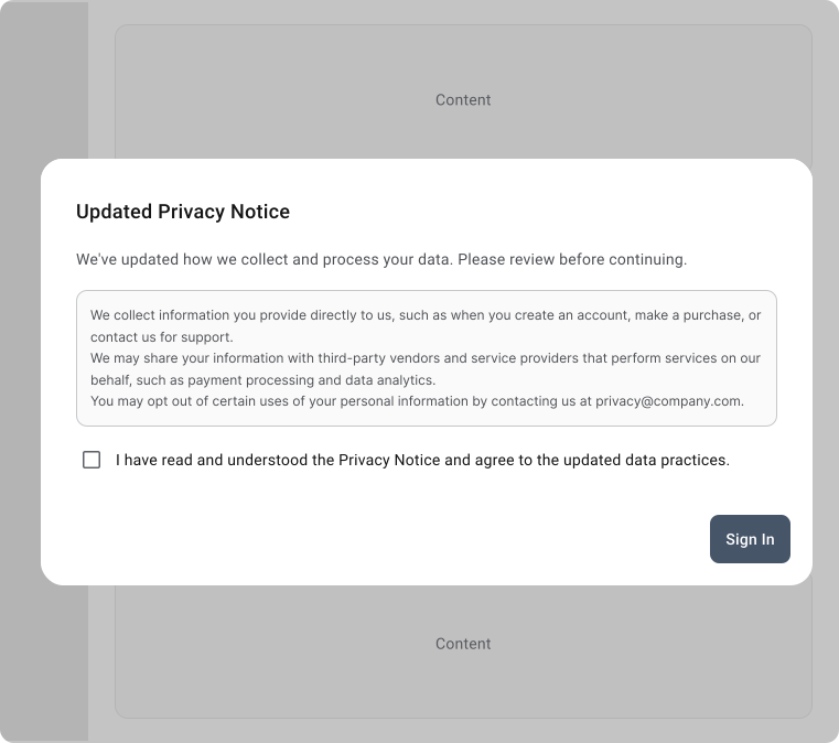
Acknowledgement Dialog
Used when users must explicitly accept information.
Examples:
- Terms acceptance
- Privacy notice
- Compliance acknowledgement
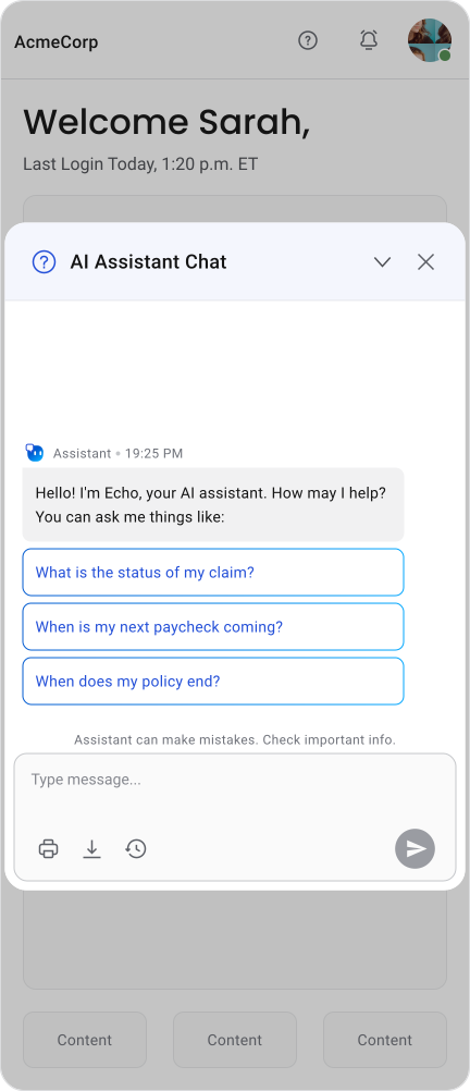
Non-modal dialogs stay active while the user keeps working. The page behind them stays fully interactive, which makes them a better fit when users need to reference other content while the dialog is open. Find-and-replace tools, floating chat windows and help panels all work this way.
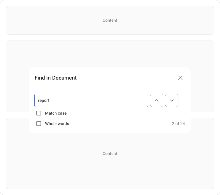
Find / Search Dialog
Users can search while continuing to work.
Examples:
- Find in document
- Find & Replace
- Search panel
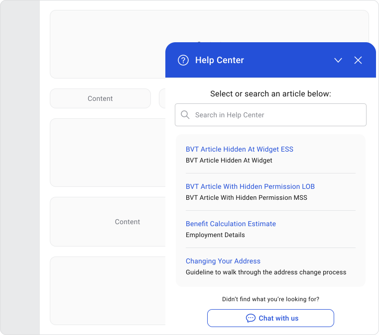
Help Panel / Help Dialog
Provides assistance without interrupting work.
Examples:
- Help center
- Product tour panel
- Contextual guidance
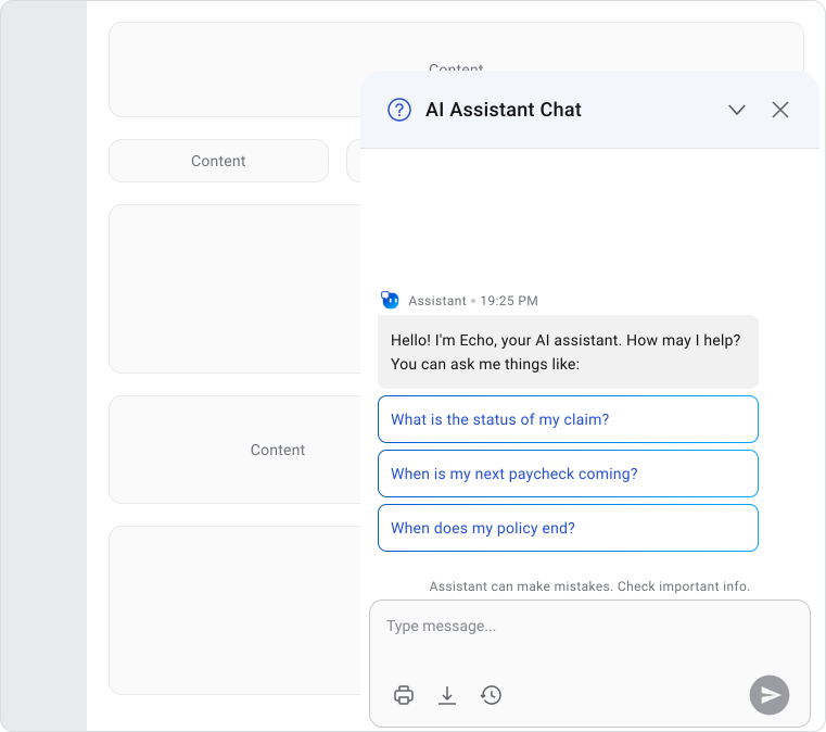
Chat / Support Window
Remains available while users continue multitasking.
Examples:
- Live chat
- AI assistant panel
- Customer support widget
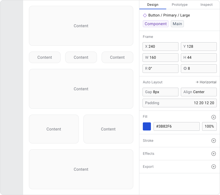
Inspector / Properties Panel
Shows details about selected content.
Examples:
- Figma properties panel
- Photoshop layers panel
- Settings inspector
- Floating Tool Picker
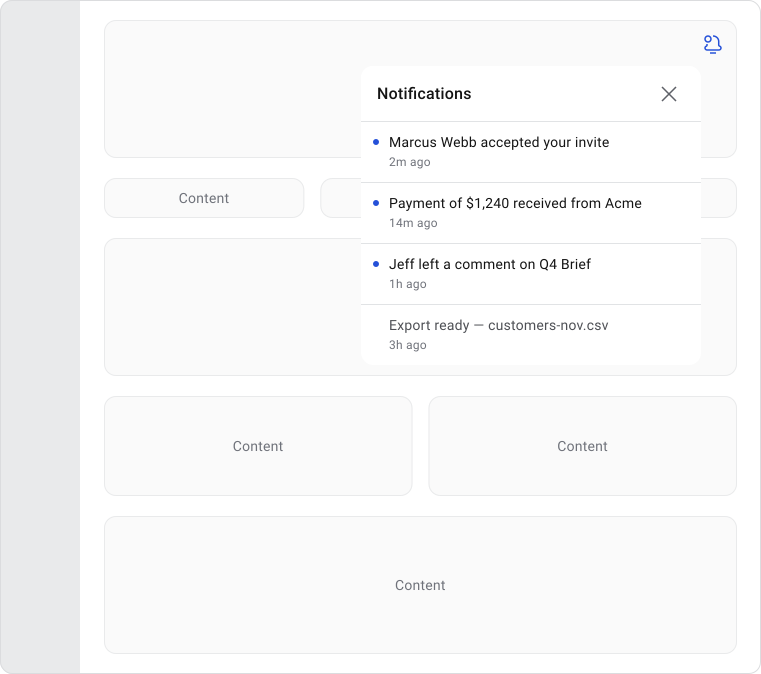
Notification Center
Displays information without requiring immediate action.
Examples:
- Activity feed
- System notifications
- Message center
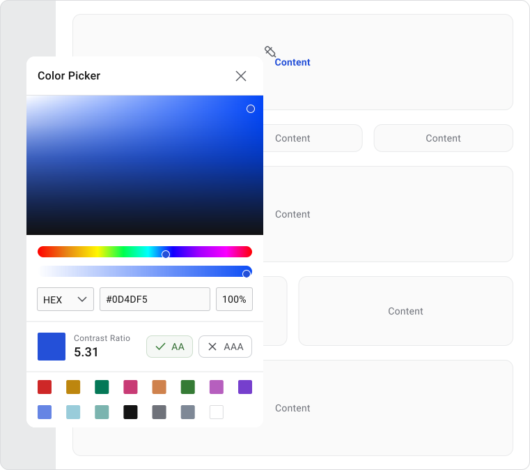
Floating Tool Window
Provides tools that support the primary workflow.
Examples:
- Color picker
- Formatting toolbar
- Calculator window
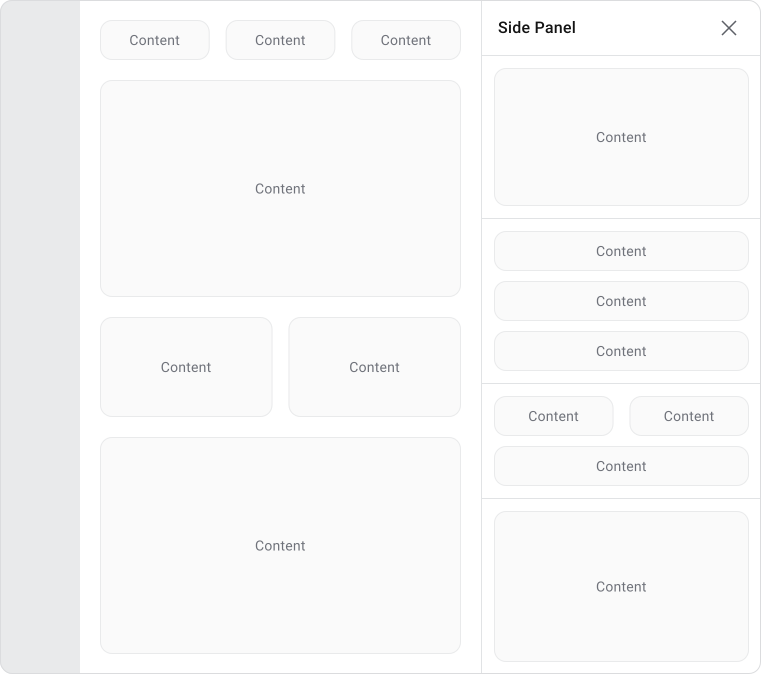
Side Panel / Drawer
Provides secondary content while keeping the main screen accessible.
Examples:
- Filters
- Cart preview
- Customer details panel
- File preview
Note!
The decision usually comes down to one question: does the user need to respond before continuing?
- If yes, modal.
- If they can carry on without it, non-modal is almost always the less disruptive option.
Interruption Cost
Every modal dialog pulls the user away from what they were doing. They have to stop, read, make a decision and then find their way back. That context switch has a real cost, even when the dialog itself is simple.
The longer the interruption lasts, the harder it is to recover from. This is why multi-step dialogs, large forms and stacked dialogs frustrate users even when they technically work fine. The problem isn't the dialog itself, it's how long it keeps the user away from their original task.
The interruption is worth it when the dialog prevents a mistake, protects data, or captures something the product genuinely needs at that moment. When the content is optional, informational, or unrelated to what the user was doing, the cost rarely justifies it.
UX Principles
A dialog should make its purpose obvious the moment it appears. The user should know why it opened, what they need to do and what happens when they confirm or dismiss, without having to dig through the content to figure it out.
Keep dialogs focused on one thing. When extra options, fields and flows get added over time, the dialog gets harder to scan and harder to complete. This is how dialogs slowly turn into mini-applications. The container was never meant to hold that much and users feel it.
Too much content or a long form?
- Dedicated page
- Slide-over / side panel (keeps context without blocking the full page)
Multi-step flow (+5)?
- Dedicated page with a stepper
- Full-screen takeover on mobile
If completing the dialog requires exploration, comparison, or learning something new, a different approach will serve the user better. Dialogs work well for decisions and short tasks. They don't work well as a substitute for a properly designed page.
Exploration or comparison?
- Dedicated page
- Split view or side-by-side layout
Contextual detail or supporting info?
- Inline expansion (accordion or inline in tables or widgets)
- Side panel
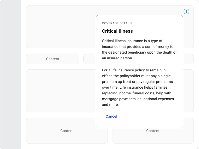
- Tooltip or popover for lightweight content
Optional or informational content?
- Inline notification
- Banner
- Toast
Note!
The general rule is: if the user needs space to think, compare, or learn, give them a real page. If they just need to glance and act, a dialog is fine.
Actions In Dialogs
The action bar is where the dialog either works or falls apart. Clear labels make the decision obvious.
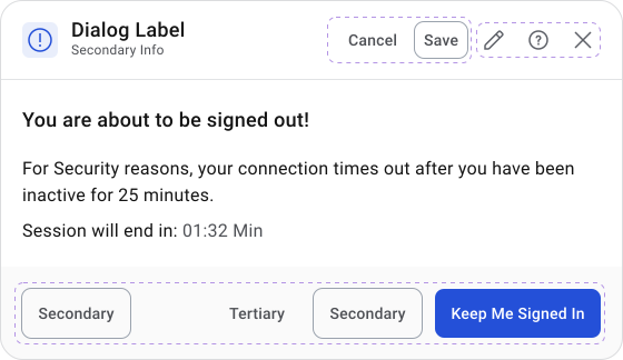
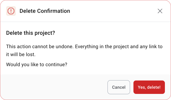
Most dialogs should have two actions:
- one that moves the task forward
- one that lets the user back out safely
When more options get added, users start evaluating choices instead of completing the task.
Destructive actions need extra care. If clicking a button deletes data, removes a record, or cancels something that can't be undone, the dialog should say that clearly, both in the content and in the button label. “Delete Project” is better than “Delete”. “This can't be undone” is worth saying out loud when it's true.
Important Note
Avoid generic labels like “OK”, “Yes”, “Confirm”, or “Done”. They tell the user nothing about what actually happens. “Delete Customer”, “Discard Changes”, “Save Draft”, or “Send Request” are better because the label describes the outcome, not just the act of clicking.
Behavior
Dialogs should always be triggered by something the user did. When one appears out of nowhere, the first reaction is confusion, not engagement. A clear link between the trigger and the dialog makes the interruption feel intentional rather than random.
Important! Once open, a modal dialog should hold focus until the user finishes or dismisses it. The page behind it goes inactive, the dialog stays prominent and nothing else competes for attention. When the user closes it, they should land exactly where they were before it opened.
Multi-step dialogs need a progress indicator. Without one, users can't tell how much is left, which makes the flow feel longer than it actually is.
Dismissal Behavior
There's no single right answer on how dialogs should dismiss. The right approach depends on how much is at stake.
- Low-risk dialogs, like informational messages or simple confirmations, can safely support clicking outside, pressing Escape, or using a close button. Users can exit quickly without consequences.
- As the stakes go up, dismissal should require a more deliberate action. If the dialog contains unsaved input, a destructive action, or a decision with real consequences, accidental dismissal can mean lost work or unexpected outcomes. In those cases, clicking outside shouldn't close the dialog and if the user tries to exit without completing the task, a short confirmation is worth the extra step.
- Every dialog needs a clear way out regardless of type. Users should never feel stuck. Whether that's a close button, a cancel action, or the Escape key, the exit should always be obvious and reachable.
Modal Stacking
Opening a dialog on top of another dialog is something most designers recommend avoiding. Each additional layer means the user has to track where they came from, what they were doing and how to get back. Focus management gets harder and the whole flow becomes harder to follow.
The one practical exception is a lightweight confirmation triggered from inside an existing dialog, typically to protect the user from losing unsaved work. That second dialog isn't really a separate flow, it's just asking “are you sure you want to leave?” before returning to the first.
That's acceptable because it serves the original task rather than adding a new one.
Accessibility
When a modal dialog opens, focus should move into it immediately and stay there until the user closes it. Tab navigation cycles through the dialog's interactive elements only.
Nothing behind the dialog should be reachable until it's dismissed. When it closes, focus returns to whatever triggered it so the user lands back where they started.
Keyboard behavior to cover:
- Tab and Shift+Tab cycle through all interactive elements inside the dialog
- Escape closes dismissible dialogs
- Enter or Space activates the focused action
For screen readers, the dialog needs a clear title and the right ARIA roles so assistive technology can announce what it is and why it's there. Background content should be hidden from the accessibility tree while the dialog is open, otherwise screen reader users will hear content they can't actually interact with.
Accessibility Implementation Checklist
- Focus moves into dialog on open
- Focus is trapped within dialog while open
- Focus returns to trigger element on close
- Escape key closes dismissible dialogs
- Tab order follows a logical sequence
- Dialog has role=“dialog” and aria-modal=“true”
- Dialog title is exposed via aria-labelledby
- Background content has aria-hidden while dialog is open
- All interactive elements are keyboard operable
- Error messages are announced by screen readers
Mobile Considerations
A dialog that works well on desktop rarely translates directly to mobile. Shrinking it down usually creates a cramped layout with small touch targets and content that's hard to scan. Mobile needs to be considered as its own context, not an afterthought.

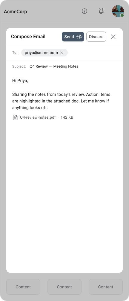

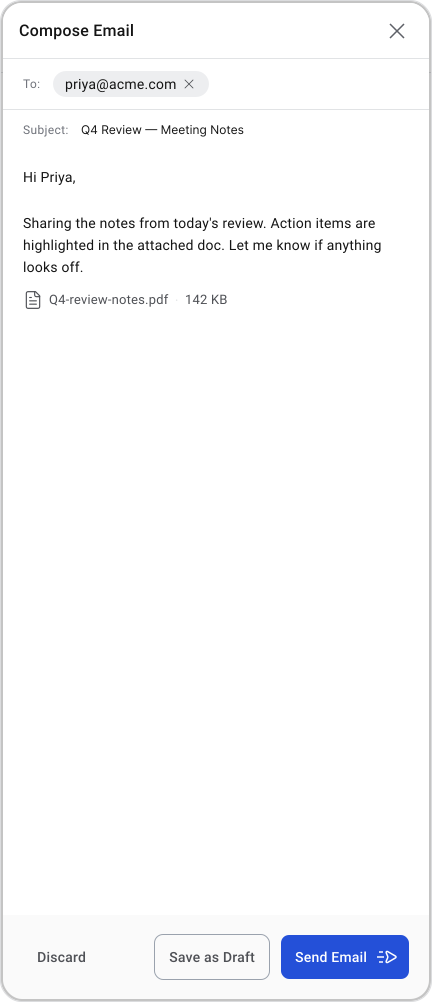
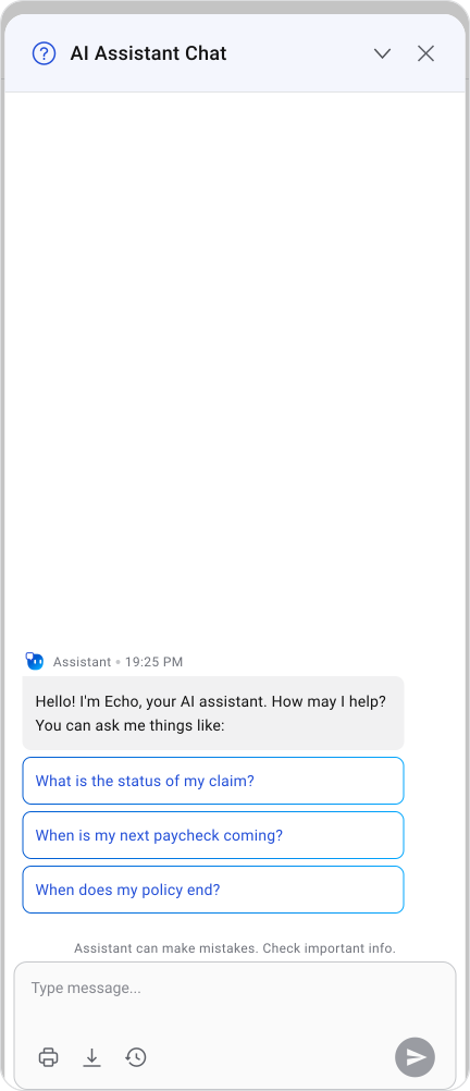
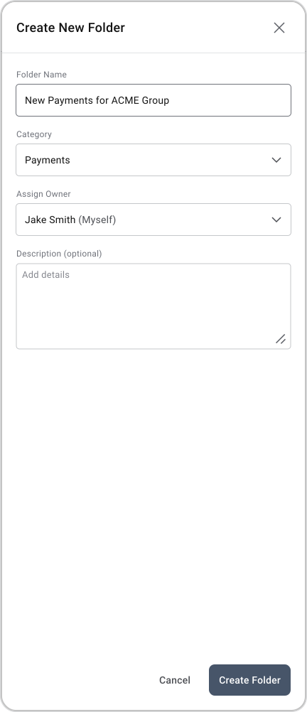
Simple confirmations and short messages work fine on mobile. Once a dialog involves a form, multiple fields, or a more complex flow, a full-screen takeover is almost always the better option. It gives the content room to breathe and feels more natural on a small screen.
Important Note
The virtual keyboard is an easy thing to overlook. When it opens, it can take up more than half the screen. A dialog that looks fine before the keyboard appears can become nearly unusable after it does.
Content gets pushed, buttons become hard to reach and users end up scrolling inside a dialog, which is a bad experience. Design for the keyboard-open state from the start, not as a fix later.
Full-Screen Modal Dialogs
Full-screen dialogs are the right call when a task is still temporary but needs more room than a standard dialog can offer. Creating a calendar event, editing a profile with multi tabs, managing complex settings, or filling out a longer form all fit this pattern. The user is still doing one focused thing, it just needs more space to do it properly.
They also solve a common design problem: instead of stretching a standard dialog with scrolling content and cramped layouts, a full-screen dialog gives the task room to breathe. Supporting interactions like pickers, selectors and secondary inputs can sit naturally within the layout instead of triggering stacked dialogs.
A few things that still apply even at full-screen:
- Users should always know they're in a temporary flow, not a new page
- A clear save or confirm action moves the task forward
- A discard or cancel action should warn before dropping unsaved work
- On mobile, full-screen is often the default for anything more complex than a short confirmation
The main thing to get right is the exit. Users need to know they can leave, what happens to their work when they do and how to get back to where they started.
Alternatives to Dialogs
A lot of dialogs exist because they were easy to implement, not because they were the right choice. Before reaching for a dialog, it's worth asking whether something less disruptive would do the job.
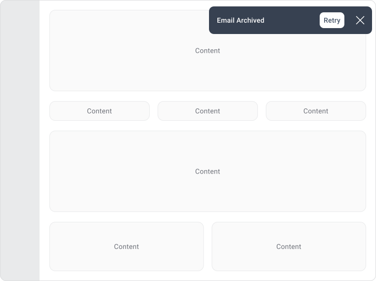
These are usually not dialogs because they don't require a confirmation or decision.
Snackbars
Examples:
- File deleted. Undo
- Message sent. View
- Upload failed. Retry
- Export ready. Open
Toast
Examples:
- Success message
- Saved notification
- Upload complete
Popover
Lightweight contextual information
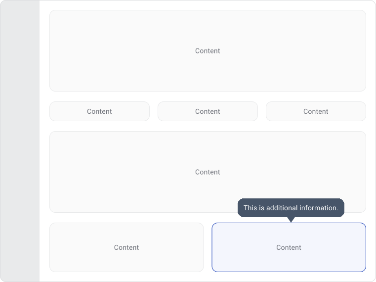
Tooltip
- Additional explanation
- Feature hint
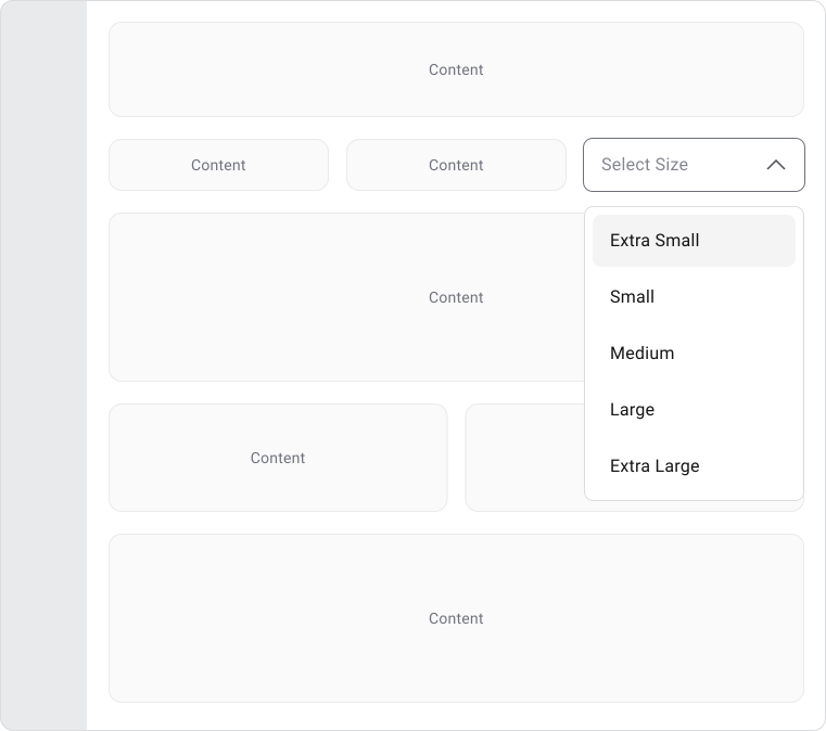
Dropdown Menu
List of selectable options
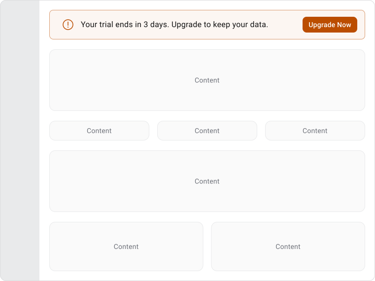
Banner
Page-level information or warnings
Best Practices
Keep dialogs focused on one thing. When multiple decisions or unrelated actions end up in the same dialog, users spend more time figuring out what's being asked than actually completing the task. If it feels like too much, it probably is.
Content should be short enough to scan. Users look for three things: why the dialog appeared, what the consequences are and what their options are. Long explanations slow that down. If more context is genuinely needed, find a way to surface it without making the user read through a wall of text first. Dialogs should feel like part of the product.
Consistent spacing, typography and interaction behavior signal to users that the dialog belongs to the same system they've been using. When a dialog looks or behaves differently from everything else, it creates a small but noticeable moment of uncertainty.
Common Mistakes
Overuse is the most damaging mistake. When dialogs appear for surveys, announcements, tips and non-critical messages, users start dismissing them without reading. Once that habit forms, even the important ones get ignored.
Trying to fit too much into a dialog is the next most common problem. Long forms, complex decisions and tasks that need room to breathe don't work well in a small container. The dialog ends up with scrolling content, cramped layouts and frustrated users. If it's growing that fast, it should probably be a page.
A few other patterns worth watching for:
- Vague action labels — “OK” and “Yes” tell the user nothing. If the label doesn't describe what happens after clicking, rewrite it.
- Modal stacking — layered dialogs are usually a sign of a deeper workflow problem, not a solution to one.
- Missing context — if the user needs to close the dialog to find information before they can respond, the wrong pattern is being used.
Final Thoughts
Dialogs have an impact on experience precisely because they interrupt. Most components sit in the background and support what the user is doing. A dialog temporarily takes over.
A dialog should exist because the interruption is genuinely worth it, not just because something needs to be shown. When used well, a good dialog feels almost invisible. The user sees it, knows what to do, acts and gets back to work without thinking twice about it.
When a dialog starts feeling like a page or a workflow, it's trying to solve a problem it wasn't built for. That's the signal to step back and find a better fit.
🔗 Sources
Mastering Modal UX: Best Practices, Common Pitfalls and Real-World Examples
Source LinkModern Enterprise UI design — Part 2: Modal dialogs
Source LinkModal Dialogue
Source LinkDialogs - Carbon Design
Source LinkModal & Nonmodal Dialogs: When (& When Not) to Use Them
Source LinkDialog UI
Source LinkDialogs
Source LinkDialog
Source LinkDialogs Material.io
Source Link