Left Side Navigation Research
View Figma ComponentKey Takeaways
- Side navigation scales better than top navigation in large systems
- Vertical lists are faster to scan than horizontal menus
- Organization quality matters more than visual styling
- Users rely heavily on predictable placement and consistency
- Navigation should reduce orientation effort, not increase it
Overview
As products grow, users rely more on navigation consistency and predictability. Once people learn where things are, they stop actively reading navigation and start using the product from habit and memory.
Side navigation became the dominant pattern in SaaS and enterprise products because vertical space handles complexity more naturally than horizontal menus. It offers better hierarchy visibility, which improves scanning and reduces navigation effort over time.
Top navigation still works for smaller products with fewer sections and lower navigation frequency. The choice mostly depends on how large the product is, how many areas users need to reach and how much the navigation is expected to grow.
Anatomy of a Left Side Navigation (Slide Bar)
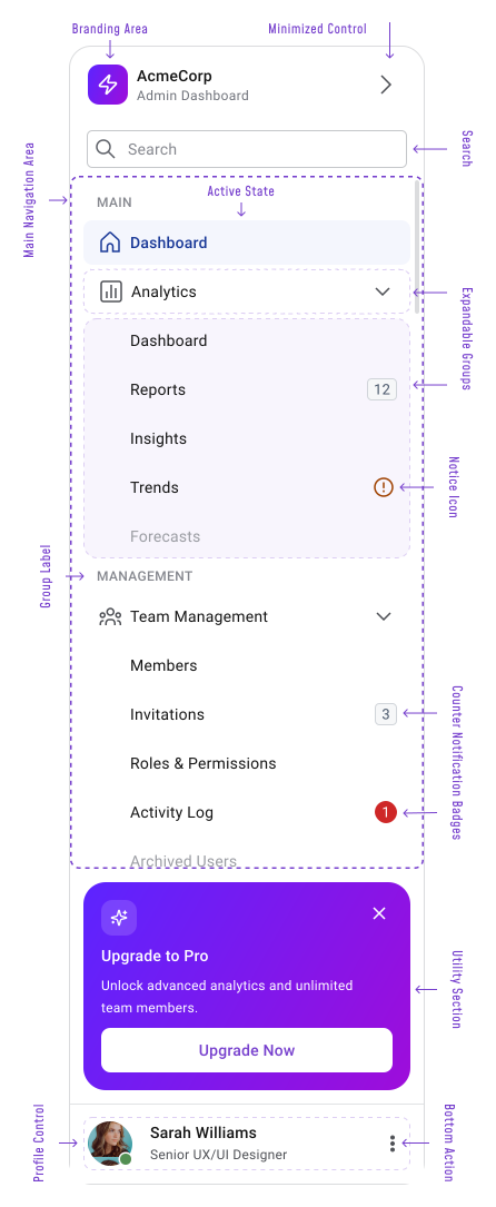
A modern sidebar usually combines several layers into one stable interface. The top area holds branding, workspace switching, or account context. Below that sits the main navigation, followed by secondary tools like settings, support, or utility actions.
Expandable tab groups help organize larger products into thematic sections without overwhelming the UI visually.
Typical sidebar elements:
- Brand or workspace area
- Main navigation with group labels
- Expandable tab groups
- Active state indicator
- Collapse / expand behavior
- Counter / notification badges
- Utility section (persistent area for supporting actions and system-related features that sit outside the primary navigation hierarchy)
- User profile or account controls
- Optional search
Important Note
Collapsed sidebars work well in dense dashboards where screen space matters, but icon-only navigation needs care. Users scan labels faster than they recall icon meanings from memory, especially in enterprise products with domain-specific terminology.
Side Navigation
Side navigation works best in products with large or growing information architecture. Enterprise tools, dashboards, CRMs, analytics platforms, admin panels and productivity products all benefit from stable vertical navigation because users move between sections frequently during active workflows.
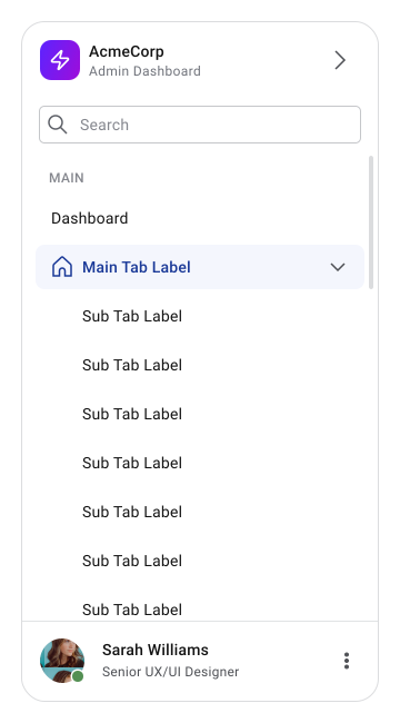
The pattern gets more valuable as the product expands. Adding more tabs to a horizontal top navigation creates layout pressure fast, while vertical navigation handles growth more naturally since scrolling is already part of how users interact with the product.
It's especially effective when:
- Users switch sections often
- Grouping and organization matter
- The product keeps adding tabs over time
- Users spend long sessions inside the product
Top Navigation
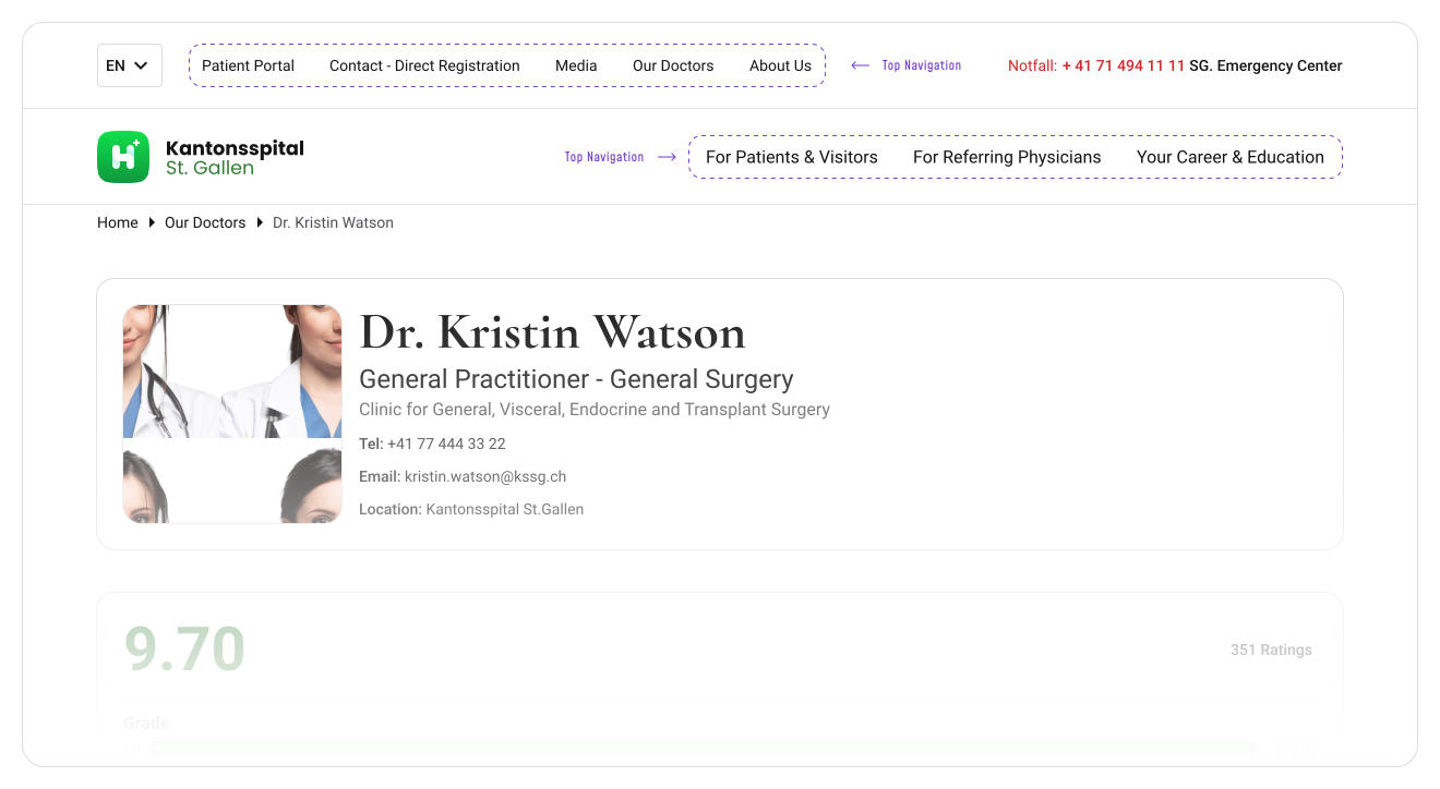
Top navigation fits better for websites, content-focused experiences and smaller products with fewer main sections where users don't navigate heavily.
Information Architecture
Most navigation problems are actually organization problems. A clean sidebar can't compensate for vague grouping, weak category naming, or poor structure. Users should understand where things live before they even interact with the navigation.
Larger products benefit from vertical navigation because more tabs stay visible without forcing artificial grouping. Once teams start compressing unrelated sections under generic categories, discoverability drops fast.
Weak organization usually looks the same across products:
- Vague labels and icons
- Overloaded categories
- Inconsistent grouping
- Too many nested levels
Good organization feels obvious. Related areas stay together, naming is predictable and users can scan quickly without overthinking where something might be.
Real Product Constraints
If only some items naturally support icons, forcing icons everywhere creates visual inconsistency. Abstract icons that don't map cleanly to a tab label slow recognition more than they help. This gets harder when the dev team's icon library is limited and custom icons aren't an option due to framework constraints.
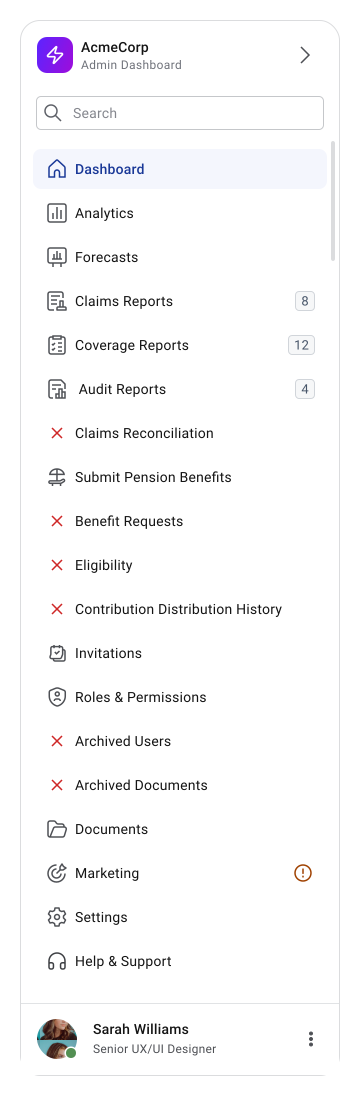
Solutions 1: Icons only for top-level grouped sections (Recommended)
Group related items and use icons only on the parent group, not on every sub-item. Sub-items use a label and a selection indicator only. This keeps the structure readable without forcing icons where they don't belong naturally.
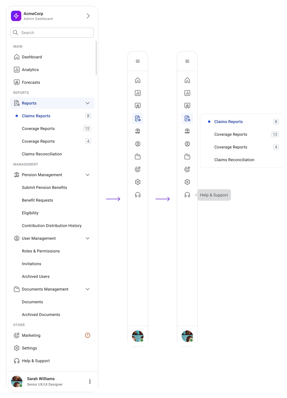
When the sidebar collapses, users still know which group they're in. On hover, only the sub-items from that group expand.
Users build navigation memory fast in products they use daily, so grouping matters. Expandable groups help large products stay manageable. Once users have to open multiple nested levels just to reach a destination, navigation starts slowing workflows.
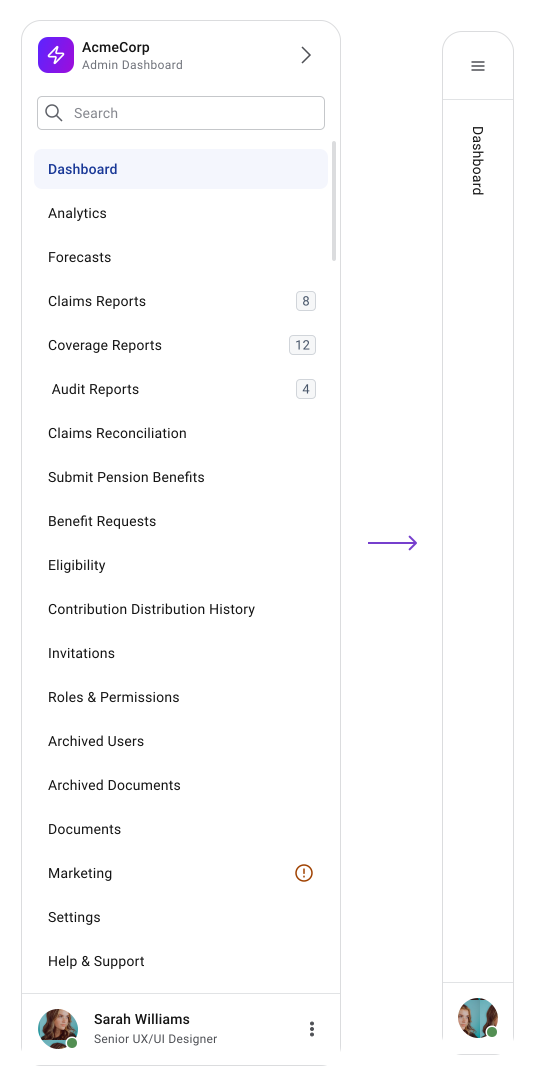
Solutions 2: No Icons At All
No icons are allocated to all tabs. Without icons, the sidebar can still work. The collapsed state just needs a different approach:
- The sidebar dismisses fully and reopens via a hamburger menu. Works well on websites
- Show only the active label vertically when collapsed. Not perfect, but keeps orientation without icons.
Important Note
Users should always know where they are, where they can go and which section they're currently inside. Once collapsed navigation removes that clarity, usability drops quickly.
UX Principles
Users scan vertical lists faster than horizontal menus. The left side of the interface naturally receives more visual attention, which is part of why side navigation performs well in workflow-heavy products.
Stable grouping, predictable placement, correct labeling and consistent interaction patterns all reduce orientation effort over time.
Scalability & Product Growth
Most navigation systems are designed around current product size rather than future growth. That breaks down fast in enterprise environments where features, tools and settings keep expanding.
Vertical Navigation
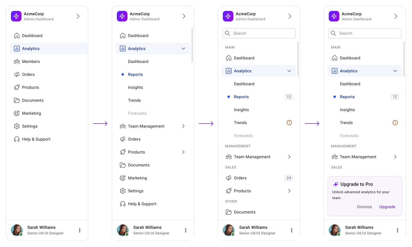
Vertical navigation handles this better. New sections, features and actions can be added without restructuring the existing model, which preserves familiarity and reduces relearning. Horizontal navigation eventually runs out of room.
Vertical navigation stays flexible as the product grows. Scalable navigation systems tend to keep grouping flexible, support gradual growth, avoid major restructuring and maintain predictable organization over time.
Discoverability vs Space Efficiency
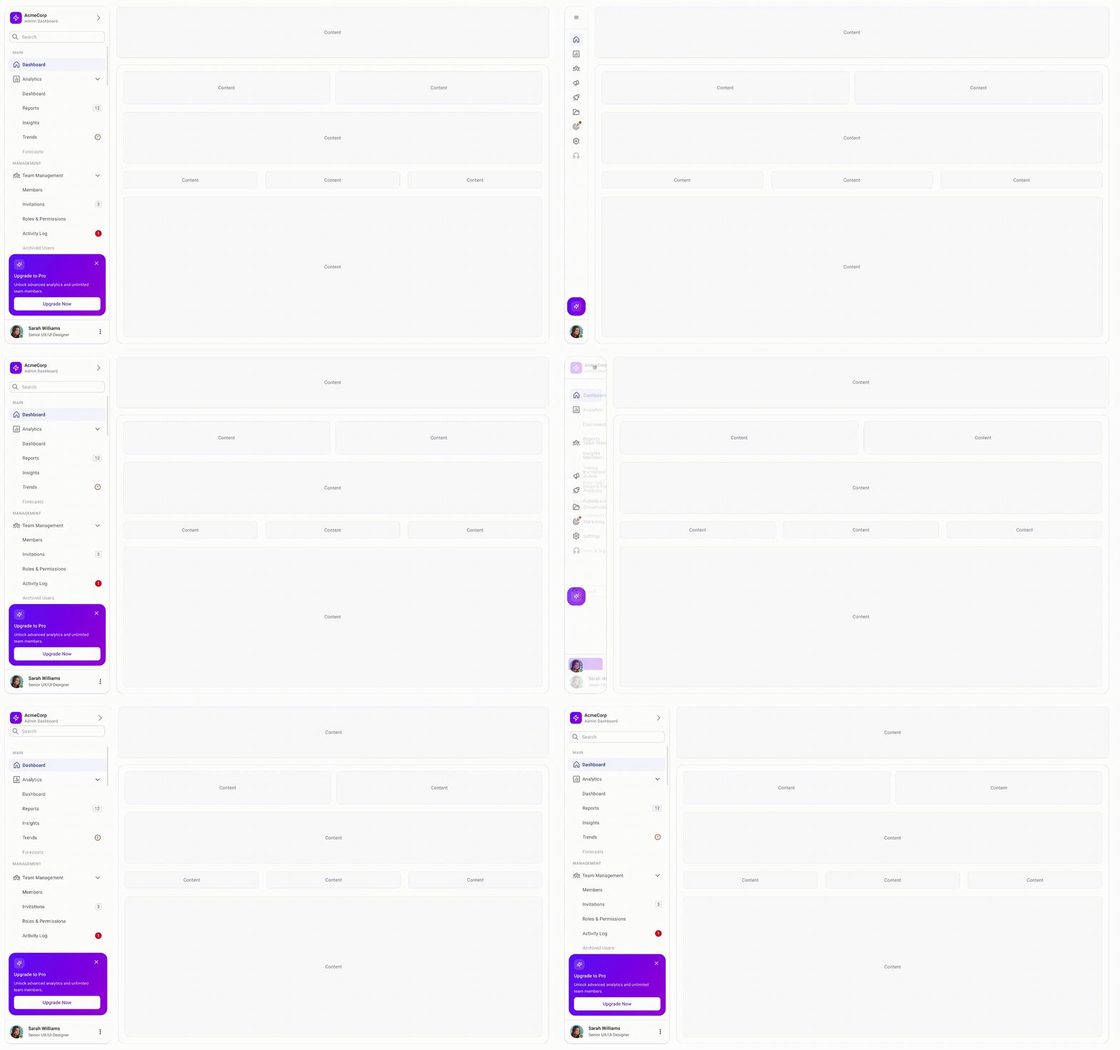
Persistent side navigation keeps tabs visible during scanning, but takes space away from the main content area. Collapsed sidebars and top navigation preserve more room for content but reduce visibility and increase the effort to move around.
This tradeoff matters more in dashboards and enterprise products where navigation complexity and workspace density both compete for the same space. Hidden navigation like hamburger menus reduces clutter but also reduces discoverability.
On mobile that's an acceptable constraint. On desktop it usually just adds unnecessary steps.
Accessibility
Navigation should be easy to scan and operate regardless of input method. Keyboard navigation needs to feel predictable, focus states need to stay visible and active states should never rely on color alone.
Contrast matters here more than most areas because users scan navigation constantly. Labels, icons, hover states, active states and focus indicators all need sufficient separation from surrounding surfaces.
Key considerations:
- Visible keyboard focus states
- WCAG compliant contrast
- Clear active state differentiation
- Screen reader support and proper ARIA structure
- Accessible collapsed state behavior
Collapsed sidebars need extra attention because once visible labels disappear, meaning depends entirely on icons and tooltips.
Mobile Considerations
Desktop side navigation rarely translates directly to mobile. Most systems shift to drawers or overlays because persistent sidebars take up too much space on smaller screens.
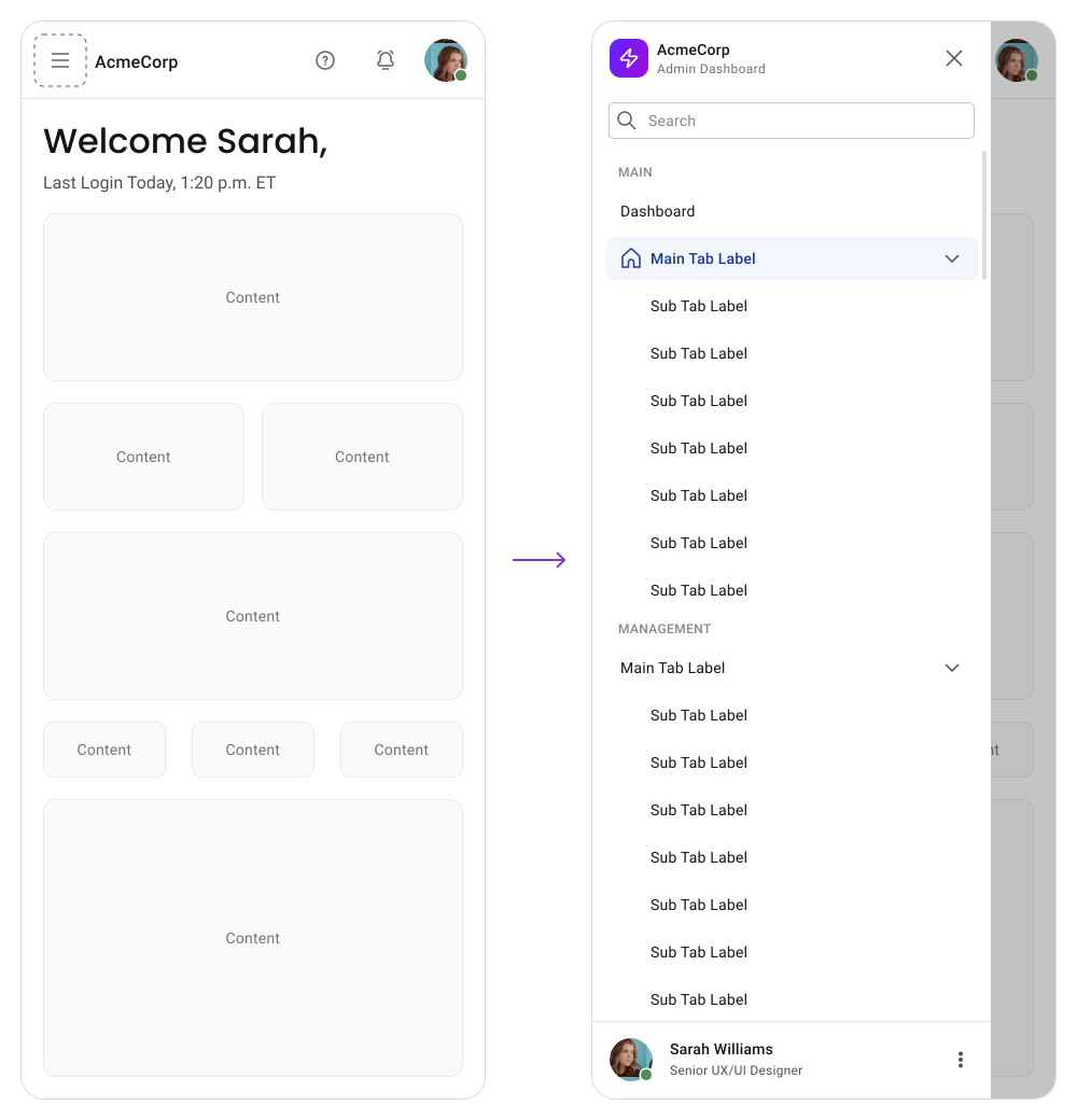
The grouping and interaction logic should stay consistent across breakpoints. Completely changing navigation patterns between desktop and mobile creates unnecessary relearning.
Best Practices
Clear labels outperform detailed/long labels almost every time. Grouping related tabs reduces scanning effort, especially in enterprise products with large interfaces. Users should be able to understand the organization quickly and move through workflows without thinking about the navigation itself.
Strong navigation systems usually:
- Prioritize common actions
- Keep organization simple
- Maintain consistent grouping
- Scale without major restructuring
- Support fast scanning
- Preserve positional memory
Consistency matters because users depend on scanning rhythm. Repeating patterns for spacing, indentation, states and grouping build familiarity over time.
Common Mistakes
- Most navigation problems come from forcing the wrong pattern onto the wrong product size. Small products overcomplicate navigation with enterprise-style sidebars, while large products try to compress too many tabs into a horizontal menu.
- Another common issue is relying too heavily on icons. Icons support recognition but rarely replace readable labels effectively in complex systems.
Frequent navigation failures usually include:
- Vague category labels
- Too many nested levels
- Icon-only navigation
- Weak active states
- Excessive hidden navigation
- Constant navigation redesigns
Examples / Patterns
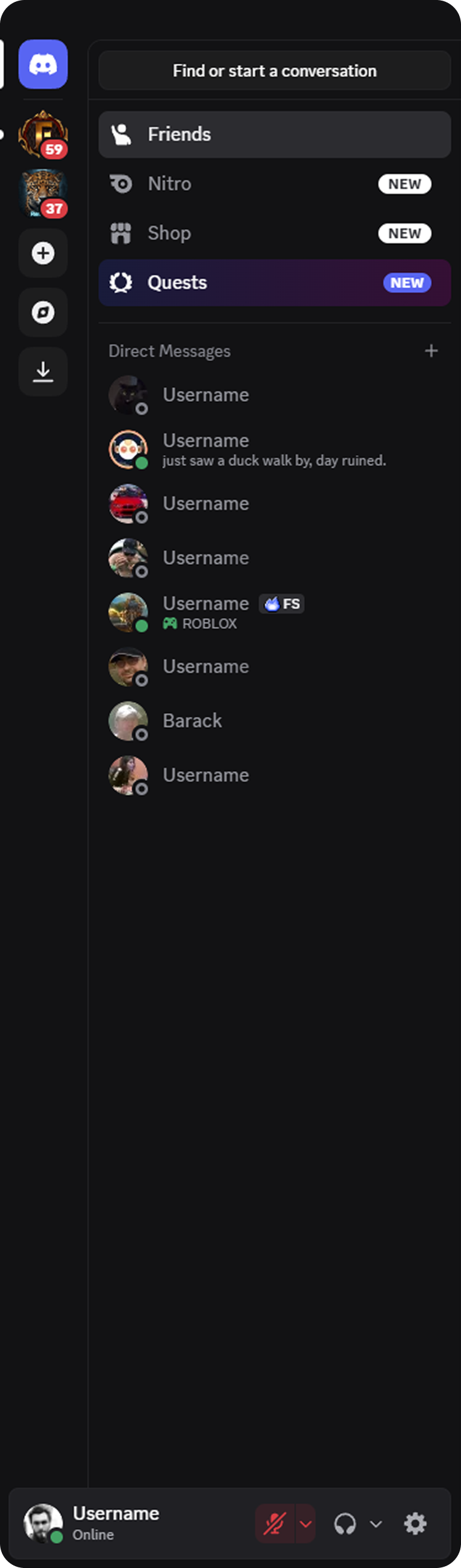
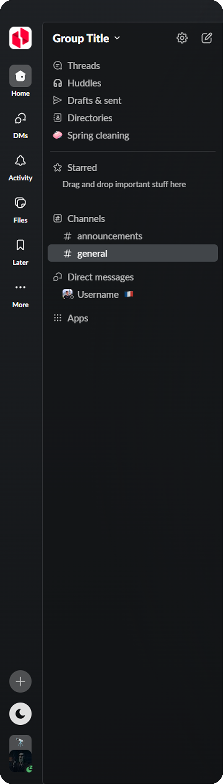
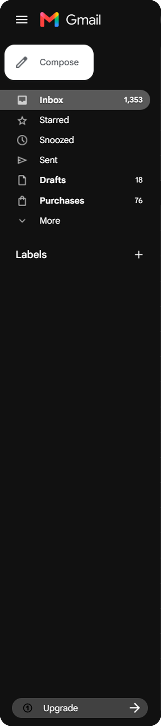
Products like Slack, Gmail, Discord, Outlook and Google Drive use persistent left navigation because users constantly move between workspaces, files, channels and settings throughout long sessions. The navigation needs to stay visible, scalable and easy to scan the entire time.
Discord
Slack
Outlook

Gmail
Marketing websites tend to work better with top navigation because content visibility matters more than workflow efficiency.
Many enterprise systems also combine patterns:
- Persistent side navigation
- Contextual top navigation
- Workspace switchers
- Secondary navigation bars
Final Thoughts
Simple products can survive weak navigation for a long time because users have fewer decisions to make. Enterprise systems can't.
As products grow, navigation starts affecting almost every part of the experience: discoverability, efficiency, orientation, memorability and perceived product quality.
The best navigation eventually feels invisible. Users stop thinking about the interface and move through the product automatically. That only happens when grouping, behavior and predictability stay consistently aligned over time.
🔗 Sources
UX Design for Navigation Menus
Source LinkTop Navigation vs Side Navigation for Your Interface — What to Choose?
Source LinkNavigation in UX/UI Design
Source LinkCase study research: Sidebar Navigation
Source LinkTop Navigation vs Left Navigation: Which Works Better?
Source LinkLeft Hand Tab Navigation
Source LinkTop vs. Left Website Navigation: Unraveling the Pros and Cons from a Tech Users Perspective
Source LinkA Quick Sidebar Tutorial for UI Designers
Source LinkMastering navigation sidebars in product design.
Source LinkTop vs side navigation: Which one is better for your product?
Source LinkSidebar UI
Source LinkLeft-Side Vertical Navigation on Desktop: Scalable, Responsive and Easy to Scan
Source LinkBest UX Practices for Designing a Sidebar
Source Link