Input Fields Research
View Figma ComponentKey Takeaways
- Input fields should stay clear and predictable. Labels need to be easy to understand, states should remain visible and users should immediately know what is required.
- Consistency makes forms faster to scan and easier to complete. Reusing the same sizes, spacing and structure helps users move through forms without stopping to re-learn patterns.
- Good form design reduces effort before errors happen. Labels, helper text, formatting and validation should guide users through the input process and prevent confusion early.
Principles
Text fields are one of the main interaction points in a product, so they need to feel clear and predictable. Three principles help keep them usable across different flows and contexts.
Discoverability
A text field should be easy to spot and clearly look interactive. Placement, spacing, borders and labels should help users immediately recognize where input is expected.
Clear State
States should always communicate what is happening. Required, hover, focus, error and disabled states need to look visually distinct so users understand availability, interaction and validation at a glance.
Efficiency
A text field should reduce effort during data entry. Clear labels, helpful examples, formatting hints and concise helper text make it easier for users to understand what to enter and avoid mistakes.
Anatomy
Text fields should clearly look interactive and easy to use. Users need to quickly recognize where they can type, what information is expected and whether the field is in a normal, focused, or error state.

A standard input field is usually built from the following parts:
- Label
- Input Area (Placeholder)
- Helper Text (Microcopy)
- Error Message (Microcopy)
- Icons or Actions (optional)
Default State
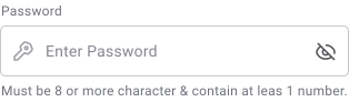
Hover State
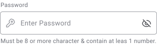
Focus State
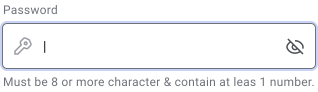
Active / Pressed State
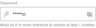
Disabled State
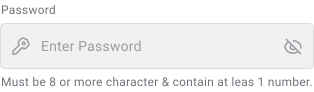
Read Only State
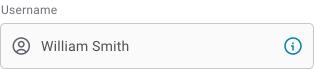
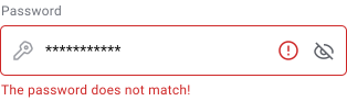
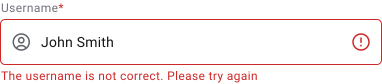
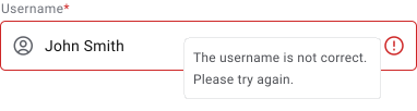
Error State
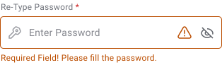
Warning State
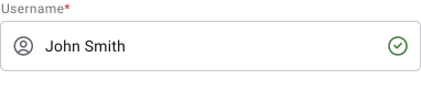
Validation State
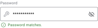
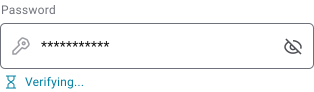
Most input variations are built from the same base text field structure, with adjustments for specific types of data or interaction patterns. Different input types help users enter information faster, reduce formatting mistakes and improve validation.
Below are some of the most commonly used input types across interfaces:
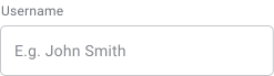
Text Input Field
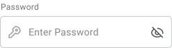
Password Input Field
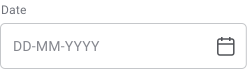
Date Input Field
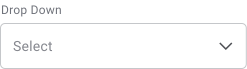
Selection Input Field

Phone Input Field
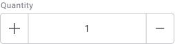
Quantity Input Field
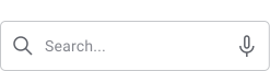
Search Input Field

Password Input Field
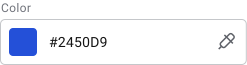
Color Input Field
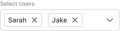
Multi ‑ Selection Input Field

Comment / Description Input Field
Input Field Styles
Underline
For Read Only / Data Display
Pros
- Minimal and visually lightweight
- Works well in simple or mobile-focused interfaces
- Keeps layouts feeling less crowded
Cons
- Weak visual boundaries make fields harder to scan in dense forms
- Easier to miss when many inputs appear together
- Lower affordance can reduce accessibility and interaction clarity
Use It When
- Very simple forms
- Low-density layouts
- Read-only data display
- Interfaces where reducing visual noise is more important than strong field separation
Outline (Fixed Label)
Recommended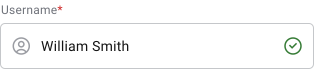
Pros
- Labels remain visible at all times, making fields easier to understand
- Strong accessibility and readability across different form types
- Easier to scan in long or data-heavy forms
- Familiar pattern that most users already recognize
- Placeholders can support the label instead of replacing it
- Faster form completion because users can move through fields more confidently
- Left-aligned fields stay visually organized and consistent
- Clear structure without making layouts feel overly dense
Cons
- Requires more vertical space
- Can feel less visually lightweight compared to newer styles
Use It When
- Forms are critical, such as checkout, onboarding, or dashboards
- Interfaces contain large amounts of data entry
- Clarity, speed and consistency are the priority
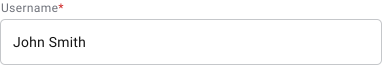


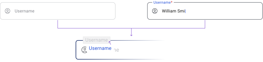
Outline (Adaptive Label)

Pros
- Saves vertical space by placing the label inside the field
- Feels modern and visually lightweight
- Works well in short and simple forms
- Users can immediately see what the field expects
Cons
- Shrinking or moving labels reduce readability during input
- Labels can be mistaken for placeholders
- Harder to scan in long or complex forms
- Placeholder examples become difficult to support unless the field is active
- Error states, icons and helper text can make the field feel crowded
- In larger forms, placeholders often become hint text instead of true labels, which creates inconsistency when states change
Use It When
- Space is limited
- Forms are short and simple
- Some usability trade-offs are acceptable
Underline Filled

Pros
- Strong visual grouping
- Works well in interfaces with heavier visual contrast
- Makes active areas more visually obvious
Cons
- Can feel visually heavy in large forms
- Adds noise in dense enterprise layouts
- Multiple filled fields close together can reduce scannability
Outline (Contained Label)

Pros
- Structured and visually organized
- Labels remain visible during input
- Clear separation between fields
Cons
- Slightly more visually complex
- Less familiar than standard outlined fields
- Users may need more time to scan the layout in large forms
Side Labeled (Left or Right Aligned)

Pros
- Compact and space efficient
- Useful for structured data entry, tables and admin tools
- Supports faster horizontal scanning in repetitive workflows
- Reduces vertical space usage
- Handles longer labels more easily
Cons
- Harder to scan vertically in long forms
- Poor fit for mobile layouts
- Different label lengths create uneven spacing and inconsistent alignment
- Can introduce excessive empty space in responsive layouts
- Less effective in complex dashboards unless limited to dedicated form sections
Left Aligned
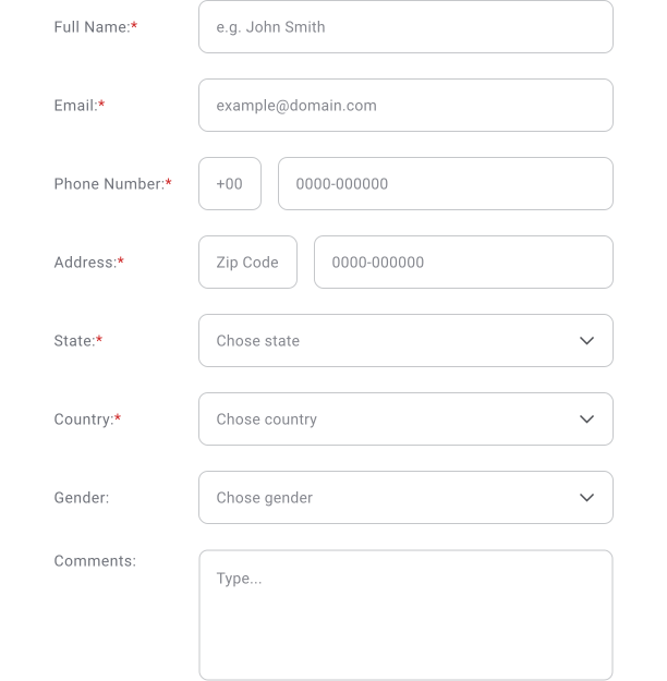
Right Aligned
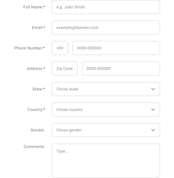
Icons, Placeholders & Feedback Text
Icons, placeholders and feedback text help users understand fields faster and move through forms with less hesitation. When used well, they reduce mistakes and make input states easier to recognize.
Leading Icons
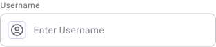
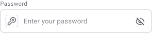
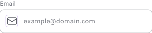
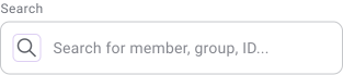
Leading icons help users quickly recognize the purpose of a field. They are commonly used in login forms, search fields and standalone inputs where fast recognition improves scanning.
They are placed on the left side of the input field before the placeholder.
Trailing Icon
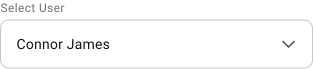
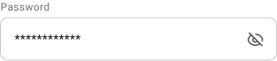
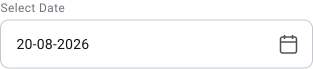
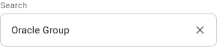
Trailing icons trigger actions related to the field content. Common actions include showing or hiding passwords, clearing input, opening calendars, triggering auto-complete, or expanding dropdowns.
They are placed on the right side of the input field and should remain visually connected to the action they control.
Feedback Icon
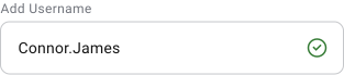
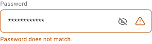
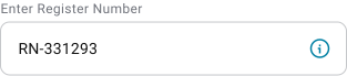
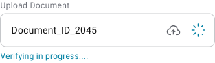
Feedback icons help draw attention to validation states, warnings, or errors. They are often paired with feedback text to make issues easier to notice and understand quickly.
These icons can appear inside the input field, usually after trailing actions, as long as spacing, color and behavior clearly separate them from interactive controls.
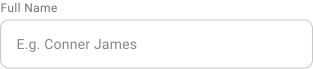
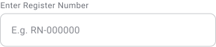
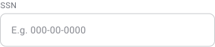
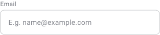
Placeholders provide short hints about the expected input. They should support the label, not replace it. Keep placeholders short and practical, usually a word, format example, or simple hint that helps users understand what to enter.
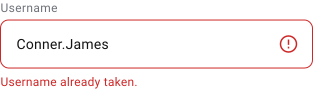
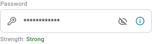
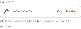
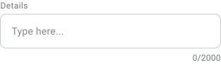
- Feedback text explains validation states, errors, or additional guidance. It should stay short, direct and easy to understand while users are actively completing the form.
- Feedback text can be paired with icons to improve visibility and help users identify issues faster.
- Comment fields should also have reasonable character limits. Extremely long input makes content harder to review, scan and process later.

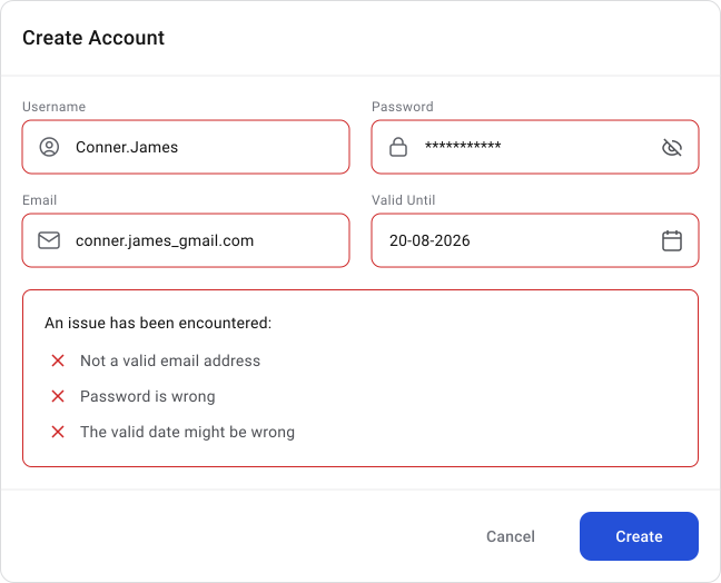

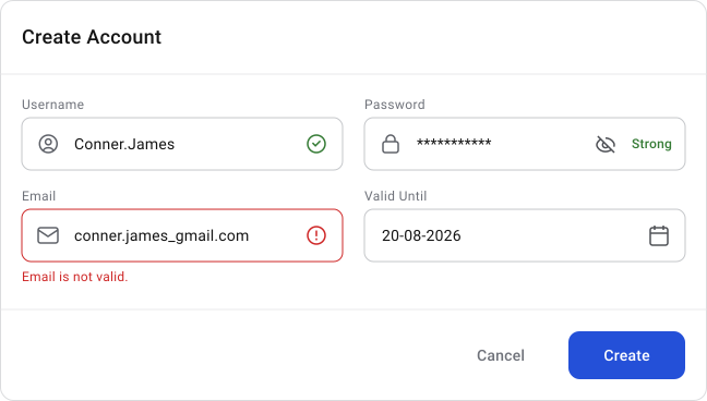
Important Note
Only highlight the fields that actually need attention. Users should immediately see where the issue is and how to fix it without searching through the form.
Input Field Groups and Structure
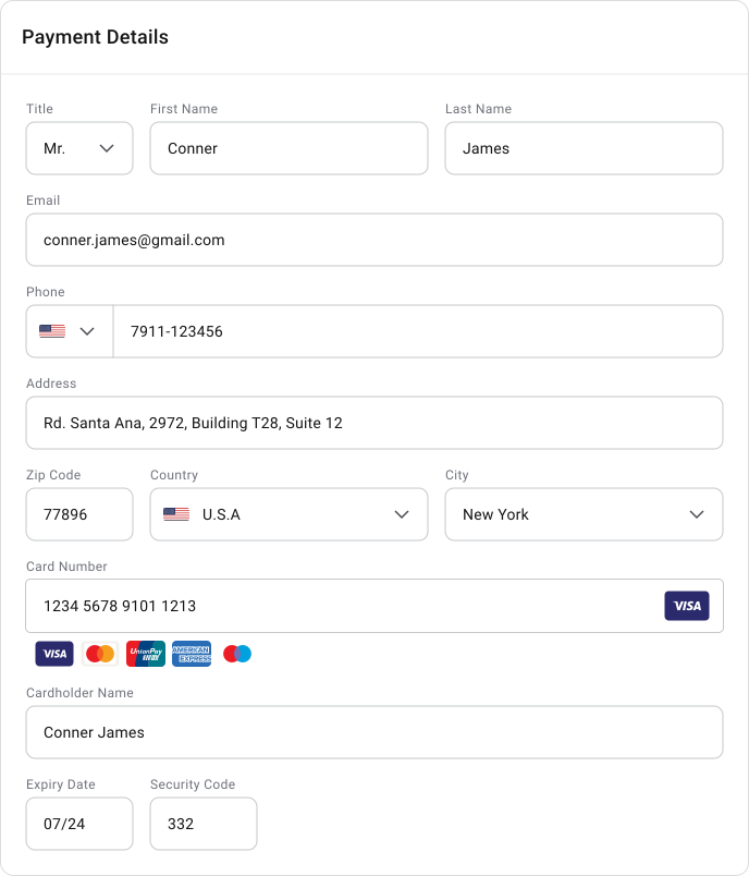
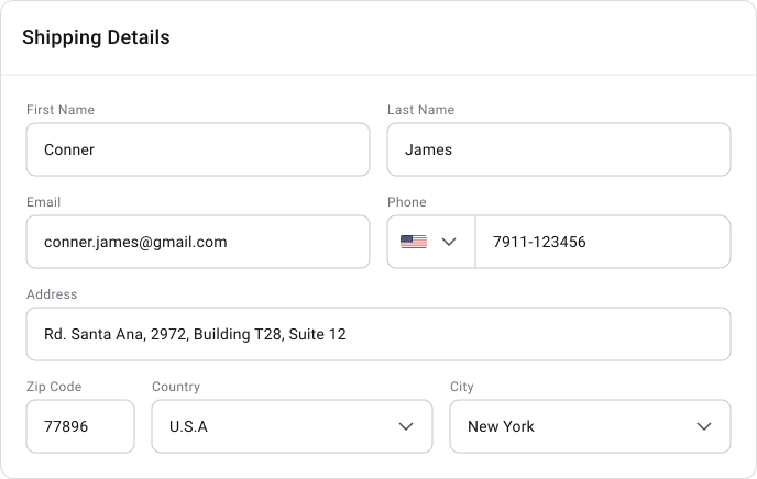
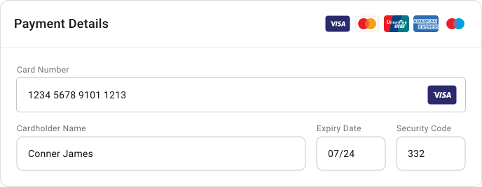
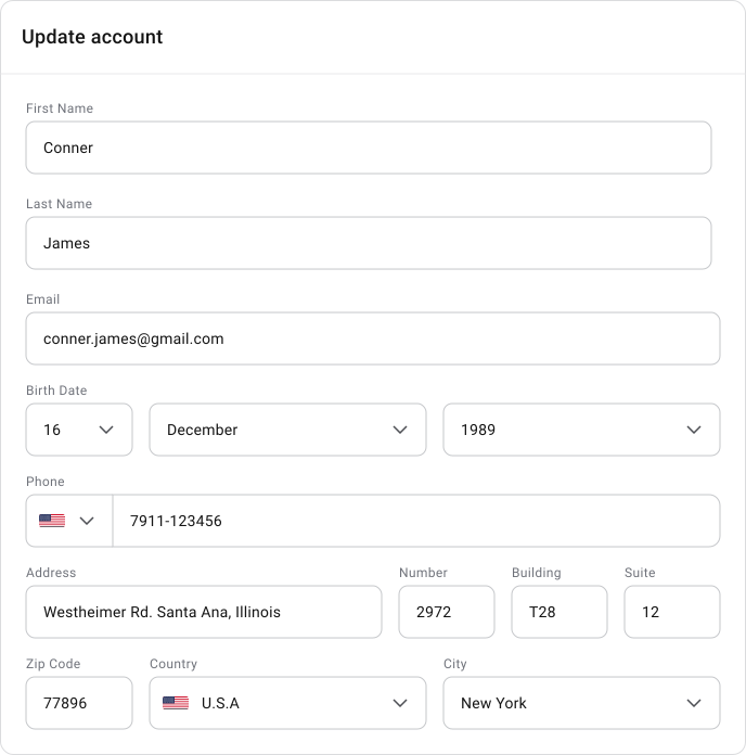
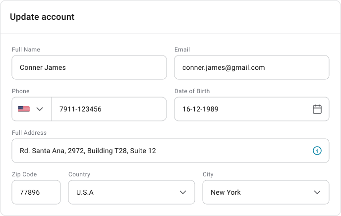
Grouping related fields helps users understand forms faster and complete them with less effort. Clear structure reduces cognitive load and makes long forms easier to scan.
- Field width should reflect the type of information being entered. An address field and a zip code field should not use the same width because users expect different input lengths. Proportional layouts usually work better, such as wider fields for addresses and smaller grouped fields for zip codes, country, city, or region.
- Related fields should stay visually connected so users can understand the relationship between the information they are entering. Consistent spacing and alignment also help forms feel more predictable.
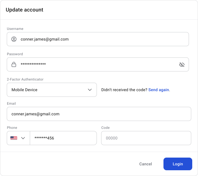
- Avoid adding fields that are unnecessary for the current flow. The more input users need to process, the slower and heavier the experience becomes.
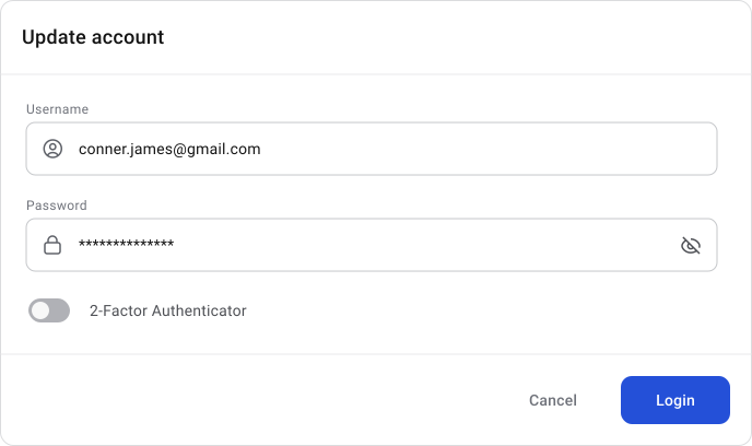
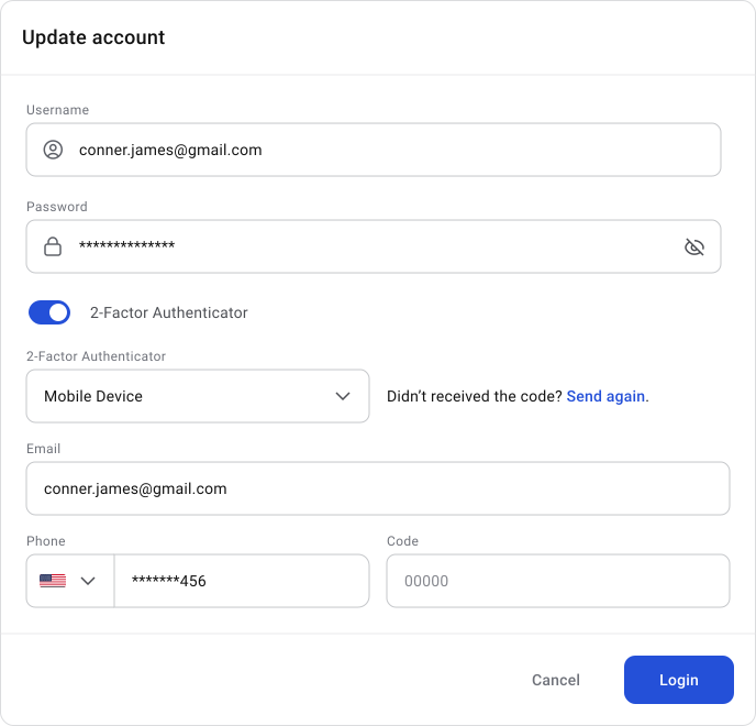
- Hide fields that are not immediately relevant and reveal them only when needed. Optional steps should remain easy to skip or expand based on user intent.
Text / Input Format
Clear formatting helps users understand what is expected before they start typing. Good formatting reduces validation errors and makes forms faster to complete.
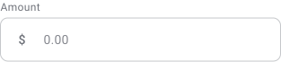
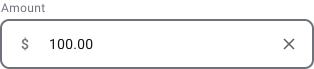
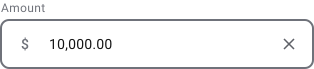
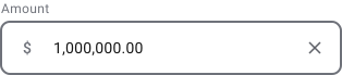
Numeric fields should format values automatically when possible. Separators, decimals and spacing improve readability and help users verify values more quickly, especially in financial or data-heavy interfaces.
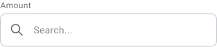
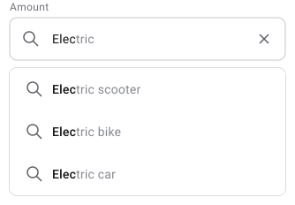
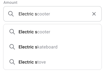
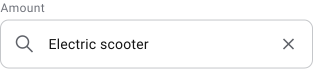
Auto-fill speeds up input by predicting values and suggesting matching results. This reduces typing effort, improves completion speed and helps prevent spelling or formatting mistakes.
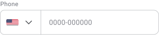
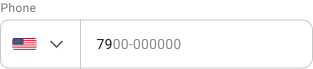
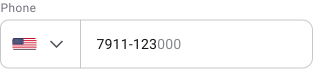
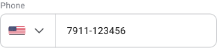
Masking helps users understand the expected structure of the input. Grouping characters into readable sections, such as phone numbers or identification codes, makes information easier to scan and validate while typing.
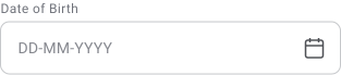
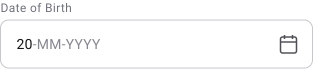
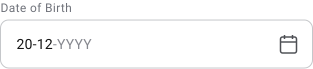
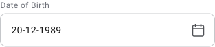
Date fields should always use a clear and consistent format. Calendar pickers help reduce formatting mistakes and improve accuracy, especially across regions with different date conventions.
Size (Height and Length)
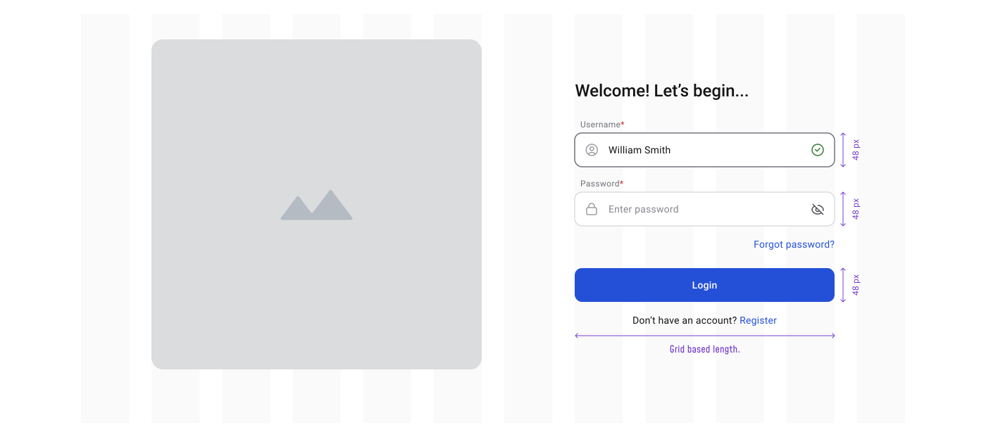
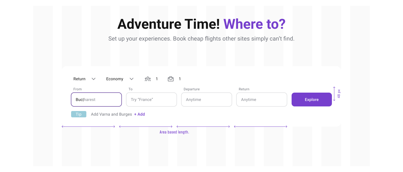
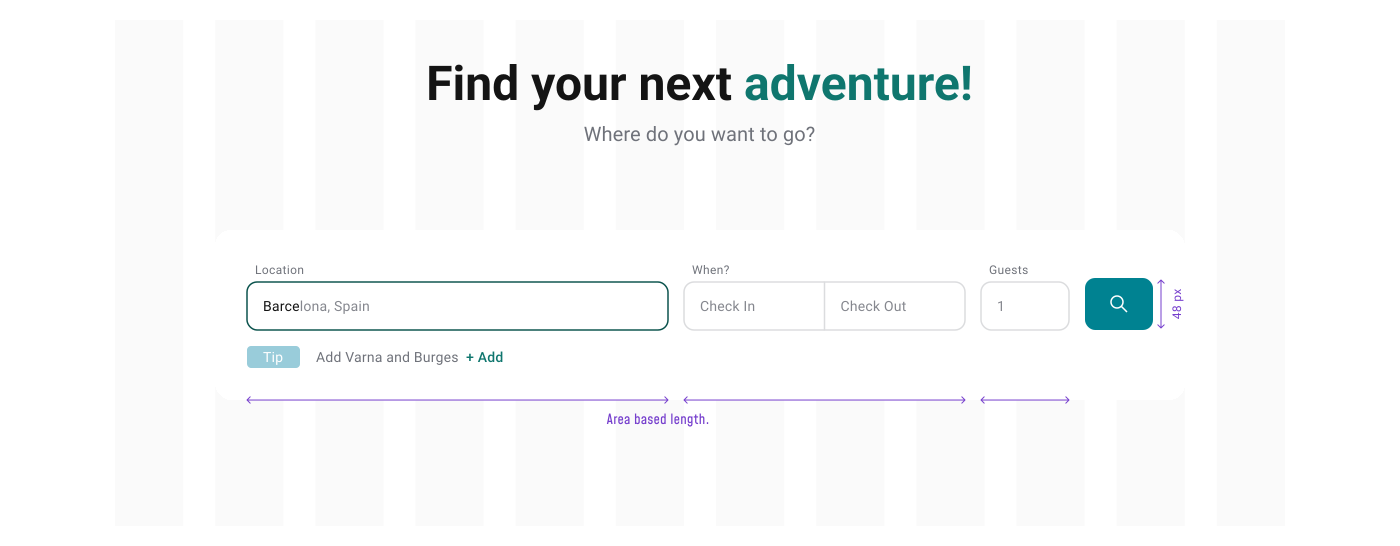
The recommended height for most input fields is between 40 and 44px. This keeps inputs aligned with common button sizes and creates a more consistent interface. Larger sizes can make sense when input is the primary action on the page, such as booking flows, search-heavy experiences, or large hero sections where interaction needs to feel more prominent and comfortable.
Input width should reflect the expected content length. Short values like zip codes, CVV numbers, or dates should not use the same width as addresses, descriptions, or search fields.
Accessibility guidelines do not define exact input sizes, but they do define minimum interactive target sizes, which directly affect input usability.
WCAG 2.2 (Level AA) — Practical Minimum
24 × 24 px is the minimum target size. Smaller interactive elements are only acceptable when enough spacing exists around them to prevent accidental interaction.
WCAG 2.1 (Level AAA) — Recommended
44 × 44 px is considered more comfortable and accessible, especially for:
- Touch interaction
- Users with motor impairments
- Faster and more accurate input
WCAG allows a balance between size and spacing:
- Smaller targets require more spacing
- Larger targets can sit closer together safely
Example:
- A 24px checkbox usually needs around 8px or more surrounding space
- A 44px input field can sit closer to nearby elements without reducing usability
Most modern design systems use input and button heights between 40 and 48px. This range balances usability, accessibility and layout density while staying close to WCAG recommendations.
Examples:
- Material Design → ~40–48px
- Apple Human Interface → ~44px
- Many enterprise systems → ~40px default
XS — 28px S — 32px M — 40px (default) L — 44px XL — 48px
This gives you flexibility across dense layouts and more accessible contexts without introducing too many variants.
XS — 28px
Use only in very dense layouts where space is limited, such as inline table editing or advanced admin tools. This size reduces readability and click accuracy, so it should stay limited to experienced users and controlled workflows.
S — 32px
Useful for compact layouts that still need reasonable usability, such as side panels or secondary forms. More usable than XS, but still not ideal for primary flows or important actions.
M — 40px (default)
The standard size across most products. It balances readability, interaction comfort and layout density. Suitable for most forms, dialogs and desktop workflows.
L — 44px
Use when accessibility and comfort matter more than density. Works well for onboarding flows, important forms and mobile-focused experiences where interaction accuracy is more important.
XL — 48px
Best for touch-first interfaces or high-priority input areas. This size feels more forgiving on mobile devices and helps reduce interaction errors, especially in accessibility-focused flows.
Rules of Thumb
- Stack and align fields consistently
- Match field width to expected content length
- Use helper text for guidance instead of relying on placeholders
- Avoid placing critical instructions only inside placeholders
- Place required asterisks (*) to the right of the label
- Mark optional fields with “(optional)” next to the label
- Use native browser behavior for numeric inputs when possible
- Include constraints in helper text when needed
- Use input masking for structured formats such as phone numbers or IDs
🔗 Sources
8 Recommendations for Creating Effective Input Fields
Source Link54 Input Field Design Examples: Principles, Inspiration and Expert Tips
Source LinkForm Input Design Best Practices
Source LinkText fields & Forms design — UI components series
Source LinkThe Anatomy of Input Field
Source LinkInput Field
Source LinkUI Designer's Guide to Creating Forms & Inputs
Source LinkText Field
Source LinkInput Fields
Source LinkText Field MUI
Source LinkText fields Material
Source Link