Info Bubbles Research
View Figma ComponentKey Takeaways
- Info Bubbles give users a way to get more context without leaving what they’re doing. They sit between a tooltip and a modal: more room than a tooltip, less weight than a modal.
- They support understanding. They don’t replace visible instructions, onboarding, or documentation.
Overview
An Info Bubble is a contextual overlay that provides additional explanations, guidance, or supporting information without requiring users to leave their current workflow. It appears above existing content when users intentionally interact with a trigger element such as a question mark icon, information icon, help link, or related piece of content.
Unlike a tooltip, which is designed for quick identification and brief clarification, an Info Bubble allows more space for explanations, formatted content, links and supporting information.
It belongs to the broader Popover family of overlays but is specifically focused on helping users understand something within the current context.
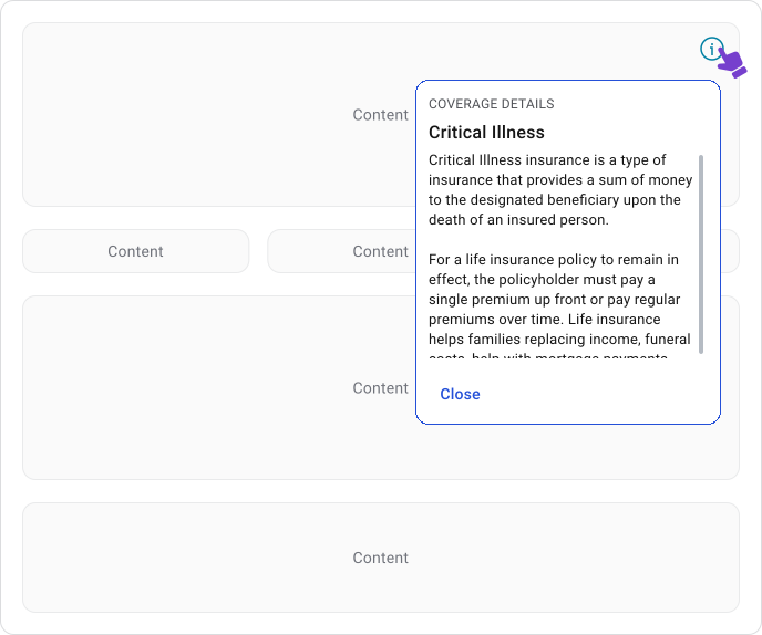
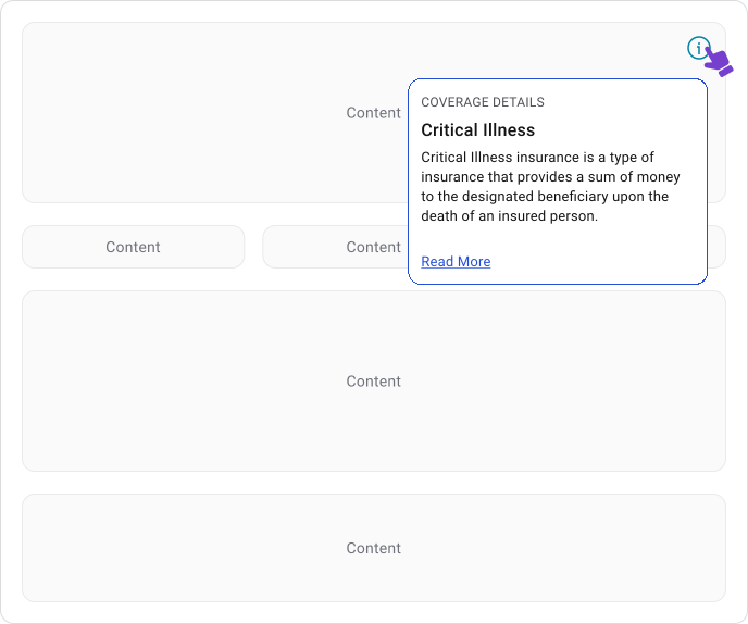
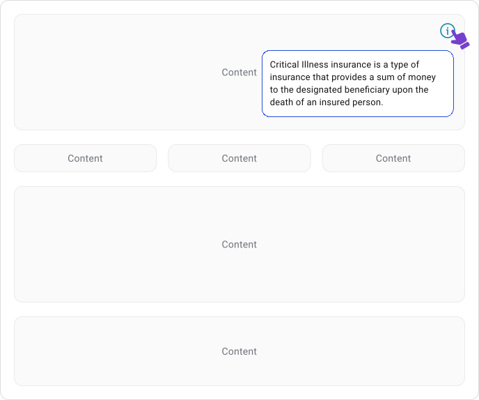
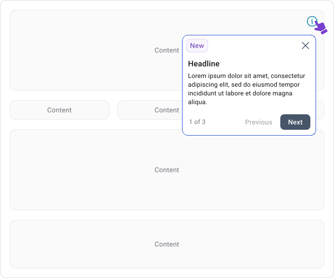
Info Bubble Anatomy
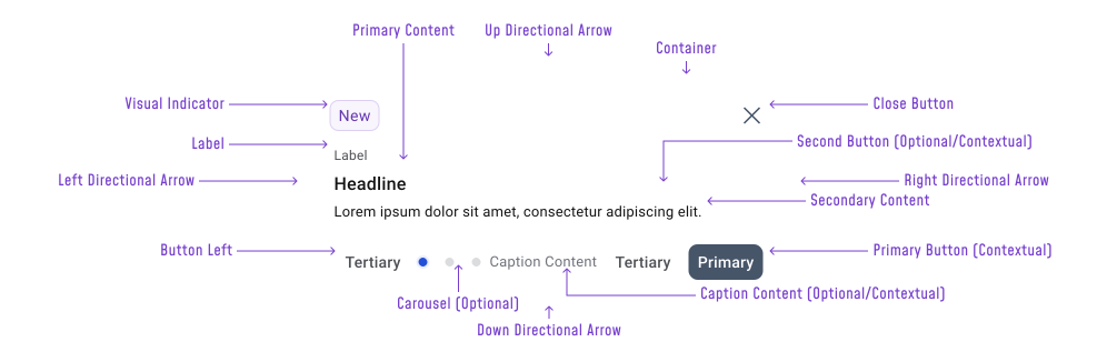
An Info Bubble typically consists of:
- Trigger Element — the ?, ℹ️, badge, or inline link the user clicks to open the bubble. It anchors the bubble’s position and makes the relationship between the bubble and the content clear.
- Container — The card that holds everything. Rounded corners, subtle shadow, white background. Sits above the page content with a directional arrow pointing back to the trigger.
- Directional Arrow — The small pointer that connects the container to the trigger. Can appear on any side (up, down, left, right) depending on where the bubble opens relative to the trigger or not at all.
- Close Button (×) — Explicit dismiss control. Sits in the top-right corner. Should always be present when the bubble is modal or when there’s no obvious way to dismiss it otherwise.
- Visual Indicator — Usually a status ti emphasize the importance of the information within the tooltip.
- Label — A short tag or badge sitting above the headline, used for status or categorization (“New”, for example). Optional.
- Primary Content — The title of the bubble. Can include a leading icon for additional context. Not always needed for short explanatory content.
- Secondary Content — Additional contextual text below the headline.
- Carousel — Dot indicators for multi-step or multi-page bubbles. Optional, only relevant when the bubble contains more than one screen of content.
- Caption Content
- Tertiary Button left (Tertiary)
- Second Button
- Primary Button
In practice, most instances use a smaller subset. A lot of the Ui elements are either contextual or optional. The end result should be simple and clean.
When to Use
Use an Info Bubble when a tooltip won’t cut it. Tooltips work for quick labels. An Info Bubble is for when the user genuinely needs to understand something before moving forward.
Good use for:
- Unfamiliar terms or labels that need a real explanation, not just a name repeat
- Clicking an ℹ️ or ? next to settings or config options where picking the wrong one has real consequences
- Values or calculations the user didn’t produce themselves and can’t be expected to understand without context
- Alerts or status messages where the label alone doesn’t tell the user what happened or what to do next
- Anything where a “Learn more” link is currently doing all the work
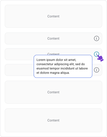
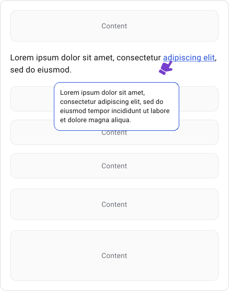
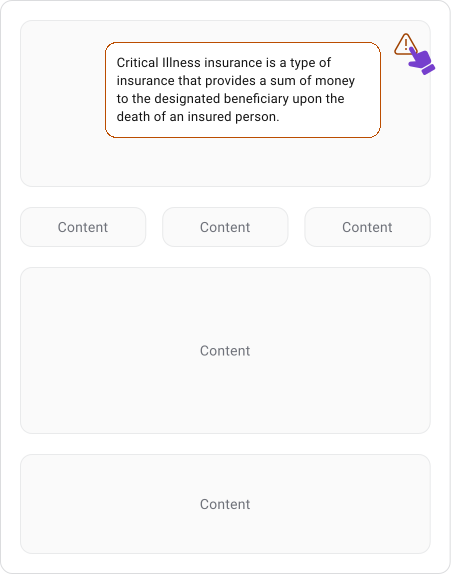
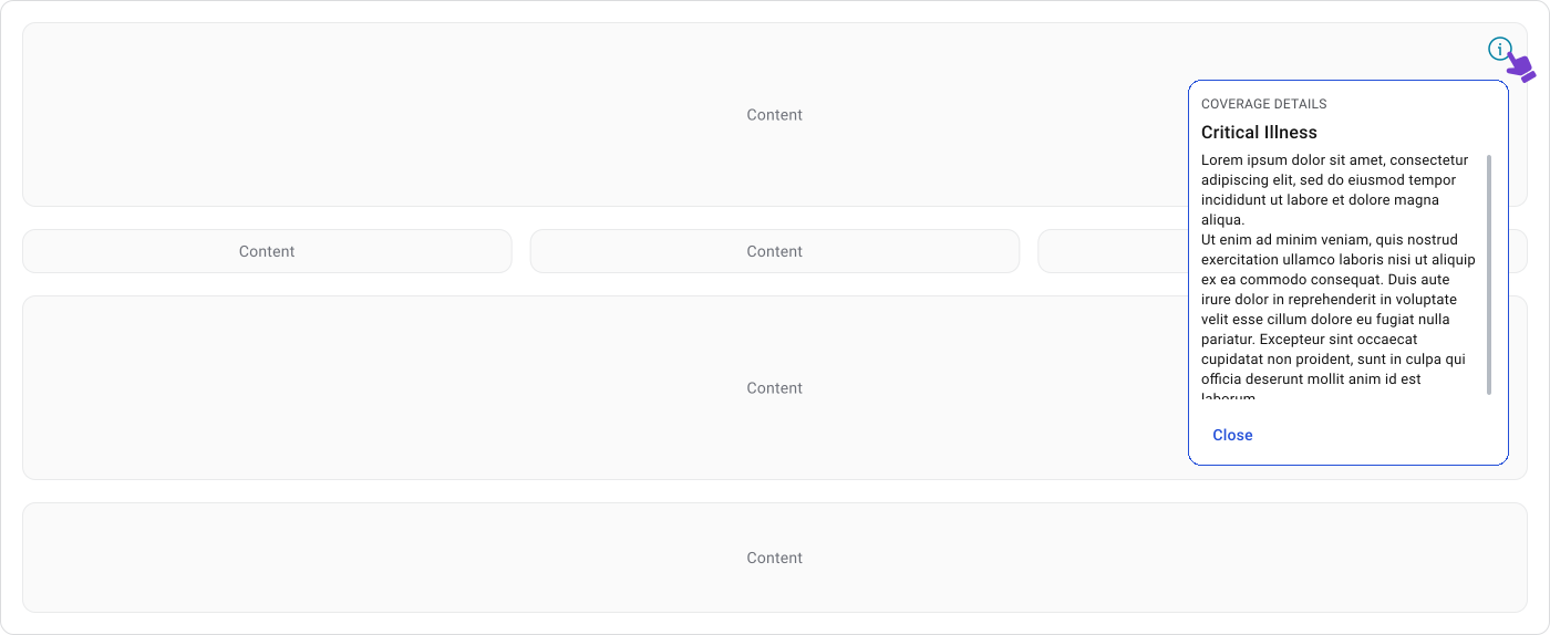
Medium-length content like a term definition, a short policy explanation, or a contextual help note with a couple of paragraphs works fine as long as the container scrolls and has a clear way to close it.
Once the content needs navigation, multiple sections, or user input to get through it, move it out as it does not belong into an Info Bubble.
When Not to Use
If a user needs the information to complete a task, it shouldn’t be inside an Info Bubble. Things like password rules, validation requirements, critical instructions, or mandatory steps belong in the interface where the user can see them without having to ask.
If the content is too large for a scrollable bubble, use a modal, drawer, flyout, or dedicated page instead.
UX Principles
Info Bubbles are user-initiated. The user decides when they need more context, which keeps them in control. This is different from onboarding components (coach marks) that push information at the user whether they asked for it or not.
The content should stay tightly scoped to whatever triggered it. If the bubble starts explaining things beyond the immediate context, it’s carrying too much and the user will feel lost. A good Info Bubble reduces uncertainty around a specific thing and helps the user move forward with more confidence.
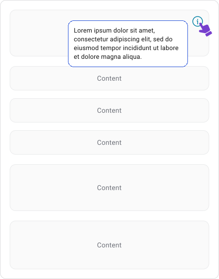
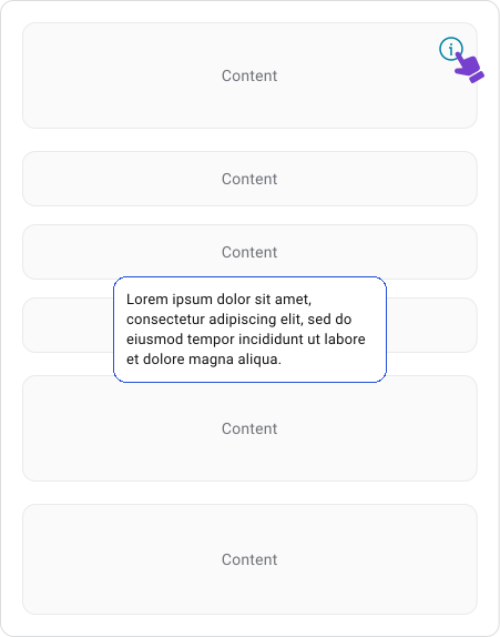
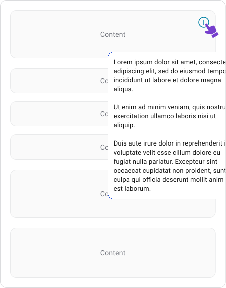
The bubble should stay visually connected to its trigger. A directional arrow helps with this, especially when the trigger is a small icon or when several interactive elements sit close together. The bubble should always stay fully within the viewport, avoid covering the trigger where possible and reposition automatically near screen edges.
Most implementations support placement above, below, left, or right depending on available space.


Behavior Patterns
Info Bubbles are intentionally triggered by users. Common triggers include:
- Question mark icons
- Information icons
- Help links
- Linked questions
- Contextual UI elements
Unlike tooltips, which often appear on hover, Info Bubbles are typically triggered through click or tap interactions. This gives users greater control over when additional information appears.
Note!
Only one Info Bubble should be open at a time. Opening a second one closes the first. Clicking anywhere outside the bubble also dismisses it. The close button is an explicit option, but it’s not the only way out and shouldn’t be treated as required to move on. Users press Escape also closes it.
Accessibility
Keyboard users should be able to open, navigate and dismiss the bubble without a mouse. Dismissing with “Esc” is the standard expectation. If the bubble contains links or buttons, focus should move into it when it opens and return to the trigger when it closes.
Icon-only triggers need a meaningful accessible label. A bare “?” or “i” icon with no description gives screen reader users no signal that more information is available or what it’s about.
When the bubble contains interactive content, focus order matters. Users should be able to tab through links and actions in a logical sequence without getting lost or trapped.
Mobile Considerations
Mobile devices do not support traditional hover interactions.
Because of this, tooltips should appear through long press or another intentional touch interaction. The tooltip must remain readable without covering important content and should be easy to dismiss.
Content becomes even more important on small screens. Long messages quickly consume valuable space and can obscure surrounding controls. Mobile tooltips should be shorter and more focused than their desktop equivalents.
Best Practices
Keep the content focused on one thing: the question the user had when they clicked the trigger. If the bubble is trying to answer multiple questions or explain a broader concept, it’s doing too much.
The trigger should make it obvious that more information is available. Click or tap to open, Esc or clicking outside to dismiss, one bubble open at a time. These are the behaviors users expect and they should work consistently across every instance.
Common Mistakes
1. Most problems come from using an Info Bubble as a catch-all. Hiding critical information inside one, stuffing it with excessive content, or treating it as a substitute for proper documentation all work against the user.
2. Avoid embedding forms, workflows, or decisions inside a bubble. If the user needs to do something, not just understand something, a different component fits better. The same goes for nesting a bubble inside another overlay or using it as a warning dialog. These push it into territory it wasn’t built for.

Info Bubble vs Tooltip
Tooltips are for quick identification. Info Bubbles are for when the user needs to actually understand something.

Info Bubble vs Coach Marks
Info Bubbles answer questions when the user does not full get the concept. Coach Marks show up when the system decides the user needs guidance.

Final Thoughts
A good Info Bubble shows up when the user needs it and gets out of the way once they have what they came for. It answers one question, stays connected to its trigger and doesn’t try to do more than that.
If it’s interrupting the workflow, carrying too much content, or hiding something the user actually needs to see, it’s not an Info Bubble problem. It’s a design decision that needs revisiting.
🔗 Sources
Popover - Info Bubble
Source LinkPopover - patternfly.org
Source LinkPopover - carbondesignsystem.com
Source LinkInformation bubbles
Source LinkPopove - HIG
Source LinkPopover - developer.blackbaud.com
Source LinkTooltip: A small design element with a big UX impact
Source Link