Icons Research
View Figma ComponentKey Takeaways
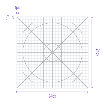
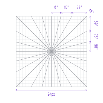
- Stick to a 24×24 grid with keylines for alignment. If an icon doesn't fit naturally, adjust the design, not the grid.
- Pick one style, line or filled and use it consistently. Only mix them when it genuinely helps clarity, like on hover states.
- Keep icons simple. If a detail doesn't add meaning, cut it.
- Skip 3D effects and decorative elements. Every icon should feel visually balanced with the rest of the set.
Before We Start
Group icons by function from the start: actions, navigation, objects and so on. It makes them easier to find, reduces duplicates and keeps the set manageable as it grows. Consistent naming matters too.
When everyone uses the same conventions, collaboration gets easier and the risk of building the same icon twice goes down.
Examples for Icons Layer Naming:
Keep naming simple so the system stays easy to scale and maintain.
- 20px [Size] / Users [Category] / User, Account, Profile [Description]
- 24px [Size] / Interface, Essential [Category] / Arrow, Left, Drop Down [Description]
Grid, Size & Technical Foundation
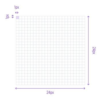
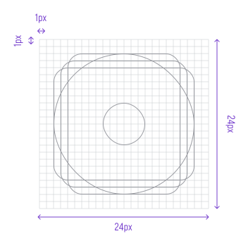
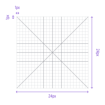
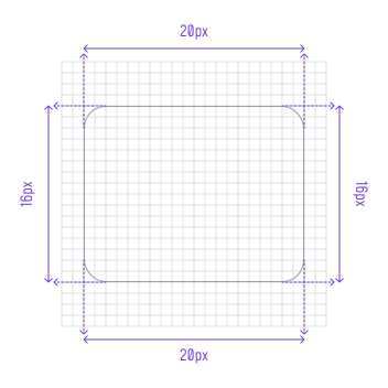
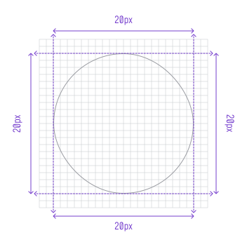
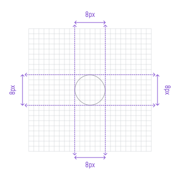
Icon systems are built on a pixel grid that controls proportion, spacing and alignment across the whole set. Icons should snap to pixel boundaries and avoid fractional values, which keeps edges sharp especially at smaller sizes.
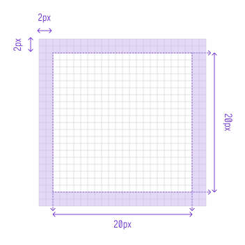
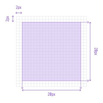
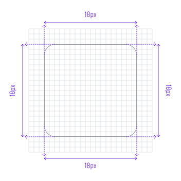
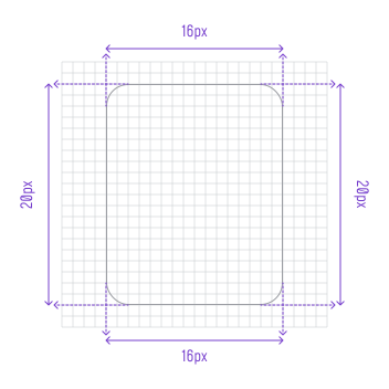
Standard sizes like 16, 20, 24, 28 and 32px work well for most contexts. Each size needs proper padding and safe areas so icons stay visually balanced and scale cleanly across different use cases.
Style & Visual Language
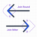
All icons in a set should share the same stroke thickness, visual weight and corner treatment. Shapes and angles should feel like they came from the same hand. The style should fit the product's overall tone, whether that's sharp and utilitarian or soft and rounded.
Use visual judgment alongside geometry. Stroke weight and proportions should feel balanced even when shapes vary. If something looks off, trust your eye over the grid.










Strip each icon down to its core idea. If a detail doesn't add meaning, cut it. If the icon needs too much detail to be understood, it's crossed into illustration territory.





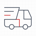
Icons should respond consistently across hover, active and selected states. Keep changes subtle, usually a color or weight shift, without altering the shape. Changing the shape between states makes interactions feel unpredictable.








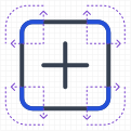
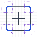
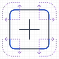
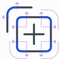
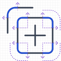
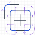
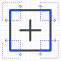
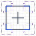
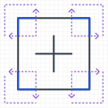
Define how icons are constructed so new additions stay consistent. Use the same grid, keylines and padding every time. That said, don't distort a shape just to match keylines. If the icon reads clearly and sits within the padding area, a small deviation is fine.





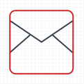
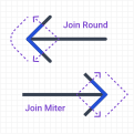
Increase in 2px increments when it helps define a shape. Don't force rounded corners if they make the icon harder to recognize.
Accessibility & Legibility
Standalone icons used for actions or states need at least 3:1 contrast against adjacent colors. When paired with text, the text needs 4.5:1 against the background, but the icon still only needs 3:1. Text has stricter requirements because it has to be read, not just recognized.
Common icons that need clear contrast and labeling:
- Heart → Like
- Bookmark → Save
- Bell → Notifications
- Gear → Settings
- Checkmark → Success
- Warning triangle → Alert
Use Labels or Tooltips
Even well-designed icons can be ambiguous. A heart could mean Like or Add to Favorites.
Start by reducing ambiguity at the icon level first: if a heart means Like, use a bookmark for Save. Then add labels. They help users learn the interface early on and over time icons can carry more weight on their own.
Many products show text labels next to navigation icons by default and only drop them in compact views. Lead with labels. Icon-only navigation works best after users already know the system.
Final Thoughts
A good icon system is invisible when it works. Users don't think about the icons, they just understand them and move on. That only happens when the system is consistent, simple and built with clear rules from the start.
The grid, naming, style and labeling decisions might feel like small details, but they compound. A system built with loose conventions becomes harder to maintain, harder to hand off and harder to extend as the product grows.
Get the foundations right early. An icon added six months from now should look like it was always part of the set.
🔗 Sources
Icon Usability
Source LinkNielsen Norman Group – Consistency
Source LinkW3C – Non-text Content
Source LinkMaterial Design – Icons (root section)
Source LinkApple HIG – Icons (root section)
Source LinkPractical Guide To Icon Design
Source LinkLearn How I Design Icons for UI
Source LinkIcons as Part of an Awesome User Experience
Source LinkSmall Elements, Big Impact: Types and Functions of UI Icons.
Source LinkMaterial Icons vs Material Design Icons
Source LinkUX Drill 11— “Designing Icons for a Brand Design System”
Source Link