Dropdowns Research
View Figma ComponentKey Takeaways
- Dropdowns earn their place when they save space without making the decision harder. They work for moderate predefined lists where seeing all the valid options helps users move forward. They fall apart when options are few, familiar, too many to scan, or easier to type.
- The main design call is not how the dropdown looks. It’s whether hiding the options helps the user or just makes the screen look cleaner.
Overview
A dropdown lets users pick one value from a predefined list without showing every option upfront. That hidden list is exactly what makes it useful in some situations and wrong in others. It saves space and keeps data clean, but it costs the user an extra step before they can even see the choices.
The component earns its place in forms, filters, settings, language selectors and sorting controls. It starts to hurt when the list is short, the answer is something users already know, or the options need to be compared side by side.
Most dropdown problems come from reaching for it out of habit rather than asking whether hiding the options actually helps.
Dropdown Anatomy
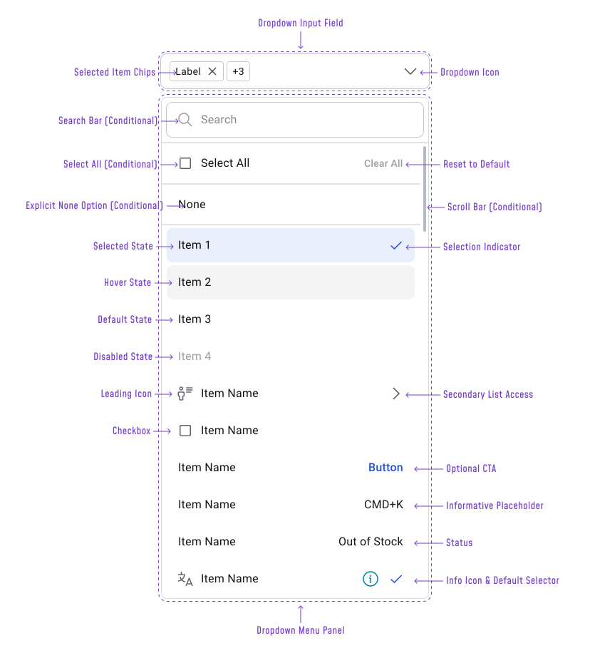
The dropdown is two separate containers: the input field and the menu panel. They look connected but have different jobs and different layout rules.
Input field contains:
- Selected Item Chips — show chosen values inside the field for multi-select; each chip has a remove control
- Overflow Counter (+N) — appears when selected chips exceed the available width; shows how many additional selections are hidden rather than wrapping or truncating the chips individually
- Placeholder Text — visible when nothing is selected; should look different from a selected value
- Dropdown Icon — the icon on the right edge; signals the field opens a list; rotates or changes on open
Dropdown Menu Panel contains:
- Search Bar (conditional) — appears when the list is long enough that scrolling alone would be slow; filters the list as users type
- Select All (conditional) — a checkbox row above the list that selects every option at once; only relevant in multi-select; sits alongside Clear All in the panel header area
- Clear All / Reset to Default (conditional) — paired with Select All in multi-select; clears all current selections or restores the system default; use “Reset to Default” when the field has a recoverable default state, not just an empty one
- Explicit None Option (conditional) — a “None” or “No selection” row at the top of the list; only include this when leaving the field empty is a valid choice
- Scroll Bar (conditional) — appears when the list exceeds the panel height; the menu should have a max-height so it does not push off screen
- Option Rows — the list itself; each row can be in a default, hover, selected, or disabled state
Option row variants rows are not always plain text. Depending on the use case, a row can include:
- Leading Icon — Helps users identify or differentiate options visually
- Checkbox — Used for multi-select; makes it clear multiple choices are allowed
- Secondary List Access (›) — Indicates a nested submenu; use sparingly and avoid on mobile
- Optional CTA Button — A secondary action attached to the row, like “Manage” or “Edit”
- Informative Placeholder — Shows a keyboard shortcut or secondary label, e.g. CMD+K
- Status Label — Communicates availability, e.g. “Out of Stock” in a color that doesn’t rely on hue alone
- Info Icon — Opens a tooltip or detail without selecting the row
- Default Selector (✓) — Marks a system or recommended default distinct from a user’s active selection
- Selection Indicator (✓) — Confirms the currently selected value inside the open menu
Note!
Most dropdown implementations will use only a few of these. Adding too many row variants inside the same list makes it hard to scan and signals that the component is doing too much.
When to Use
Dropdowns are a good fit when users need to pick from a predefined list and showing all the options would take too much space. A practical range for standard form use is around 5 to 15+ options, but that rule does not apply cleanly outside of forms.
In tables, dashboards, filter bars and widget toolbars, a dropdown with two or three options is often the right call. The layout may not have room for a segmented control or radio group and the dropdown keeps the interface consistent without adding visual weight.
A “Sort by” menu with two options, a view toggle with three, or a row density selector with four are all reasonable uses.
Dropdowns also make sense when the number of options is conditional. A version history list or a tag selector might start with one item and grow to twenty depending on what the user has done.
Important Note
Dropdowns also make sense when the number of options is conditional. A version history list, a saved filter list, or a tag selector might start with one item and grow to twenty depending on what the user has done.
Where a dropdown is usually the wrong choice:
- Binary decisions in a form context (yes/no, on/off) — a toggle or radio pair communicates the decision more directly
- Values users already know and can type — birth year, quantity, a familiar address
- Short option sets in a form where comparison matters — three payment methods are easier to read as radio buttons than hidden in a menu
Types
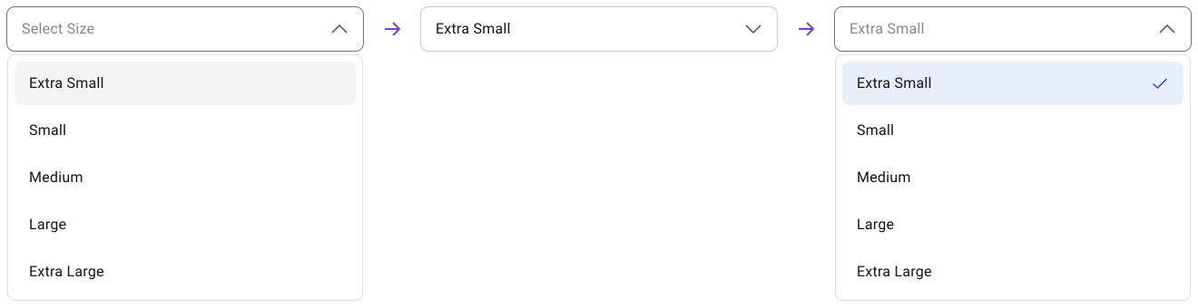
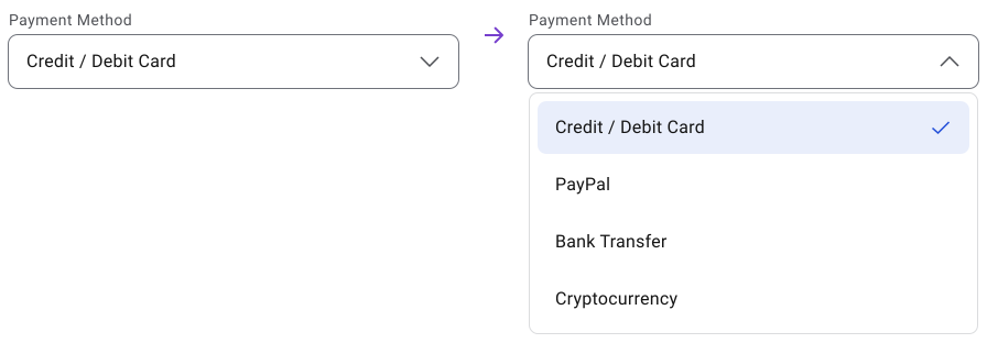
One selection from a list. The most common version. Works for controlled form input, simple settings and compact selection fields. Rows are plain text with a selection indicator on the active item.
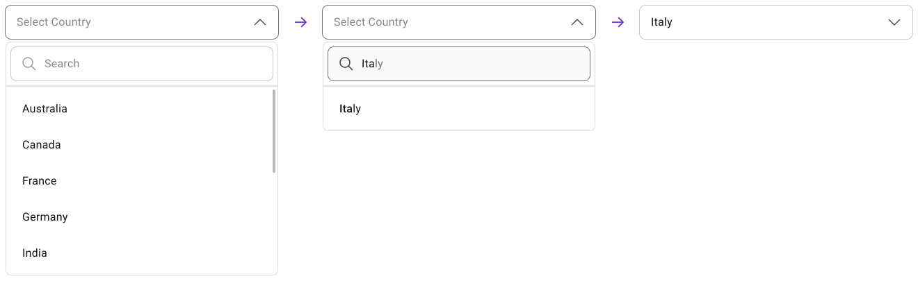
Adds a search bar at the top of the menu panel. Needed when the list is long enough that scrolling becomes slow. The search bar is conditional. It should not appear on short lists just because it is available in the component. Filters results as users type and should show a clear empty state when nothing matches.
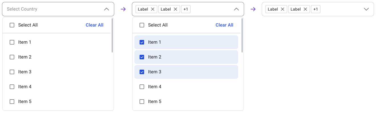
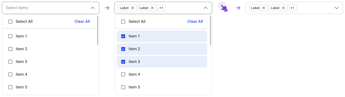
Lets users pick more than one option. The input field shows selected values as chips; when chips exceed the field width, an overflow counter (+N) replaces the rest. Rows use checkboxes instead of a selection indicator so users can see at a glance what is and is not selected.
The menu usually stays open during selection and closes via an Apply button or clicking outside. Include a “Clear all” option when selections may accumulate.
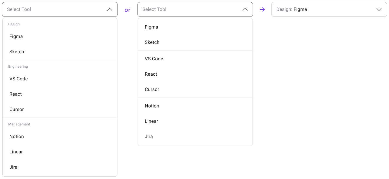
Organizes options under section headers or visual dividers. Useful when the list has distinct types that users naturally think about separately. The grouping should match how users would describe the categories, not how the data is structured on the backend.
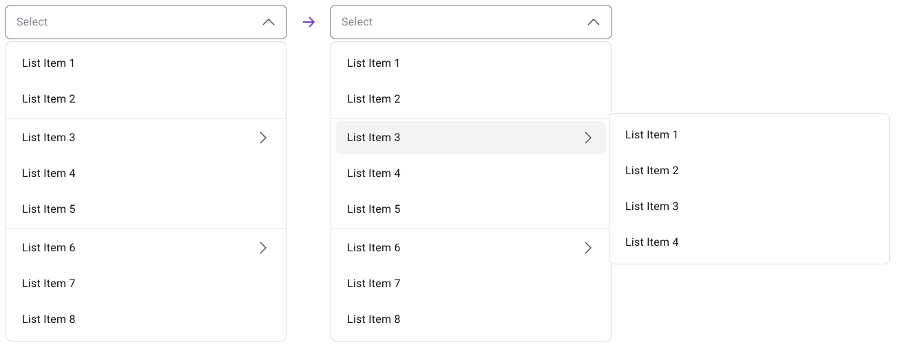
List Items with a secondary list access indicator (›) open a submenu. Keep nesting to one level and avoid it on mobile entirely. Users have to track where they are, hold the parent menu open and move precisely into the child list. If the structure needs two or more levels of nesting, a dedicated page or panel is usually the right call.
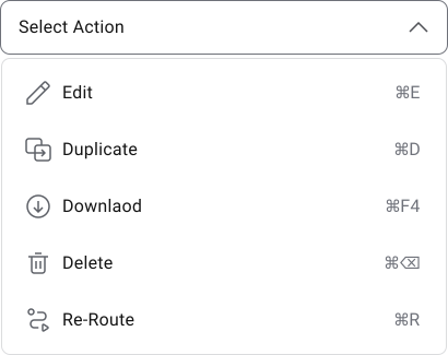
Exposes actions like Edit, Duplicate, Delete, or Share rather than form values. Rows may include optional CTA buttons or status labels, but the list should stay short and context-specific. If a user has to think for more than a second about what an action will do, the label or the menu structure needs work.
Placeholder, Default Value and Empty State
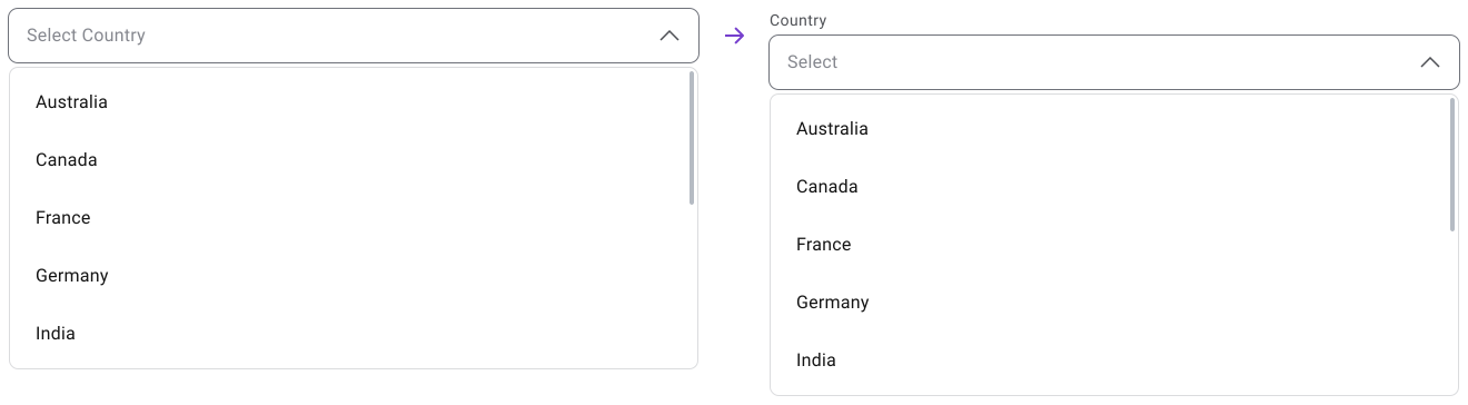
A placeholder like “Select country” or “Choose payment method” gives users a hint about the kind of input expected. “Select” alone works when the label is already specific. Either way, the placeholder should look different from a selected value so users do not skip over an incomplete field thinking it’s already done.
Only use a default value when there is a genuinely common or recommended option. Defaults speed things up but can cause users to miss a choice they were supposed to make. This is especially risky when the selection has legal, financial, privacy, or preference consequences.
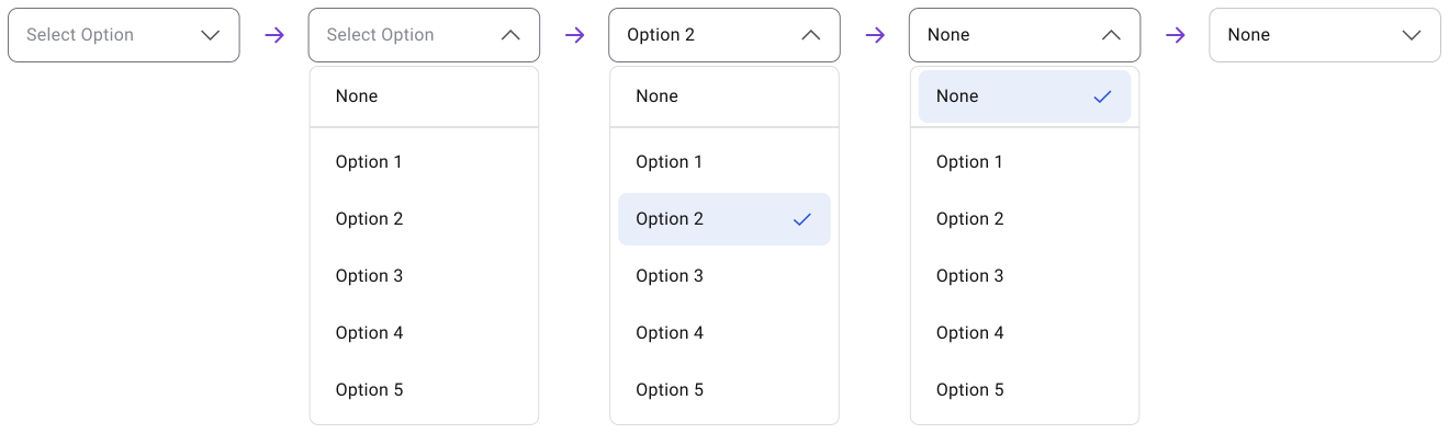
If users are allowed to leave the field empty, make that option explicit. “None,” “No selection,” or “Not applicable.” After choosing it, the field should display that value, not go visually blank. An empty field looks broken or incomplete.
Behavior
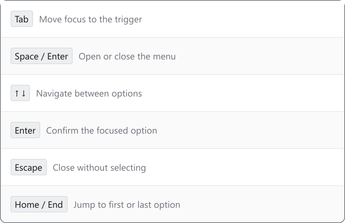
Opening should work through click, tap, Enter, or Space. Hover-only dropdowns break on touch devices and cut out keyboard users. Hover can supplement desktop interactions but should never be the only way to open the menu.
The menu needs to stay stable once it opens.
Important! Menus that close too quickly when the cursor drifts slightly outside the container are frustrating, especially for users with less precise motor control.
1. After opening a drop down, the menu panel can be close by:
- Clicking outside of it
- By clicking again on the drop down input field
- By pressing tab key which moves the focus to another UI element.
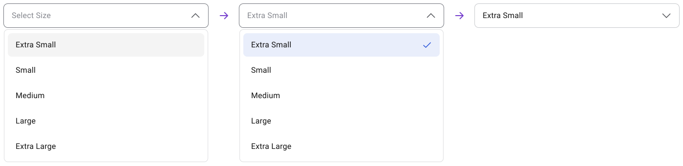
2. After selection, the menu closes and the selected value shows in the field.
3. For multi-select, the menu can stay open so users can pick multiple values without reopening each time. This works well for filters.
4. Unavailable options should stay visible but be disabled. Removing them causes the list to shift and leaves users wondering where an expected option went. A disabled state keeps the full range visible and signals that something is temporarily restricted. If the reason is not obvious from context, a short tooltip or helper text helps.
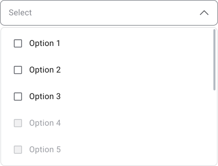
Option Organization
The order of options should match how users will look for them
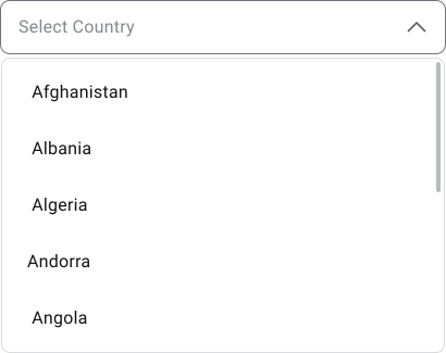
Alphabetical
Alphabetical works when all options are equally weighted and users know the label.
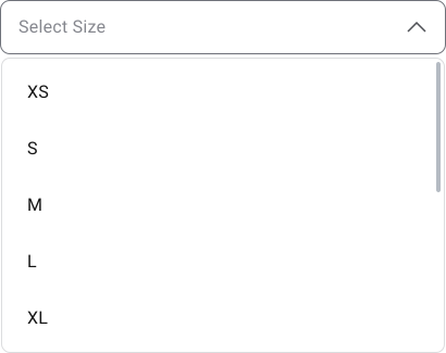
Sequential
Sequential order works for dates, numbers and ranges.
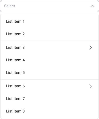
Grouped
Grouping works when the list has distinct types that users naturally separate.
Important Note
Long lists need either search, grouping, or both. If users have to scroll too far they start missing options and lose the ability to compare. Also, avoid nested dropdowns beyond two levels. Multi-level menus require users to track their position, hold the menu open and move precisely along nested paths.
On touch devices this is especially hard to get right. If the structure needs that many levels, a dedicated page, side panel, or searchable view gives the content more room.
Accessibility
Visible focus is non-negotiable. Users need to know which dropdown or option is active at all times. Focus styles that disappear against the background are not accessible. Selected, hover, focus, disabled and error states should all be visually distinct and should not rely on color alone.
WCAG and platform guidance consistently push toward larger targets, not smaller ones. Touch targets need enough size and spacing so users can hit the right item without accidentally selecting the one above or below it.
Keyboard Navigation
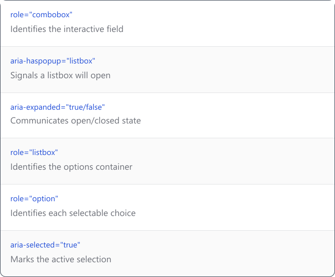
Required ARIA Attributes
Common Mistakes
- Using a dropdown because it looks tidy. A two-option dropdown saves space but hides a simple choice. A birth year dropdown controls formatting but forces scrolling for something users could type. Clean UI is not a good enough reason.
- Treating custom dropdowns as purely visual. They carry a lot of behavior: focus management, keyboard support, screen reader announcements, scroll handling, selected states, disabled states, mobile behavior and positioning. Skipping any of these makes the component fragile.
- Burying important things in menus. Frequently needed navigation paths, primary actions, or critical choices should be visible. Hiding them in dropdowns to keep the screen clean makes the interface harder to use.
Final Thoughts
Dropdowns are familiar, but that familiarity can make them easy to overuse. When used well, they keep forms clean and choices controlled. When used poorly, they hide simple decisions, slow users down and make the interface feel harder than it needs to be.
A good rule is simple: if the dropdown makes the decision easier, use it. If it only makes the screen look cleaner, reconsider the pattern.
🔗 Sources
10 Best Practices for Designing Drop-Down Menu
Source LinkUI cheat sheet: dropdown field
Source LinkDropdowns: Design Guidelines
Source LinkDropdown menu design: guidelines and examples for web and mobile
Source LinkDropdown Menu UI: Best Practices and 14+ Real-World Examples for Designers and Devs
Source LinkDropdown UI design: Standard, multi-select, searchable and more
Source LinkDrop down list design: the complete guide
Source LinkDropdown Cheat Sheet: A Practical Guide for UI/UX Designers
Source LinkDropdown menu design: UX best practices
Source LinkWhat are Dropdown Menus?
Source LinkDropdown Interaction Patterns: A Complete Guide
Source LinkBest Practices for Dropdown Menu Design to Avoid User Frustration
Source LinkInspirational dropdown menu examples: web and mobile
Source LinkHundreds of items in a dropdown
Source LinkTop 10 UX Design Tips for a Dropdown Menu
Source Link5 Design Tips for Dropdown Menus on Websites and Apps
Source LinkDrag & Drop UX Design Best Practices
Source Link