Colors Research
View Figma ComponentFoundations
The color system is the single source of truth for all colors in the product. It replaces ad-hoc color decisions with a shared language that designers and engineers can use consistently. Every color has a defined purpose and a clear role.
Brand vs Functional Color Goals
Brand colors are what users recognize and associate with the product. Because of that, they need to be used with restraint. Overusing them dilutes their meaning and creates visual noise that's harder to scan.
Use brand color to draw attention to what matters most: primary actions, active states, key links, selected tabs and focus states.
Rules:
- Include lighter and darker shades to cover hover, pressed and disabled states.
- Never use brand colors for error, warning, or success messages. Those states need their own semantic meaning.
- When everything uses the brand color, nothing stands out.
Common mistake!
Using the brand color as a large background surface. This creates contrast problems and makes the interface more visually tiring to scan over time.

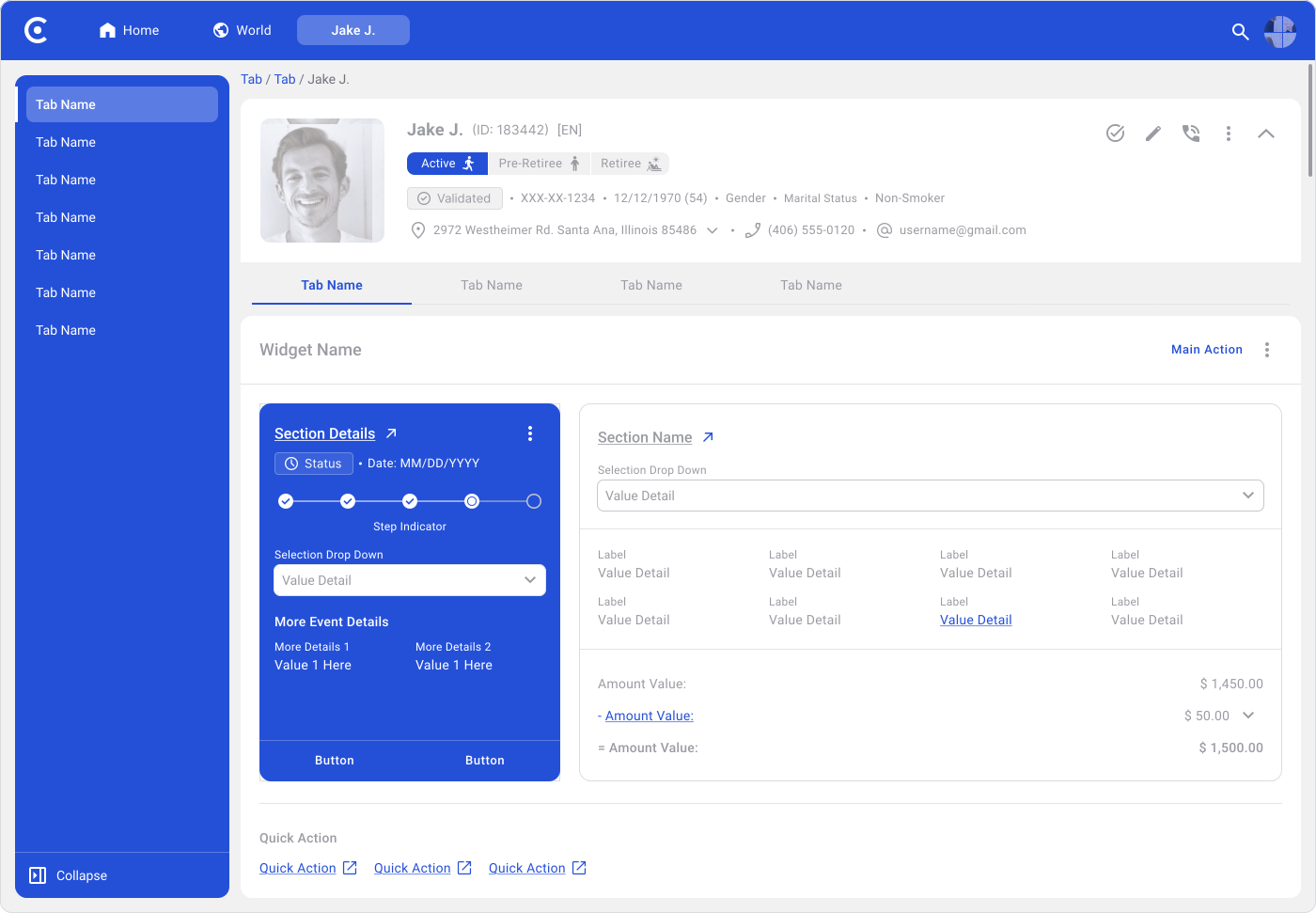

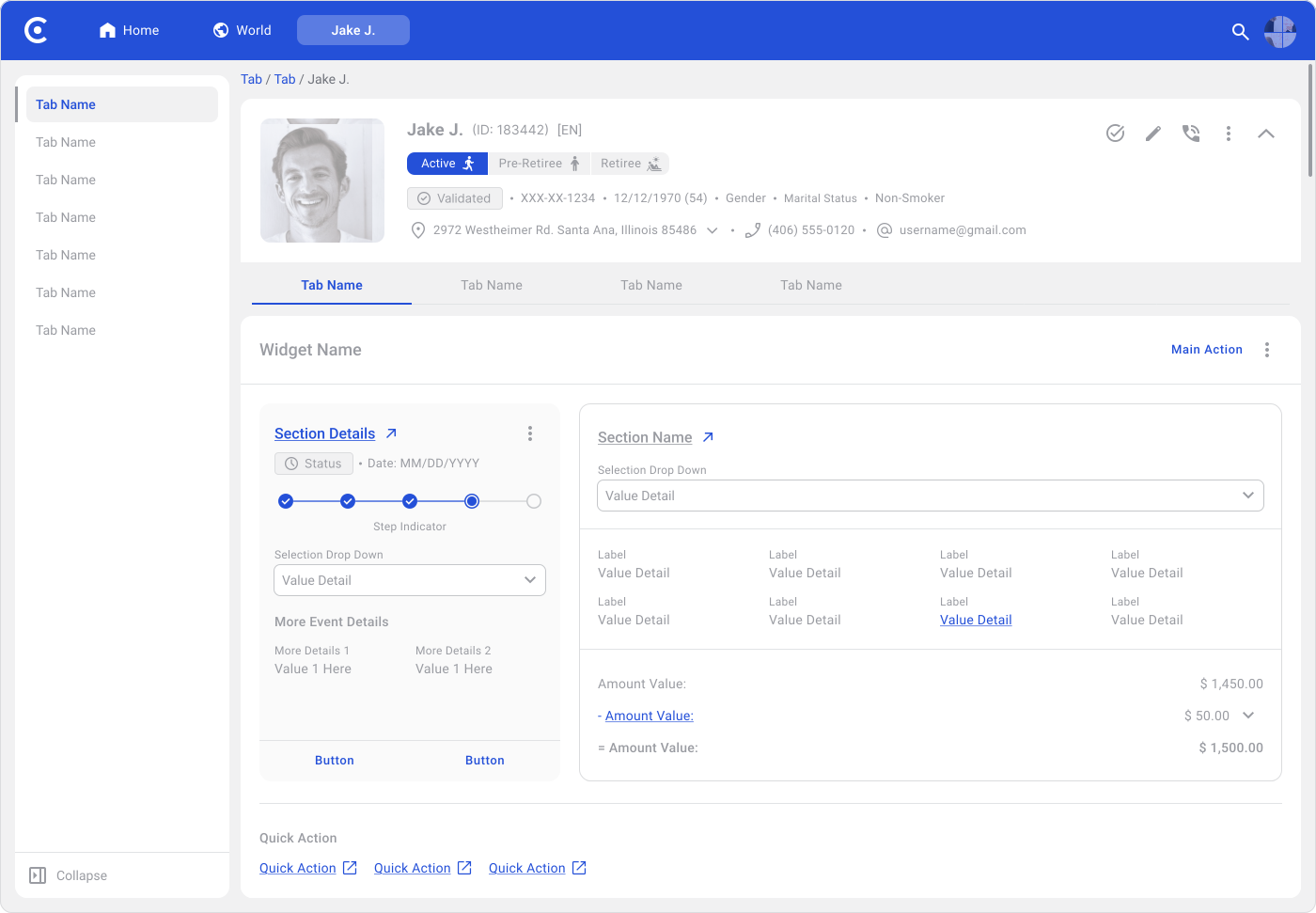
Functional colors communicate status, feedback and system behavior. When used consistently, users can understand what's happening at a glance, often before reading the full message.
These colors should follow patterns users already know:
- Red for errors
- Green for success
- Yellow or orange for warnings
- Blue or aqua for informational states
Consistency here matters more than brand alignment. Users scan interfaces quickly and rely on these patterns to orient themselves.
Rules:
- Give each semantic color one clear meaning and stick to it.
- Don't use semantic colors as decorative accents.
- Check that semantic colors remain legible in both light and dark themes.
- Always pair color with text or an icon. Color alone isn't enough to communicate meaning.
Common mistake!
Using the brand color as a semantic color. For example, reusing a brand red for error states. This blurs the line between brand expression and system feedback, making it harder for users to trust the signals the interface sends.
Neutrals carry most of the interface. They handle layout structure, content separation, readability and reduce visual fatigue over extended use. A solid neutral scale keeps screens feeling organized and makes the UI easier to maintain as the product grows.
Most surfaces, text, borders and backgrounds should come from the neutral scale. Brand and semantic colors only stand out when neutrals give them space to.
Rules:
- Use neutrals across most of the interface.
- Always pull text colors from the neutral scale.
- Keep borders and dividers subtle, but visible enough to support clear separation.
- Use dedicated neutral values for disabled states rather than relying on opacity alone.
Common mistake!
Lowering opacity to fake a disabled color instead of using an actual neutral value. This creates inconsistent contrast across different backgrounds and makes hierarchy harder to read.
Pure black on pure white gives you maximum contrast, but on text-heavy interfaces it can feel harsh and tiring over long sessions. Many systems use a slightly softened black for body text, especially in dashboards, tables and content-dense products.
Rules:
- Avoid pure black for large amounts of body text unless contrast requirements demand it.
- Test black and white combinations with real content and realistic layouts.
Common mistake!
Applying pure black text on pure white across the entire product without checking how it reads over time. A small adjustment to body text color can make a noticeable difference in comfort.
Accent colors support the interface without competing with primary actions. They work well for charts, tags, highlights, progress indicators and secondary UI elements where visual separation helps users scan faster.
Keep accent usage controlled. Too many competing colors flatten hierarchy and makes screens harder to read.
Rules:
- Don't use accent colors in place of brand or semantic colors.
- Limit accent usage to avoid visual noise.
A practical guide for distributing color across the interface:
- 60% neutral colors — backgrounds, text, surfaces, borders and layout structure
- 30% supporting colors — secondary surfaces, soft accents and lower-emphasis elements
- 10% brand and emphasis colors — primary actions, highlights and areas that need user attention
Accessibility, Contrast and Edge Cases
Passing WCAG audits is the baseline, not the goal. If someone has to squint, slow down, or look twice to understand what they're seeing, the color has already failed in practice.
This color system accounts for low vision, color blindness, sensitivity to visual overload and everyday conditions like bright sunlight or small screens.
If it must be read, text contrast is mandatory (WCAG 2.1: 4.5:1)
Any text a user needs to read in order to understand or act must meet a minimum contrast ratio of 4.5:1 against its background. This covers body text, labels, helper text, button text, links, error messages and icons that function as text.
Note!
Large text (18pt or larger, or 14pt bold) can pass at 3:1. Either way, the target is clear readability at a glance.
If It Must Be Seen or Used, Non-Text Contrast Is Required (WCAG 2.1: 3:1)
Any element a user needs to notice or interact with must meet a minimum of 3:1 against surrounding colors. This includes buttons, selected states, focus indicators, toggles, sliders, charts and interactive containers.
Note!
If a user can't quickly tell what's clickable or what state something is in, the contrast isn't strong enough.
If It Is Only Decorative, Contrast Is Optional
Elements that don't affect how the interface works don't require strict contrast. This includes light background tints used to separate sections, soft shadows that add depth without implying interactivity and illustrations that don't communicate status or instructions.
1. All Readable Text Must Meet at Least 4.5:1 Contrast (WCAG 2.1)
Any text that communicates information needs a minimum contrast ratio of 4.5:1 against its background. This applies regardless of size or visual priority. Secondary and helper text still needs to be readable.









2. Large Text May Meet 3:1, but Readability Still Matters
Large text (18pt or larger, or 14pt bold) can meet the threshold at 3:1, but the goal is still clear readability at a glance, not just passing the check.
3. Icons That Act Like Text Follow Text Contrast Rules
If an icon is needed to understand content, identify an action, or communicate a state, it should meet at least 3:1 contrast against adjacent colors. When an icon appears alongside text (like in a button), the text must meet 4.5:1 and the icon must meet 3:1.
Examples of functional icons:
- Heart icon for Like
- Bookmark icon for Save
- Bell icon for Notifications
- Gear icon for Settings
- Checkmark for Success
- Warning triangle for Alert
Icon-only and icon+text actions follow the same principle of visibility, but text carries a stricter threshold because it has to be read, not just recognized.
Common mistake!
- Lowering contrast for helper or secondary text
- Assuming short text doesn't need proper contrast
- Using bold text to compensate for low contrast
- Treating meaningful icons as decorative
1. Surface Contrast Is Contextual
Layout containers, cards and background sections don't always need a specific contrast ratio. When they're purely structural, light visual separation is enough.
2. Interactive Surfaces Must Meet 3:1 Contrast
If a surface has interactive states like hover, focus, or selection, it needs at least 3:1 contrast against surrounding backgrounds. This applies to clickable containers, selected rows, active tabs, error backgrounds, focus states and data visuals.
Common mistake!
- Making interactive surfaces look the same as static ones
- Applying WCAG contrast requirements to containers that are purely decorative
1. Inputs Must Be Easy to Spot
Users shouldn't have to search for where to type. Inputs need to be clearly visible in every state except disabled.
2. Input Borders Must Meet 3:1 Contrast
If a border defines the input boundary, it must meet at least 3:1 contrast against the background. This applies across default, hover, focus and error states.
Common mistake!
- Very light borders on white backgrounds
- Inputs defined only by placeholder text
- Inconsistent contrast across input states
1. Disabled UI Elements May Fall Below WCAG Contrast
WCAG allows lower contrast for disabled states because they signal that something can't be used right now.
2. Disabled Content Must Still Be Readable
Lower contrast doesn't mean illegible. Disabled text should still be easy to read and clearly visible.






3. Disabled Should Look Intentional
Users should immediately understand the element exists but isn't available, not wonder if something is broken or still loading.
4. Opacity Is Not a Good Strategy
Opacity creates unpredictable contrast depending on the surface underneath. A button at 40% opacity might look fine on white but nearly disappear on a grey background. Color blind users may also struggle to distinguish states when opacity is the only differentiator.
Use specific neutral values built for low emphasis instead.
Common mistake!
- Making disabled text hard to read
- Applying opacity to entire components
- Using brand or semantic colors for disabled states
Borders Are Functional Unless Proven Decorative
Most borders serve a purpose, whether that's defining structure, indicating interaction, or communicating state. Input borders and card states are good examples.
Functional Borders Must Meet 3:1 Contrast
If a border defines an input, focus, error, selection, or any interactive area, it needs at least 3:1 contrast against the background.
Decorative Borders Are The Exception
A border only skips contrast requirements when it's purely visual. If removing it doesn't change how the interface is understood, strict contrast isn't required. This covers subtle dividers inside cards or tables, light outlines used to group content, or borders that are part of a visual pattern.
Opacity Is Not a Good Strategy
Opacity creates inconsistent contrast depending on the surface underneath. Use dedicated neutral values built for lower emphasis instead.
1. Focus Must Always Be Visible
Keyboard and assistive technology users depend on focus indicators to navigate. If the focus state is hard to see, the interface doesn't work for them.
2. Focus Must Not Rely on Color Alone
Color alone isn't enough. Shape, outlines, or stroke weight should also contribute to making the focus state clear.
3. Focus Must Work on All Backgrounds
If the focus indicator disappears on certain backgrounds or themes, it needs to be fixed.
WCAG 2.1 covers contrast across different UI elements. It helps to think of them as layers, each with a different level of importance.
1. Text on Surface (Highest Priority)
Any text a user needs to read must meet 4.5:1, or 3:1 for large text. This covers body text, labels, button text, links, helper text, error messages and icons that function as text. This is typically the first thing accessibility tools, auditors and legal reviewers check.
2. Interactive Elements and States (Very High Priority)
Anything a user needs to notice or interact with must meet at least 3:1 against surrounding colors. This includes buttons, selected states, focus indicators, toggles, sliders, input borders and error or success outlines.
Users need to clearly see what's clickable, what's selected, where focus is and what feedback the system is giving. If those states aren't visible, the product becomes hard to use even when the text is readable.
3. Surface on Surface (Contextual)
Surface contrast depends on purpose. Backgrounds, cards and containers don't always need a fixed ratio. A layout-only card can stay subtle. A clickable or meaningful card must meet 3:1.
4. Borders on Surfaces (Conditional)
Borders become a contrast requirement when they serve a functional role. They must meet 3:1 when defining inputs, showing focus, indicating error, warning, or success states, or separating interactive areas users need to notice. Purely decorative borders are exempt.
What to Do If The Branding Colors Don't Meet The Contrast Ratio?
If a brand color doesn't meet 4.5:1, avoid using it for readable text on light backgrounds. Ignoring it leads to inconsistent rules, accessibility gaps and engineering workarounds down the line.
Keep the original brand color for decorative or marketing use, but create an accessible variant for text and UI components:
- A darker version for light themes
- A lighter version for dark themes
This keeps the brand recognizable while making text accessible and easier to implement consistently.
If the brand color can't be adjusted, limit where it appears.
Avoid using it for:
- Body text
- Small text
- Links
- Labels
Instead, use it for:
- Backgrounds
- Highlights
- Decorative accents
- Non-essential icons
Readable content should rely on neutral or semantic colors that reliably meet contrast requirements.
What not to do (Important)
- Don't slightly tweak the color and assume it's accessible without testing
- Don't create exceptions like "it's fine for short text"
- Don't rely on visual judgment alone
- Don't leave engineers to solve contrast issues during implementation
Making text bold, increasing font size, or lowering opacity doesn't reliably solve contrast problems. These adjustments often fail audits and create inconsistent behavior across components. If a color fails contrast, it's a color problem, not a typography problem.
System Structure (How to Build a Color System)
There's no single correct way to build a color system. What matters is maintaining accessibility, validating contrast in real use cases and keeping the system easy to scale and maintain over time.
Most teams usually follow one of two approaches:
- Automatic generation
- Manual construction
Both can work, but they solve different problems and come with different trade-offs.
Using a tool to generate a palette is the fastest way to get started. These tools produce evenly spaced tints and shades that tend to look visually balanced and consistent.
The trade-off is that generated colors are optimized for visual harmony, not accessibility. A palette can look correct in isolation and still fail when applied to text, buttons, states, charts, or interactive surfaces.
Manual adjustment is usually still needed if accessibility is a real requirement.
Advantages:
Automatic generation works well when speed and visual consistency are the priority. It helps teams build palettes quickly, reduce setup time, explore directions faster and arrive at polished starting points.
It is often a practical option for products outside heavily regulated environments such as:
- Government
- Banking
- Healthcare
- Education
- Enterprise systems
Disadvantages:
The main drawback is reduced control. When a tool generates the palette, the reasoning behind individual shades isn't always clear. Over time, this makes the system harder to evolve because color decisions become tied to the tool rather than product needs.
Products built on fully generated palettes can also start to look similar, since many teams use the same generation methods.
Note!
Automatic generation isn't a bad approach. It's fast and practical in many scenarios. The trade-off is that speed often comes at the cost of accessibility confidence and long-term control over the system.
Building a color system manually takes more time, but gives you much more control over accessibility, usability and consistency. Each shade is chosen intentionally, tested in real components and adjusted based on actual usage rather than visual balance alone.
This approach works especially well for products with:
- Strict accessibility requirements
- Complex interfaces
- Large or diverse user groups
- Regulated industries
Testing colors directly inside components makes audits, accessibility reviews and future expansion easier to manage.
Advantages:
The biggest advantage is a deeper understanding of the system. When every shade has a clear purpose, extending the palette becomes more predictable. New colors, states and variants can be added without breaking consistency.
Manual systems also tend to feel more refined in dense interfaces because colors are adjusted for real usage, not theoretical balance.
Disadvantages:
The trade-off is time and ongoing maintenance. Manual systems require:
- Repeated testing
- Visual comparison
- Accessibility validation
- Careful balancing between hues
Some colors create more problems than others. Bright colors like yellow or cyan often need extra adjustment to meet contrast requirements while still feeling visually balanced. That process takes iteration and experience.
First Step
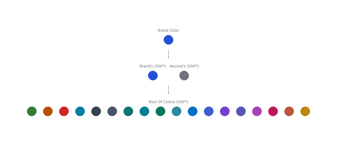
Begin by manually selecting the main colors, usually the 500th shade. These are the most important because they're typically used for default component states and interactive elements.
Validate these directly against the primary surface, usually white in light mode. Dark themes work slightly differently since pure black isn't always the primary surface, so handle those separately within the dark theme system.
Second Step
Once the core 500 shades are validated, use a tool to generate lighter and darker variations. This keeps the palette scalable while maintaining accessibility where it matters most.
Common usage patterns:
- Darker shades for hover, active and focus states
- Lighter shades for backgrounds, grouping, subtle emphasis and decorative structure
This gives teams flexibility without losing control over the colors that carry the most accessibility risk.
Method Used (How This System Is Built)
This system uses a hybrid approach, combining automated generation with manual verification. This keeps contrast reliable, the palette consistent and the system easier to maintain over time.
BEFORE YOU START! Very Important Note
Set up a clear and consistent naming convention before building anything. This makes the palette easier to scale and simplifies token generation later.
Many Figma plugins that generate tokens rely on layer names to organize styles and variables correctly. Inconsistent naming causes confusion once the system grows.
Examples for For Primitive Colors Tokens:
Example 1: Functional Colors / Green / Green 500
Example 2: Neutral Colors / Grey / Grey 500
Text Tokens:
Example for text tokens: Text Color Tokens / Functional Text / Text Positive Default
Surface Tokens:
Example surface tokens: Surface Color Tokens / Functional Surface / Positive Surface Default
Use Numeric Color Scale To Create The Primitive Colors
Use a numeric scale to organize the tints and shades of each base color. Numbers like 50, 100, 200, 300, 400, 500, 600, 700, 800 and 900 simply indicate how light or dark a color is.
- Lower number = lighter (Tints)
- Higher number = darker (Shades)
- Usually the 500th is the base color. <<<
Numbers are more predictable than labels like "light blue" or "dark blue." Anyone working in the system immediately understands that 600 is darker than 500, or that 200 is lighter than 300.
It's also easy to add steps later if needed: (25, 50, 75, 100, 150, 200, 300, 400, 500, 600, 700, 750, 800, 850, 900, 950).
Numeric scales also keep primitive colors neutral. Meaning and usage get assigned later through semantic tokens such as:
- Success
- Error
- Warning
- Hover
- Selected
- Disabled
This separation makes the system easier for both designers and developers to understand and maintain.
Start
Begin with the brand color. Verify that it meets a 4.5:1 contrast ratio against the main surface, usually white.
If it fails contrast, create an accessible variant and use that version for readable text and interactive elements. Keep the original brand color for decorative accents, highlights, or marketing usage.
Step 1: Neutral Colors
Define the neutral palette first, usually greys.
Neutrals shape most of the interface and heavily influence readability, hierarchy, borders, backgrounds and layout structure. A strong neutral system prevents many accessibility issues before they appear.
Make sure the base neutral color (500) should maintain at least a 4.5:1 contrast ratio against the primary surface, usually white.
Step 2: Define the Base Colors
Once the brand and neutral colors are validated, compare them side by side with the other base colors in the system. The palette should feel visually balanced, with colors sharing a similar perceived intensity even if the hues are different.
Adjust the supporting colors carefully around the brand color rather than modifying the brand itself. This helps preserve brand consistency while maintaining accessibility and visual harmony across the palette.
All base colors (500 shades) should meet a 4.5:1 contrast ratio against the main surface.
Step 3: Generating Tints and Shades
Use a tint and shade generation tool such as Shadowlord by Noel Delgado or the on this page, which uses OKLCH. OKLCH is a modern tool ensuring that numerical changes in lightness or hue produce consistent, predictable visual shifts that match how humans actually perceive color.
If using Shadowlord:
- Add the hex value of your 500 shade and set the percentage to 5%. Pick colors at every 5% step in both directions to build your tints and shades.
If using an OKLCH tool:
- Make sure the tool lets you set a background color so you can see how each variant looks in context and check contrast against a real surface.
- The also lets you force your chosen 500 shade to meet a minimum contrast ratio against the background of your choice. Targeting 4.7:1 instead of 4.5:1 gives you a small buffer. If the same color ends up on a slightly darker surface, it will likely still land at 4.6 or 4.5 and remain accessible.
Step 4: White and Black Colors
White and black variants can be created by reducing opacity in controlled steps. These values are useful for overlays, layering, dividers, shadows and subtle surface treatments.
From the base color, reduce opacity to: 80%, 75%, 70%, 65%, 60%, 55%, 50%, 45%, 40%, 35%, 30%, 25%, 20%, 15%, 10%, 5%, 2% (adjust if needed).
Step 5: Group Colors into Clear Categories
Group colors based on their purpose to keep the system easier to understand and maintain.
- Primary or Brand Colors
- Functional or Semantic Colors
- Neutral Colors
- White and Black Variants
- Secondary or Accent Colors
- Gradients
Clear grouping improves token organization and helps both designers and engineers apply colors more consistently.
Common mistake!
Be careful when using pure black on pure white backgrounds. While this combination easily passes accessibility requirements, the contrast can become visually harsh in dense interfaces, dashboards, or reading-heavy layouts. Long exposure to maximum contrast often increases eye strain and makes hierarchy feel too aggressive.
Softer dark neutrals usually create a more comfortable reading experience while still maintaining strong accessibility contrast.
Color Tokens
Color tokens are named variables in Figma. They create a layer between raw color codes and UI elements. Instead of applying HEX values directly, colors are used based on their purpose.
As for how to create the color tokens, Christopher Deane structured a great tutorial which was used to create tokens for this Design System.

Reminder
Keep tokens simple and easy to manage. Avoid complex naming systems. This prevents problems later if colors change or the system grows. Use short, clear names. Long or complicated names make the system harder to maintain and easier to misuse.
🔗 Sources
Using Color to Enhance Your Design, Nielsen Norman Group
Source LinkSnippet: "Color is one of the most important and influential tools a designer has… it can set the brand tone… draw users' attention…"
Color roles, Material Design 3
Source LinkSnippet: "There are 26 standard color roles organized into six groups: primary, secondary, tertiary, error, surface and outline."
Visual Hierarchy in UX: Definition, Nielsen Norman Group
Source LinkSnippet: "A clear visual hierarchy guides the eye to the most important elements on the page."
Colour, GOV.UK Design System
Source LinkSnippet: "The GOV.UK Design System has a set of functional colours for essential page elements. These help apply colours… in a way that makes interactions predictable and consistent to users."
Color, Apple Human Interface Guidelines
Source LinkSnippet: "Avoid using the same color to mean different things. Use color consistently throughout your interface…"
What is Color Harmony?, Interaction Design Foundation
Source LinkSnippet: "Color should not be the sole indicator of meaning… Designers supplement colors with icons, text prompts and other visual cues."
Overview: Color, Atlassian Design
Source LinkSnippet: "Neutral colors apply to most backgrounds, text and shapes in our experiences. They don't typically have a meaning associated with them, though they can imply things like disabled states."
Color, Carbon Design System
Source LinkSnippet: "For enabled UI colors light themes primarily use the color range of White to Gray 20 and for text and icons uses the color range between Gray 100 and Gray 60."
Dark Mode: How Users Think About It and Issues to Avoid, Nielsen Norman Group
Source LinkSnippet: "Thin fonts can be easily 'swallowed up' by a dark background… This is true even of pure white fonts on pure black backgrounds."
The 60–30–10 Rule: A Foolproof Way to Choose Colors for Your UI Design, UX Planet
Source LinkSnippet: "60% of the dominant color… 30% of the secondary color… 10% of the accent color"
WebAIM: Understanding WCAG 2 Contrast and Color Requirements
Source LinkSnippet: "Users, including users with visual disabilities, must be able to perceive content on the page."
Low-Contrast Text Is Not the Answer, Nielsen Norman Group
Source LinkSnippet: "Low-contrast text may be trendy, but it is also illegible, undiscoverable and inaccessible."
Considering the User Perspective, WebAIM
Source LinkSnippet: "Make sure that there is sufficient contrast between text and background and for icons and graphics. Don't use color alone to convey meaning…"
Understanding SC 1.4.3: Contrast (Minimum), W3C WAI
Source LinkSnippet: "text… has a contrast ratio of at least 4.5:1" and "Large-scale text… at least 3:1"
Understanding SC 1.4.11: Non-text Contrast, W3C WAI
Source LinkSnippet: "User Interface Components: Visual information required to identify user interface components and states…"
WebAIM: Understanding WCAG 2 Contrast and Color Requirements
Source LinkSnippet: "Contrast and color use are vital to accessibility."
G207: Ensuring that a contrast ratio of 3:1 is provided for icons, W3C WAI
Source LinkSnippet: "if the icons are required to understand the content, then the icons need to have a contrast ratio of at least 3:1."
GOV.UK Design System Components
Source LinkSnippet: "GOV.UK's component-first system reflects accessible, clearly identifiable inputs and form patterns."
Understanding SC 1.4.3: Contrast (Minimum), W3C WAI
Source LinkSnippet: "User Interface Components that are not available for user interaction… are not required to meet contrast requirements."
Systemizing color for change, UX Collective
Source LinkSnippet: "Opacity doesn't always translate the same across different color pairs"
Understanding SC 2.4.13: Focus Appearance, W3C WAI
Source LinkSnippet: "The purpose of this success criterion is to ensure a keyboard focus indicator is clearly visible and discernible."
C41: Creating a strong focus indicator within the component, W3C WAI
Source LinkSnippet: "create a highly visible focus indicator that has sufficient contrast against the internal background color of a component."
Designing a scalable and accessible color system for your design system, UX Collective
Source LinkSnippet: "Accessible or inclusive design focuses on making products consumable for people with disabilities."
Designing an accessible color scheme, again, Medium
Source LinkSnippet: "I built all the colors on top of a white background and chose shades greater than or equal to common accessibility contrast ratio breakpoints of 7:1, 4.5:1 and 3:1."
Colour contrast in UX. What does it mean to design for…, UX Collective
Source LinkSnippet: "...focus on colour contrast, both how to plan for an accessible palette and how to meet the standards."
Designing a colour system, UX Collective
Source LinkSnippet: "Organizing color systems, light/dark mode and architectural separation of color layers."
Color in Design Systems, Medium / EightShapes
Source LinkSnippet: "...16 lessons I've learned while stabilizing a primary palette, tint and shade choices, secondary palettes and solving for accessible contrast."
Reimagining Colors for Digital Accessibility, UX Planet
Source LinkSnippet: "The 5 points below explain the steps designers can take to learn and understand the use of colors for an accessible user experience."
How to define color usage through semantic sets for design systems, UX Collective
Source LinkSnippet: "A semantic name for a color defines how a primitive color will be used throughout a design system."
Accessible colours for your design system: A comprehensive guide, Medium
Source LinkSnippet: "A robust and accessible colour palette stands as a pivotal cornerstone that profoundly shapes a product's identity and user experience."