Coachmarks Research
View Figma ComponentKey Takeaways
- Coach marks work best when they teach one thing at a time, appear in context and help users take immediate action. They are most effective for introducing features, highlighting changes and drawing attention to interactions that users might otherwise miss.
- They should remain short, optional and visually distinct from the product. The more information they contain, the less likely users are to read them.
Overview
Coach marks are temporary instructional overlays that appear over the interface to point users toward something specific: a new feature, a recently changed workflow, or something easy to miss. They show up when it's relevant, not upfront as a product tour.
They're commonly used during onboarding, feature releases, or when introducing workflows that aren't immediately obvious. The key is that they guide users toward a specific action rather than trying to explain everything at once.
One hard limit worth calling out early: coach marks can't fix a confusing product. If you need a large number of them just to get users through basic navigation, the interface needs work, not more coach marks.
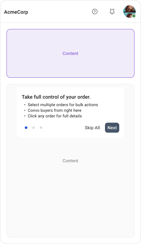
During a Product Tour
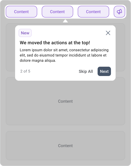
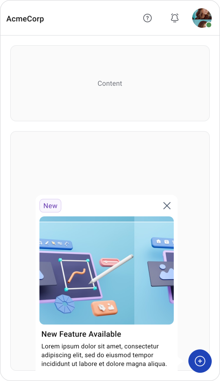
Discovering a New Feature
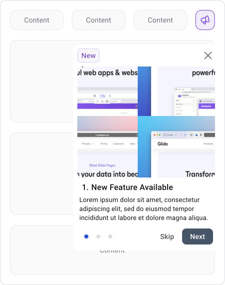
Discovering a New Feature
Coachmarks Anatomy
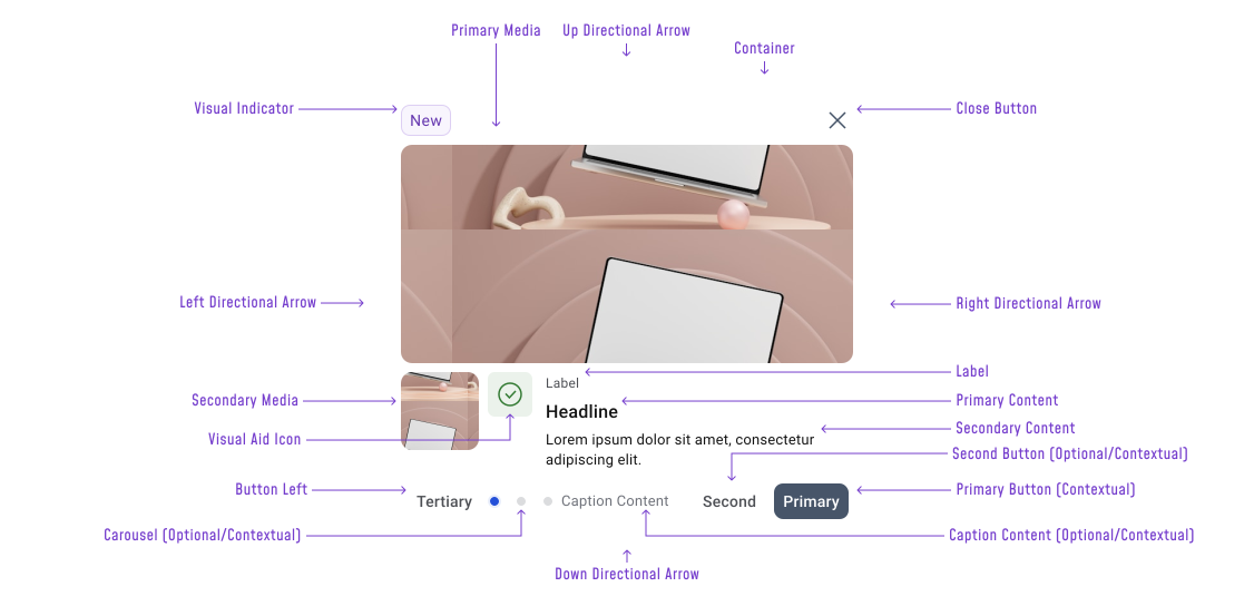
A Coach Mark typically consists of:
- Container — The card that holds all content. Sits above the dimmed interface, visually separate from the rest of the UI so the user understands this is instructional, not interactive.
- Visual Indicator — A badge or tag ("New") that signals why the coach mark is appearing. Helps users immediately understand whether this is a new feature, an update, or something else worth paying attention to.
- Close Button (×) — Explicit dismiss control. Sits in the top-right corner. Should always be present when the coach mark is modal or when there's no obvious way to dismiss it otherwise.
- Primary Media — A smaller thumbnail image sitting alongside the headline and body content. Optional, used to reinforce the explanation with a supporting visual.
- Secondary Media — A full-width image or illustration at the top of the container. Used when a visual makes the explanation clearer than text alone IT can be a short animation, video or image.
- Visual Aid Icon — An icon paired with the headline to add context or reinforce meaning. Optional.
- Label — A short tag or badge sitting above the headline, used for status or categorization ("New", for example). Optional.
- Primary Content — The title of the bubble. Can include a leading icon for additional context. Not always needed for short explanatory content.
- Secondary Content — Additional contextual text below the headline.
- Carousel — Dot indicators for multi-step or multi-page bubbles. Optional, only relevant when the bubble contains more than one screen of content.
- Caption Content
- Button Left (Tertiary)
- Second Button
- Primary Button
- Directional arrows
In practice, most instances use a smaller subset. A lot of the Ui elements are either contextual or optional. The end result should be simple and clean.
When to Use Coachmarks
Coach marks work best when something specific needs pointing out that a user would likely miss on their own. Timing matters as much as placement. Showing a coach mark when the feature is actually on screen means the user can act on it immediately instead of trying to remember instructions from earlier in the flow.
Good use for:
- New features the user hasn't seen before
- Features that moved and users expect somewhere else
- Advanced interactions or gestures that aren't visually obvious
- Complex or unique workflows that need a nudge to get started
- Important updates after a product release
- Onboarding flows and guided product tours
When Not to Use Coachmarks
Avoid them for long explanations or multiple callouts at once. If onboarding requires that much education, a guided setup, walkthrough, or interactive learning flow will serve users better.
UX Principles
One coach mark, one idea. Users are trying to get something done, not read instructions. When multiple callouts appear together, most people dismiss everything and move on.
A short explanation shown directly on the feature beats a longer one shown before the user gets there. When users can immediately try what they just read, it sticks. When they have to remember it for later, it doesn't.
Visuals carry a lot of the weight. Arrows, highlights and illustrations often communicate faster than the text alongside them. Even users who skip the written content can usually tell where to look and what to do next.
Behavior Patterns
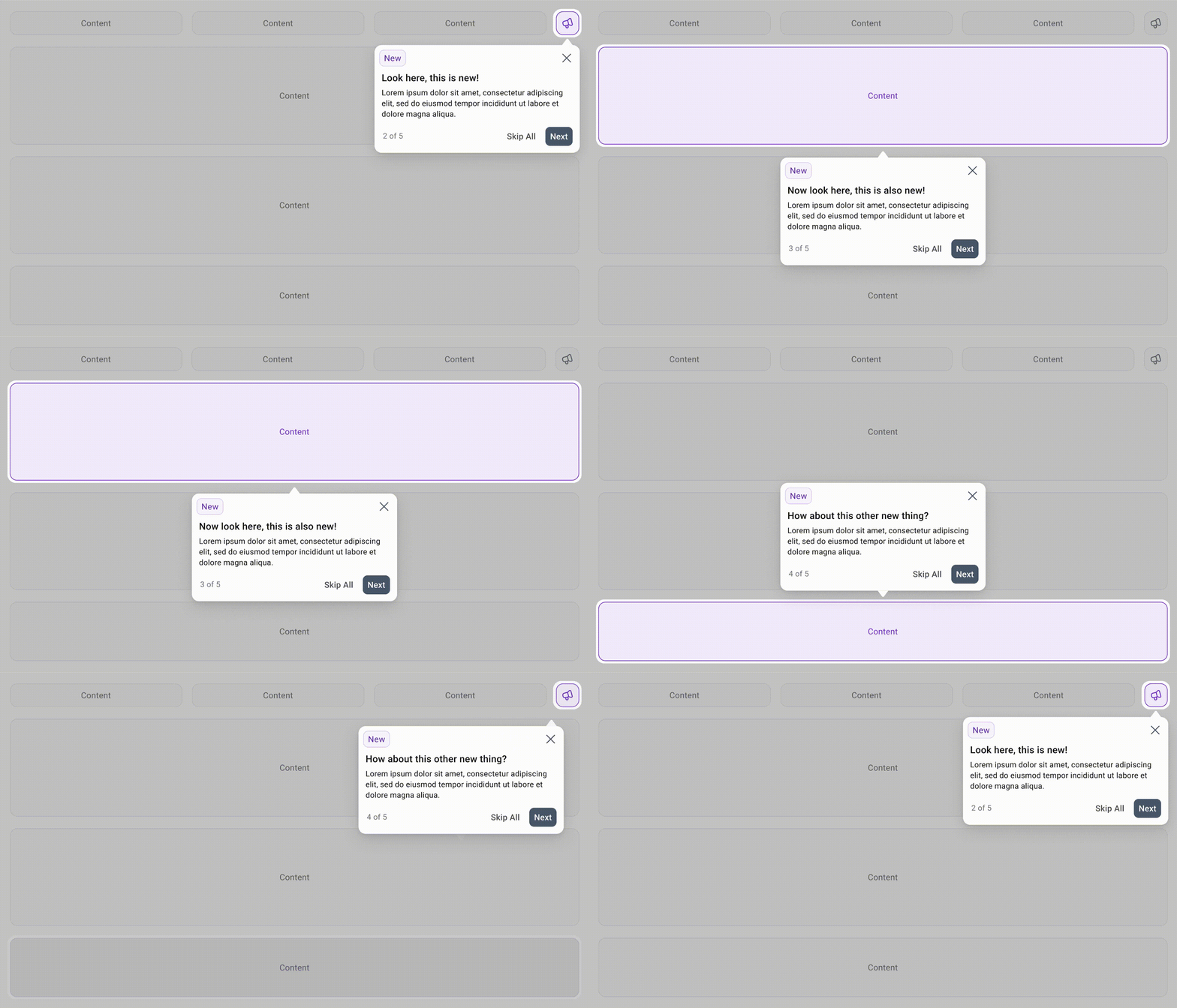
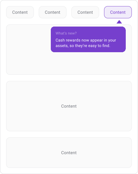
Discovering a New Feature
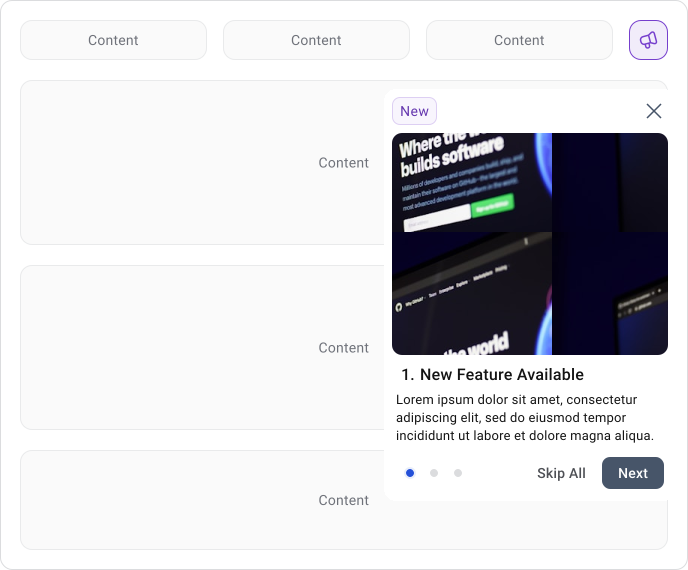
Discovering a New Feature
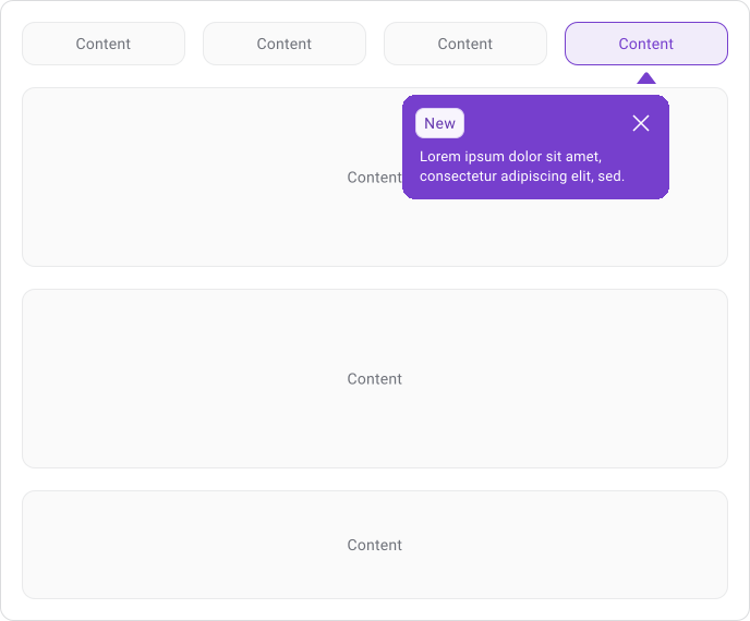
A coach mark sits near the element it's referencing, points toward it and dims everything around it. The target stays visible so the user can see exactly what's being talked about while the rest of the interface steps back.
Some coach marks are standalone and dismiss immediately. Others are chained into a sequence where each step covers one thing before moving to the next. When there's a sequence, progress indicators and a skip option are essential. Users need to know how many steps are left and be able to exit at any point.
Action-dependent coach marks stay visible until the user completes a specific interaction. This works well for teaching a gesture or a non-obvious action, but even then the user should always have a way to dismiss it without completing the task.
Note!
Only one should be visible at a time. If multiple coach marks open at once, the user will be overwhelmed and tend to skip all of them.
Content Rule - Keep it simple!
Keep it to one or two short sentences. The copy should tell the user why something is useful, not walk them through every step of how it works. Value lands better than instructions.
Titles short, body text shorter, everything easy to scan at a glance. If the explanation needs several paragraphs, a coach mark is the wrong place for it.
Accessibility
Coach marks behave like temporary modal content. When one appears, screen readers need to know about it, typically through dialog or alert semantics.
Keyboard focus should stay inside the coach mark until it's dismissed. Users shouldn't be able to accidentally tab into the dimmed interface behind it. When the coach mark closes, focus should return somewhere logical on the page.
Always provide a way to dismiss or skip. This applies to every user, not just those using assistive technology.
Mobile Considerations
Screen space is reduced compared to desktop and attention is shorter on mobile. Keep coach marks to a single interaction and avoid covering large portions of the screen.
Visuals do more work here than on desktop. An image or gesture illustration communicates faster than a sentence, which matters when users are in a shorter session or easily interrupted.
If several coach marks are needed, spread them through the experience over time rather than stacking them into a sequence right after launch.
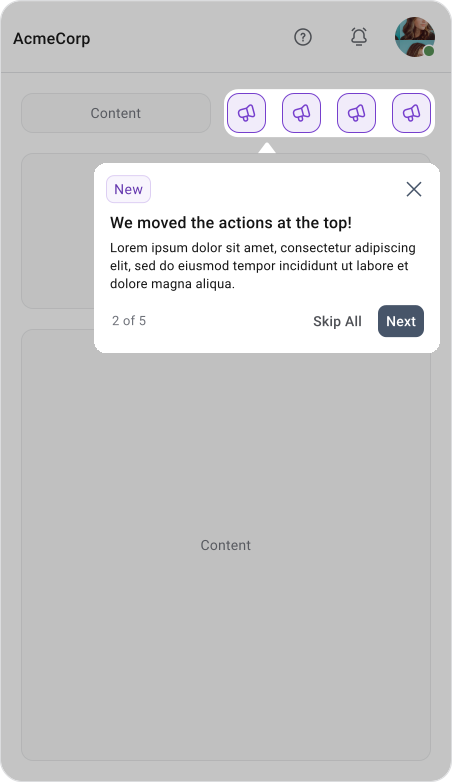
Best Practices
A coach mark should feel like useful information at the right moment, not an interruption. It shows up when the feature is visible, points directly at it and gets out of the way once the user has seen it.
- One tip at a time
- Short, scannable content
- Clear visual connection to the UI element it's referencing
- Easy to dismiss or skip at any point
- Used only when the feature genuinely needs it
Common Mistakes
- The most common mistake is trying to explain too much. Long tutorials, multiple simultaneous callouts and lengthy tours often lead users to skip everything.
- Another common problem is making coach marks visually blend into the product. When users cannot distinguish instructional content from the actual interface, they may attempt to interact with the tutorial itself.
- Poor placement can also reduce effectiveness. Covering the feature being explained or showing the coach mark out of context makes the guidance harder to understand.
Final Thoughts
Coach marks work well when the product is already clear and something specific just needs pointing out. Used sparingly, they help users discover new features or adapt to changes without getting in the way.
When the product is confusing, adding more coach marks makes it worse. Good product design does most of the teaching. Coach marks just fill in the gaps.
🔗 Sources
Coach Mark
Source LinkWhat Are Coach Marks?
Source LinkCoach Mark Adobe
Source LinkWeb Guided Tour UI - Coach Mark
Source LinkHow to Use Coachmarks and Spotlight UI in Mobile Apps
Source LinkMastering Mobile Onboarding: A Comprehensive Guide to UI Success
Source LinkCoachmarks - Design Pattern
Source LinkCompose Coach
Source LinkOnboarding UX: Ultimate guide to designing for user experience
Source LinkPut me in coach (marks)
Source LinkWalkthrough vs Coach marks
Source LinkCoach Mark- designlibrary.sebgroup.com
Source LinkCoachmarks - chameleon.io
Source LinkMobile Coach Mark UI
Source Link