Chips & Tags Research
View Figma ComponentKey Takeaways
- Chips work for quick, lightweight interaction. Keep primary actions elsewhere.
- State needs to be immediately obvious. Visual style is secondary.
- Labels should be short. If a user has to read twice, it’s too long.
- In multi-select, always give users a way to remove individual items.
- Reach for chips when users are managing multiple values or filters. For simple single choices, a simpler control usually works better.
Differentiating Statuses, Badges and Chips/Tabs
Statuses, badges and chips/tags share the same compact, rounded visual style, which makes them easy to confuse. The difference is functional. Ask yourself: what does it communicate and can the user interact with it?
Display data only. Users read them, nothing happens when clicked.
Statuses
Communicate state or condition. They’re informational, telling the user what something currently is. Not clickable.












Badges
Highlight small pieces of metadata or counts. They sit next to something else and draw attention to it, but don’t invite interaction.


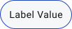
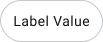
Work as lightweight interactive controls. Users can select, filter, input values, or trigger actions with them. They behave like compact buttons.
Chips/Tags
Dismissible
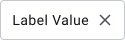
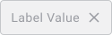
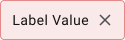
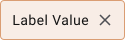
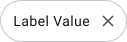
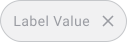
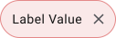
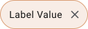
Chips/Tags
Filter/Selectable


Anatomy and Structure
A chip has two required parts: a container and a label. Optional elements like icons, avatars, counters, or a remove action can add meaning or enable interaction. These extras support the label, they never replace it. The text is always the primary signal.
Chips behave like lightweight buttons, so state communication matters. Users need to know at a glance whether a chip is interactive and what state it’s in.
Core states: Default, Hover, Selected, Disabled. Each should be visually distinct enough that there’s no ambiguity.





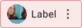

Three additional states cover edge cases where a chip’s value has a problem or needs attention, for example: a user who has left the organization, is no longer eligible, or an invalid value was entered.
These states give users a clear signal that something needs to be resolved.
- Keep labels short, one to three words. Longer text breaks the rhythm and makes chips harder to scan at speed.
- Keep it minimal. Colors can indicate status or category, but overusing strong colors or effects creates noise.
- Interaction feedback is mandatory. Micro-interactions like subtle animations help confirm actions.
What are Chips/Tags & When To Use
Chips (also called pills or interactive tags) are small, compact UI elements that represent a piece of information or an option the user can interact with. They work well for simplifying interactions that involve multiple values or quick selections.
Reach for chips when users need to manage multiple values at once or when quick, lightweight interaction is the goal. They support a flow rather than drive it, so keep primary actions elsewhere.
Examples
- Selecting multiple filters in a product list (e.g. “Wi-Fi”, “Parking”, “Pool”)


- Showing selected recipients in an email field
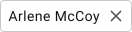
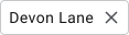
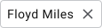



- Displaying selected interests during onboarding
- Tagging tasks with labels like “Urgent” or “Review”
- Quick actions like “Cafes”, “Shops”, “Gas Stations” in a map app
When Not To Use Chips
Avoid chips where clearer, more established patterns already exist, like primary buttons, navigation, or strict single-selection controls. They also don’t work well for long content or complex messaging. Their value is in quick scanning and lightweight interaction.
Examples:
- Don’t use chips as main CTA buttons
- Don’t replace radio buttons for strict single selection
- Don’t use icon-only chips without labels
- Don’t use chips to display error messages
Types and Behavior
Chips cover multiple interaction patterns. The type depends on what the user needs to do.
- Input chips capture user input and convert it into a removable item
- Choice chips allow selecting one option from a group
- Filter chips allow multiple selections to refine content
- Action chips trigger quick actions
Chips need clear visual feedback across hover, focus and selected states. When selected, they change color or show an indicator. When removable, the remove action should always be visible and easy to hit.
- Clicking a filter chip toggles it on or off and updates results
- Typing an email converts it into a removable chip
- Selecting one chip in a group deselects the others
- Pressing backspace removes a focused chip
Accessibility
Chips are interactive in most cases, so they carry the same accessibility expectations as buttons. That means proper keyboard support, correct ARIA roles and clear state communication for screen readers, especially when chips represent dynamic content like filters or selected values.
Touch usability matters too. Chips that are too small or too close together cause misclicks, particularly on mobile.
Chips combine text, interaction and state, which creates three common accessibility risks: poor contrast, unclear states and weak focus visibility.
Text must stay readable across all states. Selected and disabled chips still need sufficient contrast and state changes should never rely on color alone.
- Text contrast: at least 4.5:1 for normal text, 3:1 for large text
- Non-text contrast (borders, selected states): at least 3:1 against background
- Selected state uses more than color alone, such as a checkmark or border change
- Focus state clearly visible on all backgrounds
- Disabled chips stay readable, not faded to the point where the label becomes illegible
🔗 Sources