Checkbox, Radio & Switches Research
View Figma ComponentKey Takeaways
- Checkboxes, radio buttons and switches support different types of decisions. Choosing the wrong control creates confusion because users already associate each one with a specific interaction pattern.
- Checkboxes and radio buttons are usually part of a larger form or selection flow where users review choices before submitting. Switches apply changes immediately.
- Most usability problems come from mismatched behavior. Common issues include allowing multiple selections when only one is valid, restricting users when flexibility is needed, or using switches for actions that should require confirmation.
When to use: Checkbox, Radio Buttons, Switches?
The main thing to consider is the type of decision users are making and whether the system allows one option, multiple options, or an immediate on/off action.
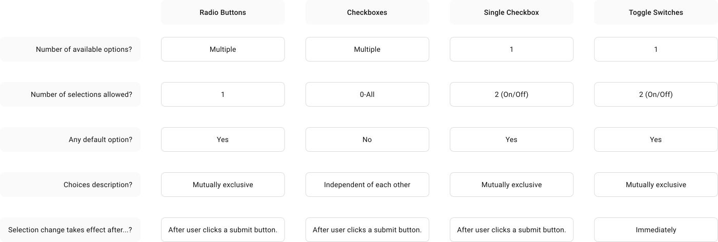
Source: Toggle-Switch Guidelines
Checkboxes
Checkboxes allow users to select one option, several options, all options, or none at all. This flexibility helps when users need time to build a selection or when there is no single correct combination.
A single checkbox can also be used for consent or preferences. In those cases, the state is usually reviewed later as part of a larger action like submitting a form.
Checkboxes work well when users:
- Build a selection over time
- Combine multiple options
- May leave everything unselected
Checkboxes work best for independent selections. Each option can be turned on or off without affecting the others, which gives users flexibility when building a selection. This makes checkboxes useful in flows where users explore preferences, filters, or combinations.
Checkbox lists should support fast scanning. Vertical layouts work best because they follow natural reading patterns and make options easier to compare. Labels should stay short and direct. Users should understand the outcome of selecting an option without reading long descriptions.
Examples:
- Vertical filter lists with clear spacing improve scanning
- Short labels like “Email notifications” are easier to process
- Clickable rows improve mobile usability and reduce missed taps
Mistake 1: Using checkboxes when only one option is allowed creates confusion because users expect multiple selection.
Mistake 2: Long or unclear labels slow down decision-making and increase mistakes.
Mistake 3: Large unstructured lists make scanning harder and increase cognitive load.
Radio Buttons
Radio buttons are used when users must choose one option from a predefined set. Selecting one option automatically deselects the others, which keeps the decision controlled and predictable.
This pattern works well when the system requires a single answer before users can continue.
Examples:
- Choosing a payment method
- Selecting a shipping option
- Picking a subscription plan
- Choosing a language
Radio buttons function as a connected group. Only one option can remain active at a time and the system enforces that relationship automatically.
Many interfaces preselect a default option to speed up completion and reduce empty states.
This can help in simple flows, but users may also skip the decision entirely if the default already looks acceptable.
Radio buttons should make comparison easy. Options should stay aligned, readable and visually connected to their labels.
- Vertical layouts usually work best because they support scanning and reduce spacing issues. Horizontal layouts become harder to read when labels vary in length.
- Labels should follow a consistent structure so users can compare choices quickly.
- Defaults should only be used when there is a clear safe or commonly expected option.
Mistake 1: Using radio buttons when users need multiple selections restricts flexibility and creates frustration.
Mistake 2: Preselecting defaults without a clear reason can lead users to submit unintended choices.
Toggle Switch
Toggle switches control immediate on/off states. The change happens as soon as the user interacts with the control, so users expect the result to apply instantly.
Because switches trigger immediate updates, they should only be used for actions that are clear, reversible and low risk.
Examples:
- Turning notifications on or off
- Enabling dark mode
- Muting sound
- Showing or hiding a section
- Enabling a feature flag
Toggles are action-based controls. Changing the switch immediately updates the system state without requiring an extra confirmation step.
Strong visual feedback helps prevent mistakes.
Position, color and movement should clearly communicate whether the switch is on or off.
Labels should describe what the switch controls so users understand the outcome before interacting. Most interfaces place the active state on the right and reinforce it with color, while inactive states remain neutral.
Touch targets should be large enough for comfortable interaction, especially on mobile devices.
Mistake 1: Using switches for destructive or high-risk actions creates uncertainty because users expect immediate and reversible behavior.
Mistake 2: Weak visual distinction between states makes it difficult to tell whether something is enabled or disabled.
Accessibility Guidelines
Checkboxes, radio buttons and switches should remain easy to identify and understand across mouse, touch, keyboard and assistive technologies.
Labels and text should meet WCAG contrast requirements of 4.5:1 for normal text and 3:1 for large text. Interactive parts such as borders, check indicators, selected states and focus states should maintain at least 3:1 contrast against surrounding surfaces so states remain clear in different conditions.
States such as hover, focus, selected, disabled and error should remain visually distinct and should never rely only on color to communicate meaning.
Keyboard focus must stay visible and interactions should follow predictable keyboard behavior. Controls should also provide comfortable touch targets, especially on mobile.
A minimum size of 24×24 px supports accessibility requirements, while 44×44 px improves usability and reduces missed taps.
Final Thoughts
Checkboxes, radio buttons and switches support different interaction patterns, so choosing the right control has a direct impact on clarity and usability.
Small details like layout, labeling, feedback and accessibility states also make a noticeable difference, especially in forms and settings used frequently.
🔗 Sources