Button System Research
View Figma ComponentKey Takeaways
- Buttons should feel easy to understand and easy to trust. If users pause before clicking, the label, hierarchy, or placement may be unclear.
- Hierarchy helps users understand which action matters most. Visual weight, spacing and placement guide attention and reduce decision effort.
- Feedback makes interactions feel reliable. When a button responds immediately, users know their action was recognized.
- Consistency helps users move faster. Repeating familiar patterns reduces hesitation and makes interfaces easier to learn.
Principles
Buttons should follow a small set of shared principles across the product. Consistent behavior and structure make actions easier to recognize, understand and use.
A button should clearly explain what happens after interaction. Users should understand the outcome without needing extra explanation from surrounding content.
- Use specific action labels.
- Avoid vague wording.
- Match the label to the result users expect.
Examples:
- “Create Account” clearly explains the action and outcome.
- “OK” often depends too much on surrounding context.
Hierarchy helps users understand where to focus first. Interfaces become harder to scan when multiple actions compete for attention.
Hierarchy is created through:
- placement
- spacing
- size and type
- contrast
Primary actions should stand out clearly, while secondary and tertiary actions should feel less visually dominant.
Feedback confirms that interaction happened. Without it, users may click repeatedly or assume the interface is broken.
Buttons should always respond visually:
- Hover - shows the element is interactive
- Pressed - confirms the click or tap
- Loading - communicates that the system is processing
Even short delays feel uncertain when there is no visible response.
Consistency helps users rely on learned behavior instead of re-evaluating every screen.
This applies to:
- placement
- order
- styling
- behavior
When primary actions move between screens or behave differently, users slow down and make more mistakes.
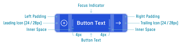
Anatomy
A button is made of a few core elements that help users recognize interaction, understand the action and click comfortably.
- Button Text → explains the action clearly
- Container → creates the visible clickable area
- Padding → improves readability and makes the button easier to click or tap
- Visual cues → communicate interactivity through contrast, borders, shadows, or states
- Icons → support recognition and help reinforce actions when used correctly
Important Notes!
Clear labels matter more than visual styling. If users do not understand the action, changing colors, shadows, or shapes will not solve the issue.
Button States
Button states help users understand what is interactive, what is happening and whether their action was successful. Clear states reduce hesitation and make the interface feel responsive.
Default State

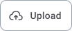


The default state establishes hierarchy before interaction happens.
- Primary buttons should stand out clearly because they represent the main action on the screen or section.
- Secondary buttons should remain visible but less visually dominant. They support the primary action without competing for attention.
- Tertiary buttons should stay subtle and avoid drawing unnecessary focus.
Hover State




Hover states help users recognize interaction, especially on desktop interfaces where cursor feedback matters. Small visual changes such as color shifts, border changes, or elevation help confirm that the element can be clicked.
Pressed / Active State




Pressed states confirm that input was recognized. Feedback should feel immediate so users do not question whether the action worked. Buttons often appear slightly darker or pressed inward to create a stronger sense of interaction.
Focus State
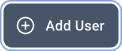
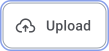


Focus states support keyboard navigation and accessibility by showing which element is currently selected.
- Use outlines as it is a strong visual indicators.
- Keep focus styles consistent across all button types.
- Ensure the focus state remains clearly visible on every background.
Disabled State

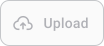


Disabled buttons communicate that an action is currently unavailable. They should remain visible so users understand the missing action or requirement, but the inactive state should be visually clear.
Loading State

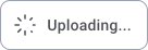


Loading states communicate that the system is processing the action. Without visible feedback, users may think the interface did not respond and trigger the action multiple times. Loading indicators should appear immediately after interaction and remain clear until the process finishes.
Hierarchy & Types
Clear hierarchy helps users decide quickly. When actions compete visually, users slow down to compare options and understand what matters most. Users should immediately recognize the primary action, understand secondary choices and ignore less important actions until needed.
Primary Buttons

Primary buttons represent the main action in a flow. They should be the most visually prominent action within their section or screen.
- Used for actions like Submit, Continue, Buy, Save
- Visually stronger than surrounding actions
- Placed where users expect progression or completion
Note: Use only one primary action per screen or section. Multiple primary buttons reduce clarity and make decisions harder.
Secondary Buttons
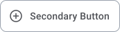
Secondary buttons support the main action. They usually handle alternative paths or non-critical actions.
- Used for Cancel, Back, Skip
- Less visually dominant than primary buttons
- Positioned near the main action without competing with it
Tertiary Buttons
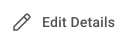
Tertiary buttons handle optional or contextual actions. They are often text-based and work well in dense layouts where stronger visual styling would create noise.
- Used for Learn more, Explore, Edit, Cancel
- Styled to remain subtle
- Should not pull attention away from primary actions
Icon Only Buttons


Icon buttons depend on recognition instead of text. They work best for familiar actions users already understand.
- Used when space is limited
- Best for common and recognizable actions
- Should appear in small groups to reduce ambiguity
Examples
- Plus icon → Add
- Pen icon → Edit
Floating Buttons


Floating action buttons stay visible above content and highlight a single important action. They are commonly used in mobile interfaces where quick access matters.
A floating button should stay noticeable without blocking content or interfering with interaction.
- Poor placement can:
- Cover important UI elements
- Hide information
- Compete with other actions
Reachability also matters on mobile. Buttons placed too high or too close to screen edges become harder to tap comfortably with one hand.
Positive Buttons




Positive buttons reinforce successful or safe actions and help users move forward with confidence.
- Used for Confirm, Save, Approve
Destructive Buttons

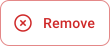


Destructive buttons represent high-risk actions that may be permanent or difficult to reverse.
- Used for Delete, Remove, Reset
These actions should feel visually distinct so users immediately recognize the risk.
Note: Destructive actions should rarely happen instantly. Confirmation steps or safeguards help reduce accidental errors.
Warning Buttons




Warning buttons communicate caution without implying permanent damage.
Used for:
- Leaving a page with unsaved changes
- Overwriting existing data
- Continuing with incomplete information
Warning states help users pause and review their decision before continuing.
Split Buttons
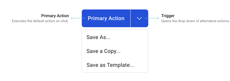



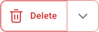




Split buttons combine a default action with additional related actions inside the same component. They work well when one action is used most of the time, while alternative versions are needed occasionally.
How Split Buttons Work
The main button triggers the default action immediately. The secondary trigger opens a menu with related alternatives or variations of the same task.
When to Avoid
Split buttons add complexity when:
- All actions are equally important
- Users switch between options frequently
- The difference between actions is unclear
Important Notes!
Split buttons depend heavily on clarity.
- The default action should be obvious
- The dropdown trigger should remain clearly visible
- Users should immediately understand the difference between options
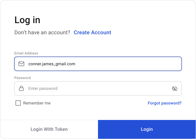
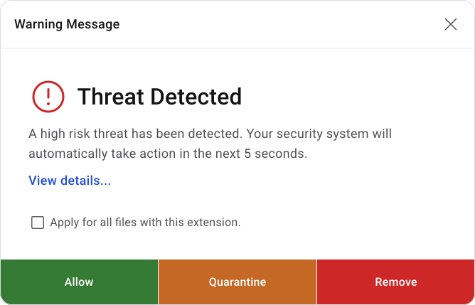
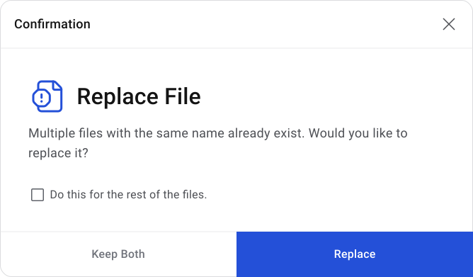
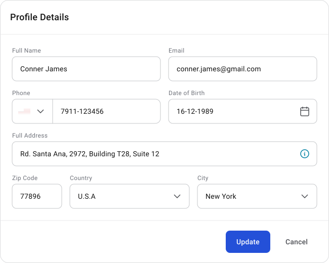
Fluid Buttons
Fluid buttons expand to fill the layout container they belong to. Their structure is tied directly to the container, which creates a more connected and compact layout. These buttons usually do not use shadows or corner radius. The container itself defines the outer shape and boundaries.
Rules to follow:
- Use a 1px space between buttons when multiple buttons appear together. Do not add spacing between the buttons and the container edges.
- Avoid overcrowding the layout. In most cases, 2 to 3 buttons are enough. Smaller layouts should use fewer actions to keep interaction clear and comfortable.
- Button widths should use equal percentage distribution inside the container. Width should stay consistent regardless of text length so the layout feels balanced and predictable.
Layout & Placement
When placement stays predictable, interfaces feel faster and easier to use. Inconsistent placement forces users to pause, scan the screen and re-evaluate actions.
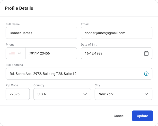
Button order directly affects speed and decision-making. Different platforms use different approaches, but consistency matters more than following a single rule.
A common pattern is:
- Negative action (Cancel) → left
- Positive action (Continue) → right
This supports natural left-to-right reading flow and reinforces the idea of moving forward through an interface.
Microsoft’s Approach
Microsoft often places the positive action first in simpler confirmation flows. This pattern follows familiar decision structures such as:
“Yes / No” or “Accept / Decline”
The expected or recommended action appears first, followed by the alternative.
Apple & Android’s Approach
Apple and Android commonly place forward-moving actions on the right side of the interface.
Actions like Continue, Save, or Next appear where users naturally finish scanning the layout.
Dismissive actions such as Cancel or Back are placed on the left to separate them from progression actions.
Button placement should remain predictable across the product. Repeated patterns help users build habits and interact with less effort over time. Most placement conventions exist because they performed well across large-scale products and repeated usability testing.
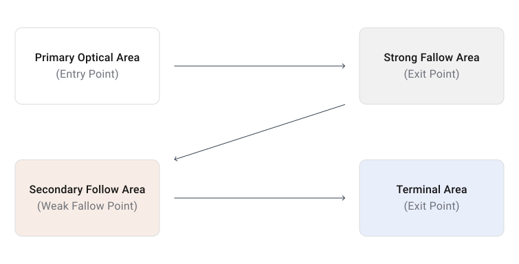
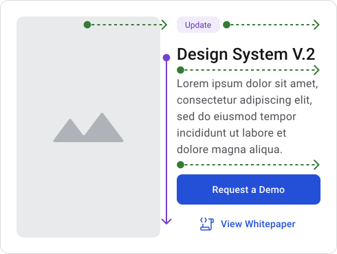
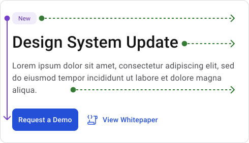
Gutenberg diagram (Z-pattern)
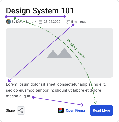
The Z-pattern works well for lighter layouts with limited content.
Users typically scan from left to right across the top, move diagonally downward, then scan across again. Important actions are often placed near the end of this visual path to support progression and completion.
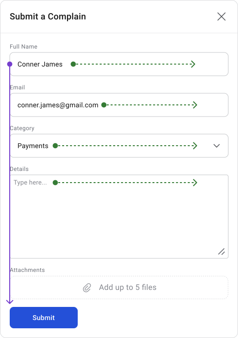
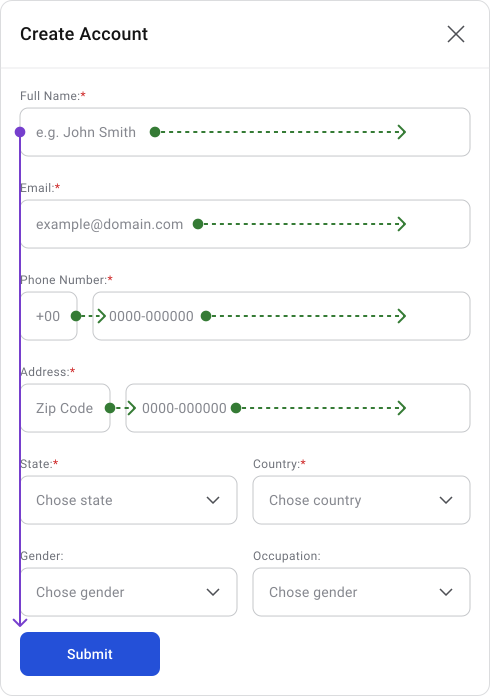
F- Pattern
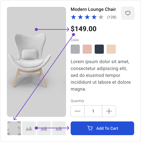
The F-pattern is commonly used in content-heavy layouts where users scan information instead of reading every detail.
Users usually scan horizontally across the top, move down the left side and occasionally scan across content sections again. Strong hierarchy and clear placement help users find actions without interrupting their reading flow.
Button Groups
Button groups organize related actions into a single, connected area. Grouping actions together reduces scanning effort and helps users compare options faster. They work best when actions are closely related or when users need to switch between a small number of options.
Examples:
- Formatting controls (Bold, Italic, Underline) in a text editor
- View switchers (List, Grid, Calendar)
- Filters with a small set of mutually exclusive options





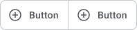
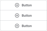
A button group is made from individual buttons that share alignment, spacing, sizing and styling. The group should feel like one connected control instead of unrelated buttons placed next to each other.
Examples:
- Horizontal group → most common, supports fast scanning and comparison
- Vertical group → useful in side panels or constrained layouts, especially on mobile
- Icon-only group → useful when actions are familiar and space is limited
Default State

Hover State

Selected State

Disabled State

Button groups should stay easy to scan and easy to understand. As more actions are added, decision-making becomes slower and the layout becomes harder to manage.
Examples
- Limit groups to 2–5 actions for clarity


- Collapse extra actions into a dropdown or “More” menu when space is constrained


- Adapt layout (horizontal to vertical) on smaller screens

Accessibility
Buttons are points where users make decisions and expect immediate clarity. Accessibility helps reduce friction during that interaction.
Buttons should remain easy to recognize and read in all states and environments.
- Button labels should meet a minimum contrast ratio of 4.5:1 for normal text
- Icons, borders, focus indicators and other non-text elements should maintain at least 3:1 contrast
- Hover, focus, disabled and loading states should remain visually clear and readable
Color helps communicate meaning, especially for destructive or warning actions, but it should never be the only signal. Some users experience color blindness, low vision, poor screen quality, or difficult lighting conditions. Actions should still remain understandable without depending entirely on color.
Destructive buttons should:
- Use clear action labels such as “Delete Account”
- Include supporting indicators when needed, such as icons or confirmation steps
- Using multiple signals improves clarity and reduces mistakes.
Buttons should remain comfortable to interact with across mouse, touch and assistive technologies. Small buttons or tight spacing increase accidental clicks and interaction errors, especially on mobile devices.
This is why minimum touch targets exist.
Recommended touch target sizes:
- 44 × 44px → recommended target size
- 40 × 40px → common practical default
- 24 × 24px → WCAG AA minimum when enough spacing exists around the target. In practice, 28 × 28px is usually a safer minimum for usability.
Spacing between buttons also matters. Actions placed too closely together increase the chance of accidental interaction.
Some users navigate entirely with keyboards or assistive technologies. Focus states help them understand which element is currently selected.
Focus indicators should:
- Remain clearly visible
- Work on all backgrounds
- Avoid relying only on subtle color shifts
- Strong and consistent focus states make keyboard navigation easier and more predictable.
A button can still fail if users do not understand the action it performs. Generic labels such as “Submit” or “OK” force users to depend on surrounding context. This slows decision-making and increases uncertainty.
Short and specific labels reduce cognitive effort and help users act faster. Avoid overly long labels or vague wording.
Users need confirmation that the interface received their action.
Feedback should communicate:
- The interaction was recognized
- The system is processing the request
- The action did not fail
Without clear feedback, users often repeat actions, causing duplicate submissions, errors, or frustration.
Practical Guidelines
These guidelines help keep button behavior predictable and consistent across the system.
- One primary action per screen/section
- Keep labels short, clear and action-based
- Maintain consistent placement patterns
- Avoid overcrowding layouts with too many actions
- Always provide visible interaction feedback
Most button usability issues come from repeated interaction problems and inconsistent patterns.
- Multiple primary buttons competing for attention
- Inconsistent placement between screens
- Missing hover, loading, or pressed feedback
- Buttons that are too small or placed too close together
- Vague labels that force users to stop and interpret the action
These issues increase cognitive effort, slow interaction and make interfaces feel less reliable.
🔗 Sources
Button Design: Best Practices for Optimal UI Buttons
Source LinkThe Definitive Guide to Buttons in UX: Part 1
Source LinkMaster Button UI Design: Explore 91 Unique Styles
Source LinkButton States: Communicate Interaction
Source LinkDesigning the Perfect Button
Source LinkThe Psychology of Buttons : Why Users Click What They Click
Source LinkTypes of UX Buttons and When to Use Them
Source LinkThe Evolution of Buttons in UX Design
Source LinkButtons in UI Design: Types and Best Practices
Source LinkUI/UX tips: A guide to creating buttons
Source LinkUX Button Best Practices for Higher Conversions
Source LinkHow to design toggle Buttons (Research-backed Best Practices)
Source LinkUX Checklist Series: Button Design
Source LinkButton UX Design: Best Practices, Types and States
Source LinkMaking the most of Buttons UI Design – Tips, states, usability and inspiration
Source Link3 Design Layouts: Gutenberg Diagram, Z-Pattern, And F-Pattern
Source LinkHow to Meet WCAG (Quick Reference)
Source LinkContrast (Minimum) (Level AA)
Source LinkTarget Size (Minimum) (Level AA)
Source LinkKeyboard Accessibility
Source LinkButtons Material Design
Source LinkButton Carbon Design
Source LinkButton Atlassian Design
Source Link