Breadcrumbs Research
View Figma ComponentKey Takeaways
- Breadcrumbs are a secondary navigation pattern that provides context and orientation.
- They work best in products with clear hierarchy and multiple navigation levels.
- Location-based breadcrumbs are the most common and widely understood pattern.
- Breadcrumbs should remain visually secondary to primary navigation.
- Mobile experiences require simplified breadcrumb strategies.
- Enterprise systems benefit significantly from breadcrumbs because users frequently enter deep pages directly.
- Breadcrumbs should simplify navigation, not add complexity.
Overview
Breadcrumbs show users where they are in the product and how the current page fits into the larger structure. They give a visible path back through parent levels so users can move up without relying on the browser back button.
They're most useful when a product has multiple navigation levels, nested categories, or complex workflows where users can land deep inside from search, a bookmark, or a shared link. In those situations, breadcrumbs give quick context before a user decides where to go next.
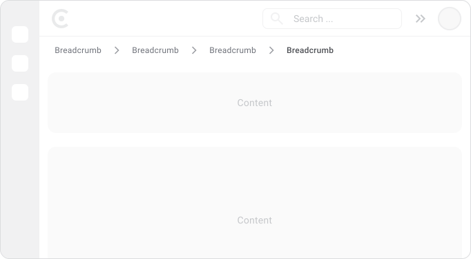
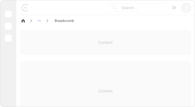
Breadcrumbs Anatomy
KEEEEEP IT SIMPLE! A breadcrumb trail is a sequence of levels running from a starting point (usually Home) through any parent sections, down to the current page.
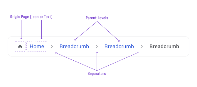
Most implementations include:
- Origin — The starting point, usually Home or a top-level section
- Parent Levels — Intermediate categories, sections, or folders
- Separators — Visual dividers between levels, most commonly a chevron (> or › or / or • or -)
- Current Page — The last item in the trail, usually not clickable
Every level should be a real destination. Breadcrumbs get confusing fast when a label isn't actually clickable, or when a level exists just for organizational structure rather than as a place users can go.
Why Breadcrumbs Matter
Users often arrive on a page with no idea how it fits into the rest of the product. This happens constantly with search results, email links, notifications, bookmarks and shared URLs. Without any context, the natural questions are:
- Where am I?
- How did I get here?
- How do I get back?
Breadcrumbs answer all three immediately. They make navigation visible so users don't have to remember where they came from and they give shortcuts back up the hierarchy so users can move between related content without extra steps or hitting the back button repeatedly.
In large products, that context makes a real difference. Users explore more confidently when they can see where they are and know how to get back. Key benefits:
- Improved orientation
- Faster navigation
- Better discoverability of related content
- Less dependency on the browser back button
- Better support for deep-linked pages
When to Use Breadcrumbs
Breadcrumbs work best when users need help understanding where they are inside a large hierarchy.
Typical products where they help:
- E-commerce platforms
- Documentation and knowledge bases
- Enterprise applications
- Content-heavy websites
- File and document management systems
These products often have several navigation levels and many possible entry points. Users can arrive on any deep page and need a quick way to see where it fits.
When Not to Use Breadcrumbs
Skip breadcrumbs when:
- The product has only one or two navigation levels (a simple marketing site or landing page)
- The layout already makes location obvious (a sidebar that always shows the full tree)
- The flow is linear, like onboarding, checkout, or a multi-step form
- The product behaves like a single-page app without a real hierarchy (A live monitoring view with no navigable structure or a canvas tool like Figma)
In these situations, breadcrumbs often repeat information without adding value. Progress indicators, tabs, or simple back links are usually better solutions.
Breadcrumbs Variations
Breadcrumbs can be implemented in different ways depending on how the product is structured and how users move through it.

Shows where the current page sits in the product hierarchy. The most common type and what users generally expect. Use this when the product has a clear, stable structure. Every level is a real page you can go to. The structure exists whether you visit it or not.

Attribute-based shows the filters a user applied to narrow down results, not a fixed place in the product like the location based. Each level represents a selected attribute, not a separate page. The trail changes based on what the user selected. Remove a level and you don't lose a page, you just widen the filter. Common in e-commerce and search-heavy products.

Shows the route a specific user followed to reach the current page. Less common because different users can reach the same page through different paths, making the trail unpredictable.
Placement and Visual Hierarchy
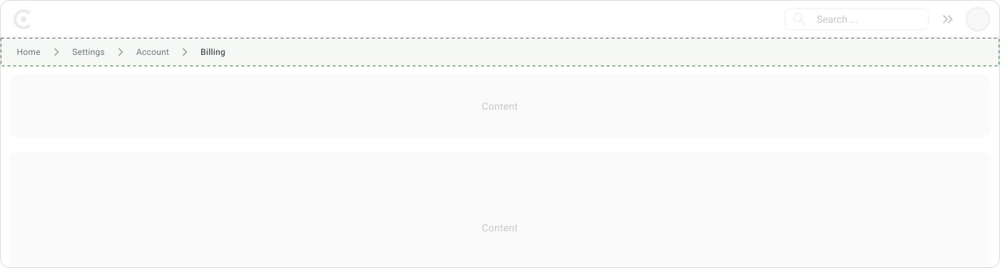
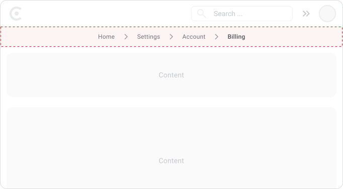
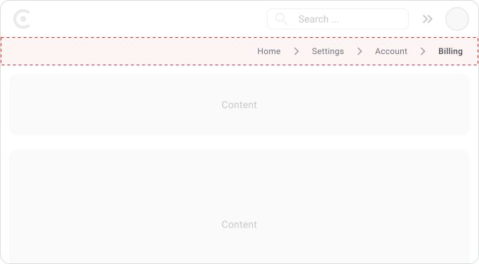
Breadcrumbs sit between global navigation and the page title. That position gives users context before they start reading the page content.
Global Navigation Then> Breadcrumbs Then> Rest of the page


Note!
Visually they should stay secondary. Small typography, subtle colors, simple separators. Enough contrast to be readable, but not so prominent they compete with the page heading or primary navigation. Users should notice them when they need them, not before.
Hierarchy Depth
Readability drops as the trail gets longer. Four or five levels is usually the limit before it starts to fail.

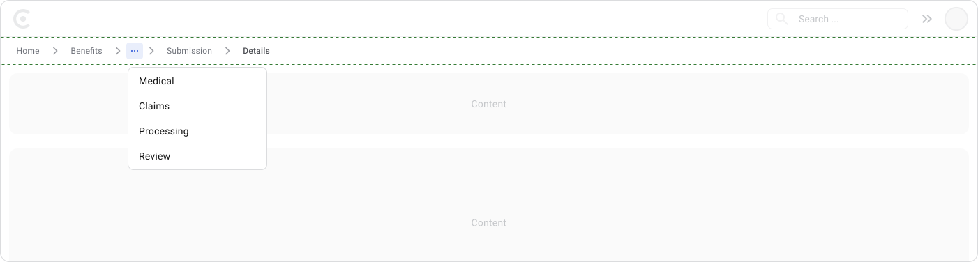
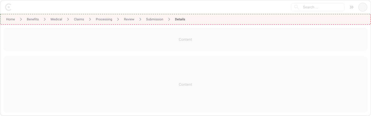
Most design systems start collapsing intermediate levels once the trail exceeds four or five items, either behind an ellipsis or an overflow menu. But that's a display fix, not a real fix.
If users are consistently six or seven levels deep just to reach a detail page, the structure is burying content that should be closer to the surface. A long breadcrumb trail is worth flagging to the team as a potential IA problem, not just something to truncate and move on.
Content and Labeling
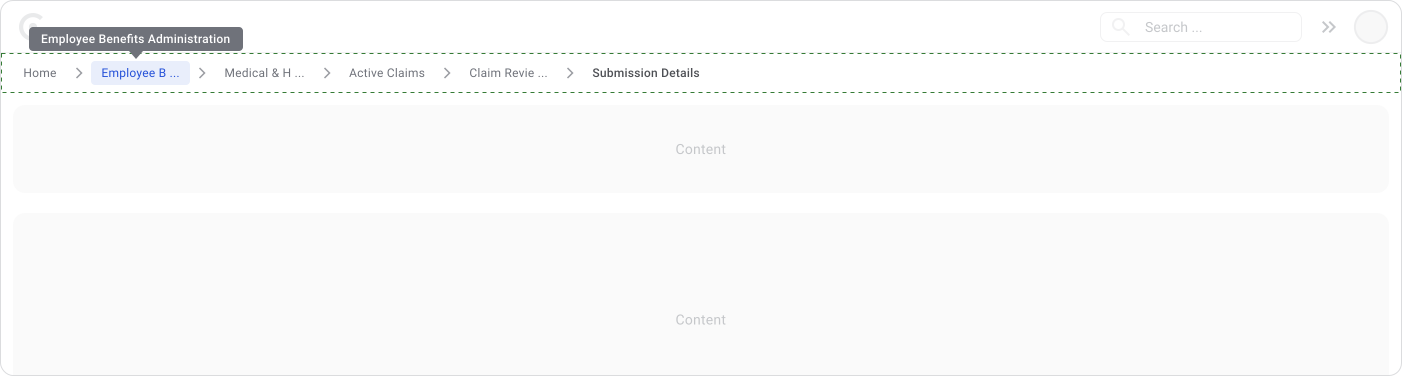
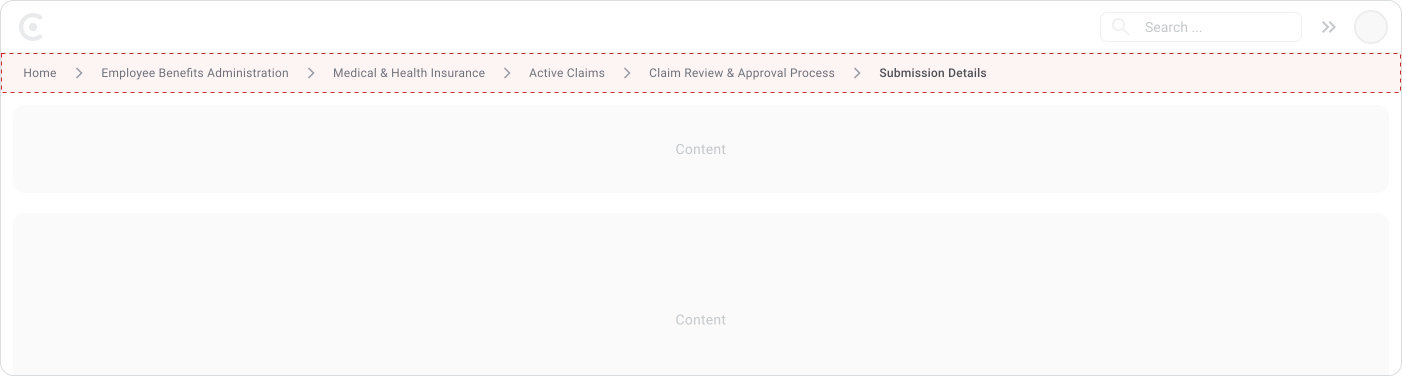
Labels should be short, clear and match the actual page names in the product. If the page is called "Medical Claims," the breadcrumb level should say "Medical Claims," not "Claims" or "Med. Claims." Inconsistent naming between breadcrumbs and page titles makes users second-guess whether they're in the right place.
Good practices:
- Match breadcrumb labels to page titles exactly
- Keep labels short without losing meaning
- Use consistent terminology across the product
- Reflect the actual structure, not an idealized version of it
When a label is too long to display in full, truncate it with an ellipsis and show the full text in a tooltip on hover. Set a maximum width for each breadcrumb label to keep sizing consistent across the trail. On mobile, hover doesn't exist, so a long-press gesture can reveal the tooltip as a replacement.
The current page label should be:
- Visually distinct from the rest of the trail
- Not clickable
- Always visible so users know where they are
Mobile Considerations
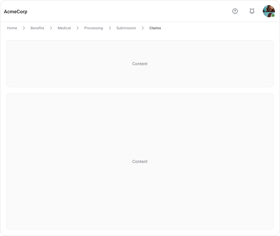
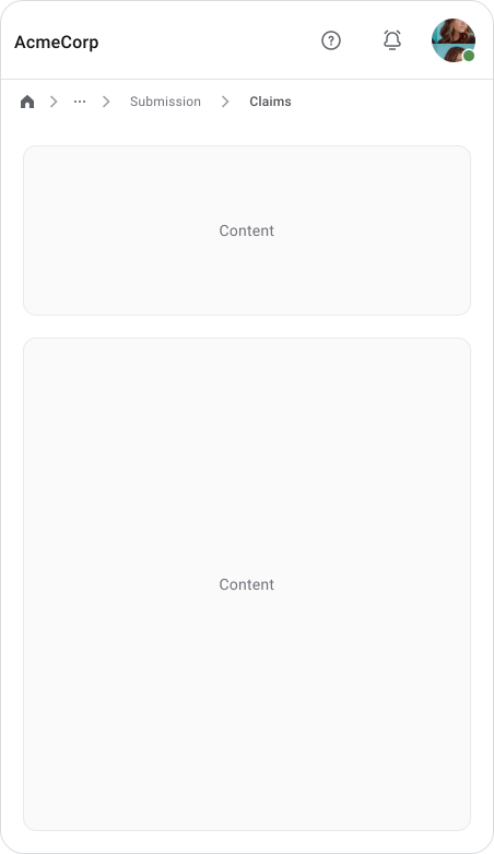
Mobile needs a completely different approach to breadcrumbs. Desktop has the space to show the full trail. Mobile doesn't and forcing the same solution onto a small screen creates more problems than it solves.
The core rules for mobile:
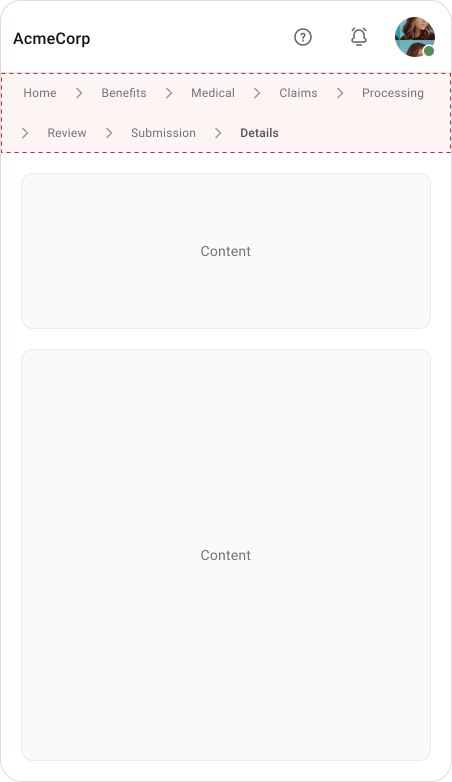
- Never let breadcrumbs wrap to multiple lines. It eats vertical space and makes the hierarchy harder to follow.
- Keep it to one line, always. If it doesn't fit, truncate or collapse, not wrap.
Handling Long Trails:
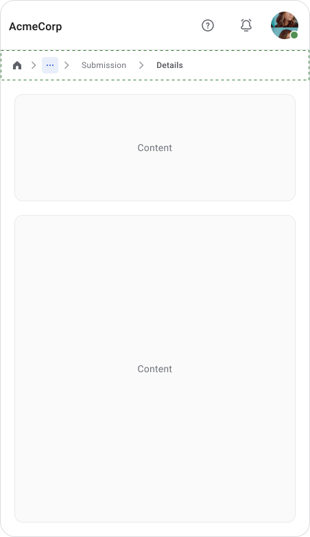
On mobile, showing just the immediate parent level is often enough. Users get the context they need without the full trail taking over the screen.
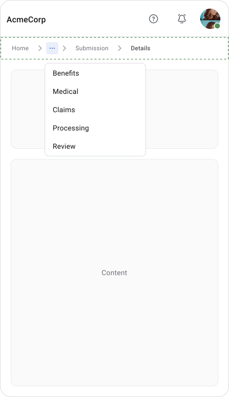
For deeper hierarchies, collapse middle levels behind an overflow menu, or truncate labels with an ellipsis. Long-press can reveal the full label as a tooltip replacement for hover.
Touch Targets:
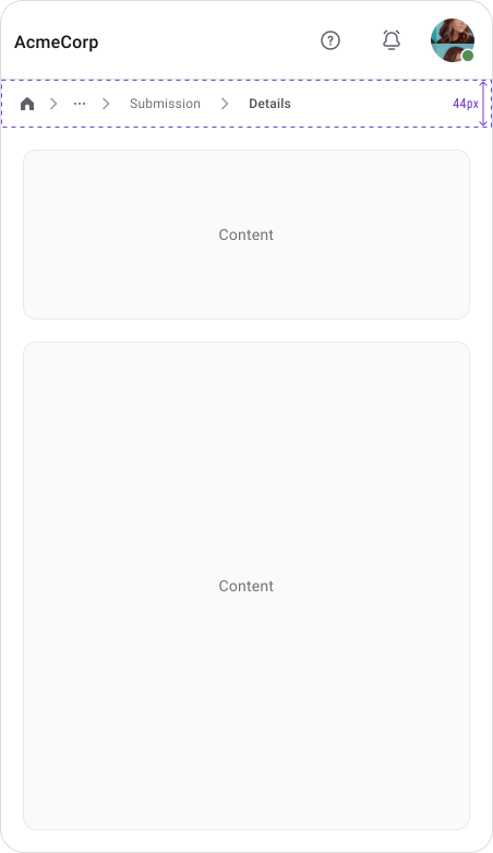
Truncated labels still need to be tappable. The entire breadcrumb component should be at least 44px tall, which is Apple's minimum touch target guideline and a good rule of thumb across platforms.
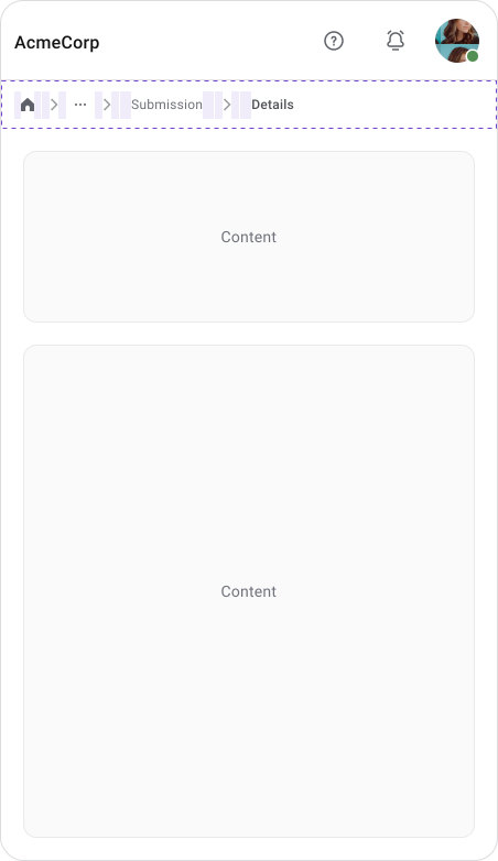
Don't rely on the label text alone as the tap area. Keep spacing between levels and separators relaxed, not cramped. When elements are too close together, users tap the wrong level or miss entirely.
Responsive Design:
The same breadcrumb that works on desktop will likely break or clutter on mobile without intentional adaptation. Breadcrumbs need to be designed responsively from the start, not retrofitted.
Accessibility
Screen Readers
Wrap breadcrumbs in a <nav> element with aria-label="breadcrumb" so screen readers announce it as a navigation landmark. Use an ordered list (<ol>) for the items since the hierarchy is sequential. Mark the current page with aria-current="page" on the last item so screen readers can distinguish it from the clickable levels.
Keyboard Navigation
Keyboard users should be able to tab through each level and see a clear focus state. Don't rely on color alone to show focus, use a visible outline.
Touch Target and Contrast
On mobile, the same 44px minimum height applies here too. Each level needs enough tap area and spacing around separators so users don't accidentally hit the wrong level.
Text and interactive states should meet WCAG AA contrast minimums across all themes, including dark mode if the product supports it.
Enterprise Considerations
Enterprise products are where breadcrumbs earn their place most. Users jump between records, notifications, emails and dashboards constantly and they rarely arrive through the front door. A claims manager opening a link from an email lands directly on Claim #12345 with no idea what's around it. Breadcrumbs fix that instantly.
Typical entry points in enterprise products:
- Search results
- Email and notification links
- Dashboard widgets
- Bookmarks and saved links
Common patterns where breadcrumbs add real value:
- Dashboard → Claims → Medical Claims → Claim #12345
- Administration → Users → Roles & Permissions → Role Details
- Documents → Policies → Benefits → Policy Details
- Cases → Open Cases → Case #84721
In each of these, the breadcrumb tells the user what type of record they're on, where it lives in the system and how to get back to the list or parent section without hunting around.
Best Practices
- Show meaningful hierarchy that reflects the actual product structure
- Keep labels concise and matched to page titles
- Make all parent levels clickable
- Place breadcrumbs between global navigation and the page title
- Keep breadcrumbs visually secondary to the page content
- Adapt to mobile with truncation, collapsed levels, or parent-only display
- Use consistent separators throughout the product
- Adding breadcrumbs to flat structures. If the product only has one or two levels, breadcrumbs just add visual noise without telling the user anything useful.
- Using breadcrumbs as primary navigation. If users have to rely on breadcrumbs to move around the product, the main navigation has a problem.
- Incorrect hierarchy. Breadcrumb levels that don't match the actual product structure confuse users.
- Making the current page clickable. The last item in the trail is where the user already is. Linking it goes nowhere useful and adds confusion.
- Trails that are too long. More than four or five levels and users have to stop and read carefully just to understand the structure.
- Wrapping on mobile. Multi-line breadcrumbs eat vertical space and are harder to scan. Truncate, collapse, or show only the parent level instead.
- Overly prominent styling. Breadcrumbs are secondary, they should not visually compete with the rest of the page or primary navigation.
- Path-based breadcrumbs without a clear reason. Showing the user's browsing history usually just duplicates the back button and creates inconsistent trails when users arrive from different entry points.
Final Thoughts
Breadcrumbs are simple, but when they're in the right place on the right product, they make a real difference. Users don't think about them. They just glance up, get their bearings and move on. That's exactly what good secondary navigation should do.
When they're wrong, whether on a flat structure, too long, or styled too prominently, they add clutter without adding value. The pattern is only as good as the information architecture behind it.
Get the structure right first. The breadcrumbs will follow.
🔗 Sources
Breadcrumbs UX Navigation – The Ultimate Design Guide
Source LinkBreadcrumbs UX: Complete Guide, Best Practices, Mobile Patterns & Modern Examples (2026)
Source LinkDesigning Effective Breadcrumbs Navigation
Source LinkDesigning Better Breadcrumbs UX
Source LinkBreadcrumbs UI design inspiration
Source LinkMobile Breadcrumbs: 8 Best Practices in UX
Source LinkDon’t make me think: The power of the breadcrumb
Source LinkDesign Guide: Breadcrumbs
Source LinkWeb Usability: Breadcrumbs Design Tips and Practices
Source LinkBreadcrumb website design: best practices and examples
Source LinkThe Complete Guide to UI Breadcrumbs
Source LinkBreadcrumb - UX Patterns
Source LinkDesigning mobile breadcrumbs for smaller screens
Source LinkBreadcrumbs: 11 Design Guidelines for Desktop and Mobile
Source LinkNavigating Websites with Ease: The Power of Breadcrumbs in UX Design
Source LinkBest Practices for Designing Breadcrumbs
Source LinkAre breadcrumbs still fresh for UX?
Source LinkThe Role of Breadcrumbs in UX Design: How to Make Users’ Paths Clearer
Source LinkA Quick Guide to Breadcrumb Navigation. Why Do Breadcrumbs Matter for SEO?
Source Link