Accessibility in Design
View Figma ComponentAccessibility means making sure people with different visual, motor, auditory and cognitive abilities can perceive, understand, navigate and use the interface.
It covers more than color contrast. It also affects interaction, content structure, keyboard navigation, assistive technology, responsive behavior and how components are implemented.
A practical way to approach it:
Design what users need → define the accessible behavior → verify it once it's built.
WCAG stands for Web Content Accessibility Guidelines. It is the main reference used to evaluate digital accessibility and is organized around four principles:
1. Perceivable
Users need to be able to perceive the information and understand what is presented on the screen.
2. Interactable
Users need to be able to navigate and interact with the interface using different input methods.
3. Understandable
Content, controls and interactions need to be clear and behave in predictable ways.
4. Robust
The interface needs to work reliably across different browsers, devices and assistive technologies.
For most product work, WCAG 2.2 Level AA is the practical target.
Minimum Contrast
- Normal text - 4.5:1
- Large text - 3:1
- Important UI boundaries/icons/states - 3:1
How accessibility reaches the user
This is a simplified view of how accessibility information reaches assistive technology
Semantic HTML → DOM → ARIA → Accessibility Tree → Accessibility API → Assistive Technology
Magnification sits outside this flow. It changes how users view the visual interface rather than how its structure and meaning are communicated to assistive technology
Semantic HTML tells the browser what an element is. Visual appearance does not define its meaning. If something looks and behaves like a button it should normally be built as a <button>
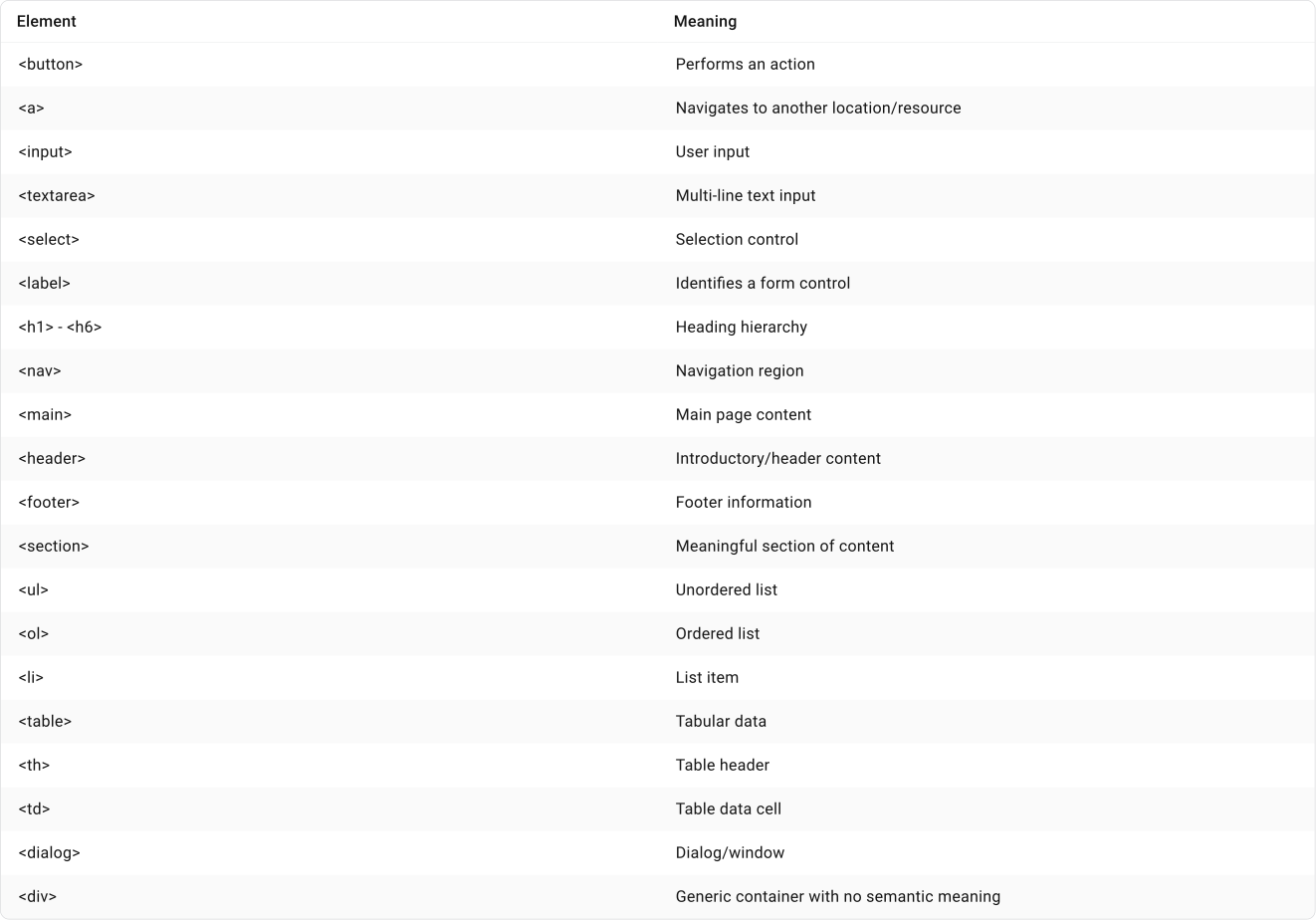
Important note!
Native HTML should generally be preferred over recreating native controls with ARIA. A useful rule is simple: if HTML already provides the meaning and behavior you need, use it.
Example:
Visually these could look identical:
- <div>Save</div>
- <button>Save</button>
The second version already communicates role: button and includes standard browser and keyboard behavior.
DOM (Document Object Model)
The DOM is the structured representation of a webpage used by the browser.
Main
|── Heading
|── Description
|── Input
|── Button
Visual order and DOM order do not always need to match. Responsive layouts can also rearrange content visually.
Check the DOM order when visual reordering could affect:
- Reading sequence
- Keyboard focus order
- Content relationships or meaning
This matters most in complex grids, dashboards, responsive tables, multi-column layouts and interfaces where CSS significantly rearranges content.
Rule: Never flag a visual and DOM order mismatch simply because it exists. It should be flagged when the resulting reading or interaction order becomes confusing.
ARIA (Accessible Rich Internet Applications)
ARIA adds accessibility information when native HTML cannot describe a component well enough. It communicates information that assistive technology needs to understand what is happening in the interface.
Rule: Use native HTML first. Add ARIA when important accessibility information is still missing.

When does ARIA fill in the gaps?
When reviewing an interactive component, think about what a user can understand visually that may need to be communicated to assistive technology.
For example, let's consider an expandable Filters button:
[ Filters ▼ ]
The user clicks it:
[ Filters ▲ ]
Category
Price
Availability
There are two conditions now:
CLOSED
[ Filters ▼ ]
OPEN
[ Filters ▲ ]
Category
Price
Availability
The visual behavior is clear because a sighted user can see the panel open and close. A screen reader also needs to know when that state changes. ARIA can communicate this information:
CLOSED
Role: button
Name: filters
> State: collapsed
The user clicks it:
OPEN
Role: button
Name: filters
> State: expanded
What Not To Do
ARIA is not another set of visual states that needs to be added to Figma components. It belongs to the implementation layer and communicates states, relationships and meaning that users may already understand visually to assistive technologies.
Screen Readers
Screen readers turn accessibility information from the interface into speech.
A sighted user sees:
[ Save ]
A screen reader user might hear: "Save, button."
Filters ▼
For an expandable control: "Filters, button, collapsed."
From a design review perspective, check:
- Accessible name
- Role
- State
- Reading order
- Dynamic changes
- Focus behaviours
- Focus behaviour
For testing, NVDA is a good option because it is free and open source.
Visual Accessibility
Text Contrast
WCAG 2.2 AA requirements:
- Normal text - 4.5:1
- Large text - 3:1
- Important UI boundaries/icons/states - 3:1
The 4.5:1 threshold helps keep text readable for people with moderately reduced visual acuity or contrast sensitivity.
For WCAG purposes, large text means roughly:
- 18pt regular, which is approximately 24 CSS px
- 14pt bold, which is approximately 18.7 CSS px
14px bold does not qualify as large text.
The relaxed 3:1 rule only kicks in once text qualifies as large.
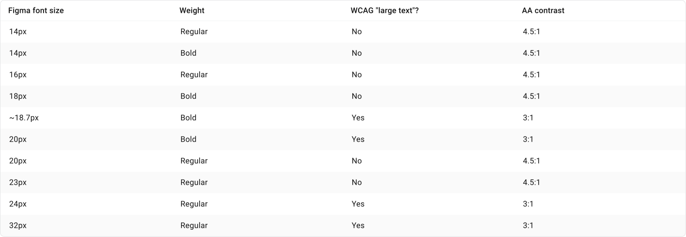
What Not To Do
Avoid designing directly on the minimum threshold when possible.
For example:
- Required AA: 4.5:1
- Design System target: 4.8:1 - 5:1+
The extra buffer helps account for differences in displays, browsers and rendering where the final result may vary slightly from the design.
Placeholder Text Accessibility
Placeholder text and hints do not have a separate contrast requirement. If the placeholder contains readable text, standard WCAG contrast rules apply. For normal-sized text this generally means a minimum contrast ratio of 4.5:1.


Placeholder text should also never replace a label. It disappears once the user starts typing which removes useful context when entering or reviewing information.
Disabled States Accessibility
WCAG does not require a minimum contrast ratio for inactive or disabled UI components. A truly disabled button is therefore exempt from the usual text and control contrast requirements.
For a design system:
- Required: no WCAG contrast threshold for truly inactive controls.
- Recommended: keep disabled controls visually identifiable and readable where possible. (3:1)
Also separate Disabled from Read-only since they create different behaviors and expectations for the user.
Target Size
WCAG 2.2 AA sets a minimum pointer target of 24 × 24 CSS px, with some exceptions such as smaller targets that have enough spacing around them.
WCAG 2.2 AAA increases the target size to 44 × 44 CSS px.
A practical guideline:
- 24 × 24 px - WCAG AA baseline
- 44 × 44 px - Preferred touch-friendly target and a good choice for mobile
- 48 px Comfortable default when space allows
The visible icon does not need to be 44px. The interactive hit area around it is what matters for target size.
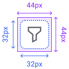
There is no WCAG rule requiring an input to be 44px high. A 32px input is not automatically inaccessible.
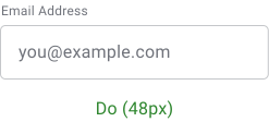
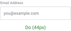
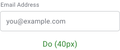
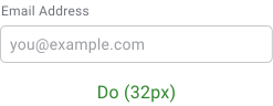
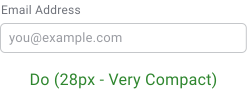
WCAG 2.2 AA sets a 24 × 24 CSS px minimum pointer target with some exceptions. The 44 × 44 CSS px target belongs to the stricter AAA criterion.
WCAG AA allows targets smaller than 24 × 24px in some cases when enough spacing exists around them. In a tightly packed interface, small targets become more difficult because users can accidentally activate a neighbouring control.
This guidance focuses specifically on highly compact grid variants where target size becomes harder to manage. Above 32px, targets generally become easier to interact with and move closer to the preferred touch-friendly sizes.
Focusing specifically on target size, these recommendations work well for highly compact interfaces while staying within the WCAG 2.2 AA baseline.
Input inside a cell
When row data is edited through a dedicated input inside the cell, 28px height is a good minimum for the most compact variant. It stays above the 24px AA baseline while allowing the grid to remain dense.
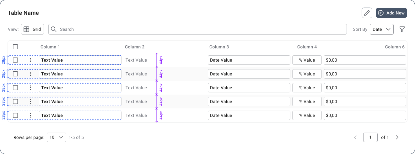
Entire cell is editable
When the whole cell acts as the editable target, use 32px as the minimum. While 28px can still satisfy the target-size requirement, 32px gives users a larger area for selecting the correct cell in a dense editable grid.
Important note!
Rule of thumb
- 28px minimum for a dedicated inline input
- 32px minimum when the entire cell is the editable target
- Go larger whenever the interface does not require extreme density
For reference:
- WCAG AA baseline: 24×24 CSS px
- 28px / 32px: Design system recommendations for compact interfaces
A 28px input can meet WCAG 2.2 AA target-size requirements when the interactive target itself provides at least that area.
Keyboard Accessibility
Main Rule! Anything users can operate with a mouse should generally be operable with a keyboard too.
What keyboard users use to navigate:
Tab
Shift + Tab
Enter
Space
Escape
Arrow keys where appropriate
There are several things to review once the interface is implemented.
<Tab> - moves forward between interactive elements.
<Shift + Tab> - moves backward.
Navigation
↓ Tab
Search
↓ Tab
Filters
↓ Tab
Results
↓ Tab
Next page
Things to check:
- Is every interactive control reachable?
- Are decorative and non-interactive elements kept out of the focus order?
- Does focus move in a logical order?
- Are hidden elements prevented from receiving focus?
Critical issue: If a mouse user can activate a control that a keyboard user cannot reach.
Keyboard order should follow a meaningful sequence.
Bad Navigation:
Name Input Field
↓
Footer link
↓
Email Input Field
↓
Cance Button
↓
Submit Button
Good Navigation:
Name Input Field
↓
Email Input Field
↓
Cance Button
↓
Submit Button
↓
Footer link
Every keyboard-focused control needs a visible focus indication.
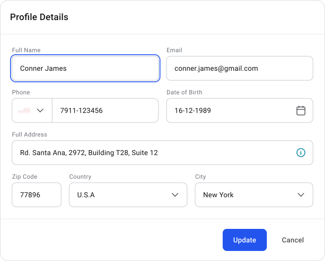
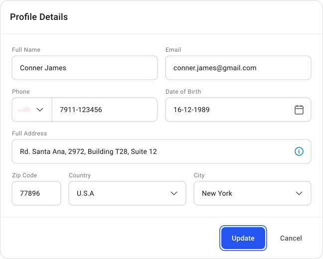
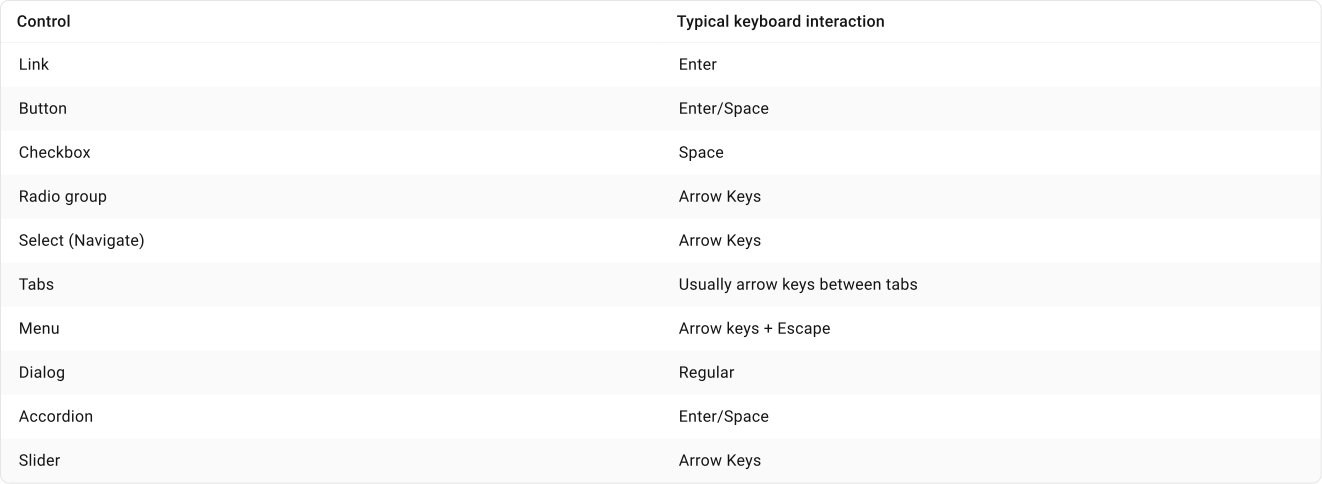
Reaching something isn't enough. Different controls have expected keyboard interactions.
Focus starts on a control on the main page.
Then user clicks o:
[ Edit profile ]
Modal (pop-up) opens.
Focus should move inside the modal to an intentional starting point. It should not remain on the page behind it.
The right starting point depends on the content and purpose of the modal. There is no universal element that should always receive initial focus.
Avoid making keyboard and assistive technology users tab through unnecessary controls before reaching the main task. For a simple form modal, for example, moving focus directly to the first input or relevant option can be more efficient than starting on the title or close button.
When a modal closes, focus should usually return to the control that opened it.
Main Page > [ Edit profile ] button that previously opened the modal. Otherwise a keyboard user can effectively lose their position on the page.
What if the focused element no longer exists?
Consider a user deleting a row from a grid. The row and the control that previously had focus disappear so focus needs a new logical destination.
Depending on the situation, focus could move to:
- The next row
- The previous row if there is no next row
- The grid's empty state if the last remaining row was deleted
If the grid becomes empty, communicating "No data available" is useful feedback because it confirms the result of the action.
What about a confirmation snackbar?
A snackbar can announce that the deletion was successful without moving keyboard focus to it. Focus can move directly to the next logical location in the grid while the snackbar message is communicated to assistive technology.
If a user activates a control that reveals additional content, focus usually stays on the control that triggered the change.
[ Show more ] ← FOCUS
Once clicked, additional details appear:
Additional content...
[ Show less ] ← FOCUS
The button changes from "Show more" to "Show less" but keyboard focus stays on the button. The user can then continue navigating normally into the newly revealed content.
The expanded state also needs to be communicated to assistive technology, usually with aria-expanded.
General Rule
- Expanding or revealing inline content: Keep focus on the control that triggered it.
- Opening a modal or overlay: Move focus into the newly opened area because the user's interaction context has changed.
Scenario 1
If a longer form is submitted and several fields are invalid, users need a clear way to understand what went wrong and find each problem.
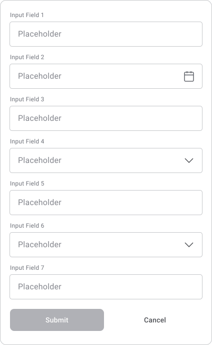
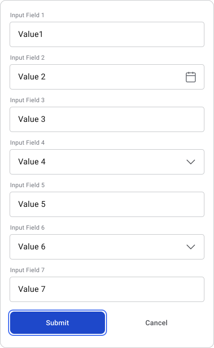
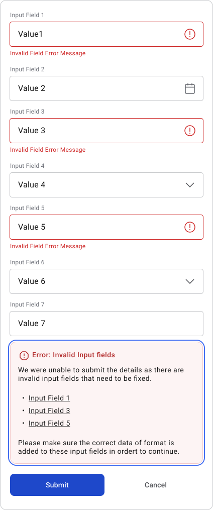
When there is no real-time validation, an error summary at the beginning of the form is a good approach. When the summary appears, move focus to it so the screen reader announces the errors.
Each error in the summary can link directly to the corresponding field so keyboard users can quickly jump to the problem.
The affected fields should also:
- Show an invalid state
- Display an error or hint explaining the problem
- Have the error message programmatically associated with the input
This keeps the explanation available when the user reaches the field.
Scenario 2
For real-time validation, validate the field when the user leaves it if appropriate for that input.
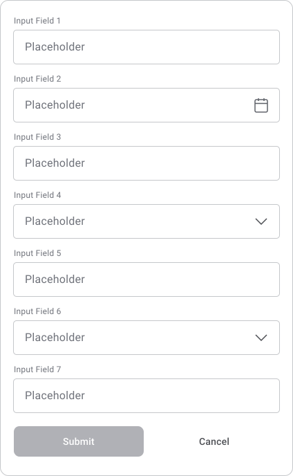
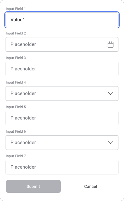
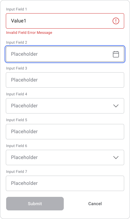
If the value is invalid:
- Show the inline error
- Mark the field as invalid
- Associate the error message with the field
- Announce the new error to the screen reader
- Keep focus moving normally to the next field
Focus does not need to jump back to the invalid input or move to the error message. The user can continue through the form and return to the field when needed.
Developer requirement: Invalid state + associated error + live announcement.
Scenario 3
If two password fields do not match after submission, use an error summary and move focus to it so the screen reader announces the problem.
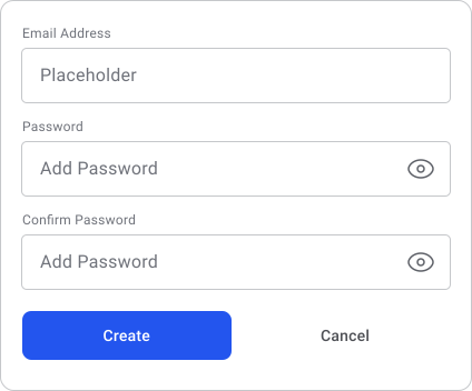
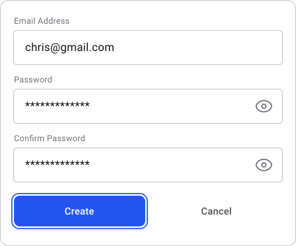
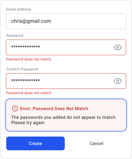
Anchor links are less useful here because the mismatch does not tell us which of the two values is incorrect. The user can navigate back through the fields and correct the appropriate value.
Rule: Move focus when users need to be redirected after submission. For inline validation during navigation, announce the error without interrupting their focus flow.
Images and Icons
Main Rule! Ask whether the user loses useful information if they cannot see the image or icon.
- If yes: Provide an accessible alternative.
- If no: If it is purely decorative, it should generally be ignored by assistive technology.
Example:
Profile photograph containing useful identity/context
→ Provide a meaningful text alternative when that information is relevant.
Background decoration
→ Ignore it for assistive technology.
Arrow icon inside "Next slide" button
→ The icon can be ignored.
→ The button itself needs an accessible name such as "Next slide."
What to review after implementation
- Do meaningful images have appropriate alternative text?
- Are decorative images and icons ignored by assistive technology?
- Do icon-only controls have an accessible name?
- Are icons inside labelled controls prevented from adding unnecessary or repeated information?
Dynamic Content
Main Rule! Ask whether the user loses important information if they cannot see the change.
Automated accessibility tools cannot fully evaluate this because they cannot always determine whether a visual change needs to be communicated to the user.
Whenever something changes visually, ask: How does someone who cannot see the change know that it happened?
Example:
Item successfully saved
Loading started
Loading completed
Three search results returned
Field became invalid
Accordion expanded
Modal opened
Product added to cart
Dynamic updates should be communicated to assistive technology when they provide information the user needs.
For status updates such as "Item successfully saved" or "3 results returned", this can often be announced without moving focus away from the user's current task.
For changes that create a new interaction context such as opening a modal, focus may need to move into the new area.
Accessibility Testing Tools
No single tool can give you a complete accessibility audit. Automated testing can find many technical issues but it cannot determine whether the overall experience is accessible.
For example, automated tools cannot reliably judge whether focus moves to the right place, keyboard navigation makes sense or a dynamic change is communicated clearly.
WAVE is useful for quickly identifying issues such as contrast, missing alternative text, structural problems and ARIA-related errors.
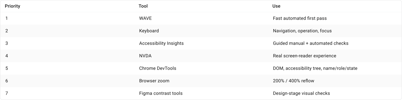
Accessibility Insights combines automated checks with guided manual testing which makes it useful for reviewing areas that require human judgement.
Product Areas Where Accessibility Has Highest Priority
Accessibility matters across digital products but legal requirements and operational pressure are especially high in some industries and services.
In EU
The European Accessibility Act (EAA) covers a range of products and services including computers and operating systems, smartphones, banking services, passenger transport, e-books and e-commerce.
Its accessibility requirements became applicable in June 2025, depending on the product or service and the exceptions defined by the legislation.
Public-sector websites and mobile apps are covered separately under the Web Accessibility Directive.
In US
Section 508 requires information and communication technology developed, procured, maintained or used by US federal agencies to meet accessibility requirements.
Typical high-priority environments:
- Government and public services
- Banking and financial services
- Healthcare
- E-commerce
- Transport and ticketing
- Education
- Large enterprise systems
- Products sold to government or regulated organisations
- Consumer services with broad audiences
🔗 Sources
Core standards and WCAG
The primary source for WCAG requirements and Level A, AA and AAA criteria.
Much easier to use than the raw specification. It explains what each criterion means, why it exists and provides examples.
4.5:1 normal text, 3:1 large text and exemptions such as inactive controls and logos.
24 × 24 CSS px AA minimum, including the spacing and other exceptions.
44 × 44 CSS px AAA target criterion.
It explicitly confirms that focus order does not have to match visual order as long as meaning and operation remain logical.
Contains the official guidance we discussed for Use of Color, Reflow, Non-text Contrast, Keyboard, Keyboard Trap, Focus Visible, Focus Not Obscured, Dragging, Error Identification, Labels/Instructions, Name/Role/Value and Status Messages.
ARIA, screen readers and component behavior
It contains practical patterns for dialogs, accordions, menus, tabs, grids, buttons, comboboxes and other components.
Covers semantics, landmark regions, names/descriptions, keyboard interfaces, tables/grids and other implementation concepts.
Source for concepts such as accessible names, aria-label, aria-labelledby, labels and descriptions. This supports our Name → Role → State discussions.
Covers Tab, Shift+Tab, focus management, keyboard interaction and ARIA widgets. Importantly, W3C explains that ARIA itself does not give custom components keyboard behavior. Developers must implement that behavior.
Explains the relationship between ARIA, HTML, CSS, JavaScript and accessible UI patterns.